Starting with the December 2021 update of ArcGIS Online and version 4.22 of the ArcGIS API for JavaScript (ArcGIS JS API), you can summarize point clusters in more detail using Arcade expressions in popups. This allows you to display informative reports, summaries and charts of clustered data.
If you already know what clustering is, feel free to skip the clustering overview and navigate to the Access and summarize clustered features using Arcade section below.
Clustering overview
Clustering is a method of merging nearby and overlapping features into a single symbol to declutter the view. The size of the cluster icon indicates the number of features in each cluster relative to other clusters.
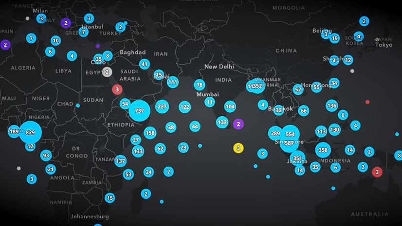
For example, check out this map of earthquakes that occurred along the Aleutian Islands in June 2020.

Clustering helps you immediately see the relative density of features. When clustering is not enabled, it’s difficult to discern areas where there are a lot of overlapping points.
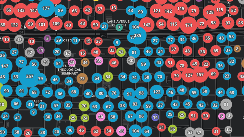
Notice how the cluster of 1,000+ earthquakes in the previous image is not noticeable when the same layer is not clustered. In fact, the density appears largely uniform.

You can define cluster labels and popups to provide users with additional information about the cluster.
Cluster popups
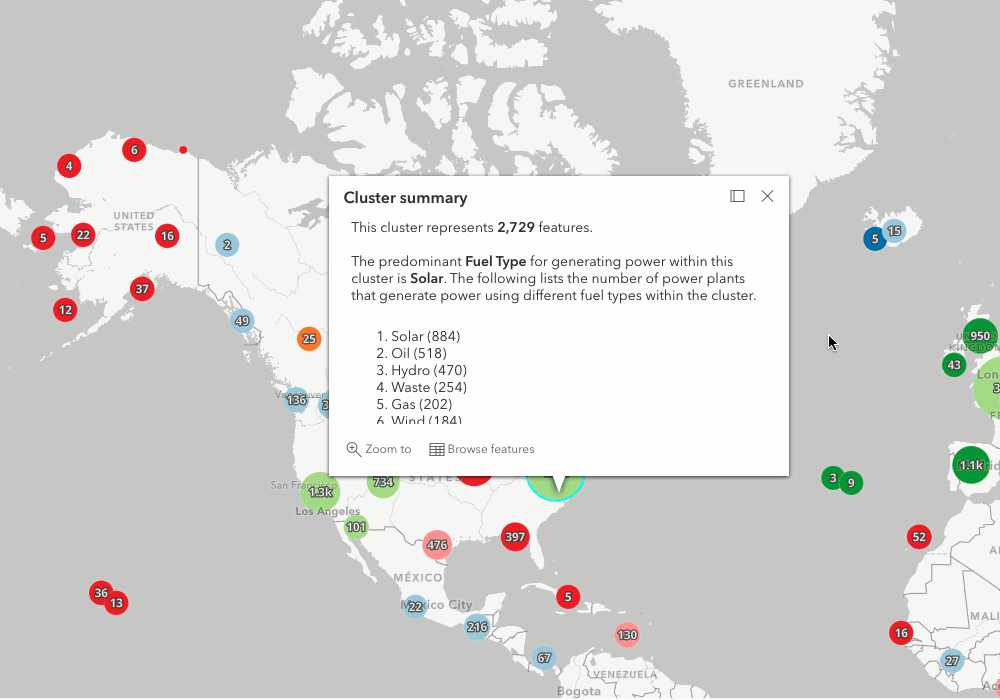
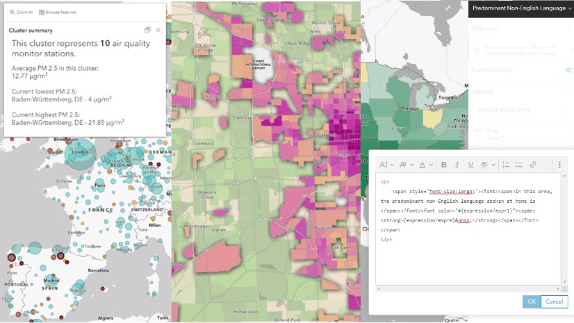
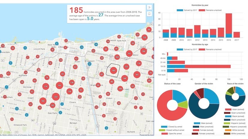
By default, when you enable clustering in the Map Viewer and select a cluster, you will see a nice popup that summarizes the data in the cluster. Clusters with no data-driven style will only display the number of features in the popup.

For clusters rendered with unique values, the popup displays the number of features in the cluster along with the predominant value of the categorical field.
 within the cluster.")
If the clustered layer is rendered with any numeric values (either using color, size, opacity, or rotation), the average of those values will be displayed in the cluster popup.

Prior to the December 2021 update, you could update the text of the cluster popup to be more descriptive, but you didn’t have the flexibility to summarize any additional information.

Access and summarize clustered features using Arcade
While the default popups for clusters are good, the information they provide can feel insufficient. In some scenarios, you may want to provide a more detailed summary of the cluster, such as a breakdown of categories present in the cluster, a list of features, or additional statistics.
Two enhancements were added to the ArcGIS Online map viewer that give you more control over the content to display in cluster popups. These include the ability to:
- Create popup elements directly from Arcade expressions. Rather than return a text or number value from an expression, now you can return tables, charts, and HTML. I encourage you to read this excellent post introducing this capability.
- Access a cluster’s features within an Arcade expression for cluster popups. Now you can iterate through a cluster’s features in an Arcade expression to create lists, tables, and charts summarizing the cluster. The remainder of this post will demonstrate various ways you can do this.
As of December 2021, you can now add an Arcade expression to a cluster popup either using the Manage Expressions entry point for returning a single text or numeric value, or you can add an Arcade element to return HTML elements, a table, or a chart directly from an Arcade expression. We’ll use the Arcade element in each of the examples below.

Access aggregated features with Arcade
Cluster popups already give you access to individual features included in the cluster via the Browse features action. This action allows you to scroll through a list of the aggregated (i.e. clustered) features and open an individual feature’s popup. Note that you can also see the selected feature’s location on the map.
Now that Arcade is enabled for cluster popups, you can access all features using the $aggregatedFeatures feature set within cluster popup expressions. With $aggregatedFeatures, you can calculate any statistic on the cluster’s features, filter them, or even list them in the popup content.
// Returns the total capacity of all plants in the cluster
Expects($aggregatedFeatures, "capacity_mw")
Text(Sum($aggregatedFeatures, "capacity_mw"), "#,###")
Examples
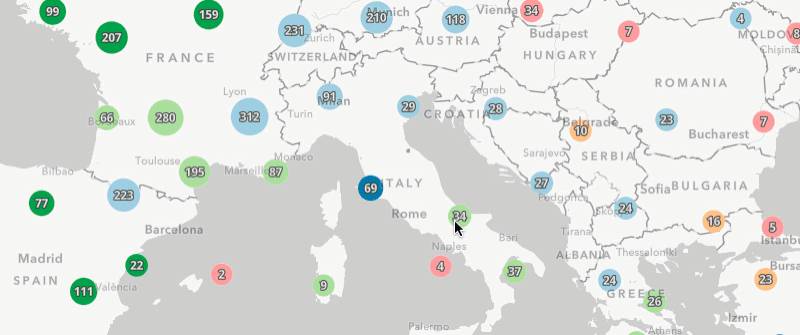
The remainder of this post will walk through various popup configurations that take advantage of these new capabilities in Arcade. They’ll all use a variation of this web map showing a clustered layer representing global power plants.
The following list describes content you can now summarize in cluster popups.
- Display the sum of one attribute
- Display the largest value
- Ordered list by type
- Table of custom attributes
- HTML table with 3+ columns
- Pie Charts
- List of features
- Column charts for features
1. Display the sum of one attribute
By default, the cluster popup only displays the average of numeric attributes included in the layer’s style. However, it may be more appropriate to display the sum of numeric attributes. The following example demonstrates how to calculate the total mW capacity of all power plants in the cluster using Arcade.
// Returns the total capacity of all plants in the cluster
Expects($aggregatedFeatures, "capacity_mw")
Text(Sum($aggregatedFeatures, "capacity_mw"), "#,### mW")

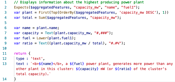
2. Display the largest value
You may want to display information about the power plant that produces the most power within the cluster. The expression can return its name, capacity, and the type of fuel it uses to generate power. These are multiple bits of information that can be returned as a text element directly from the expression.

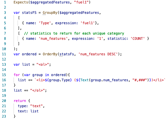
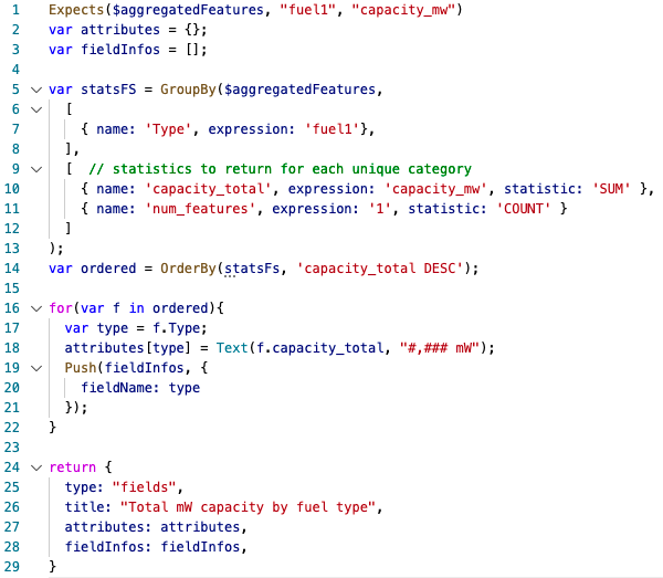
3. Ordered list by type
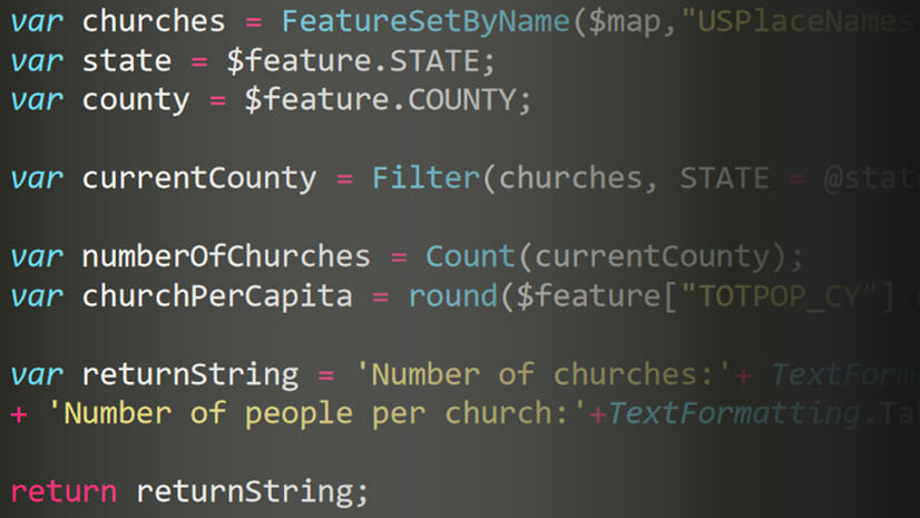
When a clustered layer styles points by category or type, the color (or symbol) of the cluster indicates the most common type of feature included within the cluster. While this is helpful in many cases, you may want to display a list of all the types included in the cluster, along with the number of features belonging to each category.
Because expressions can return popup content elements, you can return HTML from an expression to display in the popup within a rich text element. The following expression finds the distinct types within the cluster, iterates through each to get the count of each category, and dynamically builds an ordered list as HTML to return in the popup text element.

Alternatively, you could filter and display the count of only one critical category, such as the total number of fatalities in a cluster of traffic accidents.
4. Table of custom attributes
You can also build a table of key-value pairs that mimics the fields content element in the popup. When displaying a list of fields in a layer popup, you can use the Map Viewer UI to select the fields to include and set their formatting. The list of fields will then display as a table.
Similarly, you can return an attribute table directly from an Arcade expression. The following snippet does this to list the distinct types within the cluster. Rather than report the count for each fuel type, it reports the total capacity for each fuel type. It’s interesting to observe how different the list looks when comparing total count vs. total capacity.
Note how the attributes manage the values calculated by the expression and the fieldInfos indicate which attributes must be displayed in the output table.

5. HTML table with 3+ columns
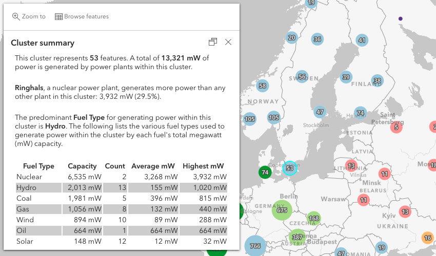
Returning a fields element works well if you only need to display one value per attribute or category. However, you may want to display more than one data attribute per category. In this scenario, you can return an HTML table within a text element. The table in the expression below has columns for four attributes per fuel type: total capacity, total count, average capacity, and maximum capacity.
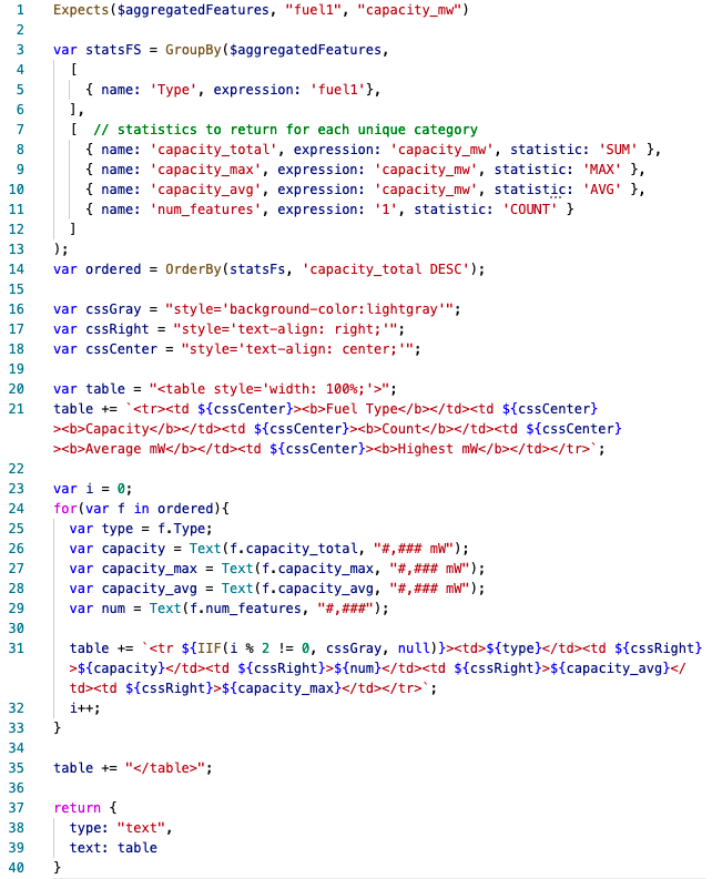

I added information about the largest plant from a previous expression to put the outliers in context with the rest of the cluster.
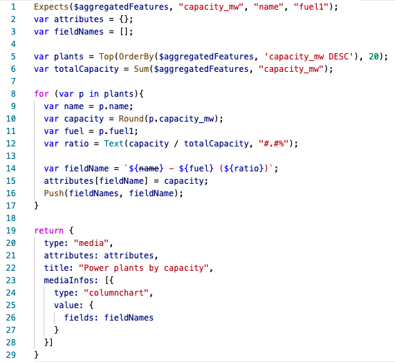
6. Pie Charts
You can also return charts directly from Arcade expressions within a popup. I was intrigued by the differences in capacity versus count for the lists of each fuel type, so I decided to create two pie charts to make it easy to compare the number of plants by fuel type with the total capacity of each type.
The mediaInfo element in a popup allows you to return an array of charts to scroll through. I did that here to keep the logic for both charts in one expression and the popup content more compact.
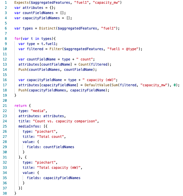
Notice how clusters that show a lot of solar or wind plants report that more power is generated from other sources of power, like nuclear.


7. List of features
Sometimes you may want to list the titles of aggregated features directly in a cluster popup as an alternative to the Browse features experience. You can do this using the techniques described above, but keep in mind that simply listing names or titles of all features in the popup can lead to a very lengthy popup and a bad experience for the user.
In the example below, I opt to list the features in the popup only if there are fewer than 20 features included in the cluster. This allows me to list individual features without worrying about the length of the popup content. I added a condition to the expression that displays a list of categories if the cluster count exceeds 20 features.
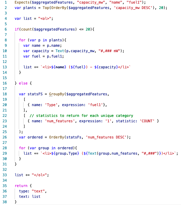


8. Column charts for features
As an alternative to listing features included in a cluster, you could display the top 20 features in a chart visualizing their total capacity. The following expression returns a column chart comparing the capacity of the top 20 power plants within each cluster. The tooltip displayed as you hover on each bar includes additional information about the power plant, such as the type of fuel used to generate power, and the percentage of the total capacity of the cluster that is generated by the plant.

Conclusion
Thanks to advancements in Arcade and ArcGIS Online, you now have many alternatives for summarizing cluster content. I highly encourage you to enhance your cluster popup content and share your maps!

Decent article but is there a link to the actual code snippets? Pasting screenshots of code is less than helpful
You’re absolutely right. Having the actual snippets is better. I actually attempted to do that in this post, but this site blocks me from posting some of the snippets (I think for security reasons). At any rate, I should have made the links to the webmap where you can copy/paste the expressions directly from the webmap. You should be able to click on any of the images in the example to open the related webmap. Once it loads, open the popup to view the Arcade expression element and its code.
Hi. Is there a way to have the pie charts for the cluster show on the map as a symbol, rather than in a pop up?
Yes. That is coming in our next update. You should see a blog coming in the next couple of weeks introducing this.