July 8, 2025 |
Christa Campbell | Resilience
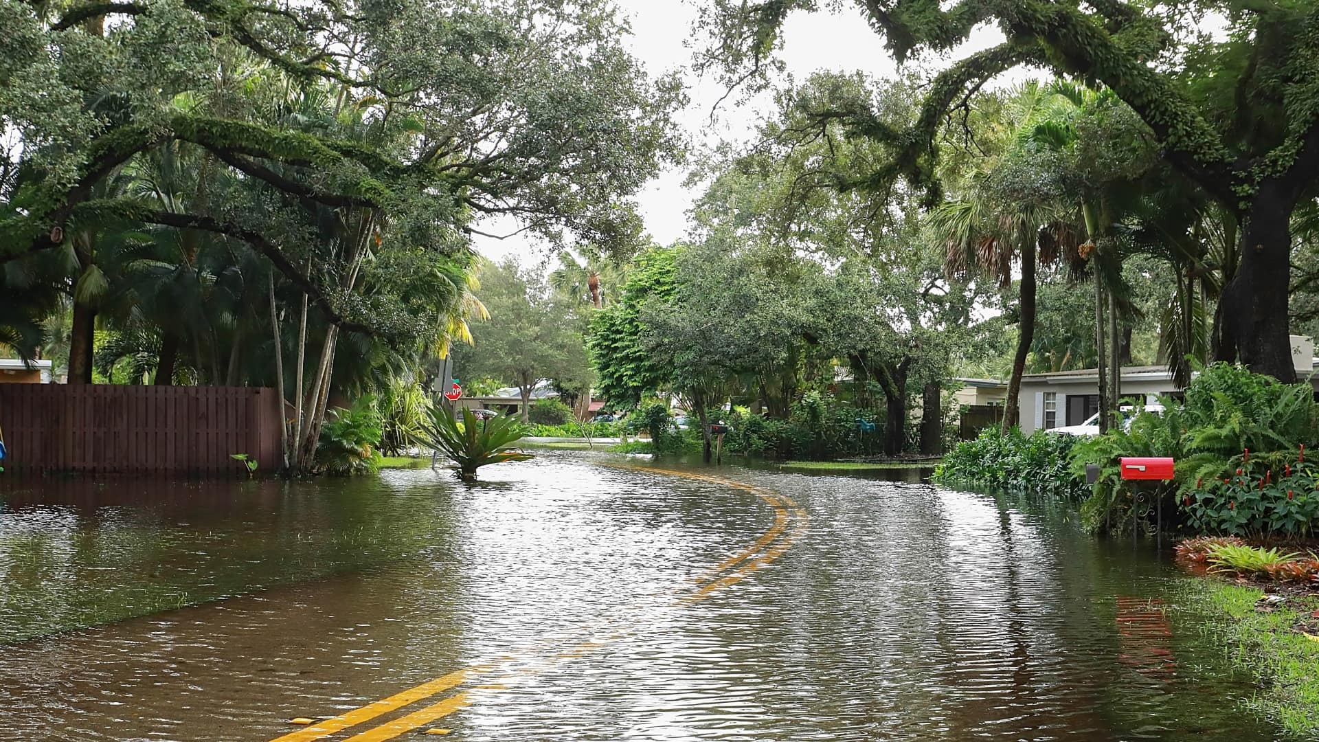
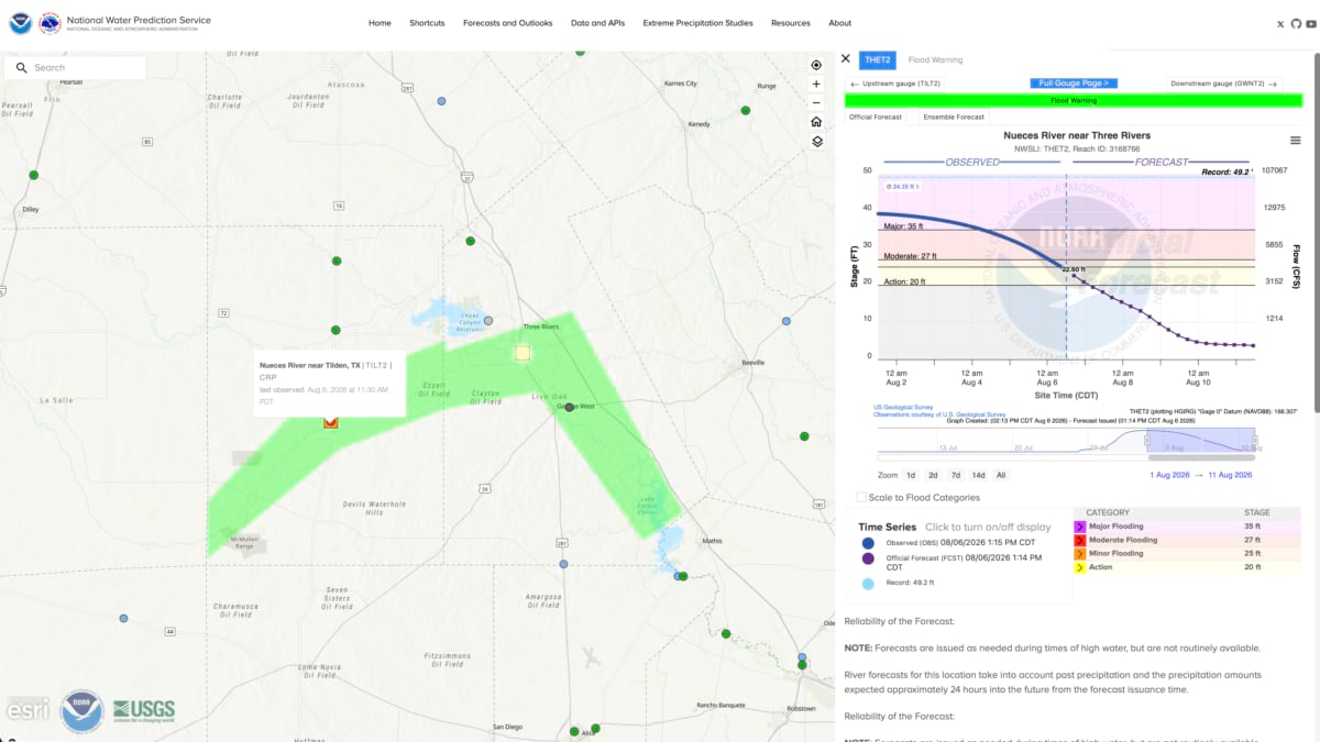
More than 20 inches of rain fell across the southern Edwards Plateau in July 2026. When the town of D’Hanis, Texas, was told to evacuate, sheriffs worked bullhorns and went door-to-door. The forecast showed that half the town would be underwater by dark.
A year earlier, almost to the week, a storm dropped a nearly identical 20 inches of rain on the Guadalupe River watershed near Kerrville. That flood killed more than 130 people. The river rose 26 feet in 45 minutes in the early-morning hours, with almost no warning.
That flood caused people in the region to talk about storms carefully, knowing that someone in the room likely had lost someone. But the severity of that storm also helped the residents of D’Hanis take it seriously—getting out instead of riding it out.
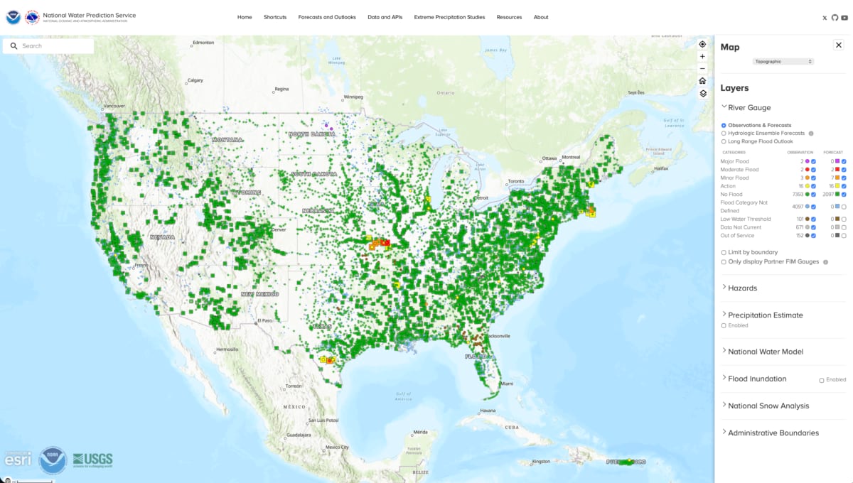
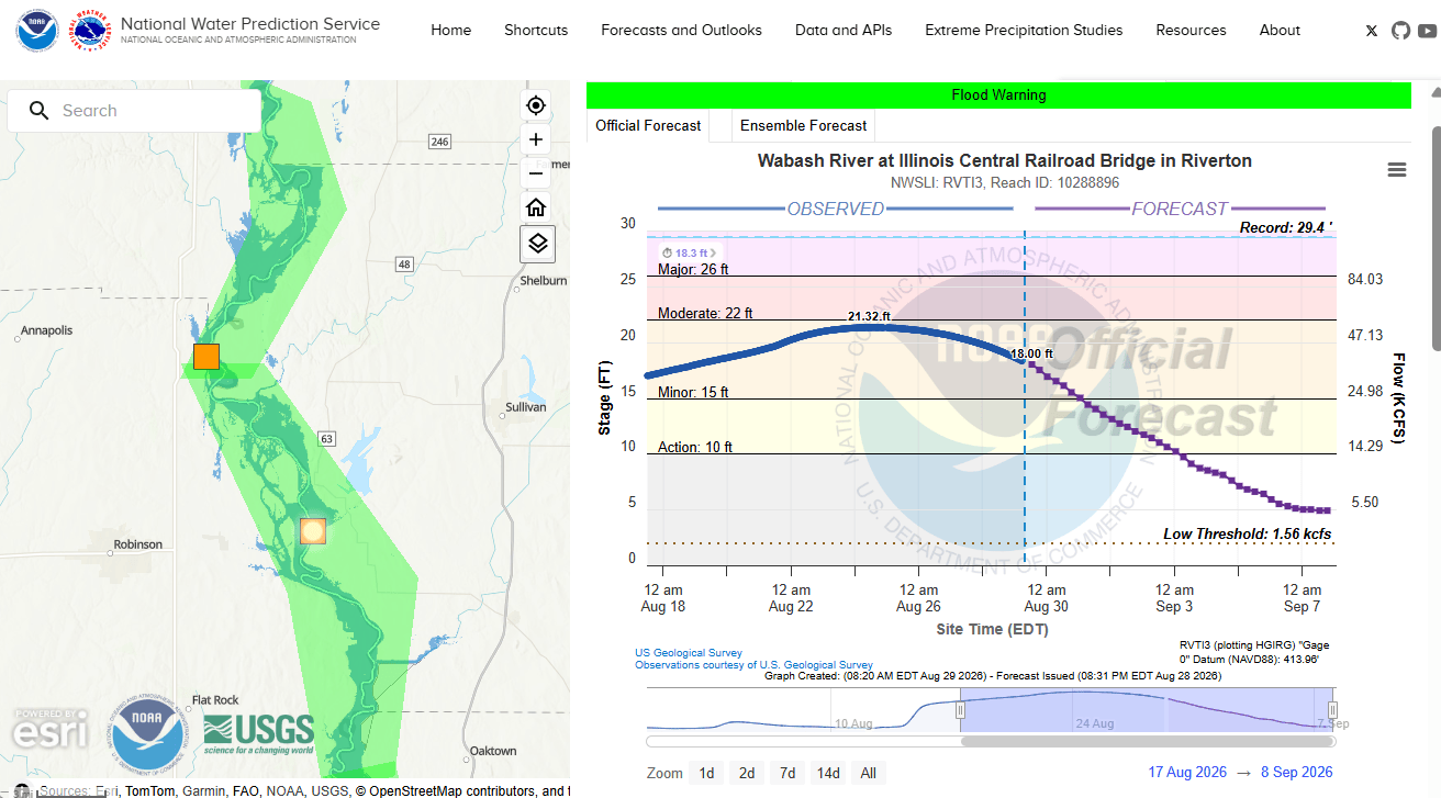
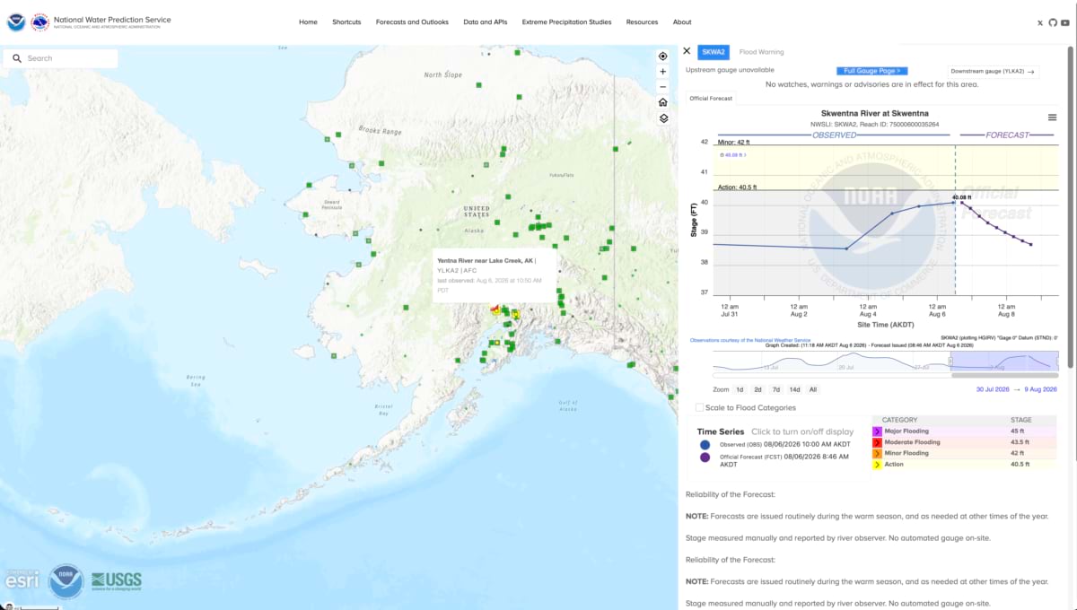
The decision to empty D’Hanis was informed by new flood-prediction tools developed by the National Water Center, which simulates the water cycle with geographic information system (GIS) technology—factoring in snowmelt and soil saturation—to forecast water volumes of streams and rivers. The tool gives neighborhood-level warning of what rain will do downstream, hours before water arrives. It comes from combining the expertise of water experts across federal agencies that have spent decades studying different pieces of the same problem.
The National Oceanic and Atmospheric Administration (NOAA) opened the center in Tuscaloosa, Alabama, in 2015. For the first time, there was a national space for collaborating across multiple federal partner agencies. The impetus was a string of expensive lessons: floods along the Mississippi, Cumberland, Missouri, and Ohio Rivers, and an extreme drought gripping much of the South.
The center’s mandate was to turn fragmented systems and scientific research into guidance, the way the National Hurricane Center turns atmospheric data into storm track prediction, a live picture of where named storms are headed, and the deadly surge they bring.
Flood maps aren’t new. The Federal Emergency Management Agency (FEMA) conducts the largest mapping program in the country, building maps that focus on where water has gone in the past to understand future risk because the agency provides flood insurance for six trillion dollars in assets.
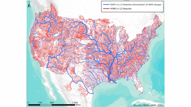
The gap the National Water Center set out to fill was a model of the nation’s watersheds across the whole country, animated by rainfall and streamgage flow volumes to predict where water would be in the near future. What existed at the time were 13 river forecast centers. Between them, they covered about 110,000 miles of river—a fraction of the country’s water, and only the stretches with enough history and instrumentation to forecast conventionally. The rest of the map stayed blank until the water was already moving through it.
The aim was to extend flood modeling to all pillars of emergency management: preparedness, response, recovery, and mitigation. What was needed was a better understanding of water behavior that leads to flooding, and a better way to predict it. David Maidment, a professor at the University of Texas at Austin, made a breakthrough—one that was to change how hydrologists think about hydrography and surveying.
Rivers had always been measured in cross sections, cutting vertically through the channel, one reach at a time. There are over three million river miles in the United States, and when you look at that many cross sections on one map, it gets tangled—the lines overlap, creating a mess of spaghetti that takes study to understand. Slices also didn’t capture how water always flows downhill or help anyone understand a waterway’s catchment basin.
Maidment’s answer was to create horizontal slices of the land along each river’s channel and parallel with its bed, with each layer filling like sloping tube. Feeding terrain, river reaches, and precipitation into this framework lets you watch each tube spill into the next, showing where the water goes as the level rises—a model of the entire country’s flood extent, built out of elevation instead of individual channels.
The idea of the National Water Model existed much earlier. What made the model possible in 2015 was finally having an accurate national river network dataset in digital format, weather models that could localize rainfall events, a hydrologic model of how waterways feed each other, and a supercomputer that could run the calculation for whole watersheds in minutes rather than days. As the science, data, and computing power came together, the ability to see streamflow led to the next obvious question: What if this tool could become near-real-time flood forecasting?
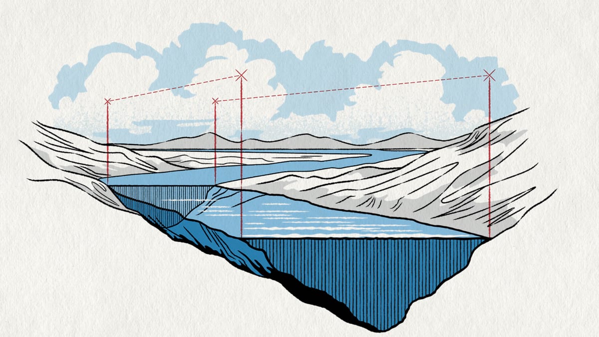
Ed Clark, now director of NOAA’s National Water Center, brought that perspective. He’d spent five years as leader of NOAA’s National Flash Flood Services, nationally responsible for the gap Maidment’s model could now close. Clark had long pushed to represent rivers as vector lines that actually trace a river’s shape instead of rasters (grid squares laid over the landscape). “Maybe we should forecast in a medium that everyone can understand,” he said. “Don’t abstract it beyond recognition.”
Fernando Salas, one of Maidment’s graduate students and now chief of the National Water Center’s Service Development Division, built an animation of the model spanning two major hurricanes. Clark describes the flow moving through the river network in sequence as being like “a system of pulsing arteries, the lifeblood of the nation.” It became the way the National Water Center showed people outside hydrology what a continental-scale water model could actually do.
None of it moved without someone willing to be wrong in public. Maidment sent the center’s leaders a long email proposing a summer research program around the concept of a national hydrologic model built in a single year, from coast to coast, and told them to throw the idea out if it sounded crazy. Nobody did. “About a week later I got the thumbs-up: Go for it,” he said. “A little bit scary. Now you’re publicly exposed and you’ve got to deliver.”
Salas and a colleague, Marcelo Somos, used the RAPID river routing model to translate the gridded modeling framework within the existing prototype National Center for Atmospheric Research (NCAR) Research Applications Laboratory forecasting modeling system (WRF-Hydro) to calculate streamflow through a river network’s flow lines. By that November 2014, the model ran for the whole country. By February 2015, it calculated streamflow nationwide in 10 minutes flat—inside the year Maidment had promised. Students at the inaugural Summer Institute at the National Water Center in 2015 were able to use the results of this prototype model running in real time across the continental United States.
The last gap to close was translation. The model’s native output, streamflow or discharge, is measured in cubic feet per second, a number Clark equates to “a basketball roughly a cubic foot in size. It’s hard to imagine 300 of them moving past you per second. Most people lose count around 10. Nobody outside hydrology or whitewater kayaking has any real feel for the word discharge . . . but most people understand ‘flood.'” Sometime around 2016, after the students had a way to model the volume of water, they began to put water on a map.
A model proves nothing until it survives a real storm. In August 2017, Maidment emailed Clark that the forecast showed feet—not inches—of rain over Houston. Clark, at a training session that week, texted back thinking his friend had dropped a decimal point. He hadn’t, but the software wasn’t ready.
Salas settled the argument at three o’clock in the morning with this strong statement: “There are people alive today who will likely not be alive by the end of this event. We have a moral obligation to do everything we can to help save lives.”
With that motivation, Texas got real-time flood maps that week. Emergency crews used them to less to track the water than to find the dry ground people could still reach. That awareness allowed rescuers to stage boats and helicopters and pick places they could drop evacuees before the next round of rain hit.
The tool was still early in development, but it was already delivering lifesaving information.
Surviving one crisis doesn’t necessarily instill trust before another one. Trust in flood forecasting has taken years, and the clearest proof of forecasting’s accuracy came during Hurricane Helene in September 2024. Coverage at the time reached about 40 percent of the country. Tennessee was in; North Carolina wasn’t. On the night before landfall, a forecaster pulled up a new layer overlaying flood maps on hospitals, nursing homes, and fire stations in Tennessee, and noticed Unicoi County Hospital, which stood beside the Nolichucky River. Someone called the National Weather Service’s office in Morristown and described what the map showed. The forecaster who pulled up the layer that night knew he had to get the word out before Morristown woke up to a crisis instead of a warning.
The flood inundation mapping (FIM) layer allowed local emergency managers to prepare, knowing that a community is only as strong as its most vulnerable people. Local knowledge, combined with the predicted flood extent, guided the analysis of every hospital, nursing home, fire station, police station, and neighborhood in the flood’s path, turning a rising river into a list of buildings that would need help before the water got there. The forecast map lets anyone see when the river is expected to crest, to know whether they have a hard day or night ahead. That’s the difference between having hours or minutes to move people out of danger. It was the same logic Texas crews had used years earlier during Hurricane Harvey, staging boats and helicopters on the highest ground, knowing not just where the dry ground was but also how long it would stay that way.
The next day, word reached Clark that Unicoi County Hospital was being evacuated by helicopter, and for a moment he assumed the warning had come too late. The opposite was true. The hospital had moved every patient out by school bus and ambulance at seven o’clock that morning, hours ahead of the water. The people still being lifted off the roof were staff, waiting on National Guard helicopters as the hospital was surrounded by water.
Meanwhile, North Carolina, which was outside the coverage area, had a harder outcome, and it exposed a different problem. A flood map can show a road underwater or a piece of critical infrastructure standing outside the flood zone and still miss the failures that matter. Near Asheville, a water treatment plant failed, which caused schools to be closed for a month, leaving about 18,000 students without a reliable food source. The National Water Model can tell you how high a river will rise but has no way to know what breaks once it does, or how far the failure spreads once it starts.
Answering that took a second kind of database—one built to trace dependencies rather than simply locations—paired with the map. NWS’s chief scientist Monica Youngman, who rode out Hurricane Helene in Asheville herself, partnered with the nonprofit organization MITRE and Esri to build the Cascading Impacts Explorer, a tool that plugs the National Water Center’s flood forecasts into a graph of the region’s infrastructure so that a forecaster can ask about the hidden consequences before a storm instead of afterward.
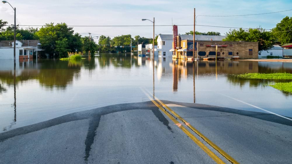
Often it’s a bridge or a washed-out road rather than a building that’s more vulnerable, and that’s arguably worse. Getting cut off carries more weight than having flooded first floors and basements—it means losing access to supplies and emergency services, and it can take years to rebuild.
That’s the risk that atmospheric rivers pose to the Pacific Northwest, and they’re showing up more often than they used to. In December 2025, one swept across Washington State from the Canadian border to the Oregon state line, pushing the Skagit and Snohomish Rivers to record crests days apart. The Skagit crested nearly 10 feet above flood stage, the Snohomish just over 9—both breaking records that had stood since 1990.
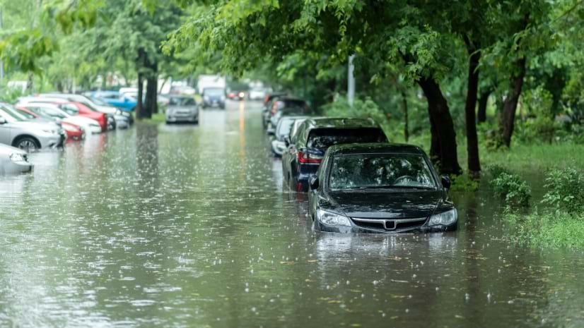
The FIM layer-informed forecast gave emergency managers 10 days to prepare, evacuate residents ahead of the crest. One person died three days after the water peaked, after driving into a flooded ditch. Floodwater depth is often impossible to judge from a car, which is why the National Weather Service warns drivers to turn around rather than risk it.
The storm broke river-level records across the region. The ten-day warning window, and the evacuations it made possible, was clear evidence that the enhanced services are making a difference.
What’s different now isn’t just the accuracy. It’s who gets to see the flood coming. For years, that kind of foresight belonged to a narrow group: forecasters and emergency managers whose job was to prepare and respond, and residents who’d lived through the worst and knew what the sky meant before anyone had to warn them. Everyone else was left to hope they’d be spared.
National coverage changes that. A clear picture of a coming flood, available to everyone at once, means that a parent in D’Hanis, a hospital administrator in Unicoi County, and a family living near the Snohomish River are all looking at the same map, at the same time, seeing the same thing coming. Not everyone will act on it the same way. But everyone will be informed.
Flood inundation mapping has continued to expand, from 10 percent of national coverage in 2023 to full coverage coming by October 2026, reaching the majority of the nation’s population. The tool encompasses 3.3 million miles of river. Nothing at this resolution, updated this often, has existed for the whole country before.
Developing these services has taken time, but it has proved to be repeatable as new areas are mapped and models are tuned against past flooding patterns. Getting someone to move their family, their patients, or a busload of kids because of a shape on a screen is a different problem, and it doesn’t get solved with better maps or better math. It gets solved by seeing something familiar: the street you drive every day—on a map where it’s being swallowed by a blue polygon—rather than a number in a table. That’s the reasoning behind pairing flood maps with places people already recognize, and it’s the same reasoning behind the Cascading Impacts Explorer.
Maidment remembers standing in a hallway years ago and talking with Cedric David, his colleague who developed the routing engine, RAPID, that calculates streamflow through the river network. Maidment told David, “We could do this for the whole country. We could do this for the whole world.”
That goal has been achieved for the whole country, and the GEOGLOWS river forecast system follows that same pattern of landscape shape and streamflow translated into flood extent, for sevem million stream reaches across the earth.
A good idea flows swiftly. The same animation that once traced a handful of rivers now plays out anywhere there’s data to build on—not just coast-to-coast but stream-to-stream, worldwide. Advance warning lets emergency managers and local leaders move people before the water arrives, saving lives.
Learn more about how GIS helps model and mitigate hazards, drive risk-reduction strategies, and engage the whole community.