ArcGIS Business Analyst helps you make smarter decisions for market planning, site selection, and customer segmentation. You can use ArcGIS Business Analyst Web App to help you identify under-performing markets, pinpoint the right growth sites, and find where your target audience is located through our web platform or mobile app. If you’d like to learn more or want to try ArcGIS Business Analyst Web App, sign up for a free 21-day trial.
The October 2023 release of ArcGIS Business Analyst Web App and ArcGIS Business Analyst Mobile App is now available, and we are excited to unveil the latest updates. Here’s a rundown of what has been recently added:
- Redesigned smart map search workflow
- Enhanced points of interest search
- New and updated infographic and report templates added to the standard infographics and reports collection, as well as the infographics gallery
- Improvements to the infographic running, viewing, and editing experiences
- Data enhancements
- Refreshed look of in-app guided tours
- Improved accessibility with Calcite Design System
- Enhancements and improvements to the Business Analyst widget in ArcGIS Experience Builder
Redesigned smart map search workflow
Smart map search allows you to view geography areas that match your criteria. You can select up to ten variables, set your ranges, and view the results on the map. In this release, we have revamped the smart map search workflow to assist users in initiating their analysis, interpreting the results more effectively, and better reusing and communicating the analysis results.
As the Business Analyst product team, we frequently interact with users from a wide range of industries. During these conversations, users often share with us the variables that are particularly valuable for their specific industries and their top concerns in their projects. Drawing from these insights, we have revisited our database and identified the variables that are crucial for each industry, creating curated lists. We aim to assist new users in jumpstarting their analysis process with the smart map search workflow and to inspire our long-time users. We are continuously seeking new variables to add to the lists. If you have any variables that would benefit your industry peers, please do not hesitate to reach out and share your list with us at businessanalyst@esri.com.
The new color-coded maps workflow we released in June has garnered significant positive feedback from our users. As a result, we have incorporated some of the highly praised changes into the smart map search redesign. For instance, the interface for setting the analysis extent remains unchanged. We have introduced a results pane that provides a summary of the search results, along with a detailed results table. Additionally, users can now visualize and better understand the distribution of selected variables through histograms and bubble charts. Furthermore, we added the ability to save the analysis results as a layer, allowing easy reuse in infographics or ArcGIS apps. This enhancement simplifies result sharing and communication like never before.
Watch our video below, which covers all the exciting new features and improvements with the redesigned smart map search workflow.

Improved POI search
In our previous release, we introduced semantic search for the data browser in Business Analyst, greatly enhancing the search results for variables. Users have since requested the same advanced technology to be implemented for points of interest search. Considering their feedback, we have incorporated this enhancement and the results have been truly remarkable.
Let’s take the example of searching for “footwear” in Los Angeles County to illustrate the point. When you performed this search in the previous version of the workflow, the points of interest (POI) search workflow only provided around 90 results. Upon examining these results, you will notice that most have the term “footwear” within the POI name. However, if you perform the same search with the Find related POI option enabled in the new release, the application will return a maximum of 5,000 results, which is our limit. By browsing through these results, you will observe that name-brand department stores, shoe and boot stores, and big box stores that sell footwear are included. This improvement is possible because semantic search goes beyond simple keyword matching and returns results closely aligned with the user’s search intent.
Please note that by default, the Find related POI setting is turned off. To turn it on, click Settings. Select Find related POI to perform a semantic search.
Note: Find related POI only works for English-language searches at this release.

Infographics & reports
New standard infographics & reports
The Business Analyst product team has consistently focused on enhancing our offerings by introducing additional standard infographics to cater to customers’ needs across various industries. Our standard infographics and reports enable users to perform instant analysis without creating everything from scratch. In this release, we have included two new infographics as part of our standard collection: the Community Change Snapshot and Emergency Information templates. Additionally, we have relocated two highly popular infographics from our infographic gallery to the standard infographic collection, making them accessible to a wider range of users.
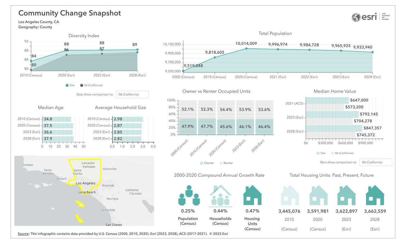
New infographic – Community Change Snapshot
Want to know what has happened in the community in the past years and see trends over time? Check out this new infographic. It provides valuable insights into essential demographic trends within the community, including population changes, diversity, median age, household size, and housing variables. It’s a great tool to delve into the dynamics of a community and gain a comprehensive understanding of its development.
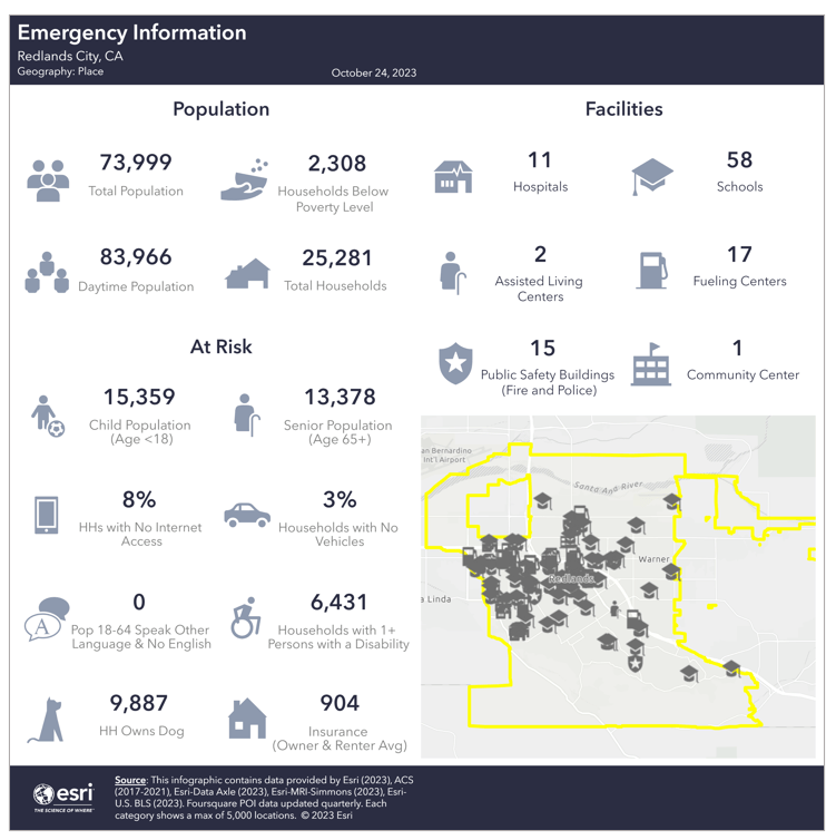
New infographic – Emergency Information
In times of emergency, every second counts. That’s why emergency responders must have immediate access to vital information about the population, at-risk groups, and facilities in the community—introducing our revolutionary, mobile-friendly Emergency Information infographic! Designed to provide users with a rapid understanding of the community, this infographic enables emergency responders to make informed decisions quickly. With this infographic at your fingertips, you can swiftly assess the situation and immediately take action.
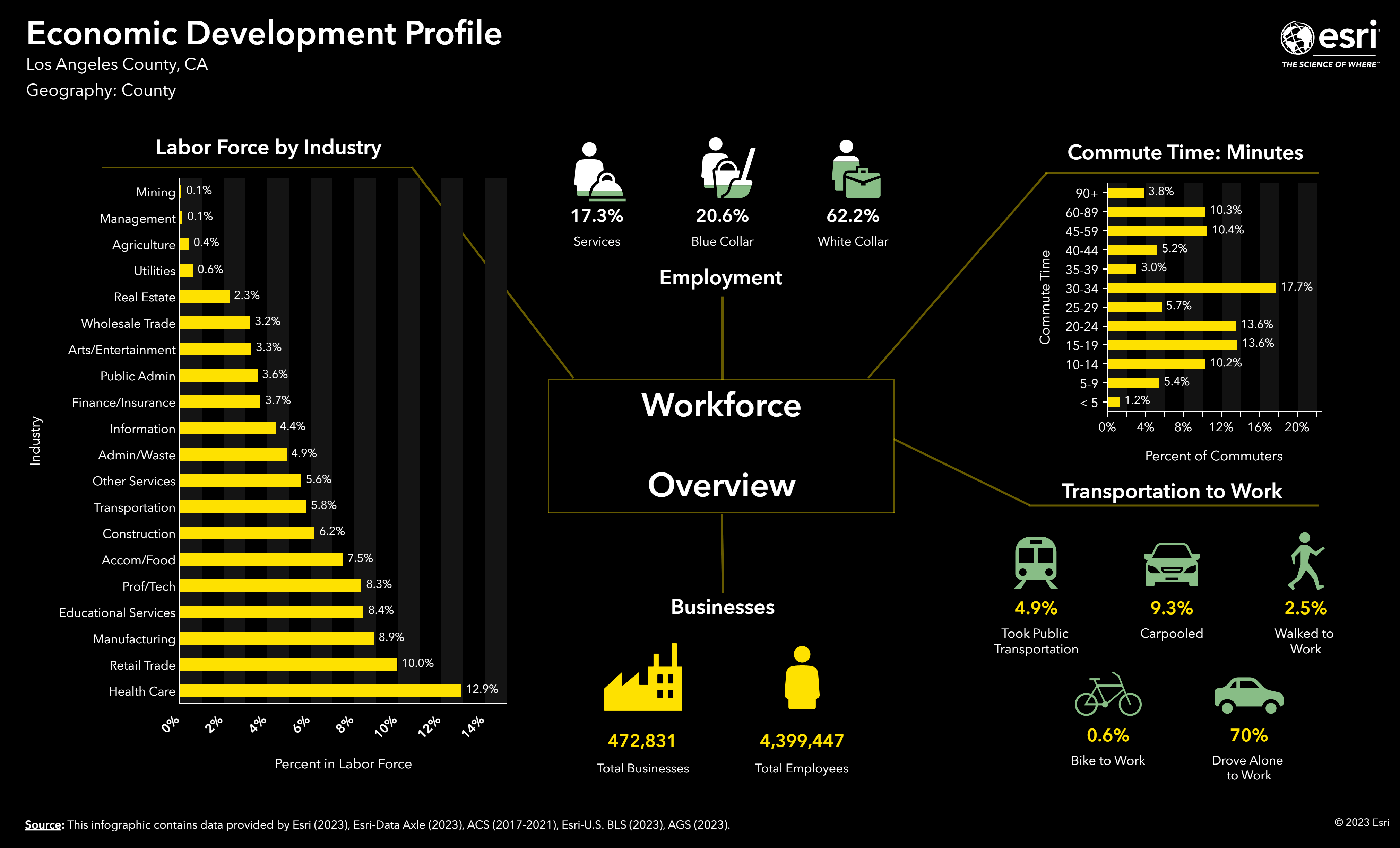
We’ve made two of our most popular infographics available to all app users in our standard infographic collection. Now, everyone can benefit from the valuable insights provided by these incredible resources. First up, we have the Nonprofit Charitable Profile infographic, specifically designed to assist nonprofit organizations in navigating the essential aspects of nonprofit development. From fundraising strategies to building a strong team and raising awareness, this infographic is a game-changer for nonprofits. We’re also introducing the Economic Development Profile, which allows communities to identify local economic assets and opportunities. Planners can leverage this invaluable resource to promote their cities and attract, retain, and expand local businesses.

-
...
As the next generation of the Retail Demand dataset becomes available, we added a Retail Demand by Industry report and infographic. You will find information such as the average and total dollar amount spent and the spending potential index for a product or service relative to the national average.

New infographics and reports for New Zealand
Community Profile, Executive Summary (Tabular), Nearby Restaurants, and What’s in My Community infographics.
New infographics in the infographic gallery (Advanced license only)
We’ve expanded our infographic gallery with a wide range of new additions. Here’s a sneak peek at what’s in store for you:
- Canada: Community Economic Development Initiative Report; Financial Report; Immigration, Ethnicity, Language Report; Market Area Report; Work and Occupation Report
- France: Demographie, Education, Enterprises, Immobilier, Logements, Profil des ménages, Santé, and Transports
- United States: New tabular-style infographics – Demographic and Income Profile, Market Profile, Community Profile, Tapestry Summary, Business Summary, ACS Population Summary, Executive Summary, Demographic and Income Comparison Profile, Household Income Profile, and Crime Summary.
Tabular infographics are presentation-ready infographic templates displaying data tables. A tabular infographic is similar to a classic report but with an updated design and improved readability for accessibility. To learn more about these tabular infographics, check out our blog article What are tabular infographics in ArcGIS Business Analyst Web App and Explore tabular infographics in ArcGIS Business Analyst Web App. If you’re interested in creating a tabular infographic on your own, we also have a great resource for you! Build tabular infographics from scratch in ArcGIS Business Analyst Web App is a helpful guide that will get you started in no time.
Updated infographics and reports
- The report “Census 2020 PL 94-171 Profile” is renamed to “2020 Census Profile,” as it now includes the complete U.S. Census 2020 decennial census data with the latest release of the DHC data.
- The report “Time Series Profile” now includes population, households, and housing units data from 2010 to 2023.
- Updated infographics for Canada: Community Profile, Demographic Profile, Demographics and Spending, Eating Places in Canada, Population and Household Trends, Poverty Indicators, Real Estate, Target Market Summary, Visible Minority.
Other infographics workflow improvements
Our focus on enhancing the overall infographics experience goes beyond introducing new templates. We have improved various aspects, from running infographics to creating custom ones.
To start, we have improved the process for using infographics from the infographic gallery, a capability for Business Analyst Web App Advanced users. You no longer need to add your preferred template from the gallery to My templates. Instead, a new option has been introduced to run gallery infographics in the Run Infographics workflow directly. To enable this option, go to Preferences > Reports > Run infographics. Once enabled, you will find the gallery infographics displayed in the Run Infographics pane.

If you wish to edit and customize an infographic template from the gallery, the process has also been streamlined. We have made the gallery accessible from the main Build infographics interface. To add a gallery template, hover over it, click Open, and save it. The gallery infographic will be saved under My templates.

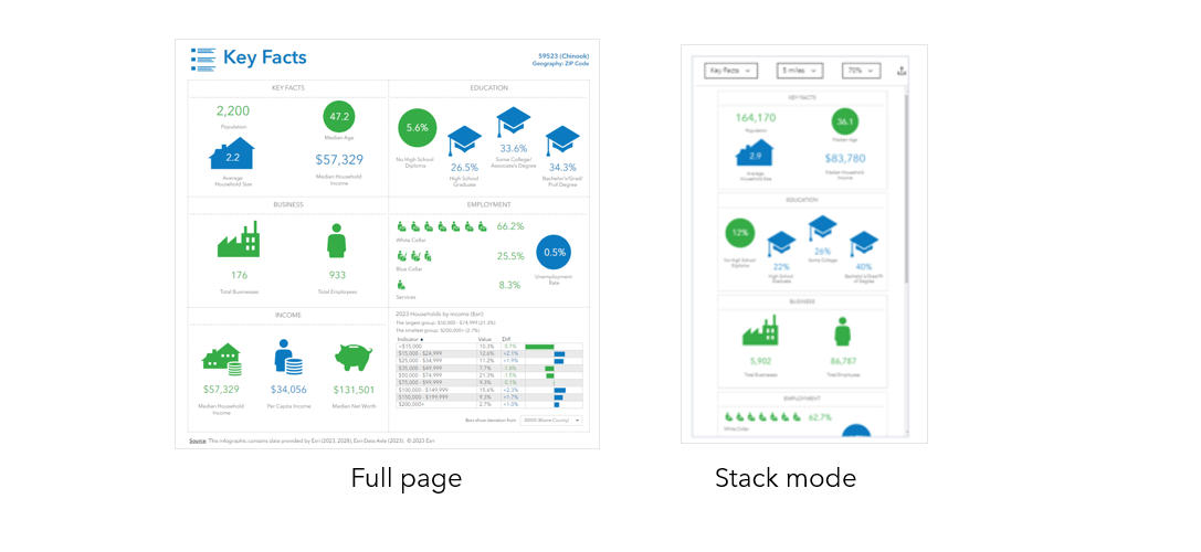
Regarding running infographics, we have introduced a new function called View infographics in stack mode. This option allows you to view individual infographic panels in a vertically stacked position, which is particularly beneficial for better viewing on mobile apps and small screens. This display option enhances the overall user experience. In addition, users can now batch export infographics in Excel format, providing them with more flexibility.
Data enhancements
We are excited to announce the following data updates for ArcGIS Business Analyst Web App, ArcGIS Business Analyst Mobile App, and ArcGIS Business Analyst Pro using online data:
- Esri’s current-year and five-year forecasts of key demographic variables combined with Census and ACS demographics, Esri USA Census 2020 Demographics and Housing Characteristics (DHC), and next-generation Retail Demand dataset.
- 2020 Demographics and Housing Characteristics (DHC) for Puerto Rico.
- USA Traffic Counts (Kalibrate).
Global data updates
- Canada Advanced Demographics from Environics.
- Global data:
- New: New Zealand Advanced dataset from NZStats.
- Updated: France Advanced dataset from Esri France, Mexico Advanced dataset from INEGI with a new Spanish-language version, and Spain Advanced dataset from AIS Group.
- Michael Bauer Research data for 71 countries and regions.
- Global points of interest (POI) data from Foursquare. New points of interest data from Esri India.
- Business data from Data Axle and SafeGraph.
Please find more information about the data updates in:
- What’s New Esri Demographics (October 2023)
- 2020 Census Data in Business Analyst
- Esri Historical Demographic Data
- Empowering Retailers: Explore Esri’s New Retail Demand Data
Refreshed look of in-app guided tours
We take great pride in our in-app guided tours, as they offer users a simple and enjoyable way to familiarize themselves with the app. In this release, we have revamped levels 1-3 of the guided tours. These updates include streamlining the content to provide a more modern appearance and improved accessibility, thereby enhancing the overall learning experience for our users. The remainder of the guided tours are slated for updates in upcoming releases.
Improved accessibility with Calcite Design System
Delivering accessible software is a top priority. Using Calcite components leverages W3C Accessibility Standards to ensure the applications and experience are usable by a wide range of audiences. Efforts are made to enhance the accessibility of Business Analyst with each release to better support screen readers, improved keyboard interaction, visual display, high-contrast support, and other improved accessible functionality. You will see efforts throughout the application, in the new smart map search workflow, updated guided tours, standard infographics, and tabular-style infographics.
ArcGIS Experience Builder: Business Analyst widget enhancements
The Business Analyst widget in ArcGIS Experience Builder is a popular and well-loved tool that provides users with the ability to view additional information about any point or polygon feature on a map through the creation of reports and infographics. Check out some of our new enhancements:
- The workflow mode has been redesigned. Users can now preview infographics, search, and sort through them.
- The Business Analyst widget now supports Experience Builder theme options.
For further information, explore What’s new for the Business Analyst Widget in ArcGIS Experience Builder | October 2023.
Additional resources
We hope you enjoyed reading through this blog article. Below, we’ve added resources to help you with your ArcGIS Business Analyst journey:
- Business Analyst product overview page
- Review pricing and purchase Business Analyst
- Join our LinkedIn Business Analyst User Group
- Join our Business Analyst Esri Community
- Follow our weekly #BATipsandTricks posts on social media
- Read more Business Analyst blog articles on ArcGIS Blog
- Watch Business Analyst Web App videos
- Watch Business Analyst Mobile App videos
- Visit the Business Analyst Resources page

Article Discussion: