ArcGIS Business Analyst Web App and the ArcGIS Business Analyst extension in ArcGIS Pro have long been companion applications for spatial analysis. Business Analyst Web App is a go-to product for web-based GIS for users who want to understand communities, support business expansion, and identify market opportunities. It is updated three times a year, in line with ArcGIS Online product releases.
Business Analyst Pro, on the other hand, is part of Esri’s powerhouse ArcGIS Pro desktop software and is released for download twice a year. It extends the web capabilities with more advanced workflows, territory design, customer analysis, and more.
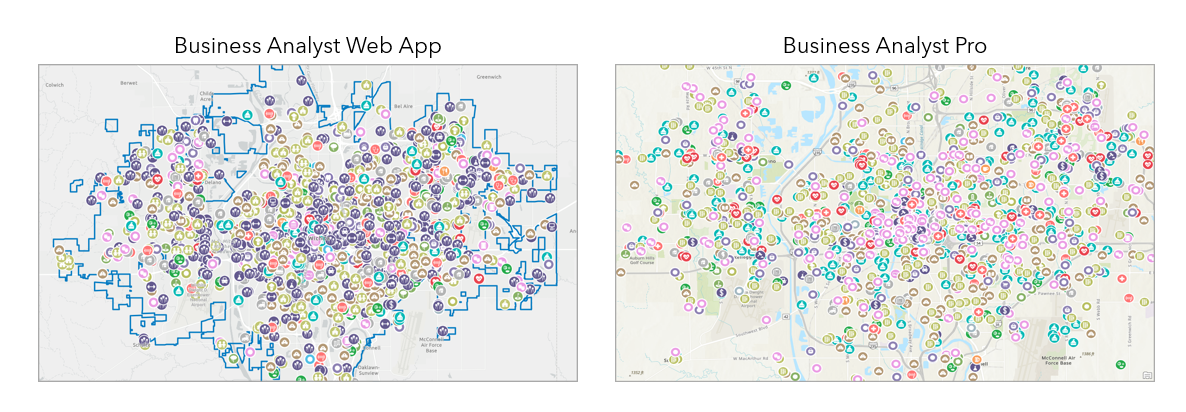
Because Business Analyst products are developed in tandem, workflows in one application often serve as inspiration for the other application. This is the case with points of interest (POI) search, which maps businesses and facilities using data from Data Axle, SafeGraph, Foursquare, and other POI data sources.
What are points of interest (POI)?
Points of interest (POI) are a single geographic coordinate that identifies a location, specifically of interest to visitors. In GIS, POI data is often used for geocoding or navigation. Examples of points of interest include natural features—such as a lake or a trailhead—and cultural features—such as a landmark like Angkor Wat or a building like the Sagrada Família. In Business Analyst, POI data comes from the ArcGIS Places dataset provided by Esri.
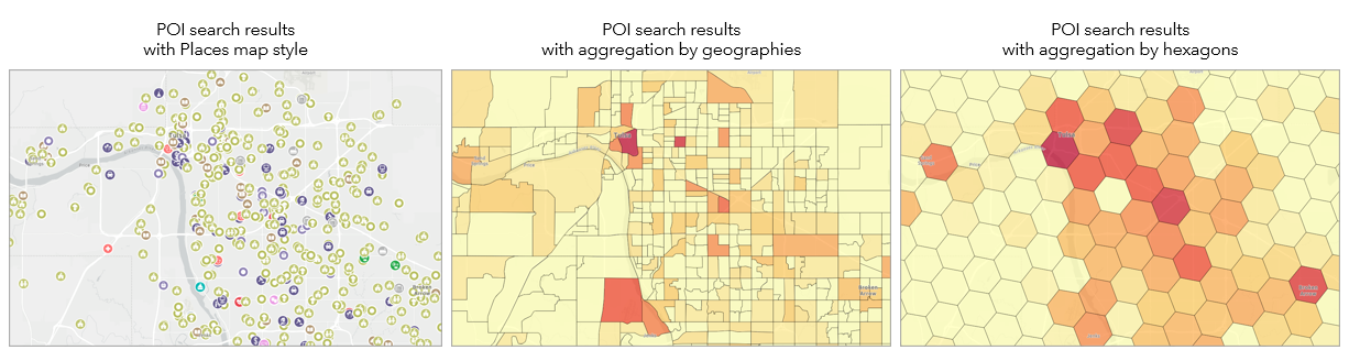
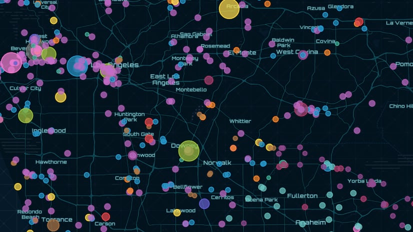
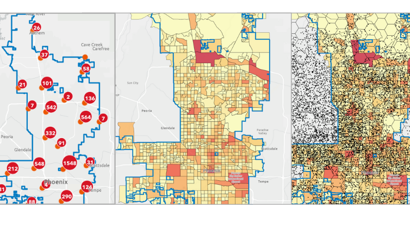
In Business Analyst Web App, you can search for POI using keywords, top retailers, categories, codes, all points, or advanced search conditions. The results can be dynamically filtered, with changes automatically appearing on the map and in the Results pane. There are eight map style options to select from (depending on the POI data source). To visualize patterns in data, you can enable aggregation by sites, standard geographies, or hexagons.
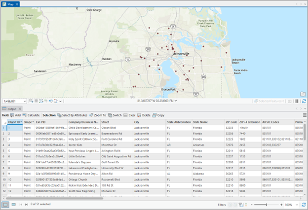
In Business Analyst Pro, you can search for POI using keywords, categories, codes, all points, or advanced search conditions. The results can be filtered, aggregated, and viewed as a map layer and in the layer’s attribute table. To filter dynamically, use the Preview Map and Preview Table options.
How do I get started?
In both workflows, set the country data source. Depending on the country, different POI data sources are available. Likewise, depending on whether you are using online or local data in Business Analyst Pro, your POI data sources may vary.
To launch the workflow in Business Analyst Web App, on the Maps tab, click Create maps and select Points of interest (POI) search. For Business Analyst Pro, on the Analysis tab, click Business Analysis to open the gallery, and click Points of Interest Search.
For example, if you use United States (Esri 2025) as your project data source in Business Analyst Web App, you can select Foursquare, Data Axle, or SafeGraph as the POI data source.
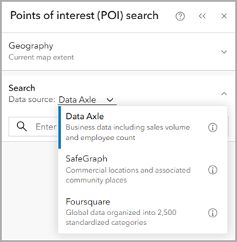
For more information on which POI data sources are available based on your country, see Points of interest (POI) data sources.
Once you’ve set the data source, you can perform a search.
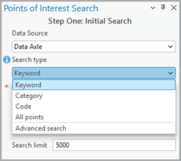
Both workflows have the following search options.
| Search type | Description |
| Keyword | Search using terms, such as coffee or dentist. |
| Category | Search, browse, and select categories and subcategories, such as Health or Hospitals. |
| Code | Search, browse, and select industry codes, such as 4411 (Automobile Dealers). |
| Advanced search | Create conditional statements to perform a search, such as Company name starts with Acme or Employee count is greater than 10. You can use multiple conditions to create a more complex search. |
Additionally, you can use All points to returns up to 5,000 points within the current map extent using Business Analyst Web App and up to a million points when using local data in Business Analyst Pro. To refine your results, try either reducing the size of your analysis or using advanced search conditions.
How do I refine my search?
Filters can be used to improve the specificity and refine the search results, which is key to accurate analysis.
In both workflows, you can refine search results by keywords and attributes, such as City, State, or Primary NAICS. Here are some examples:
- Use the keyword “retail” to limit “shopping” category search to only results that have “retail” in any of the attributes (Business Name, NAICS Industry Sector, Industry Description, etc.).
- Select “Redlands” or “Riverside” within the City attribute to limit the search to these areas.
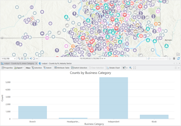
- Use Business Category = “Independent” to limit results to independently run establishments, removing chains, kiosks, and headquarters.
In Business Analyst Web App, filtering is available after the initial search has been performed, and the results are dynamically updated on the map.
The result layer can also be saved for future use in other information products created in the ArcGIS Online platform (infographics, web maps, dashboards).
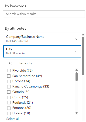
In Business Analyst Pro, filters are applied to the initial search, and results can be previewed in map or table form before they are exported as an output layer (feature class, shapefile, tables) in the final step of the workflow.
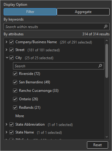
In both workflows, if you are using Data Axle as the source, you can define the minimum and maximum values of numeric attributes (such as employee count or sales volume) for the analysis by adjusting the sliders.
What is aggregation?
The search results can be summarized for sites, standard geographies, or hexagons by enabling aggregation. Aggregation visualizes patterns by summarizing point-based data to areas.
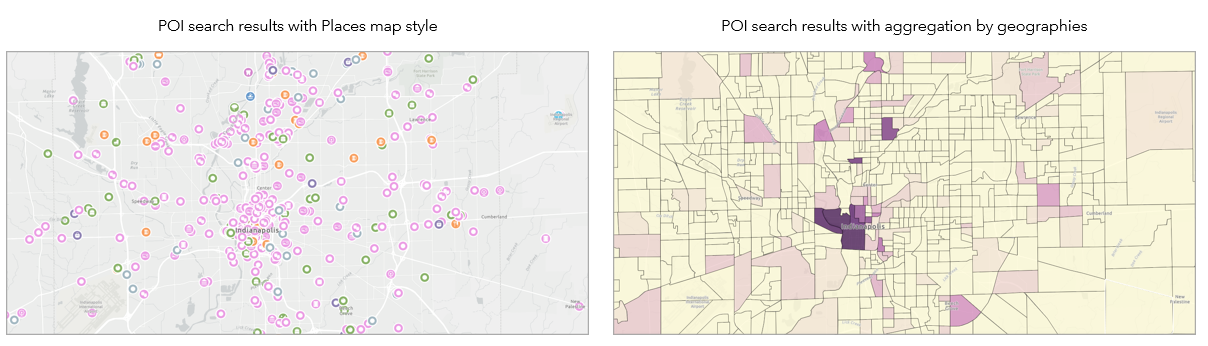
The following point data attributes and calculation types are available for aggregation in Business Analyst Web App and Business Analyst Pro:
| Attribute | Calculation type |
| Number of points | Count |
| Sales volume | Sum, average, minimum, maximum |
| Employee count | Sum, average, minimum, maximum |
In Business Analyst Web App, aggregation can be turned on or off once the search is performed.
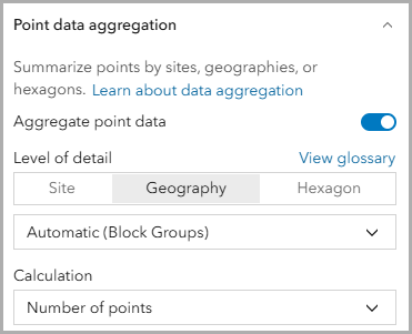
There are two usage notes when enabling aggregation:
- Filters are removed.
- The Bubble chart tab on the Results pane is unavailable.
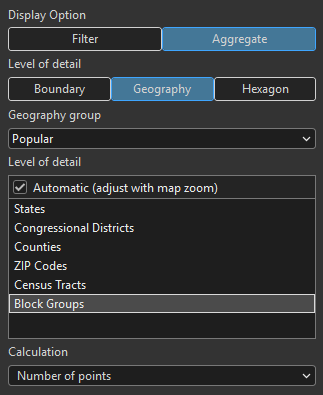
In Business Analyst Pro, aggregation can be enabled when the workflow parameters are set.
How do I explore the results?
In both workflows, the points of interest search results are displayed as features on the map. Point details are available in tabular format.
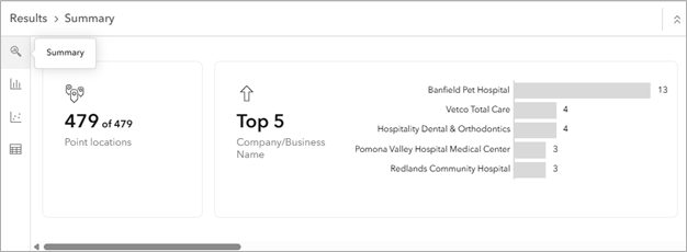
In Business Analyst Web App, explore the interactive Results pane, including a summary, histogram, bubble chart, and table.
The summary displays information about the count of points, average value of the attribute calculations, top and bottom five areas, etc.
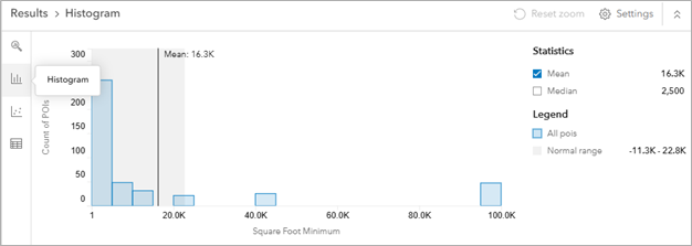
The histogram displays each variable as a histogram. You can configure the variable in the chart, the visualization type, turn outliers on or off, select calculation options, and display statistical measures.
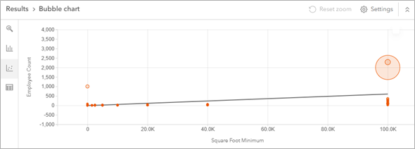
The bubble chart displays results as a bubble chart or scatterplot. You can configure the type of chart, attributes on X– and Y–axes, dot size, and regression line display and model type.
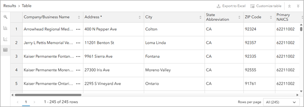
The table displays the attributes of POI results in table format. You can customize the visibility of columns in the table, limit rows per page, and export results to Excel.
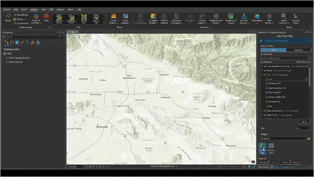
In Business Analyst Pro, explore preliminary results by using the preview options. For example, click Preview Map to view the points in your area of interest.
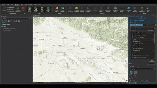
Or, click Preview Table to view the point attribute table for points in your area of interest.
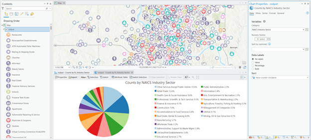
While a dedicated Results pane is not available, ArcGIS Pro’s advanced visualization and tabular chart capabilities can be used to further interpret the output dataset’s (table) relationships and characteristics.
For example, create a pie chart to visualize the counts of points in your area of interest by NAICS industry sector.
Or, create a bar chart to show counts of points in your area of interest by business category.
To learn more about the chart options available in ArcGIS Pro, see Types of tabular charts in ArcGIS Pro.
What are the similarities between the two workflows?
Overall, there are some similarities when you map points of interest (POI) in Business Analyst Web App and Business Analyst Pro.
Search types
In both Business Analyst Web App and Business Analyst Pro, the search can use keywords, categories, codes, all points, and advanced search conditions. There are additional options available to
| Search type | Usage notes |
| Keyword | Enable semantic search to return a broader range of search results related to the search term you entered. |
| Category | Categories organize points of interest records into industry-specific and thematic groups.
For some data sources, use the Esri Categories system to browse a consistent classification of POI types across data sources.
The categories available depend on the data source selected. |
| Code | Industry classification systems, such as the North American Industry Classification System (NAICS), organize points of interest records into industry-specific and thematic code groups.
If you are using Data Axle as your POI data source, there is a proprietary extra two digits to their NAICS codes for businesses in the United States and Canada.
In June 2026, SIC codes will be removed a code search type. |
| Advanced search | Search condition statements prefilter your search results, providing more specificity to the search query. To build a search condition statement, you must select an attribute, choose a filter operator, and set a value. |
Filter search results
The results can be filtered, such as by number of employees or city name. In Business Analyst Web App, you can filter the results and see it dynamically updated on the map and in the Results pane. When you filter in Business Analyst Pro, you can use the Preview Map and Preview Table options to view the dynamic results.
Perform aggregation
The results can be aggregated, such as by number of points or sales volume.
In Business Analyst Web App, you can aggregate the results and see it dynamically updated on the map and in the Results pane. When you enable aggregation in Business Analyst Pro, you can use the Preview Map and Preview Table options to view the aggregated results. However, once you perform the search, you cannot disable aggregation.
What are the differences between the two workflows?
There are a few key differences when you map points of interest (POI) in Business Analyst Web App compared to Business Analyst Pro.
Data source
In addition to POI data sources, Business Analyst Pro can use local data. For example, Esri offers Data Axle POI you can use locally on your machine or you can use POI data managed by your organization. The benefits of using local data include viewing and analyzing more POI results and not consuming ArcGIS Online credits.
Search type differences
When it comes to searching, you can save an advanced search in Business Analyst Web App but not in Business Analyst Pro.
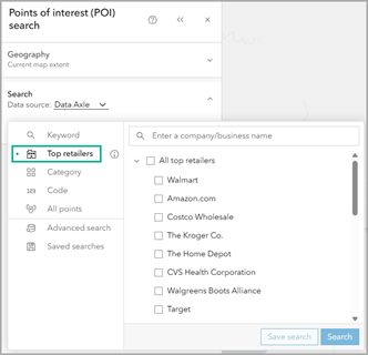
Additionally, you can search by top retailers in Business Analyst Web App. The top retailers search option is a curated list of the top 25 retailers in the United States based on sales volume. In future releases, this list will be expanded to include more retailers and potentially other industry categories. For more information, see Search for top retailers in ArcGIS Business Analyst Web App.
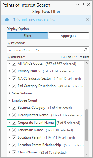
To achieve a similar result in Business Analyst Pro, filter by Corporate Parent Name.
Aggregation differences
If you enable aggregation, there are some differences in the available attributes and calculation types in Business Analyst Web App compared to Business Analyst Pro.
| Business Analyst product | Attribute | Calculation type |
| Business Analyst Web App and Business Analyst Pro | Sales volume | Count |
| Employee count | Average, sum, count, minimum, maximum | |
| Business Analyst Pro only | Square foot minimum | Sum, average, minimum, maximum |
| Square foot maximum | Sum, average, minimum, maximum |
Map style differences
To style the results, Business Analyst Web App includes eight map styles (depending on the POI data source). For example, use the Heat map style to display the relative density of points on the map.
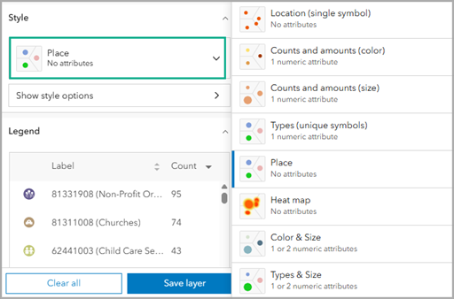
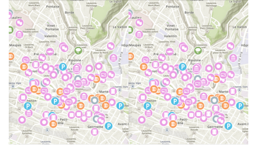
Comparatively, Business Analyst Pro has two map styles available: Location or Place. The location style displays a single symbol to show feature distribution whereas the place style displays data using thematic symbols representing the types of features on the map.
Results display differences
To explore the results, Business Analyst Web App displays a map and Results pane. The Results pane includes a summary, bubble chart, histogram, and table, with some limitations:
- The histogram is only available when using Data Axle as the data source.
- The bubble chart (and scatterplot) is only available when using Data Axle as the data source without aggregation.
- In the table, the export to Excel option is available for all POI data sources with aggregation enabled. If aggregation is not enabled, export to Excel is not available using SafeGraph or Foursquare.
Comparatively, Business Analyst Pro only includes a preview table during the workflow and map once the workflow is finished.
Summing it all up
Hopefully this article has inspired you to explore points of interest (POI) search in Business Analyst software. Both workflows are undergoing continual improvement, so keep an eye out for more enhancements in future releases, and if you have ideas, share them below.
Resources
Now that you’ve learned about mapping points of interest (POI), we hope you’ll explore more capabilities in Business Analyst. To continue your Business Analyst journey, visit the following resources:
- Business Analyst product overview page
- Review pricing and purchase Business Analyst
- Business Analyst resources page
- LinkedIn user group
- Business Analyst Web App video channel
- Business Analyst Pro video channel
- Business Analyst on Esri Community
- Business Analyst Web App login page
- Email the team: businessanalyst@esri.com
This article uses Business Analyst Web App Standard and Business Analyst Pro 3.7 to map points of interest (POI). Points of interest data is from the ArcGIS Places dataset provided by Esri. Basemaps are provided by Esri.


Article Discussion: