Version 4.25 of the ArcGIS API for JavaScript (ArcGIS JS API) introduced the ability to override default styles for point clustering. You can now do the following:
- Define a distinct symbol for representing clusters
- Visualize clustered layers with a custom renderer
- Represent clusters of categorical data as pie charts
- Define aggregate fields for use in popups, labels, and cluster renderers
These have been some of the most popular enhancement requests by our user communities.

Let’s take a look at 8 examples for styling clusters — beginning with default styles, and ending with the new capabilities.
Default cluster styles
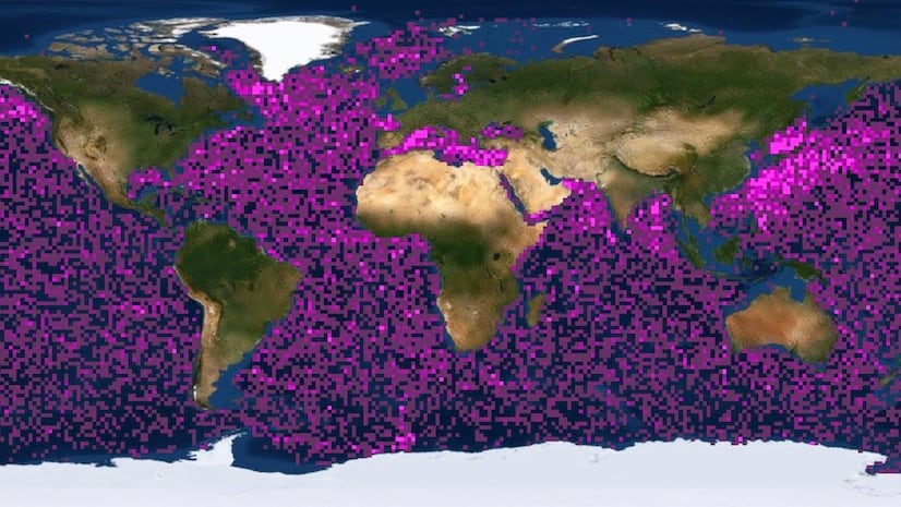
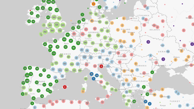
By default, clusters are styled so they represent a summary of the variable used to style individual points within the cluster. Typically, the size of each cluster varies depending on the count of points it represents. The following are just a few examples of how clusters are styled by default.
1. Simple renderer
The SimpleRenderer allows you to style a layer so that each point has the same symbol. This simply communicates where data points exist with no additional information. When clustering is enabled on a layer with this style, each cluster is represented with the same symbol as individual points. The size of the cluster indicates the number of points it represents.
Simply enable clustering on the featureReduction property of the layer, and the cluster will be automatically styled with the same symbol as the layer’s renderer.
const layer = new GeoJSONLayer({
   renderer: {
     type: "simple",
     field: "mag",
     symbol: {
       type: "simple-marker",
       size: 4,
       color: "#c86558",
       outline: {
         color: "rgba(0, 0, 0, 0.3)",
         width: 0.5
       }
     }
   },
   featureReduction: {
     type: "cluster"
     // ...other clustering properties
   }
   // ...other layer properties
 });
View the live app
Explore the code

2. Continuous color
A color visual variable allows you to visualize a numeric variable along a continuous color ramp. When this is applied to a clustered layer, the average value of the field or expression in the color variable is used to color the cluster according to the same color stops defined in the layer’s renderer.
Again, for clusters to pick up this style, all you need to do is enable clustering and the layer’s renderer automatically applies the appropriate color.
const layer = new GeoJSONLayer({
  renderer: {
    type: "simple",
    symbol: {
      type: "simple-marker"
    },
    visualVariables: [{
      type: "color",
      field: "mag",
      legendOptions: {
        title: "Average magnitude"
      },
      stops: [
        { value: 2, color: "#00619b" },
        { value: 3, color: "#50a7da" },
        { value: 4, color: "#ffd8bf" },
        { value: 5, color: "#f89960" },
        { value: 6, color: "#b35116" }
      ]
    }]
  },
  featureReduction: {
    type: "cluster"
    // ...other clustering properties
  }
  // ...other layer properties
});
View the live app
Explore the code

3. Predominance
When a UniqueValueRenderer is used to style a clustered point layer, the symbol of the predominant (or most common category) is used to represent the cluster by default.
const layer = new FeatureLayer({
   renderer: {
     type: "unique-value",
     field: "Complaint_Type",
     uniqueValueInfos: [
       // defines symbols for representing
       // unique categories or values
     ]
   },
   featureReduction: {
     type: "cluster"
     // ...other clustering properties
   }
   // ...other layer properties
 });
View the live app
Explore the code

Custom styles
While automatically styling clusters based on a layer’s renderer is useful, there are scenarios where you may want to override this behavior. These are the new capabilities introduced at version 4.25 of the ArcGIS API for JavaScript.
4. Distinct cluster symbol
Sometimes a summary of the features within the cluster is irrelevant and you just want to see a binary view of whether a symbol in the map represents an aggregate of points, or an individual feature.
In this case, you can define a symbol on the FeatureReductionCluster instance. This will style each cluster with the same symbol. The size of each cluster will continue to depend on the count of points it represents. Individual points will retain the symbology as defined in the layer’s renderer, regardless of renderer type.
const layer = new GeoJSONLayer({
   // individual points show as triangles
   renderer: {
     type: "simple",
     symbol: {
       type: "simple-marker",
       size: 8,
       color: "#69dcff",
       style: "triangle",
       outline: {
         color: "rgba(0, 139, 174, 0.5)",
         width: 1
       }
     }
   },
   // clusters show as circles with thick outlines
   featureReduction: {
     type: "cluster",
     symbol: {
       type: "simple-marker",
       style: "circle",
       color: "#69dcff",
       outline: {
         color: "rgba(0, 139, 174, 0.5)",
         width: 6
       }
     }
     // ...other clustering properties
   }
   // ...other layer properties
 });
View the live app
Explore the code

Cluster renderers
For scenarios where you want to customize the symbol of the clusters, but vary the symbol properties dynamically based on a data value, you’ll need to create a cluster renderer. This requires you define at least one aggregate field (or reuse an auto-generated field) to use in the renderer.
Aggregate fields
Creating any custom renderer for clusters requires you to define at least one aggregate field in the fields property of FeatureReductionCluster. Aggregate fields are defined in the same manner they are for binning visualizations. An aggregate field must be defined with a layer field, statistic type, and be given a name.
The snippet below demonstrates how to create an aggregate field that sums the total number of fatalities reported in a field for all features included in a cluster. The resulting field may be used in the cluster’s renderer, popupTemplate, or labels.
const layer = new FeatureLayer({
  featureReduction: {
    type: "cluster",
    fields: [
      new AggregateField({
        name: "SUM_KILLED",
        onStatisticField: "NUMBER_OF_PERSONS_KILLED",
        statisticType: "sum"
      })
    ]
    // SUM_KILLED can be used in
    // other clustering properties:
    // ...renderer
    // ...popupTemplate
    // ...labelingInfo
  }
  // ...other layer properties
});
5. Size based on sum
By default, cluster sizes represent the total number of features in the cluster, and are controlled with clusterMinSize and clusterMaxSize. This is still true when defining any custom renderer on the FeatureReductionCluster instance.
You can override this default sizing behavior by setting any size visual variable in the cluster renderer. For example, you can use a custom renderer to size clusters based on the sum of a numeric attribute, rather than the average value (the default behavior when the underlying layer has a size variable assigned to the renderer).
To do this, you need to define an aggregate field based on the sum of a numeric attribute of the layer, then use it in a SizeVariable within any renderer type. This example shows how to sum clusters based on the total number of people living within each cluster. Note how the population_total aggregate field is referenced in the cluster renderer’s size variable.
const markerSymbol = {
  type: "simple-marker",
  style: "circle",
  color: "green",
  size: 4
};

const layer = new FeatureLayer({
  renderer: {
    type: "simple",
    symbol: markerSymbol
  },
  featureReduction: {
    type: "cluster",
    // define aggregate field for population sum
    fields: [{
      name: "population_total",
      onStatisticField: "POP",
      statisticType: "sum"
    }],
    renderer: {
      type: "simple",
      symbol: markerSymbol,
      visualVariables: [
        {
          type: "size",
          // reference aggregate field in size variable
          field: "population_total",
          stops: [
            { value: 0, size: 8 },
            { value: 100, size: 12 },
            { value: 10000, size: 18 },
            { value: 50000000, size: 48 }
          ]
        }
      ]
    }
    // ...other clustering properties
  }
  // ...other layer properties
});
View the live app
Explore the code

6. Color based on any aggregate field
You can reference aggregate fields in any visual variable type and use it to override the default cluster style. In this scenario, the size of the cluster is automatically applied based on cluster count (and controlled by clusterMinSize and clusterMaxSize). The color is varied based on an aggregate field that calculates the ratio of injuries in car crashes to the number of crashes.
const layer = new FeatureLayer({
  renderer: {
    type: "simple",
    label: "Crash location",
    symbol: {
      type: "simple-marker"
    }
  },
  featureReduction: {
    type: "cluster",
    fields: [{
      name: "AVG_MOTORIST_INJURED",
      onStatisticField: "NUMBER_OF_MOTORIST_INJURED",
      statisticType: "avg"
    }],
    // Override default cluster symbol with
    // aggregate info not included in layer's renderer
    renderer: {
      type: "simple",
      symbol: {
        type: "simple-marker"
      },
      visualVariables: [
        {
          type: "color",
          field: "AVG_MOTORIST_INJURED",
          legendOptions: {
            title: "% of motorists injured"
          },
          stops: [
            { value: 0, color: "#d7e1ee", label: "No injuries" },
            { value: 0.12, color: "#cbd6e4" },
            { value: 0.25, color: "#b3bfd1", label: "25%" },
            { value: 0.37, color: "#c86558" },
            { value: 0.5, color: "#991f17", label: ">50%" }
          ]
        }
      ]
    }
    // ...other clustering properties
  }
  // ...other layer properties
});
View the live app
Explore the code
.")
7. Binary (includes vs. excludes)
You can also style clusters based on whether they include or exclude high priority features. This example colors clusters red if they include at least one fatality. All other clusters without fatalities are colored beige. You can achieve this visualization by setting a ClassBreaksRenderer with two breaks on the FeatureReductionCluster.renderer property. One break indicates a total of zero, and the other break includes features with a sum of any number larger than zero.
const includedColor = "#de2c30";
const excludedColor = "#ffdaa6";

const layer = new FeatureLayer({
  featureReduction: {
    type: "cluster",
    fields: [
      // sum all fatalities in the cluster
      new AggregateField({
        name: "SUM_KILLED",
        onStatisticField: "NUMBER_OF_PERSONS_KILLED",  // layer field
        statisticType: "sum"
      })
    ],
    renderer: {
      type: "class-breaks",
      field: "SUM_KILLED",  // aggregate field
      legendOptions: {
        title: "Car crashes"
      },
      classBreakInfos: [{
        minValue: 0,
        maxValue: 0,
        label: "No fatalities",
        symbol: {
          type: "simple-marker",
          color: excludedColor,
          outline: {
            color: "rgba(153, 31, 23, 0.3)",
            width: 0.3
          }
        }
      }, {
        minValue: 1,
        maxValue: 99999999999,
        label: "Includes fatalities",
        symbol: {
          type: "simple-marker",
          color: includedColor,
          outline: {
            color: "rgba(153, 31, 23, 0.3)",
            width: 0.3
          }
        }
      }]
    }
    // ...other clustering properties
  }
  // ...other layer properties
});
View the live app
Explore the code
 clustered.")
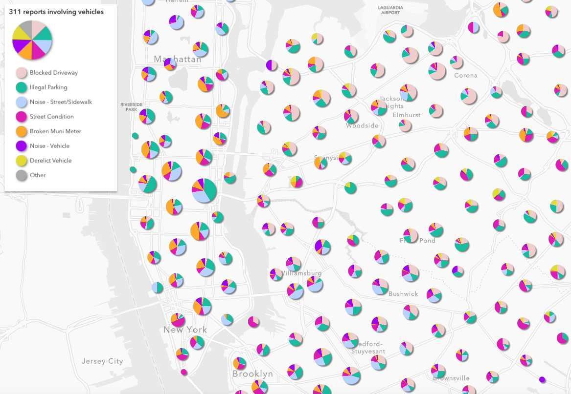
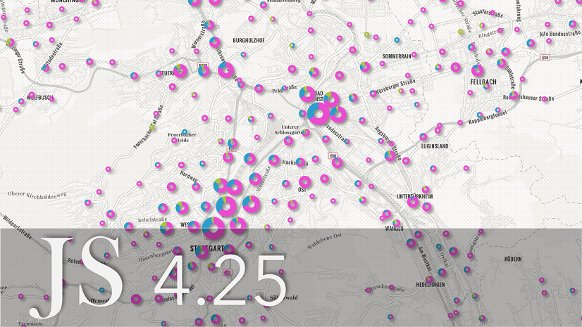
8. Clusters as pie charts
By default, clusters for layers rendered with a UniqueValueRenderer will render using the symbol of the predominant category in the cluster. However, this visualization can be misleading as the predominant category often doesn’t indicate a majority.

For this reason, you may want to show more detail about the categories inside the cluster using a PieChartRenderer. To do this, you need to define a field for each category that returns the sum of the features belonging to that category. This can be done by writing a one-line Arcade expression for each category. You should also be careful to match the colors of the pie slices with the colors of the unique value infos of the layer’s renderer.
Because this can be a tedious process, we provide the createRendererForClustering function to generate a pie chart renderer along with the required fields to apply to the FeatureReductionCluster instance.
layer.renderer = {
   type: "unique-value",
   field: "Complaint_Type",
   uniqueValueInfos: [
     // defines symbols for representing
     // unique categories or values
   ]
   // ...other layer properties
 },

 const { renderer, fields } =
   await pieChartRendererCreator.createRendererForClustering({
     layer,
     shape: "donut"
   });

 layer.featureReduction = {
   type: "cluster",
   fields,
   renderer
   // ...other clustering properties
 };
This function allows you to generate a donut chart or a fully filled in pie chart. The donut chart is nice because you can fit a label inside the donut hole, but the pie may be easier to read.
View the live app
Explore the code
.")
Conclusion
The latest version of the ArcGIS JS API gives you full control over styling clusters in a variety of ways. While having this degree of control is nice, keep in mind that most of the time the styles automatically generated based on the layer’s renderer will be the best visualization option.
Check out all the clustering samples in the ArcGIS JS API documentation to learn more.

What I need is the ability to have the clusters based on a boundaries polygon layer. We would love these pie charts and other features on the fly but we always think or report within some type of boundary. State, county, allotment, field office, etc. I can get some of this with Arcade in a popup but cannot use FeatureSet with symbols. While the images shown all look nice and follow clustering math I fail to think of a business use case for random clusters. But I have a stack of business use cases for these quick clusters by polygons. I would love to see more focus on useful tools vs cool tools. thanks
That’s good feedback. You’re right about clustering not being useful in a “business” sense. I often tell folks this is not something you should use for any real statistical analysis. It’s merely a way for reducing clutter on your screen…for example to quickly see which locations have more data than others, with a little extra info if needed.
Your case really requires creating a new layer. This workflow is documented in the Aggregation high density data visualization topic of the JS API (sorry, I’m prevented from pasting links in comments).
Creating clusters based on boundaries from another layer is too expensive to compute on the client, and the API is a bit unclear as it requires two separate data sources. That’s why I suggest performing the true analysis using a tool either in ArcGIS Pro or ArcGIS Online to create a new aggregate layer with all the computed statistics.
There is perhaps still room for research on client-side spatial joins that would make this possible. Again, it comes at an upfront performance cost, but could be available in the future.