The November 2022 update of Map Viewer really expands our options for aggregating geographic data on-the-fly and gives us a lot more control over the process. One of the most common challenges in mapping is how to fit a very large and complex world onto a small screen. For example, if we tried to map all 330 million Americans as individual points, our maps would be an illegible and unwieldy mess of points. Instead, cartographers have long relied on spatial aggregation to make thematic maps work: Those 330 million individuals become transformed into summary statistics reported by county or state and visualized as a choropleth map. Or millions of credit card transactions start to make sense when viewed as clusters or as a heat map. In other words, sometimes we must take a step back from our data to see it clearly. This is why spatial aggregation is at the heart of thematic mapping.
With traditional GIS, aggregation is often seen as a data pre-processing step. Before mapping, analysts would often derive new geographies and/or calculate new fields (which can be computationally expensive). But Web GIS has evolved so quickly we can now do on-the-fly spatial aggregation.
This is a big deal because it lets us explore how the stories our data tell change when we apply different spatial lenses to our work.
Geographers have long worried that the spatial scale at which you map the world will often alter what you think you’ve discovered; 1m pixels vs 30m pixels? Postal codes vs Provinces? As a result, best practices often involved re-running your work at multiple spatial scales to see “how stable the signal is”. But that is time consuming. Which is why the speed and flexibility of the new aggregation methods in Map Viewer are a big help.
New Renderers, Summary Stats, Projections and Tons More Control
While clustering and heat maps are two great approaches to spatial aggregation—and have been available in Map Viewer for a few years now—with this update things get taken to an entirely new level.
- There are two new renderer types: Binning and Clustering (charts) both of which expand our cartographic toolkit.
- Clustering has been thoroughly updated and authors have much more control over the styling of their clusters. This has been a top request from customers.
- Clustering now works on different map projections, which is great news if you’re working with something other than Web Mercator.
- Aggregation summary statistics (mean, min, max, mode) are now automatically calculated for bins and clusters. This means you can skip having to write Arcade expressions to extract those meaningful data. We can now move beyond just mapping the counts of things to showing things like the mean or sum or predominance of those bins or clusters.
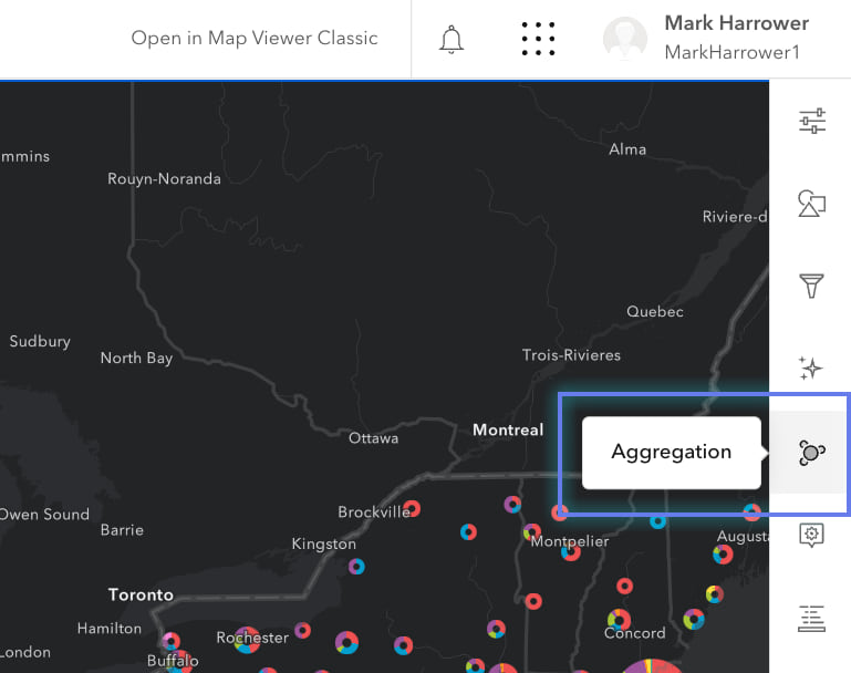
Everything in this post is found under the Aggregation tab. You’ll see different options there depending on whether you’re mapping counts or categories or numbers.
Let’s dive in.
Binning
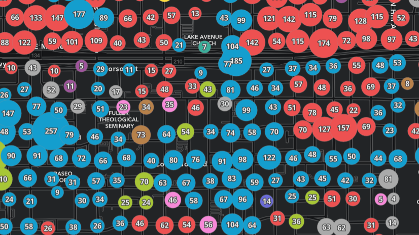
This is a really powerful new addition to Map Viewer. While many of us have worked with data that is aggregated to “standard geographies” such as states and counties, binning instead overlays a grid and counts what falls within each cell. This has two big advantages over census units: (1) they’re all the same size and orientation so that no one region visually dominates the map, and (2) we can make the grid cells any size we like.
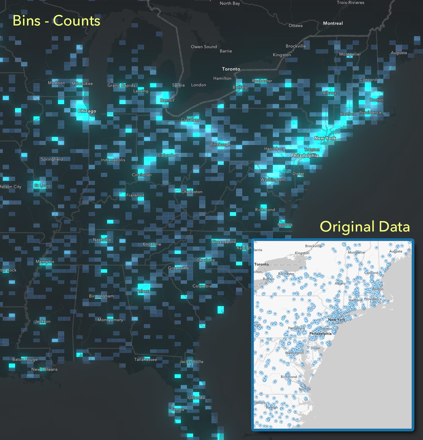
In this map I’m using bins to count how many colleges and universities fall within the grid cell. The original map has too many points on it (6,500+) which quickly overlap and a lot of detail is simply obscured. Binning cuts through all of that by overlaying a grid and counting how many schools per cell. Places with more colleges are brighter.
I’ll be using this dataset for the remaining examples, so feel free to follow along (source), or use any other point data set with a lot of observations.
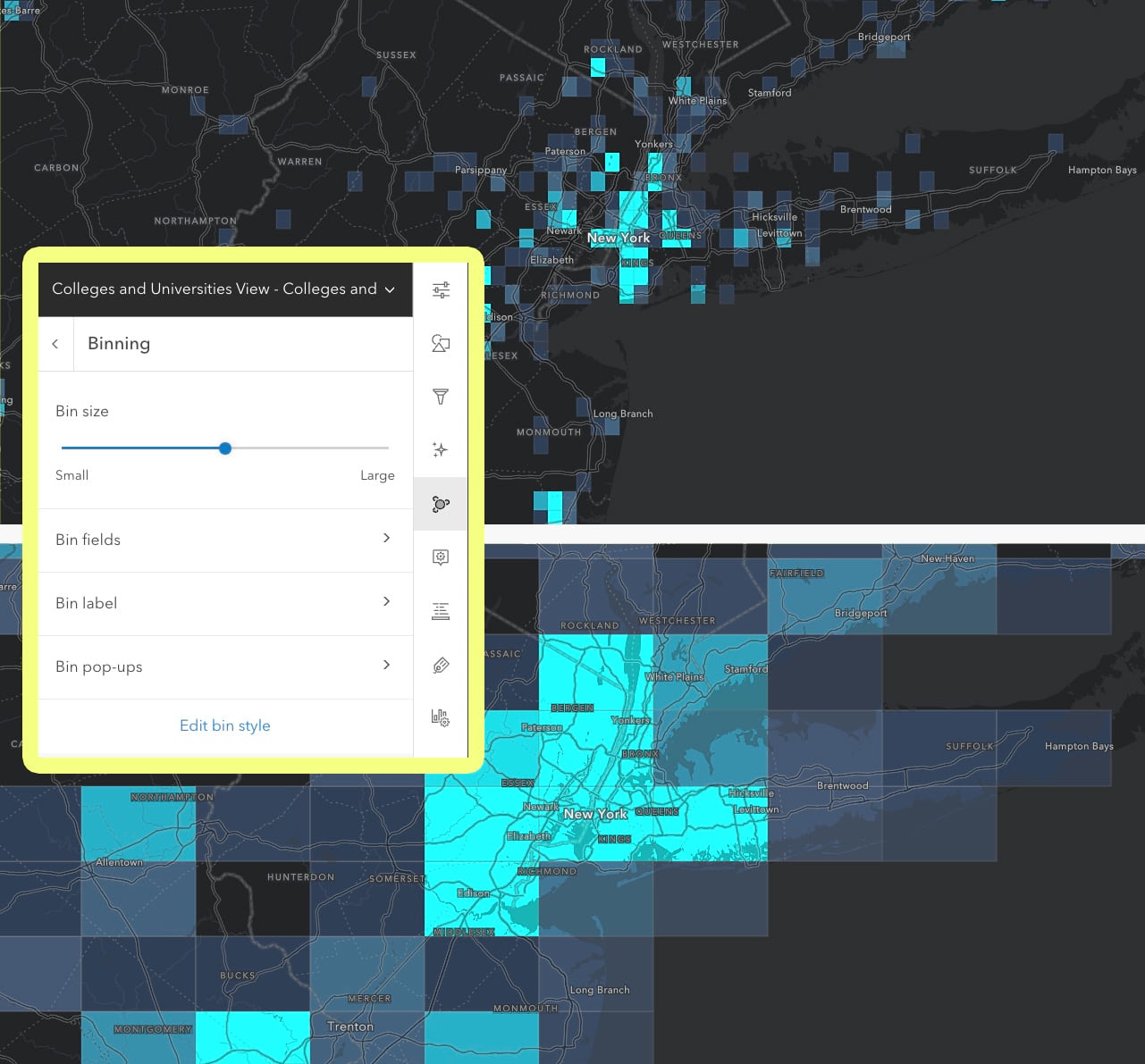
Next suggested step is to adjust the size of the grid cells, using the bin size slider. This takes less than a second so experiment. The cells don’t re-draw/re-size when zooming so make sure you test them across a few zoom levels before committing to one.
But why stop there?! As we see below, we don’t have to just paint the cells with color ramps, we can instead place a proportional symbol in each cell. Yep, the number of schools in each cell can either be color or size renderers—or in fact any of the other smart mapping renderers. And we retain full styling control of those renderers, even though they’re using data tied to bins that are generated on-the-fly.
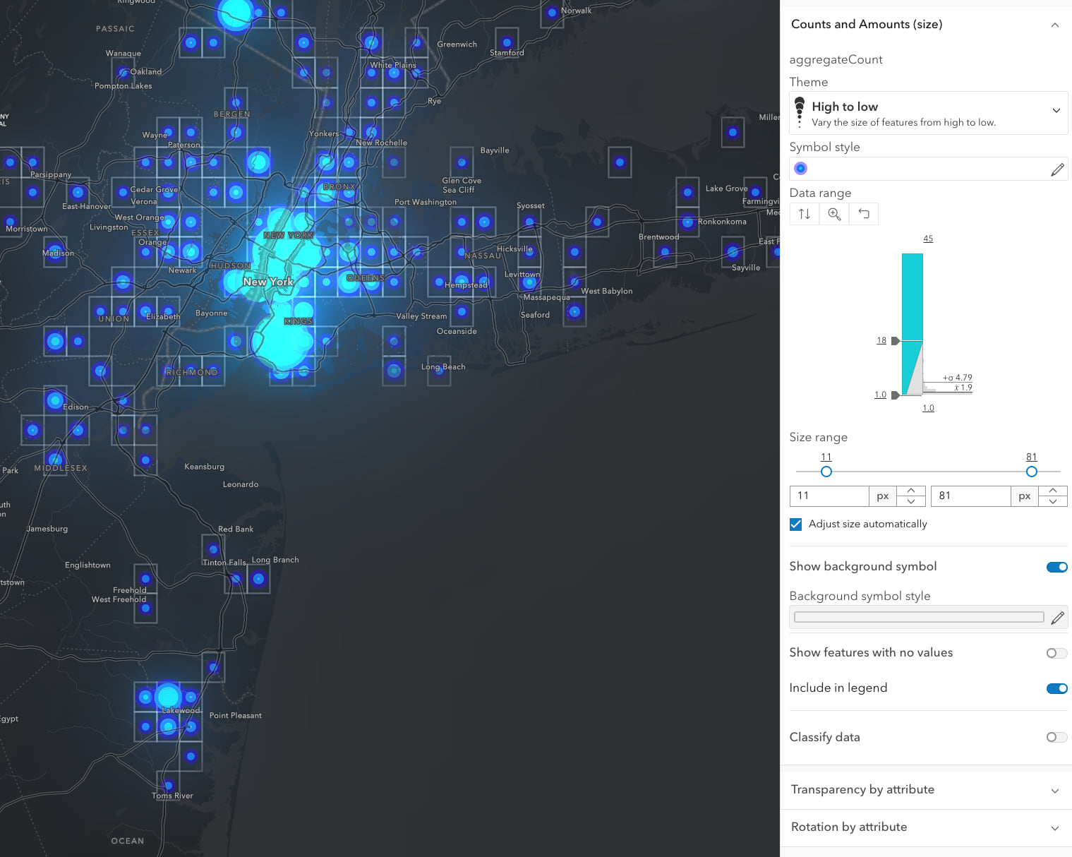
Here you can see New York City really dominates the map since it has so many schools. Use the familiar style options to fine tune the symbols attached to these bin cells, especially the Theme, Symbol style, and Data range handles. You can also opt to show or hide the bin cells themselves, using the Background symbol toggle and styling options.
Clustering (charts)
Earlier this year we added the popular pie chart map style to our list of Smart Mapping renderers. This same approach can now be applied to clusters! Previously with clustering you’ve been able to paint the cluster circles with the predominant (“most common”) category in the cluster. But as my colleague Kristian Ekenes likes to say “predominant does not mean majority!” With the winner-takes-all approach to picking a single class to highlight, we don’t know what the relative proportions of membership are in any cluster. Is the most common thing 90% of the total, or merely 1% more than the next thing? Knowing that makes a big difference.
Want to see why this matters? The maps below show clusters of schools, painted by predominant type of school (universities vs junior colleges vs trad schools, etc).
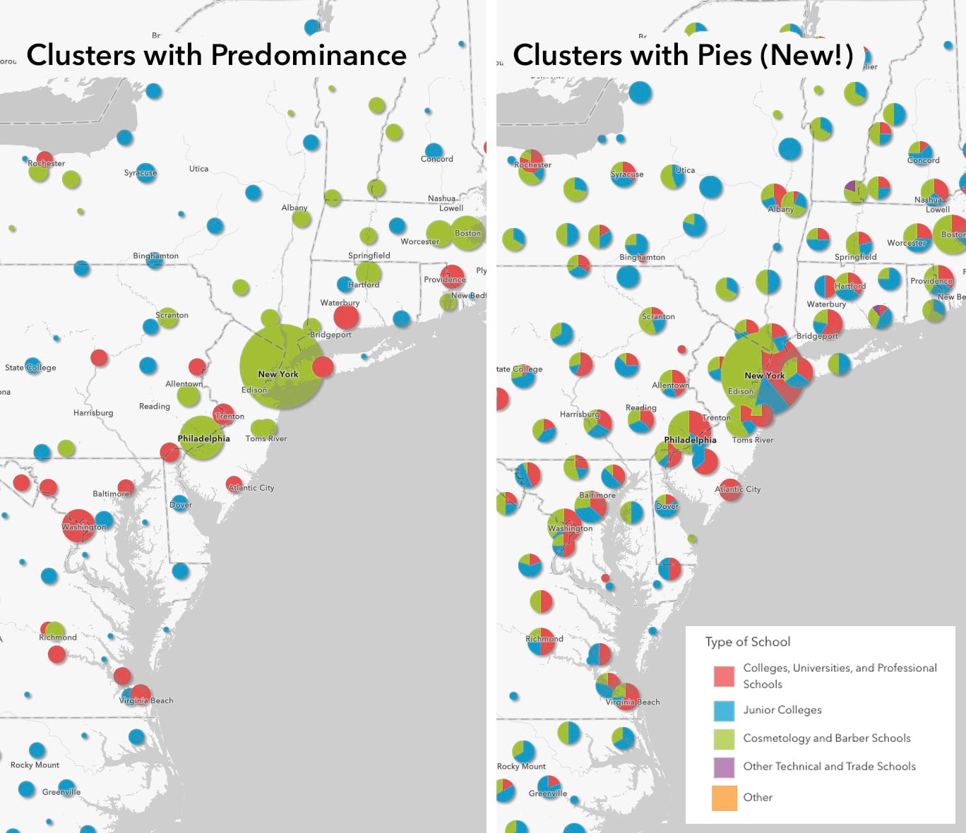
The size of the circles in both maps tells us how many schools are in the cluster. But on the left the predominant type of school gets “the entire pie” as a single color. That really overstates the degree of predominance in most locations. Now that we can use pies for clustering we can really see the relative proportions; most locations are in fact a pretty even mix of school types. That’s a very different story to tell.
Anytime you want to show relative proportions of what makes up a cluster, use this new pie cluster option.
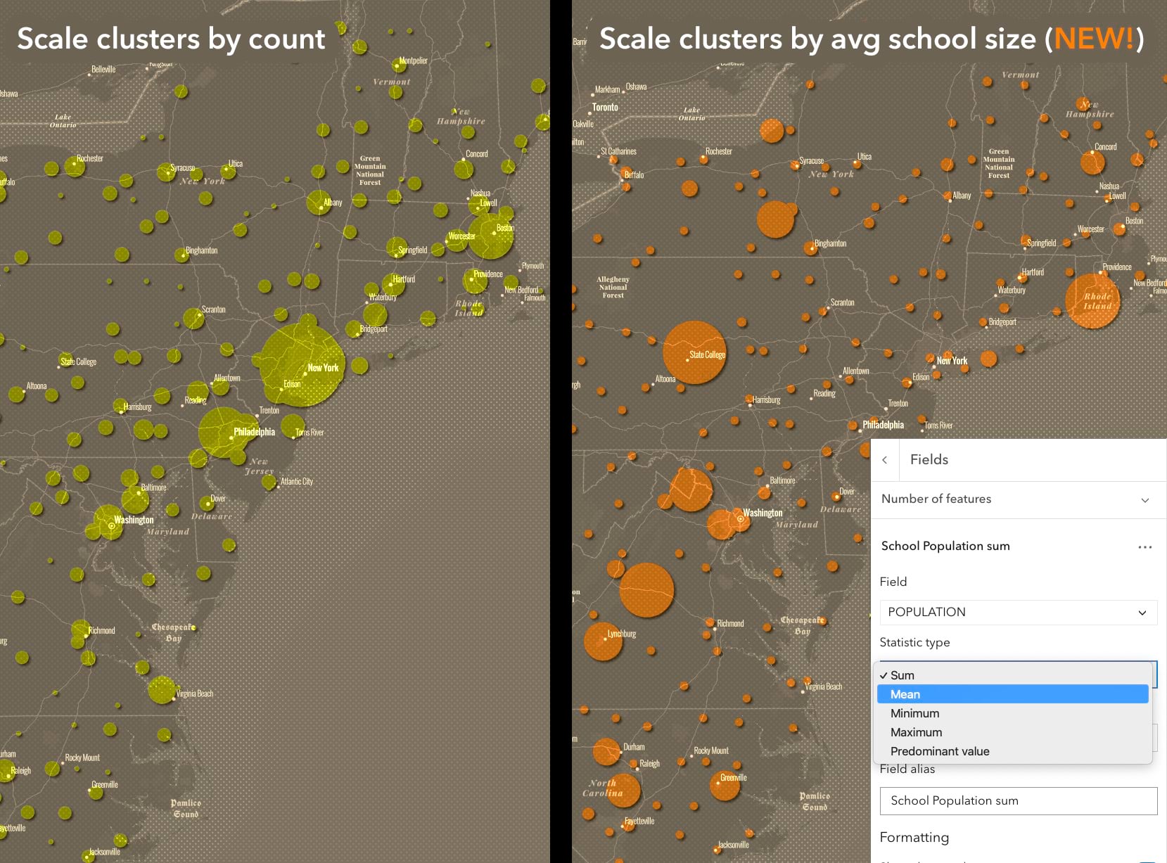
On-the-fly Summary Statistics
Normally we want to know how many things are in a bin or a cluster (aka the count). But now we have new options for controlling the size of the cluster or color of the bins. For any aggregation method we have summary stat fields that can be used for labels, popups and styling (binning only). And that this can be done now without having to write Arcade expressions is a huge time saver.
Why is this helpful cartographically? In the maps below we can see that NYC and Boston both have A LOT of schools. But when we scale those circles based on mean student population of the clusters we realize that the average school size in NYC and Boston is quite small. And the largest state schools (places like Penn State) suddenly dominate the map. Look for these options under the Fields section of both clustering and binning.
Control the Look of Clusters (finally!)
You can now style the look of your clusters, just like we can style the look of any point feature. Don’t want circles? Or want to use different colors? Or want to distinguish the clusters from the single observations? It’s all possible now. Of course the defaults still work great, so if you’re in a hurry don’t feel like you have to customize your symbology, but it’s good to know that’s possible now.
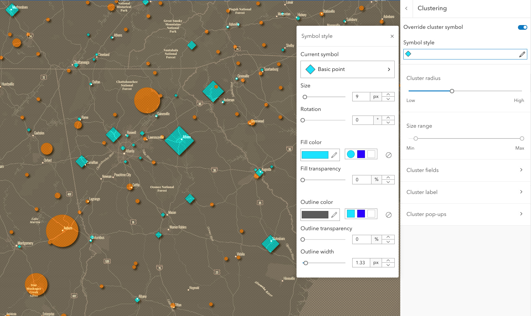
In this map I wanted to differentiate clusters of schools from individual schools that are not part of a cluster. Since the map contained both, and size is driven by student population, you couldn’t assume “small circles are single schools”. Now diamonds are the clusters, and orange circles are single schools not part of any cluster. Look for this under the Override cluster symbol toggle at the top of the Clustering panel.
Next Steps
We haven’t specified a hard limit for the number of points that can work with these on-the-fly aggregation methods since it depends on both the device and the network speed. Network speed is important since this is all happening client-side and, thus, the data needs to be downloaded before the bins or clusters can be generated. Experiment with the data you have but I’ve seen datasets with over 250k points work well. If you have tens or hundreds of millions of point features in your layers, stay tuned; we have some exciting next-gen high performance capabilities coming next year.
Binning and clustering complement each other. Bins are regularly sized and visible on the map so you know where its membership comes from. Clusters allow us in one click to easily take far too many points and make them easy to understand proportional symbols, that can now be scaled not just by count. Controlling the area of influence of a cluster (i.e., how large an area it’ll look at to include membership) is a key part of dialing-in your map, so be sure to experiment with that slider. Lastly, the new styling options available to both binning and clustering mean this blog post has barely touched on what’s possible visually. Have fun with blending, symbology, adding second varaibles into the mix, and create something beautiful and informative.
Happy Mapping!

Dear Mark,
fantastic blog entry. I am trying to create clusters with pies, but I cannot find the option (I’m looking in Map Viewer – Aggregation – Clustering – Options). Also, I cannot find relevant help entry yet. Cheers
Ben
Nevermind, I needed to delect correct styling.