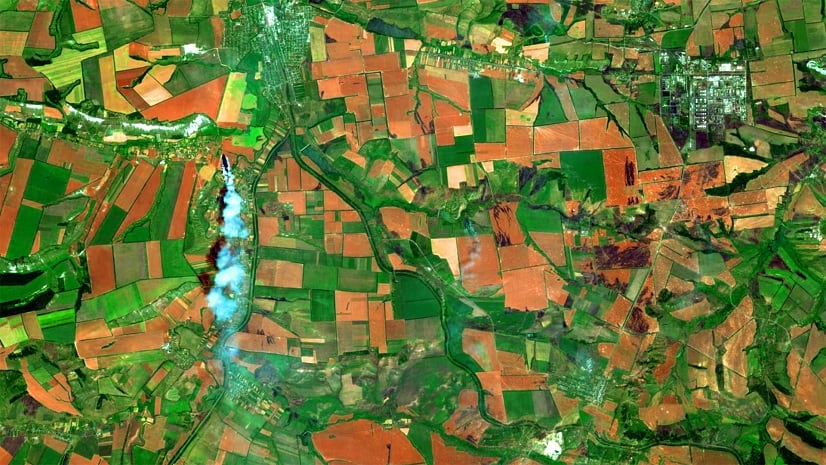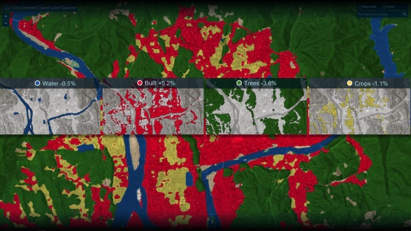
Global Land Cover Revealed
Timely data and change analysis are fundamental to revealing insights from land use/land cover maps.
Timely data and change analysis are fundamental to revealing insights from land use/land cover maps.
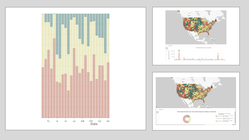
Much like how there are principles behind food and wine pairings, there are principles when it comes to pairing charts with maps.
Learn how to find and use demographic data throughout the ArcGIS platform to better understand your community.
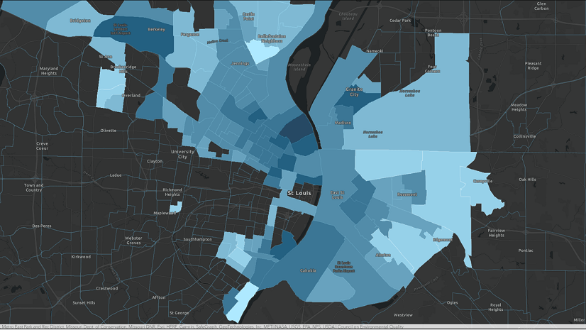
Take a closer look at the most disadvantaged American communities and study their socioeconomic context using Tapestry profiles.
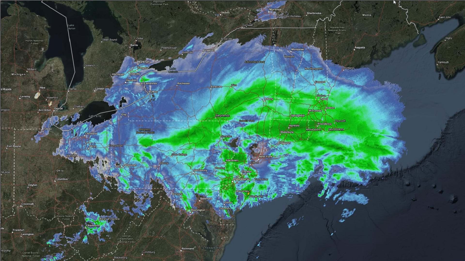
Learn to make and configure a weather map using ArcGIS Online and ArcGIS Living Atlas of the World.
The new Day/Night Terminator from ArcGIS Living Atlas of the World provides a visual representation of the day/night cycle of Earth.
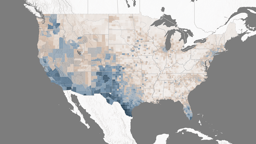
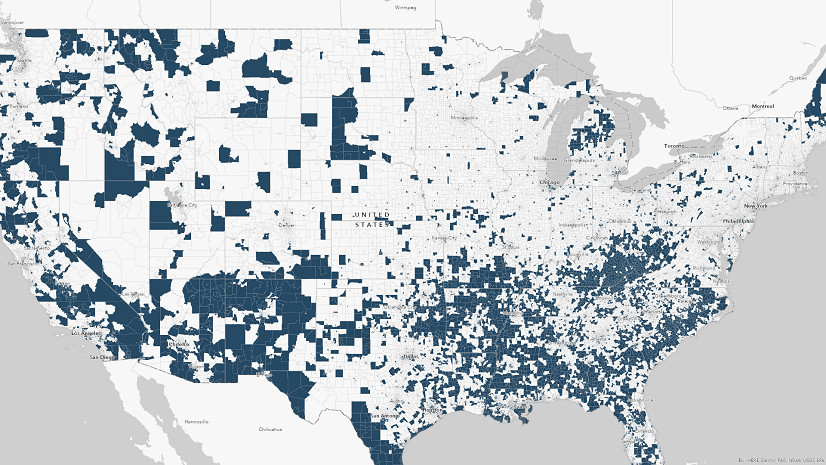
Take a closer look at the locational distribution of disadvantage in the United States according to Justice40 data.
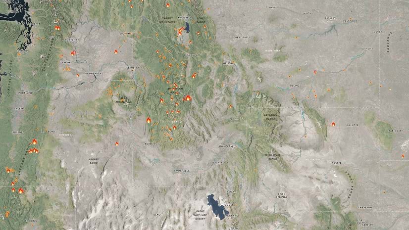
Esri's Wildfire Aware application brings together 22 layers to facilitate understanding about wildfires and surrounding areas.
If the basemap you want to use is not available with a reference layer, you can create one yourself. Here's how.
ArcGIS Living Atlas of the World is a collection of curated content you can use to populate a custom basemap gallery. Here's how.
Small nonprofit organizations based in the United States can apply for a grant from Esri that provides GIS software, data, and training.
Russia's invasion of Ukraine has thrust global food security into the limelight. Learn how this issue can be tackled through a geospatial lens.