As GIS Analysts, we know how maps can bring data to life. But maps are part of something bigger – data visualization. Charts are another broad category of data visualization. When used in conjunction with maps, charts can help your data tell a more comprehensive story. Charts can go in your pop-ups for an engaging interactive map. Charts can also complement your map when presented side by side in a Chart Viewer app. This article will focus on stand-alone charts in ArcGIS Online.
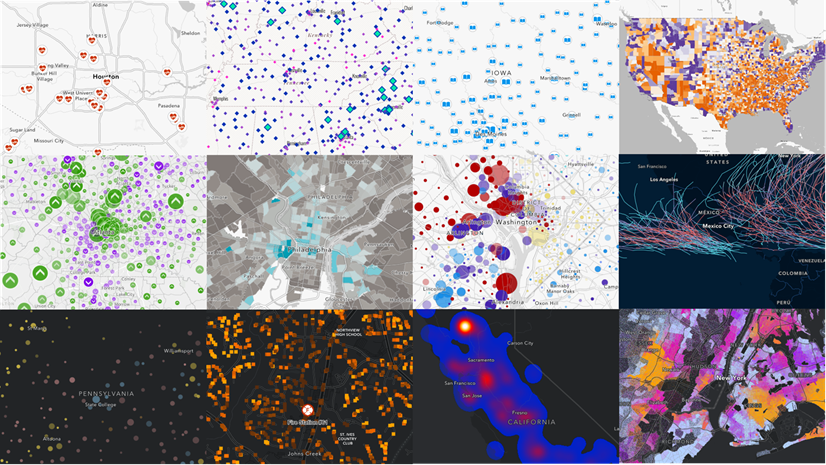
Much like how there are principles behind food and wine pairings, there are principles when it comes to pairing charts with maps. Those food and wine pairing principles generally center around flavor profiles. Just as there are a few major “flavor profiles” – acidic, salty, bitter, sweet, spicy; there are also some major “data profiles” – discrete categories, change, distributions, and relationships. As of the current release, ArcGIS Online has over a dozen mapping styles, and five chart styles. Let’s see how some of them can be paired together. Notice that there is more than one mapping style that is appropriate for each chart style.
| Data | Chart Styles | Map Styles |
|---|---|---|
| Discrete Categories | Bar Chart, Pie Chart | Types, Predominance, Dot Density, Charts, Compare A to B |
| Change | Line Chart | Continuous Timeline, Age |
| Distributions | Histogram | Counts and Amounts (Color, Size, Color and Size) |
| Relationships | Scatter plot | Relationship, Compare A to B |
When configuring a chart in ArcGIS Online, you are first prompted to choose one of five options: bar chart, line chart, pie chart, histogram, and scatterplot. Let’s go through each of these types of charts and discuss some appropriate mapping styles for each.

The examples below open to web maps so that you can see all the chart configurations. However, opening a saved web map does not open the chart automatically. Use the Charts tool in Map Viewer to see the charts, and use the Configure Charts tool to see all the behind-the-scenes configurations.

Bar charts work well with many maps
Bar charts as a data visualization is one of the most versatile, and can go with many different styles of maps. This visualization involves comparing the relative values of two or more attributes. There are three different styles of bar charts you can use in your map: Side-by-Side Bar Chart, Stacked Bar Chart, and 100% Stacked Bar Chart. Each have their own advantages and pair well with different styles of maps.
Side-by-Side bar charts
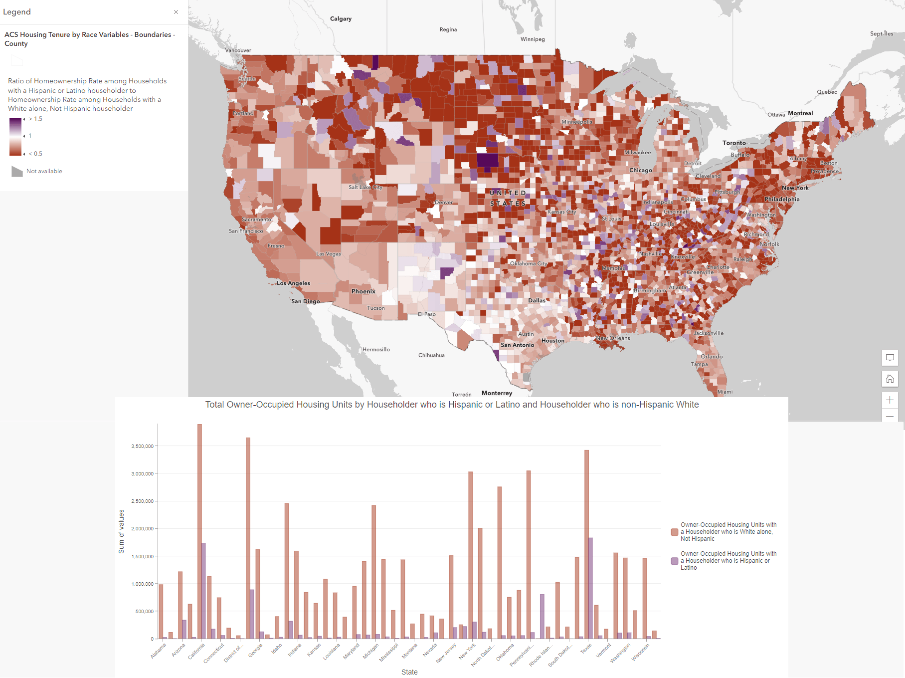
Side-by-Side bar charts pair well with Compare A to B maps or multivariate maps. In this example, we will map two different attributes using the Compare A to B mapping style, showing a ratio of homeownership rates of Hispanic & Latino households, and non-Hispanic white householders. Our map centers on a value of 1, showing by county level where there are higher or lower rates of Hispanic & Latino household ownership relative to non-Hispanic white household ownership.
By adding a side-by-side bar chart, we can summarize the total number of owner-occupied housing units by Hispanic & Latino householders and non-Hispanic white householders in each state. This bar chart provides supplemental information to the ratio mapped, showing total numbers for each state.
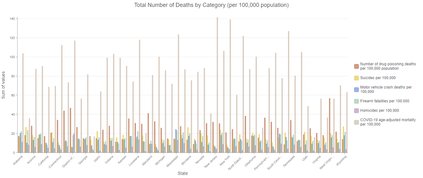
Side-by-side bar charts also pair well with predominance or charts maps. We can use a side-by-side bar chart to reinforce or bring light to several variables at once, such as number of deaths by certain categories across all states. Our map could display the predominant cause of death by county or state, but our bar chart can provide us total deaths in each category mapped, providing easy-to-compare summarizations.
Stacked bar charts
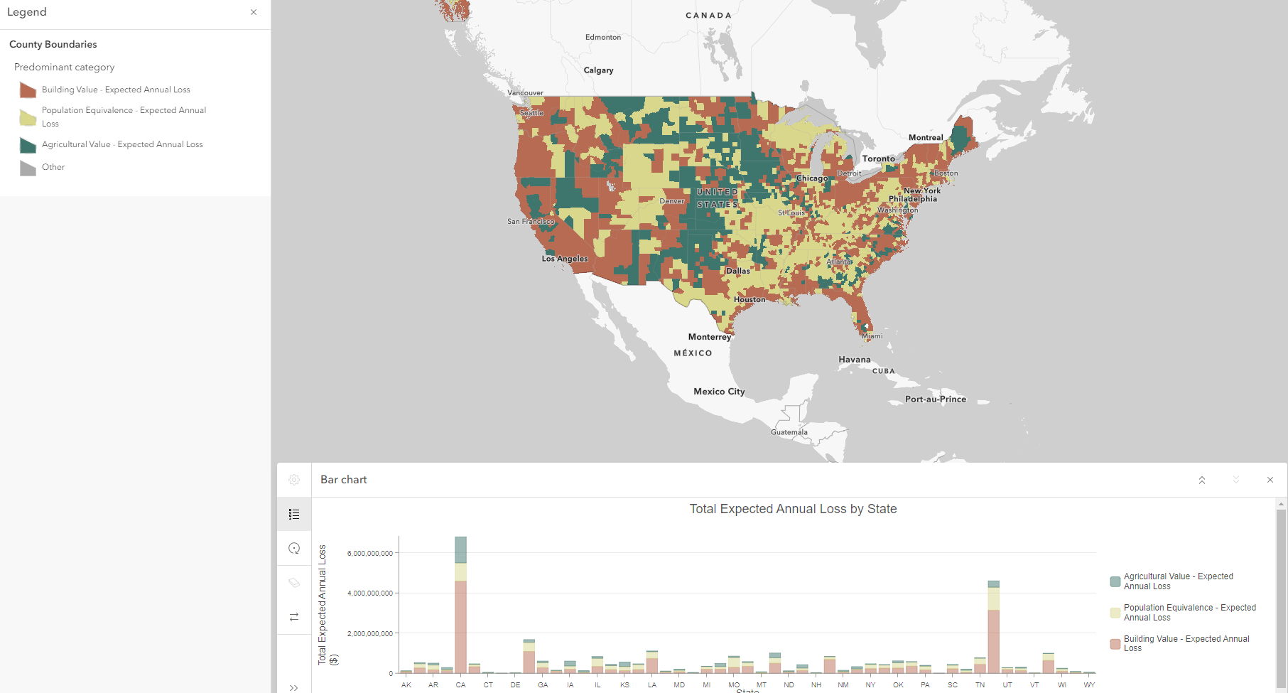
The stacked bar chart is best applied when you are interested in the totals for each of your categories but also want a sense of their series breakdown. Stacked bar charts, therefore, pair well with Types, Predominance, Dot Density, and Charts maps. Let’s see a pairing of stacked bar charts first with a predominance map.
The Predominance mapping style allows us to compare multiple attributes to determine the largest, or predominant, value in our dataset. By combining a stacked bar chart with a predominance style map, we can reinforce the predominant category in our map while simultaneously emphasizing the relative proportion of all attributes mapped. In this example, we have mapped the predominant expected annual loss due to natural hazards in the United States. We are comparing across three attributes, or categories:
Expected Annual loss of Building Value
Expected Annual Loss of Population Equivalence
Expected Annual Loss of Agricultural Value
We have mapped the predominant, or highest, expected annual loss due to natural hazards for each census tract and county for the United States. But let’s imbue it with more information using a stacked bar chart, and summarizing expected annual loss by state. Here we can reveal another geographic level of information, and see how prevalent each expected loss category is.
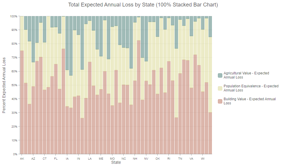
100% stacked bar charts
Best uses of 100% stacked bar charts are when you are only interested in visualizing part-to-whole relationships without absolute totals. We can use our map showing predominant expected annual loss due to natural hazards and reveal different relationships with a 100% stacked bar chart. Our values for each state now equal 100% revealing the relative percentage of total annual loss in dollars that each of our categories makes up. We can now compare evenly across and between all states. Patterns come to life such as: certain states relative to all others will experience drastically more agricultural value loss (such as Idaho or Iowa) or building value loss (New Jersey, Alaska and Hawaii).
Combining size with these mapping styles (Types and Size, Predominance and Size, Charts and Size) can make the connection between the map and the stacked bar chart even more clear.
Line charts work well with maps about time
Line charts allow you to visualize change of a continuous range, like time or distance. Using a line chart can allow you to see overall trends at once and compare multiple trends simultaneously. Continuous timeline and age maps help us answer questions like: How long ago did something happen? How has a value changed over time? When did an event occur? Which features are the oldest? Paired with a line chart, we can bolster our map and present secondary visualizations of patterns and trends over time.
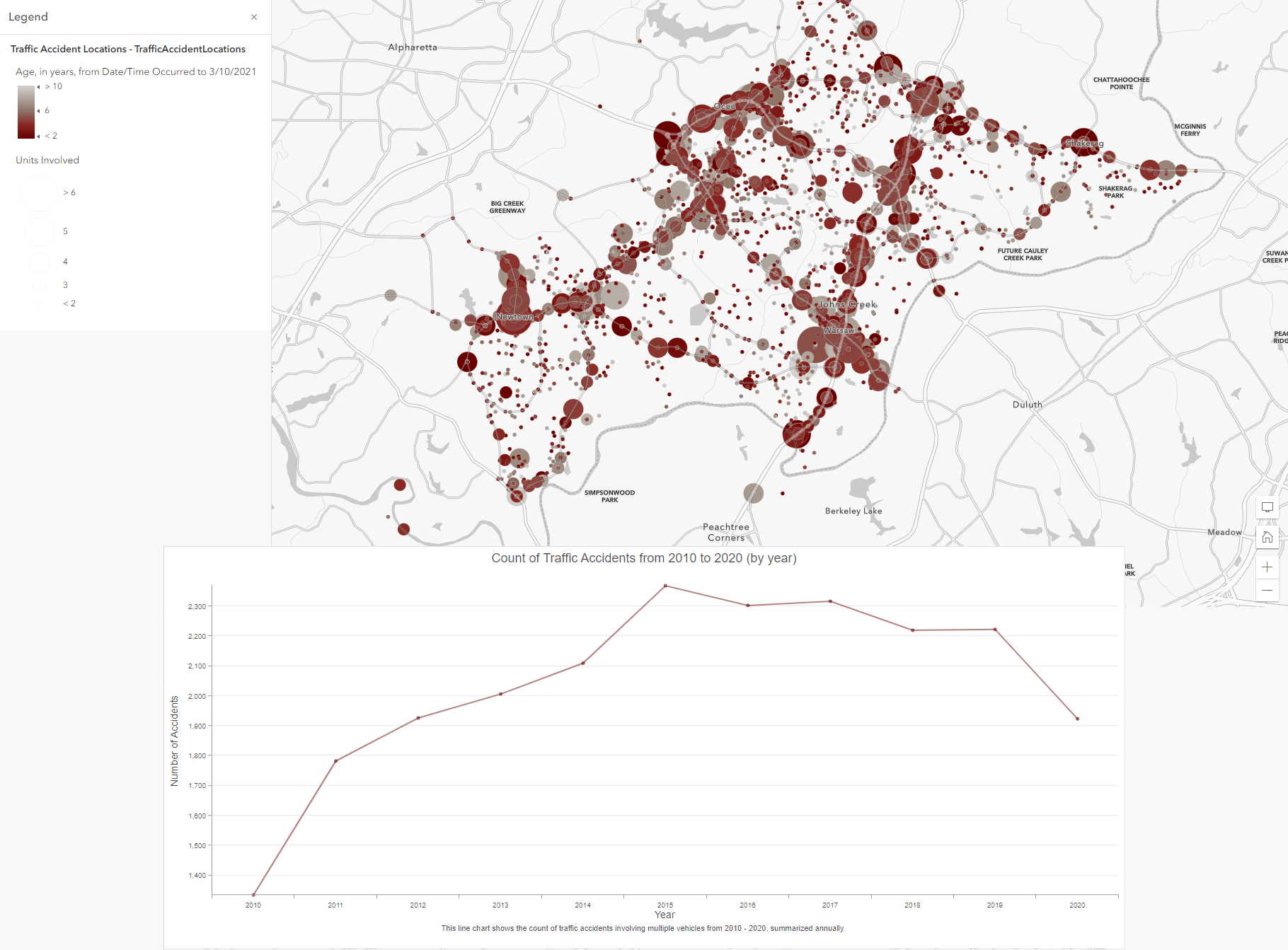
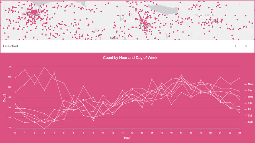
This map, created by our teammate Lisa Berry, shows traffic accidents involving multiple vehicles according to the year they occurred. The map visualizes the year the event occurred by color and the number of vehicles involved by size. We can therefore see where in space accidents have historically occurred, and where they currently happen.
Let’s add a line chart to bolster our visualization. The line chart summarizes the number of traffic accidents for each year represented on the map, tracking it in the line chart. By adding this, we can see the distribution of accidents over time and space in the map, and quantify the temporal trends of accidents for the entire time period. We have just boosted our own analysis of the dataset with this pairing of line charts and temporal maps.
Pie charts work well with maps of categorical data
Pie charts group your categorical data into slices, visualizing raw counts as simple-to-compare ratios. The pie chart represents the total (either a count or sum) of all your categories, each slice representing the proportion of a single category compared to the whole. We often map datasets with big numbers based on population or acreage that can feel rather abstract when looking at totals, especially when we want to compare to other categories in our data. Using pie charts to visualize your categories as proportions can help you understand the magnitude of each category relative to each other and to the total.
Pie charts work best with categorical data, and pair well with predominance, dot density, and charts maps.
Let’s take a look at a few examples.
Pie Chart + Predominance Maps
Let’s revisit our predominance map from before, looking at expected annual loss of building value, agricultural value, and population equivalence across the United States. By combining a pie chart with our predominance map, we can reinforce the biggest “slice” in the whole sum of categories, while also displaying the proportions of all attributes mapped.
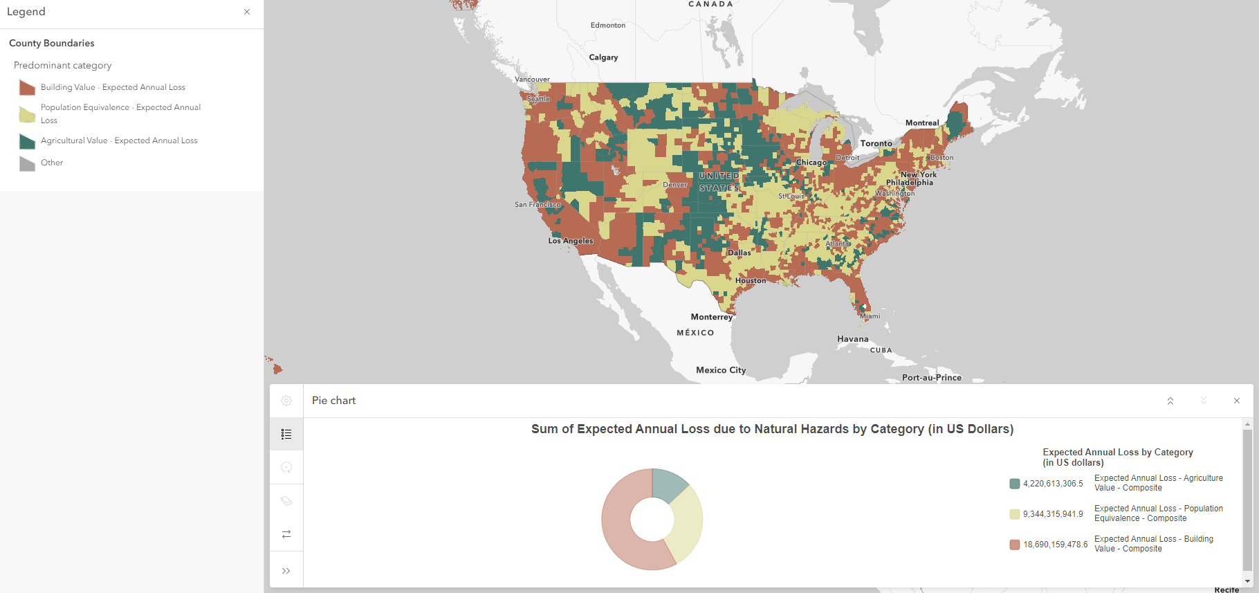
Adding a pie chart helps us see the relative predominance of each category compared to each other across the entire United States, while seeing the geographic variability of each expected annual loss category. The Midwest is overwhelmingly expected to experience highest losses in agricultural value, while much of the west coast is expected to experience highest losses in building value. These regional patterns are communicated via our map, but our pie chart shows us that nationally, building value is the highest expected annual loss overall.
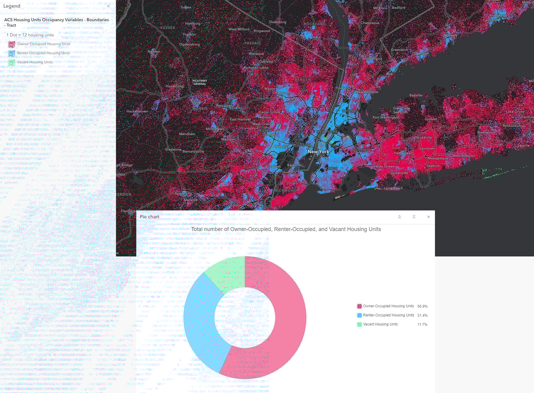
Pie Chart + Dot Density Maps
The Dot Density mapping style allows us to visualize numeric data based on the count of attributes. Instead of filling an entire polygon with homogenous shades, we can fairly and evenly represent counts across polygons using dot density visualization. Adding a Pie Chart can bolster our map by comparing the relative proportion of each attribute mapped. Let’s look at this map exploring the number of housing units that are renter-occupied, owner-occupied, or vacant. The dot density map shows the number of each category of housing unit across census tracts. Including a pie chart reinforces the pattern in the map, allowing us to easily draw conclusions about the total number of housing units occupied by owner, renter, or vacant.
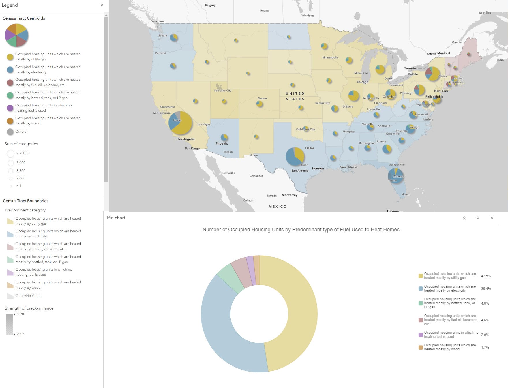
Pie Chart + Charts Map
The Charts mapping style allows us to visualize multiple numeric attributes as proportional chart symbols in our maps. Combined with the Pie Chart, we can easily see how each of our mapped categories compare to each other, and compare to national counts as expressed by our Pie Chart. Let’s look at this map, showing the predominant type of fuel used to heat homes across the country for county, state and country level geographies.
The charts mapping style shows the number homes heated by each type of fuel represented in the map. Using the Pie Chart, we can easily compare to national values, turning abstract numbers into easy-to-compare, illustrative visuals.
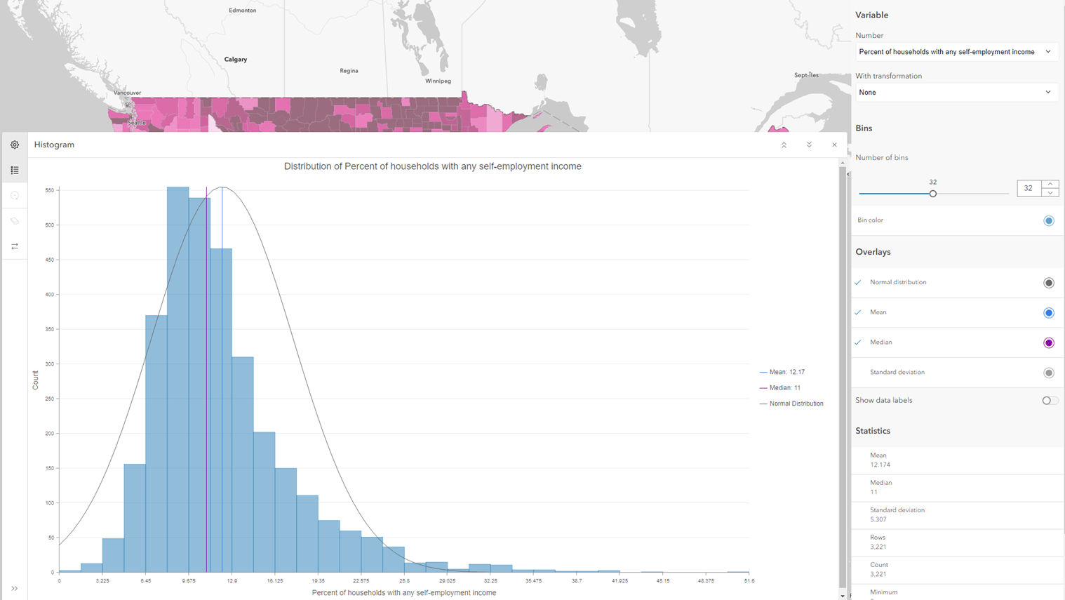
Histograms work well with maps that show distributions
With many of the chart and mapping styles above, there’s more than one attribute being visualized. Histograms are different in that they take one numeric attribute, and visualize the full distribution of values. Each and every value from the minimum to the maximum are all displayed. With the focus on only one attribute, Counts and Amounts (Color) and Counts and Amounts (Size) really are the go-to mapping styles.
For example, this map shows the percent of households with any self-employment income in the past 12 months:
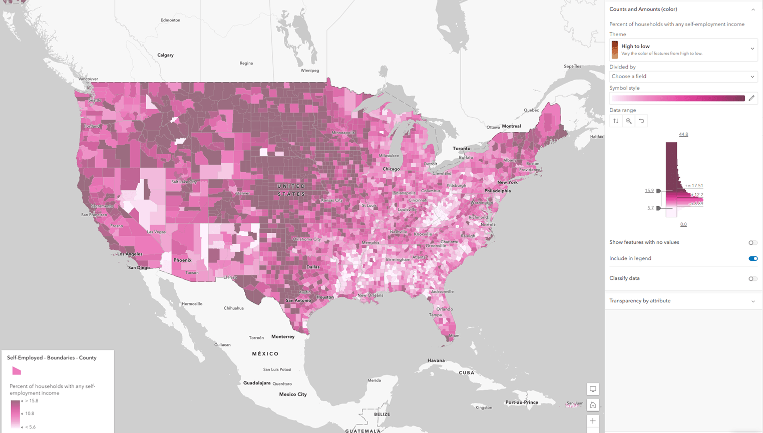
While the histogram in the symbology pane gives me a sense of the distribution, pairing it with a histogram chart can give me even further insights. I can adjust the number of bins, overlay a normal distribution, as well as some quick summary statistics, and more. If your distribution is skewed, it’s possible to do a mathematical transformation on your data’s distribution to stretch out the detail in the bottom tail. Just select either log or square root from the dropdown menu under With Transformation.
Scatter plot charts work well with maps displaying two attributes
Scatter plots chart two variables together using dots on a plane of coordinates, used to show the relationship between the two variables. For these two examples, we’ll use some homeownership attributes available from the American Community Survey layers in Living Atlas.
Scatter Plot Chart + Relationship Map
The Relationship mapping style symbolizes two normalized attributes together in one map. This style shows where both values are high, both are low, and more interestingly, where one is high and the other is low. This map shows burdensome housing costs for owners in green, burdensome housing costs for renters in purple, and burdensome housing costs for both in red.
The scatterplot displays those same two attributes in data space (rather than geographic space), so that we can see the mathematical nature of the relationship. Is the group of points forming an upward-sloping line, revealing a positive relationship between the two? A downward-sloping line, revealing an inverse relationship? Or even a non-linear relationship?
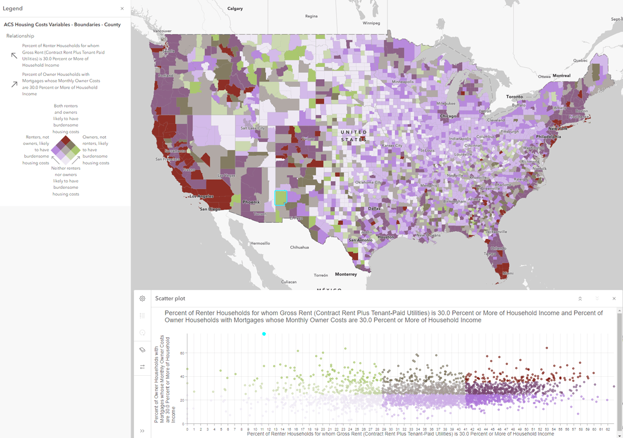
Another benefit about seeing the values in a chart rather than a map is that the outliers are very obvious. For example, this chart has a pretty clear outlier in the quadrant of owners, not renters, likely to have burdensome housing costs in bright green. We can then click on this point in the chart to reveal that it’s Catron County, NM when viewing the map.
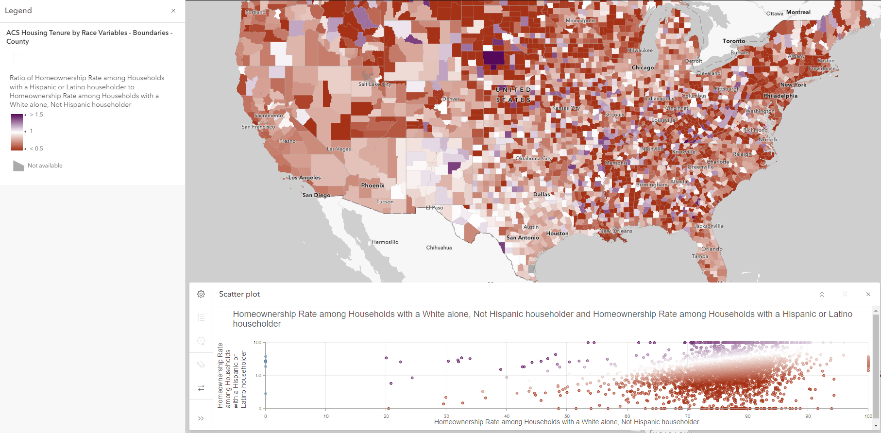
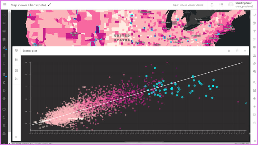
Scatter Plot Chart + Compare A to B Map
We’ll stay with the topic of homeownership and this time look at two different attributes: homeownership rates for Hispanic & Latino householders, and homeownership rates for non-Hispanic white householders. To map these two attributes in one map, we used the Compare A to B mapping style, which creates a ratio of the two values and centers a two-toned color ramp on the value of 1 (or 100, whichever you choose). We can see that ratio of 1 in the obvious y=x line in the scatter plot, which reinforces the story in these two attributes.
Charts help everyone
Charts help the map’s author/GIS analyst to understand the data they’re trying to map. Charts also help the map’s audience understand the overall story being communicated.
As the map author, you can format the look of your charts by customizing fonts, line types, colors, and more. Just as with maps, taking the time to make the data visualization shine will pay off here too. Presenting and sharing your map and chart in the Chart Viewer Instant App creates a polished viewing experience for your audience.
While there are principles about pairing styles of charts with styles of maps, they are only principles. Chefs, sommeliers, data analysts, and cartographers are all people who use both art and science. Sometimes a pairing that you wouldn’t expect just works. You never know until you try it.


Are box plots on the road map? R does these with ease. I am trying to convert the holdouts to Python but this is a major hurdle. They are great for seeing outliers.
I also need these charts in a polygon popup that charts the points found in that polygon. Edit spent a few hours coding the chart based on the blog article from Paul Barker. I got a chart finally using a Arcade element vs a chart element but no labels are supported. Not much use case for a pie chart with no labels. So close yet so far. Basically I want the clustering feature but I pick the boundaries.
thanks
Thanks Doug. I have passed this on to our Charts team. I too am a big fan of box plots.
Very helpful guidance!
Thanks Peter!