Demographic data helps us better understand the socioeconomic factors within our communities. We can learn more about the population, housing, jobs, poverty, and other features that can impact policy, logistics, and business decisions. Depending on your needs, there are various ways to find, access, and use demographic data using the power of mapping within ArcGIS. But sometimes knowing where to start can feel like a daunting task. With thousands of demographic attributes to choose from and hundreds of data layers to use in your maps, it can feel confusing how to properly use each nuanced attribute if you aren’t a trained demographer.
This blog provides a list of some of the most common questions asked when mapping demographic data within ArcGIS. Jump to a question to gain insight and resources so that you can start mapping demographic data more confidently within your GIS projects today!
Jump to a question:
General Questions
- How can I find and access demographics in ArcGIS?
- What is the difference between Esri Demographics, Census decennial data, and American Community Survey (ACS)?
- What does it cost to use demographic data?
- What does it mean to enrich data?
- What is the difference between current year and future projections in Esri Demographics?
- What is the difference between the 1-year and 5-year ACS estimates?
- Definitions – What is a Numerator? What is a Denominator?
- I want to calculate a percentage. How do I choose the proper denominator for the division?
- Is there a difference between a “null” value and a “0” value?
- What is the difference between a rate, a ratio, and a percent?
- What is the difference between percent change and percentage-point change over time?
- How can I better understand the race/ethnicity attributes when mapping?
- What is the difference between a housing unit and a household?
- What is the difference between household population and group quarters population?
- What are some resources and best practices for mapping with ethics?
- Do different levels of Census boundaries line up nicely? (Nested vs non-nested boundaries)
- How do I avoid bias in my data?
- I use an Enterprise implementation of ArcGIS behind our organization’s firewall (aka ArcGIS Enterprise). Do I get the same Living Atlas data at the same release times?
Leveraging Demographics in ArcGIS
- How can I use Living Atlas layers in ArcGIS online and ArcGIS Pro?
- How can I find the ACS attribute I need in Living Atlas?
- I found an ACS attribute that sounds interesting, and I may want to use it in my map. How do I learn more about that?
- How can I customize Living Atlas Census ACS layers for my needs?
- How can I use Esri Demographics Market Potential data?
- How can I better understand a collection of multiple demographic attributes, or create an indexed value using socioeconomic factors?
- How can I map topics related to equity?
- What are the best practices when mapping demographic data?
- I want to use American Community Survey (ACS) data, but I don’t understand the margins of error. How can I learn how to use and map this information?
- How do I calculate population statistics for my unique area of interest?
- I want to aggregate smaller geographies to a larger boundary. What is the best way to do this?
- Instead of aggregating, I want exact data, but can’t find it in the Living Atlas. Where can I find these?
How can I find and access demographics in ArcGIS?
Mapping demographic data helps us better understand our communities and the socioeconomic factors that impact our area the most. There are many ways to access and use demographics within the ArcGIS environment depending on how you need to use and share the information.
Within ArcGIS, you can access many data sources including Esri Demographics, International Data from Michael Bauer Research, country-specific National Statistical Organization data, and many others. Depending on your needs and resources, there are various options for accessing and using demographic data.
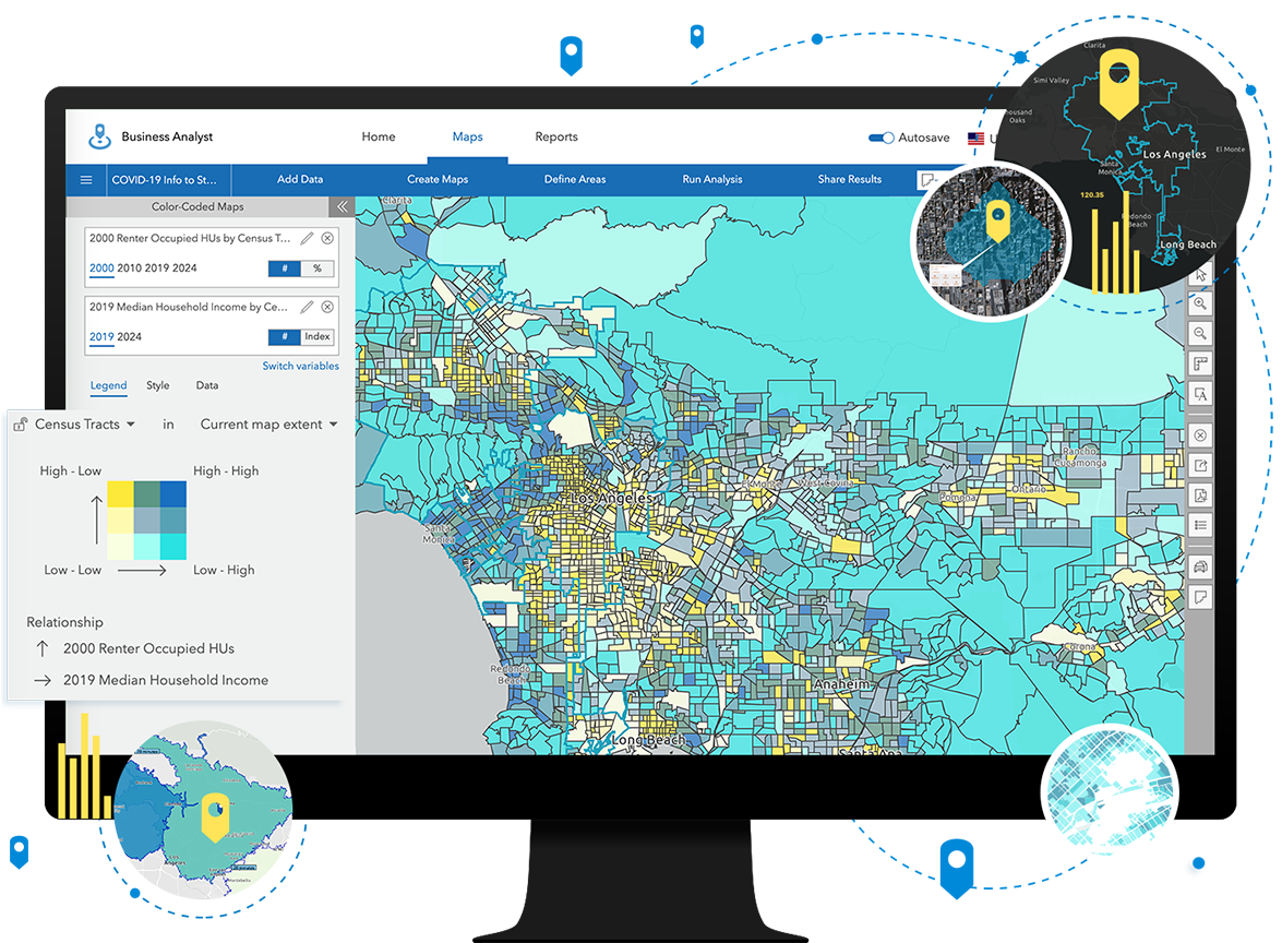
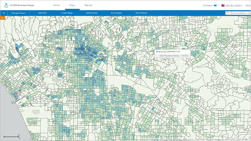
ArcGIS Business Analyst – provides an interactive experience for finding and using demographic data. Business Analyst demographic mapping software helps you identify under-performing markets, pinpoint the right growth sites, find where your target customers live, and share the analysis across your organization as accurate infographic reports and dynamic presentations. You can produce maps, analytics, infographics, and more. Access this powerful tool on the web, within a desktop product, mobile, and even an Enterprise deployment. For more information, click here.
Enrich any boundary – Using a custom boundary or a standard geography boundary layer from Living Atlas, you can apportion demographic data to your area of interest. This method of apportionment uses the underlying ArcGIS GeoEnrichment service, which can be used in ArcGIS Online, ArcGIS Pro, and even ArcGIS Insights. Look for the “Enrich Layer” tool to enrich your boundaries. Within the US, you’ll have access to Esri Updated Demographics whcih include current year estimates and 5-year projections, recent American Community Survey attributes, as well as lifestyle, spending and behavioral data. Globally, there are over 170 countries with data from Michael Bauer Research, local National Statistical Organizations, and other data providers. Click here for more information about the US available datasets, and here for an introduction to the international datasets. Visit this blog for a short tutorial within ArcGIS Online.
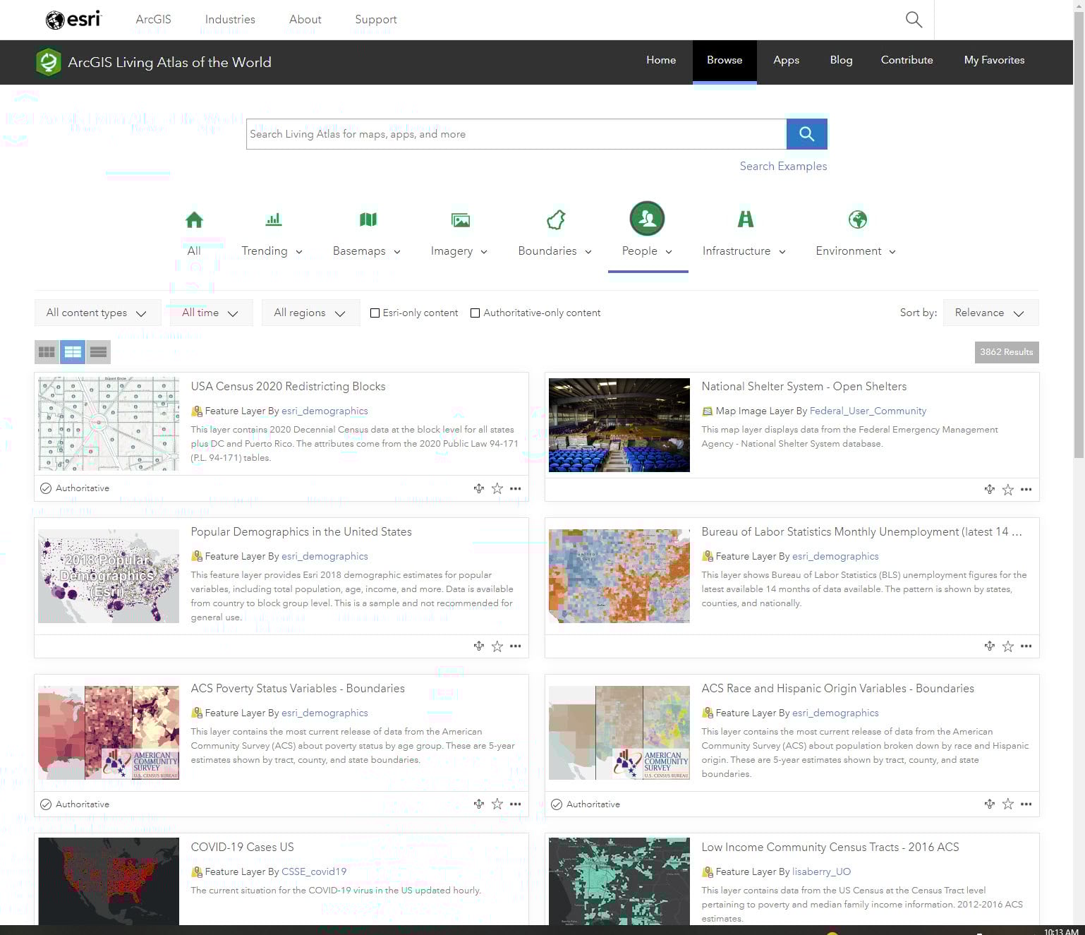
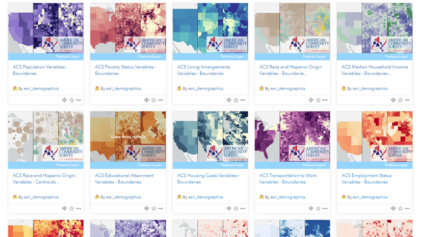
ArcGIS Living Atlas of the World – Find ready-to-use layers, web maps, and apps that can be customized and saved for your needs. Living Atlas contains demographic data from Esri Demographics, U.S. Census Bureau, American Community Survey (ACS), Centers for Disease Control and Prevention (CSC), the National Center for Education Statistics (NCES), and many other sources. For more information, browse the People category of Living Atlas.
Reports – In just a few clicks, you can get detailed demographic reports about locations in the US. For just $50, you can select attributes from the collection of 15,000+ available variables. Click here to learn more.
And More! – To learn more about the other places Esri Demographics can be accessed in ArcGIS, check out this list.
What is the difference between Esri Demographics, Census decennial data, and American Community Survey (ACS)?
Esri Updated Demographics
This is the data that fuels the Enrich Layer tools in ArcGIS Online and Pro, as it goes down to the block group level. Most Living Atlas layers with Esri Demographics data are considered premium content meaning they require a login and consume credits. Esri Updated Demographics represent the suite of annually updated U.S. demographic data that provides current-year and five-year forecasts for more than two thousand demographic and socioeconomic characteristics. Included are a host of tables covering key characteristics of the population, households, housing, age, race, income, and much more. Esri‘s Updated Demographics data consists of point estimates, representing July 1 of the current and forecast years. View Understanding Esri’s Updated Demographics portfolio to familiarize yourself with what’s included and how it’s updated.
Decennial Census
The Census Bureau is required to carry out a count of the entire population every 10 years in order to realign state apportionment and congressional districts. The decennial census only asks 10 questions, the basics as required by legislation related to voting. Decennial counts are open and free to use from Living Atlas, with both 2010 and 2020 data currently available.
American Community Survey (ACS)
In addition to the decennial census, the Census Bureau also surveys the population by taking a small sample every year. Everyone in the population has a chance to be in the sample: owners, renters, young and old, even those in group quarters. This survey has 44 questions, allowing for way more attributes than the decennial census. Due to the sampling, estimates from all surveys contain a margin of error. Census actually publishes that margin alongside their estimates. Data from the survey is used for $675 billion dollars’ worth of government spending, as it helps local officials, community leaders, and businesses understand their local population, economic, social, and housing characteristics. Living Atlas contains some of the most popular ACS estimates in a set of layers that go down to the tract level. These layers are open and free to use from Living Atlas and are always updated with the most current 5-year estimates. 2010-2014 data is also available for some estimates as well.
How can I use Living Atlas layers in ArcGIS Online and ArcGIS Pro?
There are a wide range of ready-to-use demographic layers within Living Atlas. These layers can be customized for your mapping purposes within ArcGIS Online and ArcGIS Pro by changing the symbology and saving the map to your organization. You can zoom to your area of interest, filter to your specific region, and change the symbology and pop-up to show a different attribute from the layer. To learn more about how to do this, visit this short blog explaining how to customize American Community Survey layers from Living Atlas.
If you find a layer within Living Atlas that is a “hosted feature layer”, you can also export this data or use it within analysis tools.

What does it cost to use demographic data?
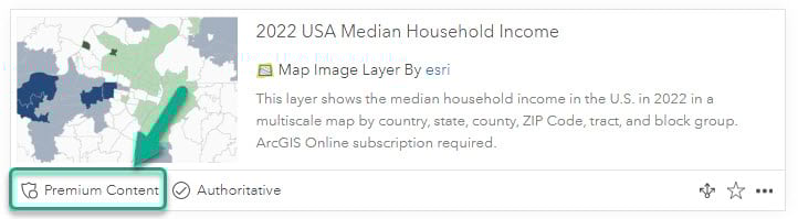
As part of your ArcGIS subscription, you have access to hundreds of maps, apps, layers in Living Atlas… many of which cover demographic data. Living Atlas items marked Subscriber require ArcGIS credentials but consume no credits. Items marked Premium require ArcGIS credentials and consume credits.
Learn more about the credits that are required for Business Analyst, enrichment, business search, infographics, reports, and other methods here. If you want to share a premium layer from Living Atlas, you’ll need to use one of the various methods for sharing premium content. Visit this blog to learn how to do this.
However, if you are accessing hosted feature layers within Living Atlas, most of these layers do not consume any credits and are free to use and share. Look for the item type “Feature Layer” (example in the question above).
What does it mean to enrich data?
You can use the Enrich Layer tool in ArcGIS Online or ArcGIS Pro to apportion demographic attributes to any set of polygon features. Search and add thousands of attributes to boundaries important for your analysis.
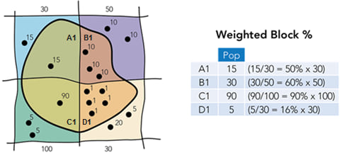
Choose the attributes that are meaningful for your work, and the data will use a weighted block apportionment method to allocate data values to that polygon.
This blog shows how to easily use enrichment in ArcGIS Online to make a demographics map.
What is the difference between current year and future projections in Esri Demographics?
Esri Demographics is a global collection of demographic data, encompassing over 170 countries and regions. There are thousands of demographic and socioeconomic attributes included in the Esri Demographics data suite. Attribute availability varies by country, with the United States containing over 15 thousand attributes and some small international countries containing five.
Current year and future projection data are included in Esri U.S. Demographic data. “Current year” data are demographic data current as of July 1st of the applicable year. So, 2022 U.S. estimates are current as of July 1, 2022.
“Future projections” are five-year projections for many variables within the Esri Demographics dataset. Projections are derived from current and past events and are updated annually alongside current year data. Visit this StoryMap for a full list of variables included in the latest future year projections.
Access a comprehensive list of methodologies for all countries included in Esri Demographics.
Read about the latest vintage update to Esri Demographics.
Read the frequently asked questions surrounding Esri Demographics.
What is the difference between the 1-year and 5-year ACS estimates?
Census publishes both 1-year and 5-year estimates, for example, there are both 2021 1-year estimates and 2017-2021 5-year estimates. A sample from only one year can provide us with high-level information for large places and counties. All estimates from ACS are really midpoints of a range, which is provided with the margin of error.
By pooling together 5 years of responses, Census is able to create smaller ranges (more reliable estimates) for those same estimates for large places and counties. It’s a tradeoff between recency and reliability.
Furthermore, by merging 5 years of responses, Census is able to create and publish estimates for smaller geographies such as tracts. The type of work that GIS Analysts do often necessitates smaller geographic resolution, hence the Living Atlas layers use the 5-year estimates.
For more guidance on when to use the 1-year vs. the 5-year estimates, see Census documentation.
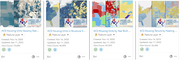
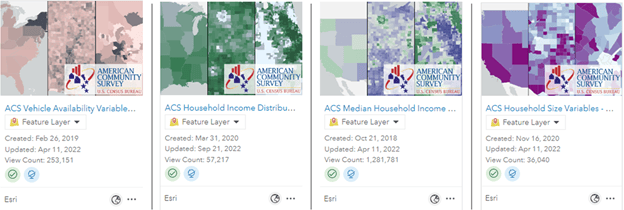
How can I find the ACS attribute I need in Living Atlas?
There are over 100 ready-to-use Census ACS layers available in Living Atlas, ready to be mapped. These layers require no credits and can immediately be used in your mapping projects with just a few clicks. These layers contain state, county, and tract values for the entire US plus Washington D.C. and Puerto Rico. These can be found from Living Atlas by adjusting the filter to find only layers, and use the search phrase “current year acs”.
These layers follow a naming pattern: ACS + topic + – Boundaries/Centroids. The topic can help you narrow down which layer might contain the attribute(s) you need for your mapping project. The Boundaries provide the TIGER boundaries, while the Centroids version provides the point centroid of each feature.
Once you find the layer topic you’re interested in, you can explore the fields in a few different ways. For example, this ACS Poverty Variables – Boundaries layer covers poverty topics, and the item page tells us that the layer contains values from the B17020 table, and I can see metadata about the vintage and where the data was downloaded from.
To see which attributes are included in the layer, go to the “Data” tab from the item page link, and choose “Fields” at the top of the page. Each field maintains its ACS table and position as the field name, but also has an alias name and long description, which brings the ACS metadata directly into the map-making experience.
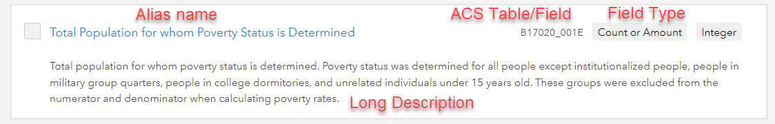
You can also see the alias name and long description when choosing a field in Map Viewer, and also within the Table view in ArcGIS Online.
I found an ACS attribute that sounds interesting, and I may want to use it within my map. How do I learn more about it?
When using demographic layers from Living Atlas, particularly the Census ACS 5-year estimates, it is important to understand the metadata for each field in order to effectively map and use the attributes.
Alias names and long descriptions within ArcGIS Online allow you to learn more about the metadata from each attribute. These are included in all American Community Survey (ACS) Living Atlas layers. See the question above to learn more about how to find and access the long descriptions for each attribute.
How can I customize Living Atlas Census ACS layers for my needs?
Once you find the layer and attribute you need from the Living Atlas Census ACS layers, you can easily customize the layer to your needs within ArcGIS Online or ArcGIS Pro. You can share, filter, symbolize, and use these layers within analysis.
For more inspiration and instructions for how to use these layers, visit this blog about making a map about your community or this blog about how to access the ACS layers.
Definitions – What is a Numerator? What is a Denominator?
When working with demographic data, we often come across numerators and denominators – but what are they? A numerator represents the number of parts out of the whole, which is the denominator. For example, we want to find the number or percentage of vacant housing units in a city. The numerator is housing units that are vacant. The denominator is all housing units – this means it includes all housing units regardless of occupancy/vacancy status.
When working with numerators and denominators, pay attention to the variables you are choosing. See the next question on choosing the proper denominator to help guide your calculations.
I want to calculate a percentage. How do I choose the proper denominator for the division?
The denominator in ACS data will either be individuals, households, or housing units. First ensure that both the numerator and denominator are keeping these consistent. If your numerator is a group of individuals (e.g. veterans), your denominator should be individuals as well. If your numerator is a group of housing units (e.g., vacant housing units), your denominator should be housing units as well.
However, it’s always best to fine-tune your denominator so that only those in the denominator have a chance to be in the numerator. That’s why many ACS estimates restrict the denominators to very specific groups. Let’s look at some examples:
Individuals age 16+ is the denominator for many of the attributes in the ACS Employment Status layers, since 16 is the youngest age that a person can legally work. Individuals age 15+ is the denominator in the ACS Marital Status layers since it is possible to marry at age 15 (under exceptional circumstances). This blog on making several nuanced maps from one layer mentions that changes to the denominator can change the question you’re answering. Fine-tuning the denominator like this helps us compare “apples to apples” when comparing state, county, or tract numbers, and be sure that the differences are not being driven by differences in age structure, sex ratio, or other population dynamics.
While restricting the age groups is a simple way that Census has fine-tuned the denominator, there are other more complex examples. Let’s look at three of the most specific denominators out there:
- “For whom poverty status is determined” is often the denominator for the percent of individuals in poverty. It’s because poverty status is not calculated for most people in group quarters nor for unrelated individuals under 15 years old (generally foster children).
- “Civilian noninstitutionalized population” is often the denominator for health insurance variables. This restricts the percentage to only considering civilians (not active duty service members), as well as those who are considered noninstitutionalized: household population as well as people in group quarters such as college dorms and shelters, where they’re able to come and go. Institutionalized group quarters have long-term care provided (by definition), so the concept of health insurance is very different. <link to group quarters question, below>
- “Population under 18 in households excluding householders, spouses, or unmarried partners” is the denominator for child living arrangements. If we unpack this, we see that it’s only children in households (no children living in group homes, residential schools, juvenile halls, or 17 year-olds living in college dorms). Additionally, it’s the population under 18 who are not “householders, spouses, or unmarried partners,” so it’s just population under 18 in households living as children (no 16 or 17 year-olds living with roommates, with their significant other, or by themselves).
The ACS layers in Living Atlas have lots of pre-calculated percentages baked into the layers, with the formulas exposed in the long field description. However, we recognize that we do not have every possible calculation. If you need to derive your own percentages, here are some best practices:
- See if you can use one of ours by subtracting from 100. For example, are you looking for the percentage of population age 5+ who speak a language other than English at home? Use one of calculated percentages available in our ACS Language Spoken at Home layers – Percent of population age 5+ who speak only English at home – and subtract it from 100. Then, as an additional check, add up the percentages for the appropriate categories and verify that it yields the same result.
- If trying to calculate age-specific rates or sex-specific rates (for poverty, disability, or other variables), this will involve adding two or more estimates together to get the denominator. Many of these layers have the estimate for the age group who are in the group of interest (those who are living in poverty, have a disability, etc.) and an estimate for the age group who are not in that group. Let’s look to the formulas in the long field descriptions of the calculated fields in our ACS Fertility in Past 12 Months by Age layers as an example. To get the age-specific fertility rate for 45 to 50 year-olds, we add females ages 45 to 50 who have had a birth in the past 12 months (B13016_009E) and those in the same age group who did not have a birth in the past 12 months (B13016_017E) to get the denominator for our final calculation:
B13016_009E / (B13016_009E + B13016_017E).
I see nulls for some percentages, why?
The percent is null (undefined) if the value for the denominator is zero. For example, percent of households with no internet in a tract that has no households will be null. The percentage is not applicable here. This is fundamentally different from a tract in which 0% of households have internet. This is a tract that has a number of households, and those households could benefit from investment, programs, or other policies that make it easier for households to get internet. Tracts that are major cemeteries, national parks, or other places with no households would not benefit from such investment because there are no households there in the first place.
If you know there’s population in a given tract, but the percentages are still null, this is most likely a tract with only group quarters population and you are looking at an estimate for households.
Is there a difference between a “null” value and a “0” value?
When looking at attributes you may see null and 0 values. These are not the same thing. A value of 0 reflects the possibility of that attribute to be present and have value in the given geographic area of interest, but currently that value is 0 or “not present”. We can think of a null value as “no data” or “not applicable.” This means that the attribute you are mapping is not applicable or does not exist in a particular geographic space. However, no data is still incredibly valuable data and can provide a lot of information.
Let’s take a concept as an example: number of households without access to a car in fire prone areas. In one fire prone area, we see a value of “0.” This means that all households have access to a vehicle (or 0 households do not have access to a vehicle). In another fire prone area, we see a value of “null.” This means that the question we are asking is not applicable. There are no households present, therefore no one without access to a vehicle and our question cannot be solved (this could be because the area is an agricultural field, or national forest land).
Why is this important? The difference is in the response or application of our question. The “null” areas may become lower priority for evacuation assistance since there isn’t the risk of people without access to cars trying to evacuate. The areas of “0” value may rank higher than this – while all households have access to a vehicle, there may be issues or intricacies with evacuations that might require resources from response units.
In short, don’t ignore your nulls! They represent entirely different information than a value of 0 and can help illuminate why certain patterns do or do not exist across geographic space.
What is the difference between a rate, ratio, and percent?
Rate: “X per 1,000” or “X per 100,000”
Rates are often used to measure prevalence, especially for indicators where a percentage would be too small. For example, infant mortality rates, HIV rates, number of doctors in a community, or other phenomena for which there’s fewer than 1 case per 100. Let’s consider infant mortality rates, which are expressed as X per 1,000. Many large hospitals see more than 1,000 births per year, think about how many more there are at the county or state level. In 2020, Colorado had an infant mortality rate of 4.8 per 1,000 live births. New Mexico had an infant mortality rate of 5.3 that same year (CDC). The decimal places might not seem like a big difference, but they allow us to express the detail in the magnitude of rare events when scaled up to population-level numbers. If Colorado had New Mexico’s infant mortality rate, the state would have seen 31 more infant deaths that year. However, both rates look like only half a percent when written as a percentage: 0.48% and 0.53%, both of which round to 0.5%. It’s better to communicate this as 4.8 per 1,000 and 5.3 per 1,000.
Ratio: “X:1″ or “X:100”
Ratios are often used to compare the relative size of two groups. The one ratio we include in the ACS layers in Living Atlas is the ratio of males to females in the Total Population layers. Because it’s defined as males:females, ratios above 100 indicate a larger male population, whereas ratios below 100 indicate a larger female population. For example, the sex-ratio in Alaska – a state with a sizeable military presence – was 109.2 males to 100 females in the 2016-2020 estimates, whereas the sex-ratio in Florida – a state with a sizeable elderly population – was 95.7 males to 100 females. Again, the decimal places make a difference when scaling up to state-level numbers, and when comparing with other states. For example, we can quickly see that Florida has a slightly more even sex-ratio than New Jersey does when comparing 95.7 to 95.5. While both round to 96 males, rounding can result in large differences when scaling up to a population. The larger that population is, the more risk of misinforming resource allocation.
Percent: Percentages are often used to express “part per hundred” where the hundred represents the denominator or total. Percentages over 100 do not make sense.
What is the difference between percent change and percentage-point change over time?
Let’s take a look at a headline from a real-life news story: “Child poverty, calculated by the Supplemental Poverty Measure (SPM), fell to its lowest recorded level in 2021, declining 46% from 9.7% in 2020 to 5.2% in 2021, according to U.S. Census Bureau data released today.”
This is a 46 percent decrease, since it was almost cut in half (which would be a 50% decrease). It is also a 4.5 percentage-point decrease, since it went from 9.7% to 5.2%, a difference of 4.5. Saying that this is a 4.5 percent change would be wrong.
A percent change can be over 100% if something increased more than double. But a percentage-point change can only be from 0 to 100.
How can I use Esri Demographics Market Potential data?
Esri Market Potential data provides insight into how people spend their time and money, what they value, and how these behaviors vary geographically. It is a US dataset that is updated every year to capture the latest changes in the marketplace and ever-evolving consumer patterns.
Market Potential variables are available throughout ArcGIS products – in ArcGIS Business Analyst, through ArcGIS GeoEnrichment Service, and in ArcGIS Online as premium content.
Additionally, here are more ways to access the data:
- Access ready-to-use maps through ArcGIS Living Atlas of the World.
- Buy Esri Reports online.
- For information about purchasing Esri Market Potential data as a stand-alone dataset, contact datasales@esri.com.
In the Business Analyst data browser, you can view Market Potential variables by clicking the Behaviors category (for behaviors) or the Psychographics category (for opinions and attitudes).
Visit this blog for more information.
Thanks to Gemma Goodale-Sussen for this valuable information!
How can I better understand a collection of multiple demographic attributes, or create an indexed value using socioeconomic factors?
Creating an index helps us visualize one or more attributes in relation to a guideline, threshold, or meaningful value. For example, many indices like the CDC’s Social Vulnerability Index normalize multiple factors into a single value in order to immediately assess the most at-risk communities across the US.
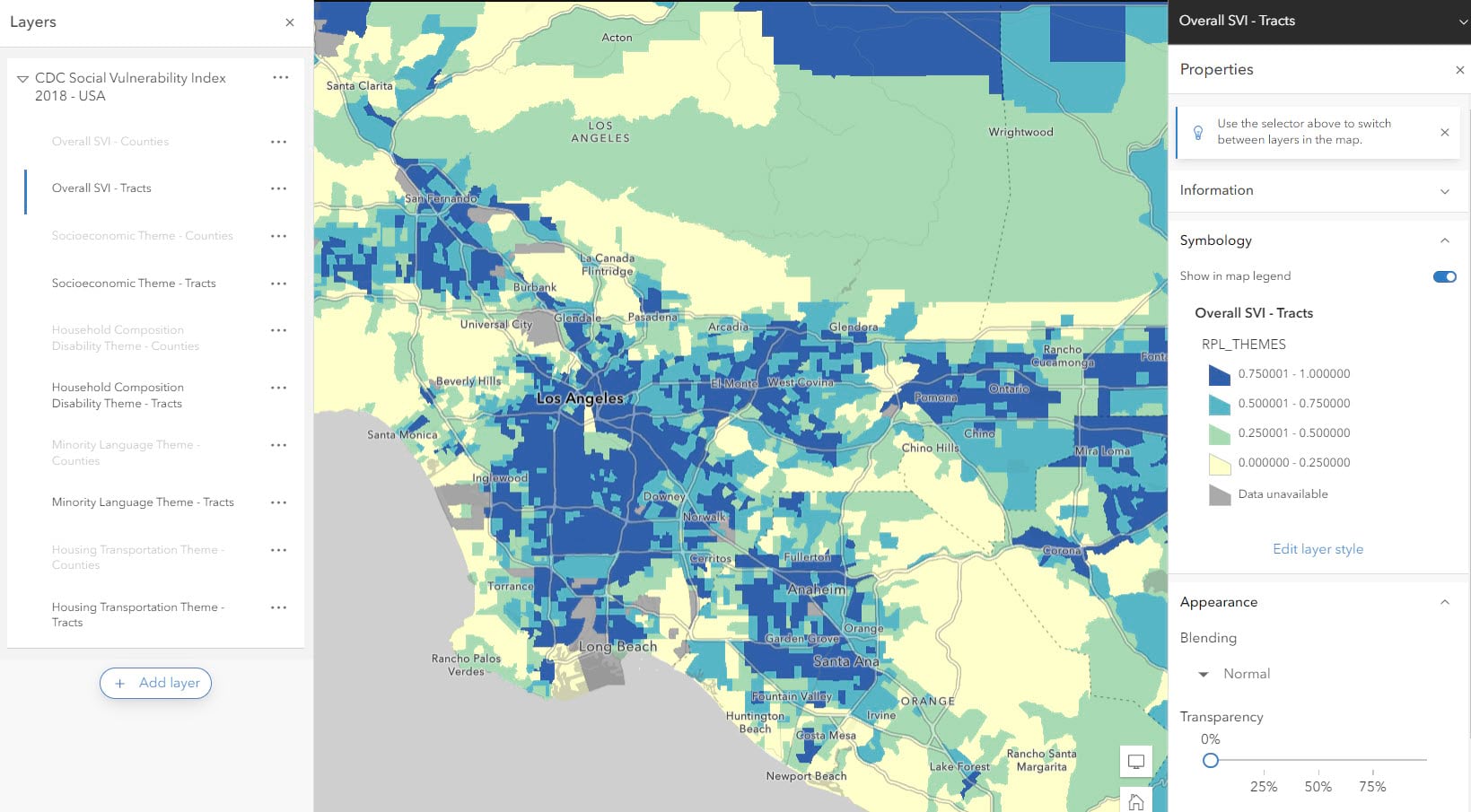
Index mapping can help us inform strategies with this use of multi-factor mapping. By visualizing and comparing demographic attributes against each other or a meaningful value like a national average, we can evaluate areas of need in a standardized method.
To learn how to create your own index, visit this blog that provides a ready-to-use template and workflow.
How can I map topics related to equity?
GIS is a powerful tool that can be leveraged to affect positive change and address inequities across communities. Esri has a host of resources that can help guide you through mapping topics related to equity and approach your mapping with ethical methodologies and understanding.
Esri’s Racial Equity GIS Hub is a resource created to help organizations and individuals address racial inequities. Resources included in the Racial Equity Hub include the Justice40 Atlas, an atlas of ready-to-use web maps focusing disadvantaged communities under the Justice40 Initiative Criteria, and ready-to-use data surrounding health, racial and economic equity data.
The Living Atlas of the World now contains gender identity and sexual orientation data for the nation, states, and the 15 largest metro areas. Read about the dataset here and access the feature layer on the Living Atlas.
The Esri Maps for Public Policy site hosts numerous layers, maps and applications that can help you map topics related to equity. Use resources on the Policy site to explore topics like broadband access, historic racial inequities using redlined neighborhood data, or map community health using current and historic County Health Rankings data.
Explore and utilize these resources to help you map equity in your area of interest.
How can I better understand the race/ethnicity attributes when mapping?
The data on race were derived from answers to the question on race that was asked of individuals in the United States. The Census Bureau collects racial data in accordance with guidelines provided by the U.S. Office of Management and Budget (OMB), and these data are based on self-identification. The racial categories included in census questionnaires generally reflect a social definition of race recognized in this country and not an attempt to define race biologically, anthropologically, or genetically. The categories represent a social-political construct designed for collecting data on the race and ethnicity of broad population groups in this country, and are not anthropologically or scientifically based. Learn more here.
Hispanic vs. Not Hispanic:
Hispanic origin is the heritage, nationality, lineage, or country of birth of a person, or a person’s parents or ancestors. People who identify as Hispanic, Latino, or Spanish may be any race. Some people who identify as Hispanic or Latino also identify with another racial identity.
Alone vs. Alone or in Combination:
People may choose to report more than one race group. For example, In our “ACS Specific Asian Groups” layers, you’ll notice a field called “Asian alone,” and another field called “Asian alone or in combination with one or more races” which includes individuals who identify as Asian as well as another group (American Indian and Alaska Native, Black or African American, Native Hawaiian or Other Pacific Islander, White, Other Race). Let’s explore some differences using the 2021 ACS 1-year estimates, going from the broadest group to the smallest group:
|
Group |
Count | Percent of U.S population |
Source Table |
| Asian alone or in combination with other races | 23,545,238 | 7.1% | B02011 |
| Asian alone | 19,157,288 | 5.8% | B02001 |
| Asian alone, not Hispanic or Latino | 18,889,050 | 5.7% | B03002 |
Which fields add up to total population?
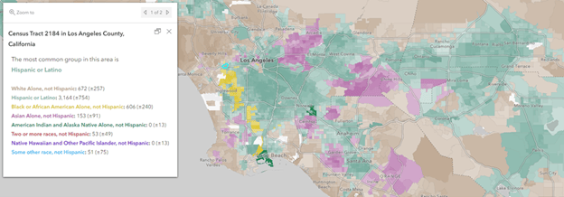
In order to add up to 100% and not more than 100%, the groups need to be mutually exclusive. That’s why you’ll notice groups with the words “Alone, Not Hispanic Latino” at the end of 7 of the 8 standard race/ethnic groups used in our ACS Race and Hispanic Origin layers and in our most common race/ethnicity web map.
- White Alone, not Hispanic or Latino
- Black or African American Alone, not Hispanic or Latino
- American Indian and Alaska Native Alone, not Hispanic or Latino
- Asian Alone, not Hispanic or Latino
- Native Hawaiian and Other Pacific Islander, not Hispanic or Latino
- Some other race, not Hispanic or Latino
- Two or more races, not Hispanic or Latino
- Hispanic or Latino
The published “Two or more races” group is tabulated by Census from those who check more than one box when responding to the survey (for example, white and American Indian, or Asian and Black). There is not an explicit option on the questionnaire called “Two or more races.”
What is the difference between a housing unit and a household?
The ACS only creates estimates for three entities: individuals, households, and housing units.
Housing units are the actual housing structures with walls and roofs that can be either occupied or vacant. This may be a house, an apartment, a mobile home, or rooms which have direct access from outside the building or through a common hall. Boats, recreational vehicles (RVs), vans, tents, railroad cars, and the like are included in the count of housing units only if they are occupied as someone’s current place of residence. Housing units have attributes such as vacancy status, structure type, year built, and heating fuel used.
A household is the group of people in an occupied housing unit. This means the number of households and the number of occupied housing units are the same (by definition) for any given geography. A household must have at least one person, but often has more. Groups of people living in the same housing unit take many forms: nuclear families with two married adults and children only make up a fraction of all households. Households also include groups of roommates, cohabiting partners, retired empty nesters, multigenerational households, widows/widowers, other individuals living alone, and more. Households have attributes such as vehicle availability, household income, and household size.
What is the difference between household population and group quarters population?
Even though “households” encompass a vast array of people, about 2.5% of the population do not live in households at all. They live in group quarters. Group quarters are places where people live or stay in a group-based living arrangement rather than a household. People in correctional facilities, nursing/assisted living facilities, military barracks, college dorms, juvenile group homes, juvenile residential schools, emergency or transitional shelters, farm workers’ camps, and many more all make up the group quarters population. For a detailed list of various types of group quarters populations, see Census doc on group quarters definitions. In some census tracts, the group quarters population can be a large portion of the overall population, such as those that contain a university campus, a military base, or a prison.
There are two general guidelines used when classifying a dwelling place as group quarters:
- People living here are often not related to each other
- The place is often managed by the organization providing the housing
For most attributes, the group quarters population is included in estimates of individuals (median age, educational attainment, marital status, race/ethnicity). The group quarters population is not included in estimates of households (internet, vehicle availability, housing cost burden).
Census also makes a distinction between “institutionalized” group quarters such as nursing/assisted living facilities and correctional facilities, vs. “noninstitutionalized” group quarters such as college dorms and shelters. In institutionalized group quarters, there is long-term care provided. In noninstitutionalized group quarters, no long-term care is provided, and residents can generally leave the building during the day.
What are some resources and best practices for mapping with ethics?
As mapmakers, our work is often viewed as a reliable, authoritative source of information. We therefore have a responsibility to approach our analyses and our presentation of spatial, and especially demographic, information with ethical considerations. Using honest, open, and sound methodologies can guide us through ethical approaches to mapping.
Here are some resources to help guide through the process of mapping, ensuring you are making the right decisions to provide valuable information and minimize harm.
Racial Equity Hub: https://www.esri.com/en-us/racial-equity/overview
Advancing Ethics in Mapmaking: https://www.esri.com/about/newsroom/arcnews/advancing-ethics-in-mapmaking/
Ethics in mapping: https://www.esri.com/arcgis-blog/products/arcgis-pro/mapping/ethics-in-mapping/
The Mapmaker’s Mantra: https://www.esri.com/arcgis-blog/products/arcgis-online/mapping/mapmakers-mantra/
Ethical considerations for surveys: https://www.esri.com/arcgis-blog/products/survey123/constituent-engagement/ethics/
What are the best practices when mapping demographic data?
There are many ways to map socioeconomic factors to help communicate key narratives from the data. A few tips/suggestions when mapping demographics:
Counts = Size: Mapping a count? For example, if I want to know where there are high counts of Hispanic or Latino populations by county in the US, I would use a proportional size symbol to show this:
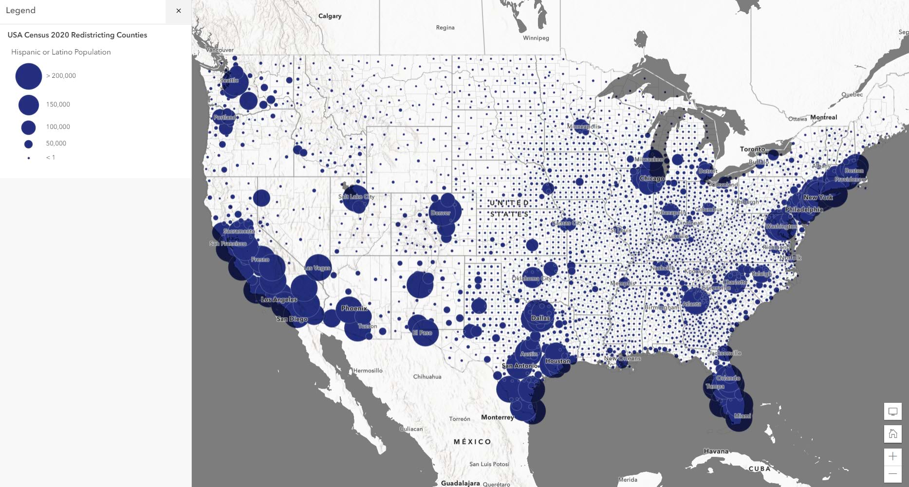
When mapping the count of a population, it is best practice to use a size symbol to represent this quantity. This allows you to see where the largest groupings of that population type are.
Click here for more information about how to map a count attribute with size.
Normalized attribute = Color: Are you mapping a percent, index or ratio? Thematic coloring is the way to go. For example, if you want to visualize the percent of total population who are Hispanic or Latino, color is a more appropriate method than size:
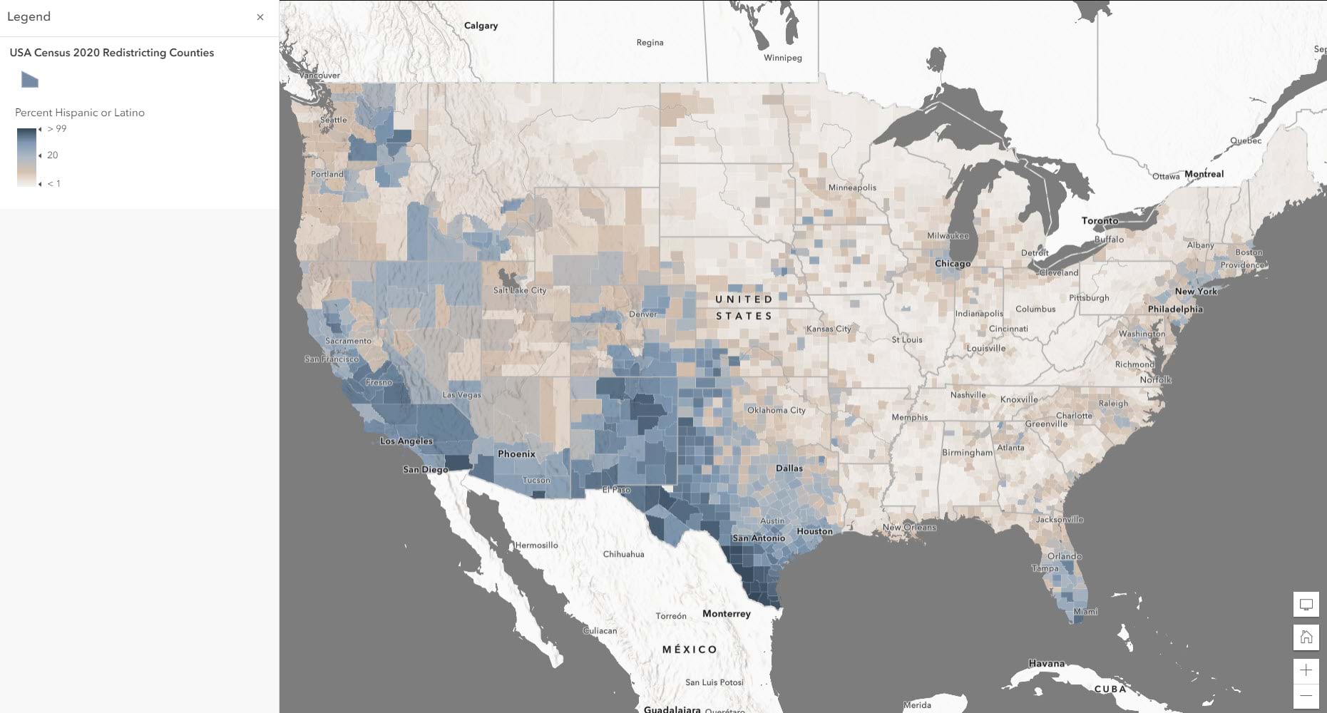
When mapping a normalized attribute, it is best practice to use a choropleth polygon fill for your thematic map. This allows you to visualize the density more clearly.
Click here for more information about how to map a count attribute with color.
Percent + count = Color & Size: If you want to reinforce a topic, use the percentage for the color and then use the denominator as the size attribute. For example, you can show both the count of Hispanic or Latino population alongside the percentage of total population who are Hispanic or Latino to combine the two maps above into a single map:
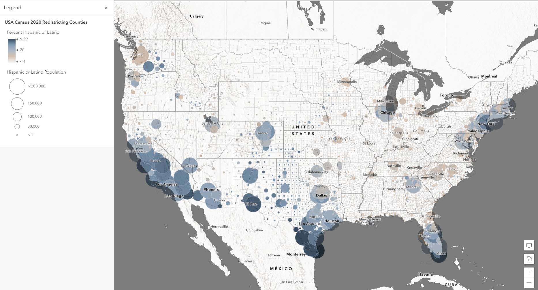
By combining both a percentage and count of a related topic, we can visualize not only the overall quantity, but also the overall density. This technique allows us to combine two maps into a single map.
Click here for more information about how to map a count attribute with color and size.
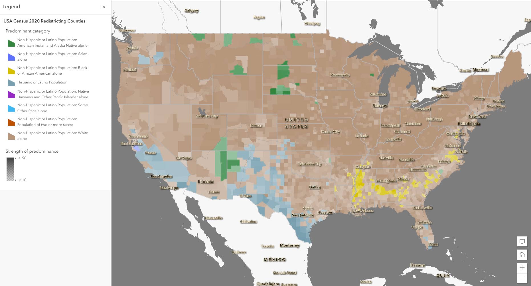
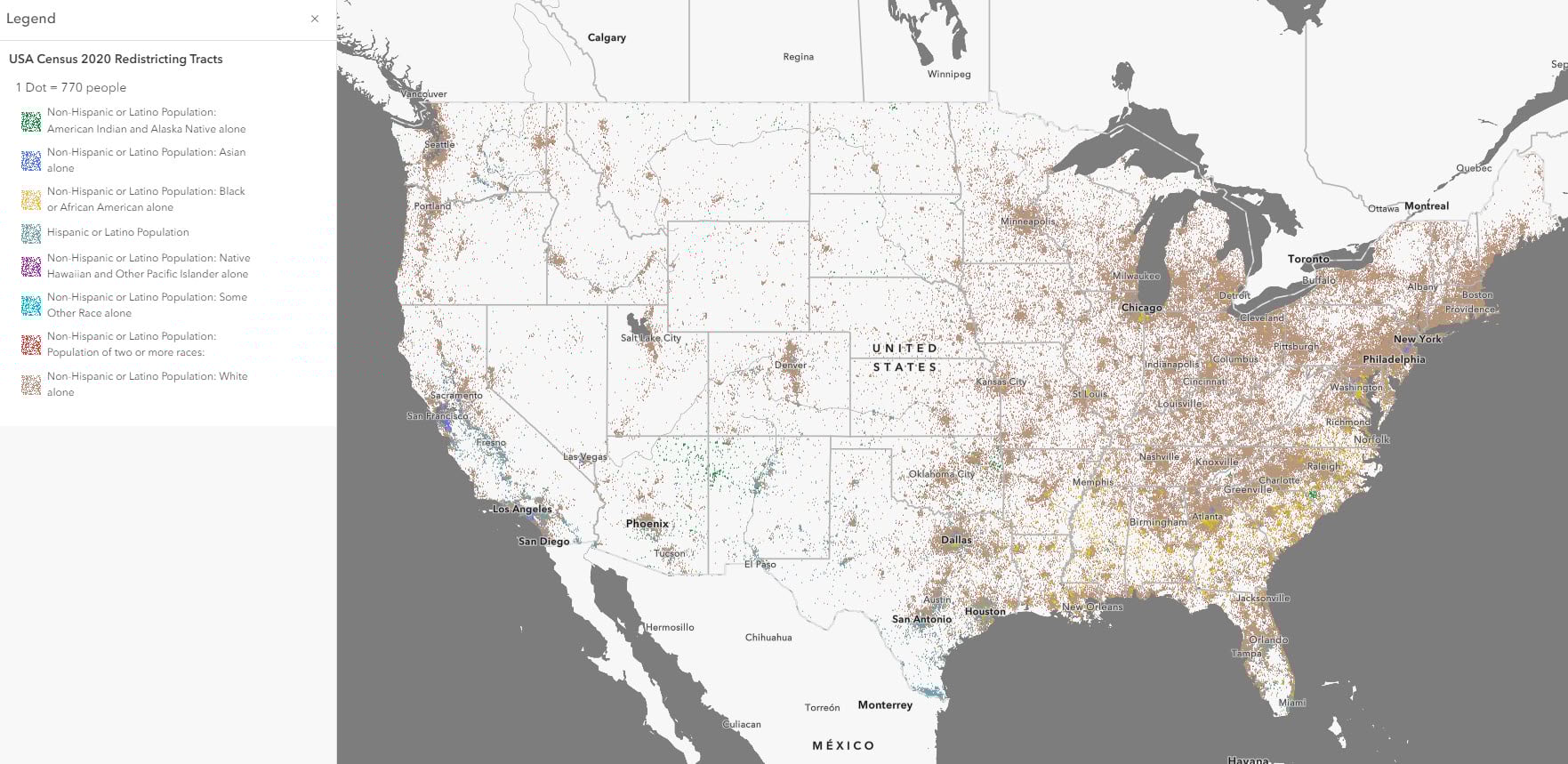
Compare multiple counts = Dot Density/Predominance/Charts: When you are mapping attributes that fall under the same universe, you can use these techniques as different comparison methods.
Predominance (which value is the largest?) For example, if you want to see which race or ethnicity is most common within an area, you can use a predominance mapping style to see which one is most prevalent:
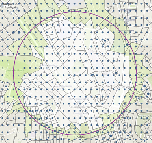
Dot Density: (where are the values the most dense/least dense?) For example, if you want to see the overall density of population by the different race/ethnicity groups, dot density visualizes the data as points within each feature:
Charts or Charts and Size: (what is the distribution of the different data values?) If you wanted to instead see the overall breakdown of each race/ethnicity group, the Charts and Size method lets you visualize the breakdown within a pie chart symbol, and you can use the size to show overall count:
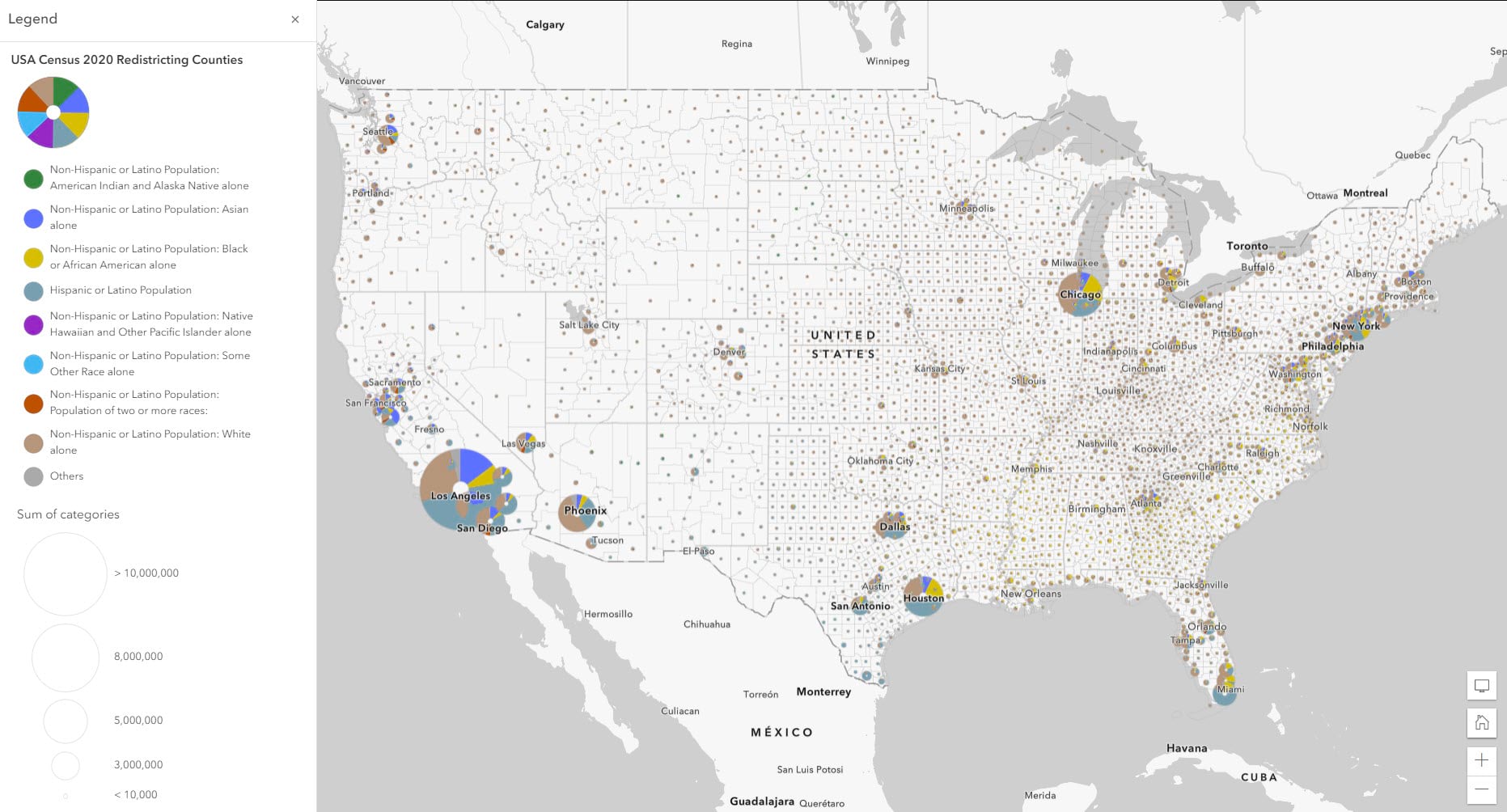
You can also use the charts method without the size component if you have trouble getting the symbols to tell a clear story.
All three of these maps are valid, and they all communicate a different story about the data. Easily swap between the different styles to see which one works best for your needs.
To learn more about these mapping styles and how to apply them:
Compare multiple normalized attributes = Relationship: If you want to compare two normalized attributes to see where their patterns converge or diverge, you can explore these visual patterns using a bivariate method called a relationship map. For example, if you want to see where the patterns exist for both the Black or African American Populations and the Hispanic or Latino populations, you could use a relationship map to visualize both patterns at once:
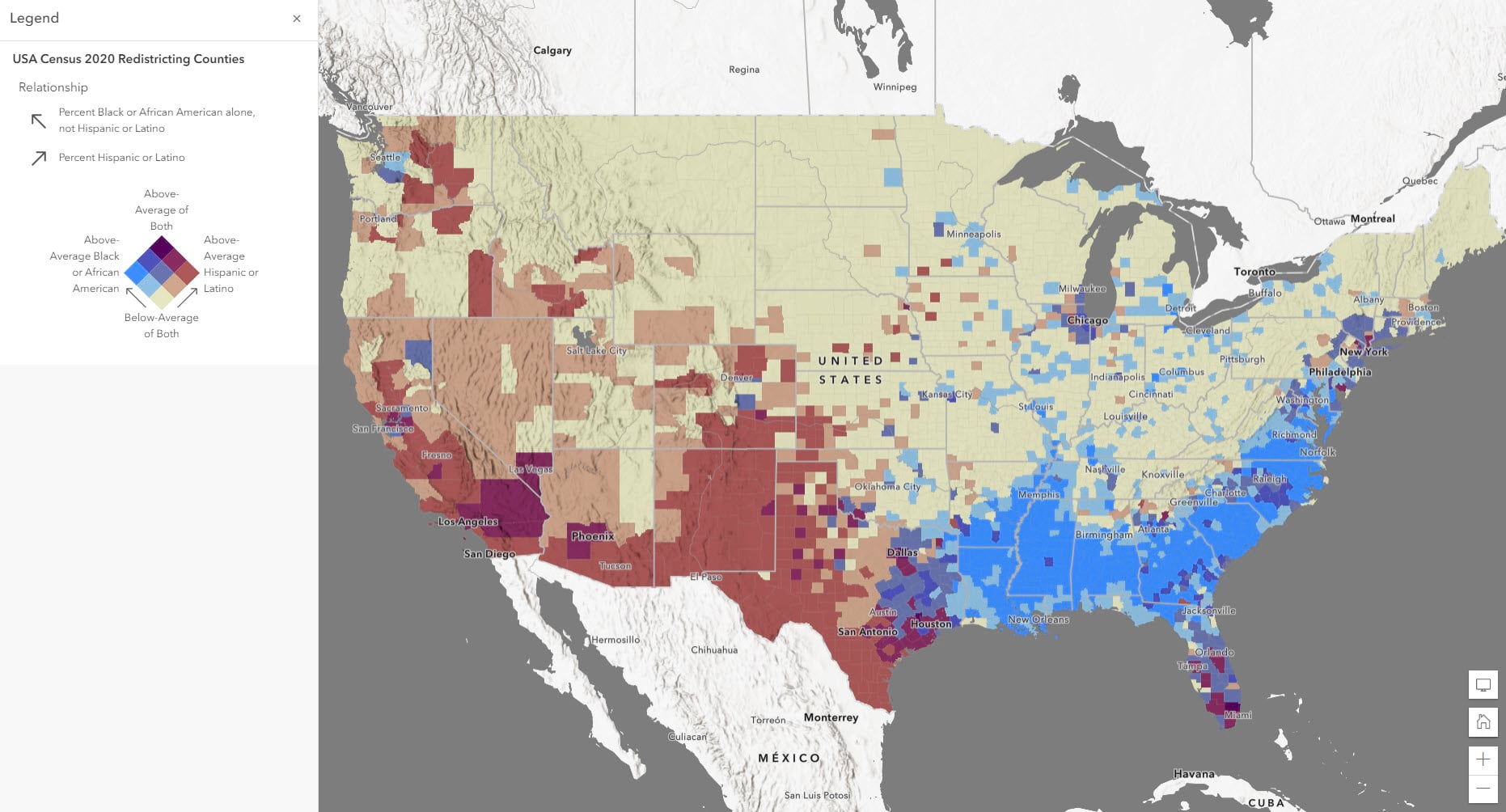
Click here to learn more about how to apply the relationship mapping style to your maps.
I want to use American Community Survey (ACS) data, but I don’t understand the margins of error. How can I learn how to use and map this information?
Since the American Community Survey (ACS) surveys the population by taking a sample, the estimates from the U.S. Census Bureau contain some level of error, known as the margin of error (MOE). For each estimate, there is an associated MOE, which helps us understand if the estimate is reliable. These can be useful to include when mapping surveyed data such as ACS.
The American Community Survey (ACS) from the U.S. Census Bureau offers a margin of error for the data estimates they provide. This tells those who are using the data that the estimate is not an exact figure, but rather a range of possible values. The MOE helps us figure out that range. For example, if the estimate for a certain group of people for an area is 361 people, there will be an associated margin of error for that estimate. If the MOE is 158, the true number of people in that group there falls somewhere between 203 and 519.
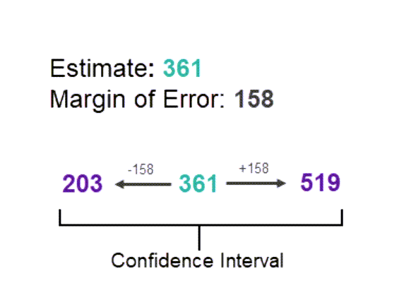
This range of values is known as the “confidence interval” and tells us that the Census Bureau is 90% confident that the count of population is between the upper and lower values.
These are just a few examples of the many factors that can impact the reliability of our data. The fact that these errors exist and can come from so many places are why it is important to effectively communicate margins of error to our map audience. Your map reader could see a map and assume that the numbers are exact, when in fact they have sampling error. Being transparent about margins of error creates accountability for both the map’s creator and those making decisions from the data.
Margins of error can be communicated through your symbology, pop-ups, and labels with various methods to communicate the reliability of the data.
For more information about mapping, using, and understanding Margins of Error, visit this Learn path.
How do I calculate population statistics for my unique area of interest?
You can quickly aggregate population data to unique boundaries, such as school districts or wildfire hazard areas, using Arcade and American Community Survey data in Living Atlas. Aggregating demographic information to your area of interest can imbue demographic details that answer questions like, “Who is disproportionately at risk?” “How many children do not have internet at home in this school district?” or “How many people have been impacted by a flood event?”
Aggregating socioeconomic or other information using arcade is valuable as it happens on-the-fly. If your boundary or your underlying data changes, your aggregation stays up to date.
Keep in mind that when aggregating, you are presenting approximations, not exact numbers. This method is therefore great for quick estimates and summarizations – or a snapshot of what conditions may look like in each area. Be sure to express this distinction in your map and pop-ups with appropriate language.
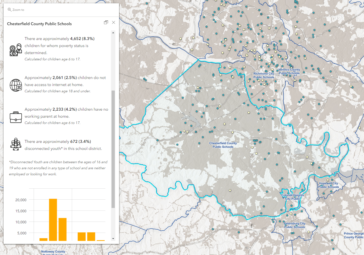
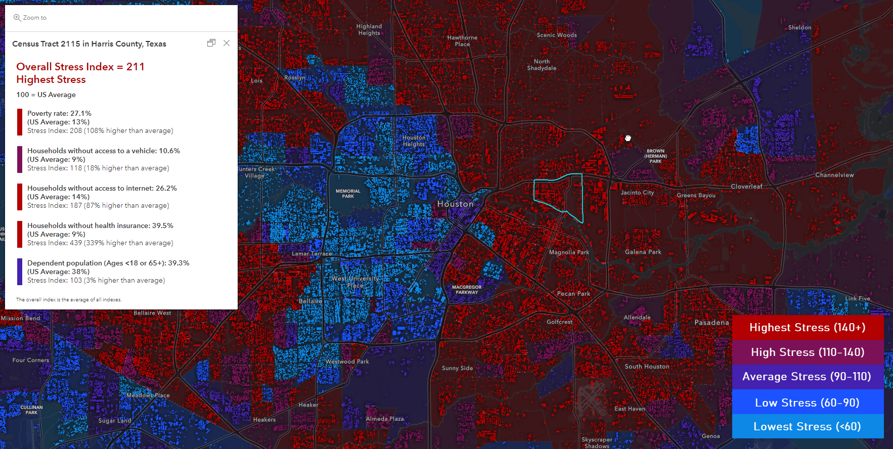
This application aggregates socioeconomic information to school district boundaries across the United States. See the underlying web map and open the pop-up expressions to view how the information was aggregated through Arcade.
P.S. This map pulls in socioeconomic information from layers that are not present in the web map. Check out this blog to see how this is done.
Things of note:
- When aggregating, use functions like Sum() to quickly aggregate values
- When calculating a percent, use Sum() and then calculate the percent at the end. If you use percentage fields, you will get an incorrect number.
- Report values as “estimates” and “approximations”
- Include a population-weighted example
- Geometry functions are scale based, meaning you are yielding results only as precise as the view scale. Your results may differ at each view scale. Read more about scale dependency with geometry functions here.
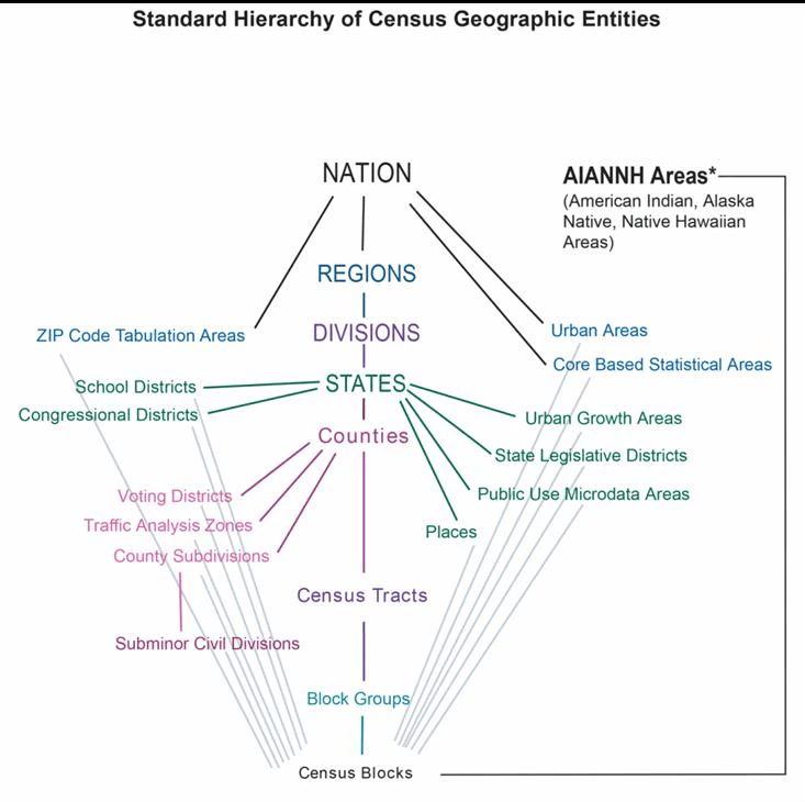
Do different levels of Census boundaries line up nicely? (Nested vs Non-Nested boundaries)
When working with demographic information, pay attention to whether your boundaries line up nicely in space. Nested boundaries, or those that line up nicely, are those that fall precisely within a larger, parent boundary. Non-nested boundaries do not fall precisely within a larger, parent boundary. Understanding the geographic relationship between your boundaries is key to your understanding and analysis. Let’s look at Census data for an example.
Nested boundaries: Block groups must fall within their corresponding census tract. Census tracts must fall within their corresponding county, and counties must fall within their state. Therefore, all block groups must fall within their corresponding county and state.
Reference this article to read more about nested boundaries and geographic relationships when using census data.
Non-nested boundaries: non-nested boundaries are those that do not line up nicely and can change your analysis. For example, say you want to get a count of population within a school district. School district boundaries must fall within a state, and districts may cross county and census tract boundaries. If you select all census tracts that cross or are within a school district boundary and summarize the population, you could get an inaccurate number if one of your census tracts just barely touches the district boundary but isn’t included within.
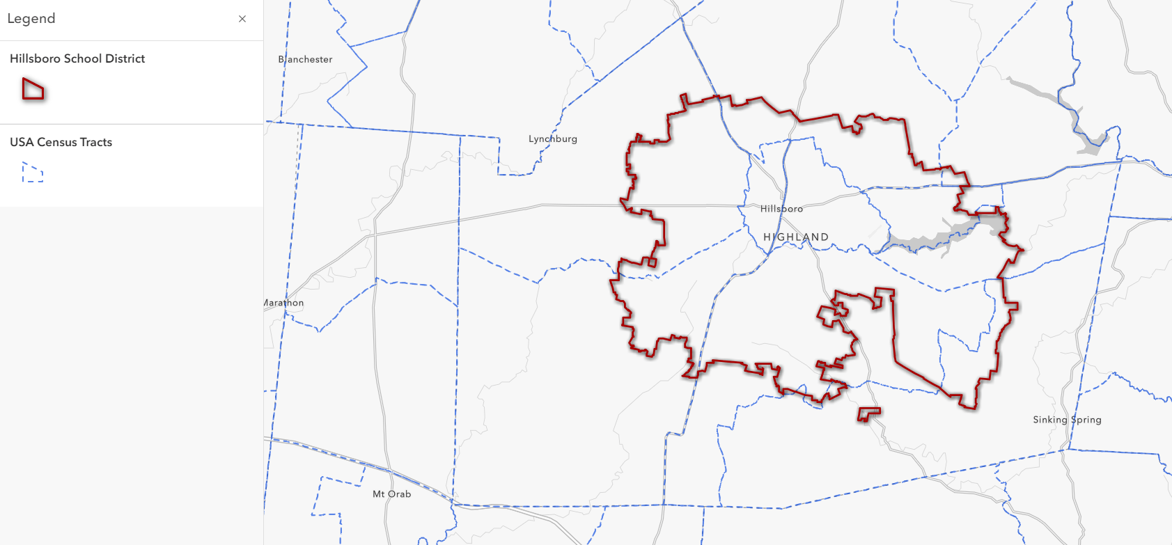
The school district boundary in red has many different census tracts that fall within and outside of its boundary. If we were to pull the population from all these census tracts, we would have an over-inflated number. This census tract here barely crosses the boundary of the school district, so it wouldn’t make sense to say that tract’s entire population is represented inside the school district.
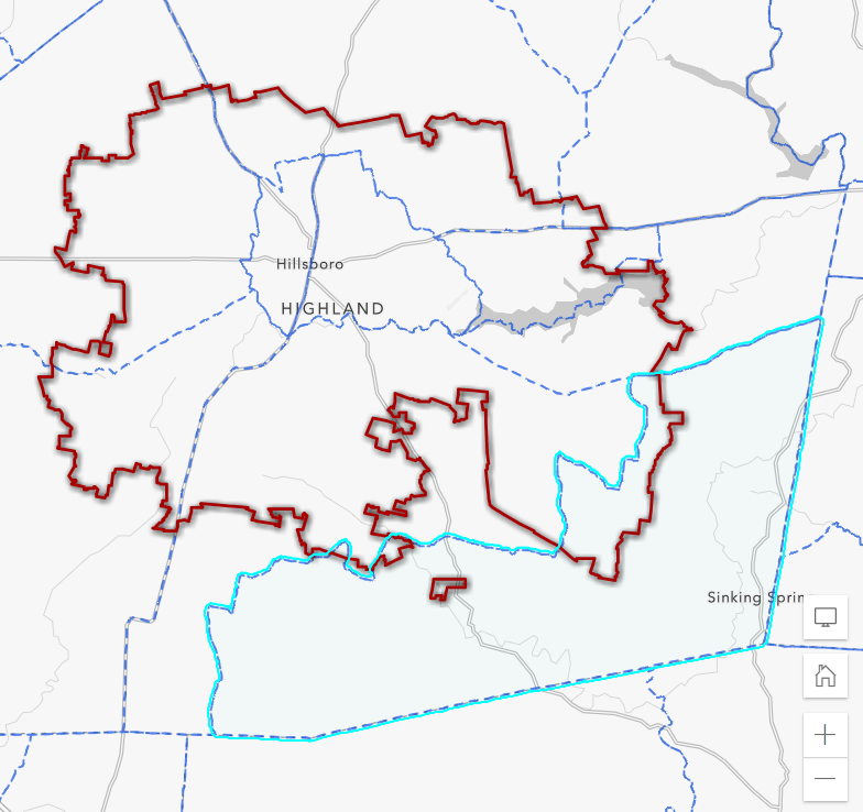
Check your boundaries for nesting or non-nesting fit and adjust your approach accordingly. See this question to aggregate with non-nested boundaries.
I want to aggregate smaller geographies to a larger boundary. What is the best way to do this?
When aggregating, make sure you are using centroids of your aggregated layers to ensure you capture all census tracts or blocks centroids that fall within your given area of interest. Using boundary layers puts you at risk for double counts, or incorrect estimates if your boundaries barely touch an area of interest.
Use Within() or Contains() in your arcade statements to capture centroids within your area of interest. If you only have boundaries, convert them to centroids in your arcade statement before summarizing.

Instead of aggregating, I want exact data, but I can’t find it in Living Atlas. Where can I find these?
If you find yourself aggregating up to approximate school districts, places, metro areas, or other geography levels that Census publishes estimates for, it’s best practice to use the official estimates available on data.census.gov rather than to aggregate up and approximate them. These official estimates will not only be true to the boundaries, they will also have smaller margins of error since Census actually calculates these using each response, rather than aggregating up from estimates for tracts or block groups.
How do I avoid bias in my data?
You can only limit bias, you can never eliminate it completely. Pay attention to the variables you are choosing to drive your analysis. Are you selecting only those variables that will falsely inflate numbers or those that will support your hypothesis? Are you looking for answers you expect or hope to find when interpreting your analysis? If so, you could be adding bias (whether intentionally or unintentionally) to your work.
If you expect to discover certain results when analyzing your data, then you will find specific examples to prove those expected results. You may end up emphasizing certain data that supports your perceived results, or mask data that negates your perceived results. Choosing certain variables that you know will support your hypothesis skews your outcome to work positively in your favor. All of this can happen without you realizing you’re doing it, making it crucial to pay attention to your decision making.
Keep an open, exploration-based mindset when interpreting your data and try to discover patterns rather than confirm what you already have guessed. Be aware that bias is present and seek to limit its presence.
I use an Enterprise implementation of ArcGIS behind our organization’s firewall (aka ArcGIS Enterprise). Do I get the same Living Atlas data at the same release times?
ArcGIS Living Atlas content is hosted on ArcGIS Online, but your portal administrator can configure the portal to access a subset of these ArcGIS Living Atlas items. Because you are accessing content outside the portal, the life cycle of that content and the details associated with it are not completely tied to the ArcGIS Enterprise release cycle or Living Atlas release cycles. Each version of ArcGIS Enterprise contains a fixed subset of ArcGIS Living Atlas items that reference content in ArcGIS Online. If the data in a specific item changes, you see those data changes when you access the portal item. However, you will not see changes to the item details, and that includes information about the item’s life cycle. To see the latest changes, including new and updated ArcGIS Living Atlas content when you upgrade the portal.
Resources
American Community Survey Hosted Feature Layers FAQ
Your Arcade Questions Answered – FAQ Blog
Esri Demographics Glossary of Essential Vocabulary
This blog post was updated on 2/15/23 in order to show a screenshot of the new Arcade Editor in the question: I want to aggregated smaller geographies to a larger boundary. What is the best way to do this?


Article Discussion: