When mapping demographic factors about our community, there are sometimes multiple things we want to visualize within a single map, such as poverty, age, access to internet, etc. A map of each of these topics is a great place to start, highlighting areas of significantly low or high figures. The areas where these topics intersect is equally interesting, and often reveals things that cannot be seen in three individual maps.
With an index map, we can bring multiple topics into a single map to see where the patterns converge into a overarching pattern. Visually comparing multiple factors in multiple maps has value on its own, but an index allows us to combine the patterns to determine where to dedicate resources in a more directed manner. An index creates a composite score of many attributes in order to map an abstract concept like well-being, stress, vulnerability, community resilience, or in this example, risk during disasters.
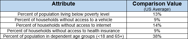
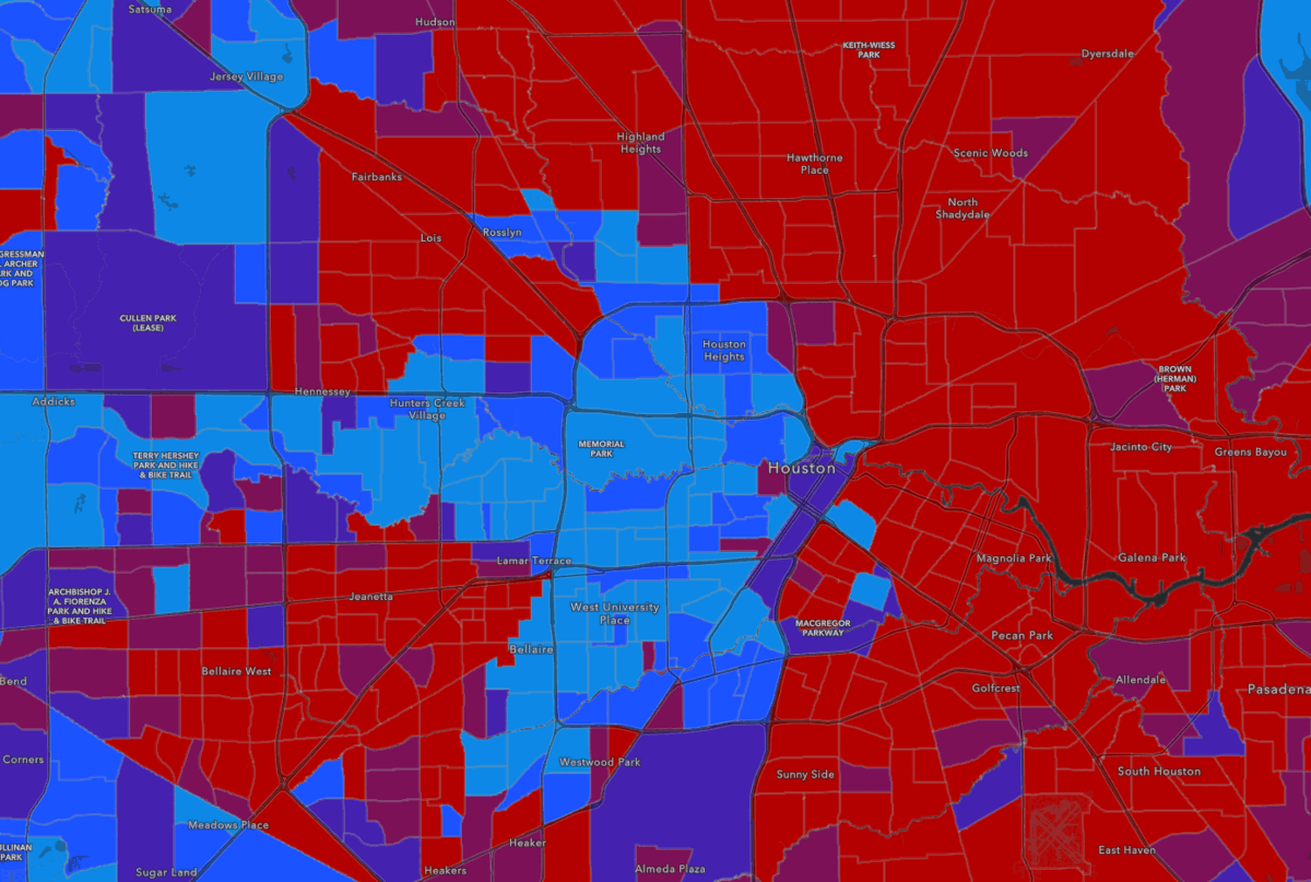
For example, if the city of Houston, TX wanted to explore the areas at the highest risk during a natural disaster, they would potentially be interested in multiple factors such as the households living in poverty, the households without a vehicle or internet or health insurance, or the population part of dependent age groups (youth and elderly). To create a holistic view of all five factors, they can use a stress index to compare each factor to the US average, and therefore see where there is the most potential need during an emergency.
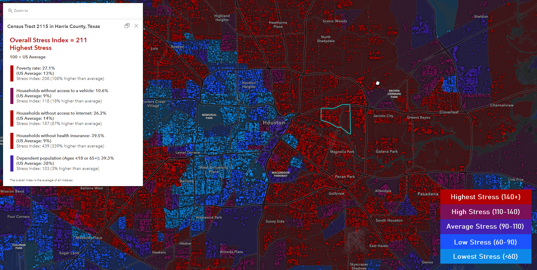
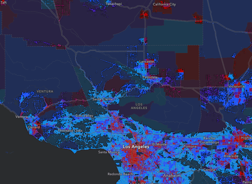
The key behind this index map technique is the fact that the index allows us to compare against an important value/threshold. By comparing each factor against something meaningful, the map highlights the areas with overall high stress on the community, and areas of need. The areas in purple and red in this map represent the areas with the highest stress factors, making it easy to immediately identify areas of need:
Our index map uses the national average as a basis of comparison for each stress factor, but it would also be valid to use a value such as the state/county average, or a policy-driven threshold/goal. The map also uses a few optional cartographic techniques which add a human context, which are explained below.
For more context and information about index mapping, visit this blog by Jim Herries.
This blog will show how to combine multiple demographic attributes into an index using Arcade, which helps us determine where the needs within our community are the greatest. The major steps are:
- What is an index?
- What you’ll need
- Build the index map in 4 steps
- Create context in your map
- Present your map
- Make it your own
What is an index?
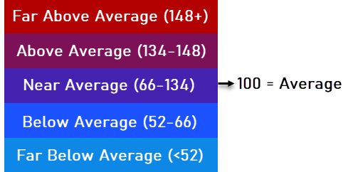
The example above is just one example of an index map, as there are many other ways to use indexing to compare statistical data. This blog will walk you through how to recreate this version. There are many valid ways to create indexed approaches, but the fundamental similarly is that a comparison is being made between a feature on the map against something else (other features, an average value, other geographies, etc). Similar to the Esri Market Potential Index, this index uses a value of 100 to represent an “average” feature on the map in comparison to the US figure.
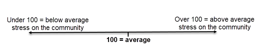
As mentioned before, this indexing technique uses a point comparison like the national, state, or county average to indicate areas in the community facing above or below-average stresses. You can also use a threshold or goal for each factor to gauge if an area is doing better or worse than an expectation or policy change. By comparing against a threshold, you’ll get values that are +/- 100, where 100 represents the most “average” area. This comparison also helps us better understand where there are areas far above, or far below the average.
Each factor is compared against its threshold and given an average. Then, all the factor indexes are averaged to create an overall index. This overall index is what allows us to explore multiple attributes from the data at once, and helps us understand how the area on the map compares to the average/threshold.
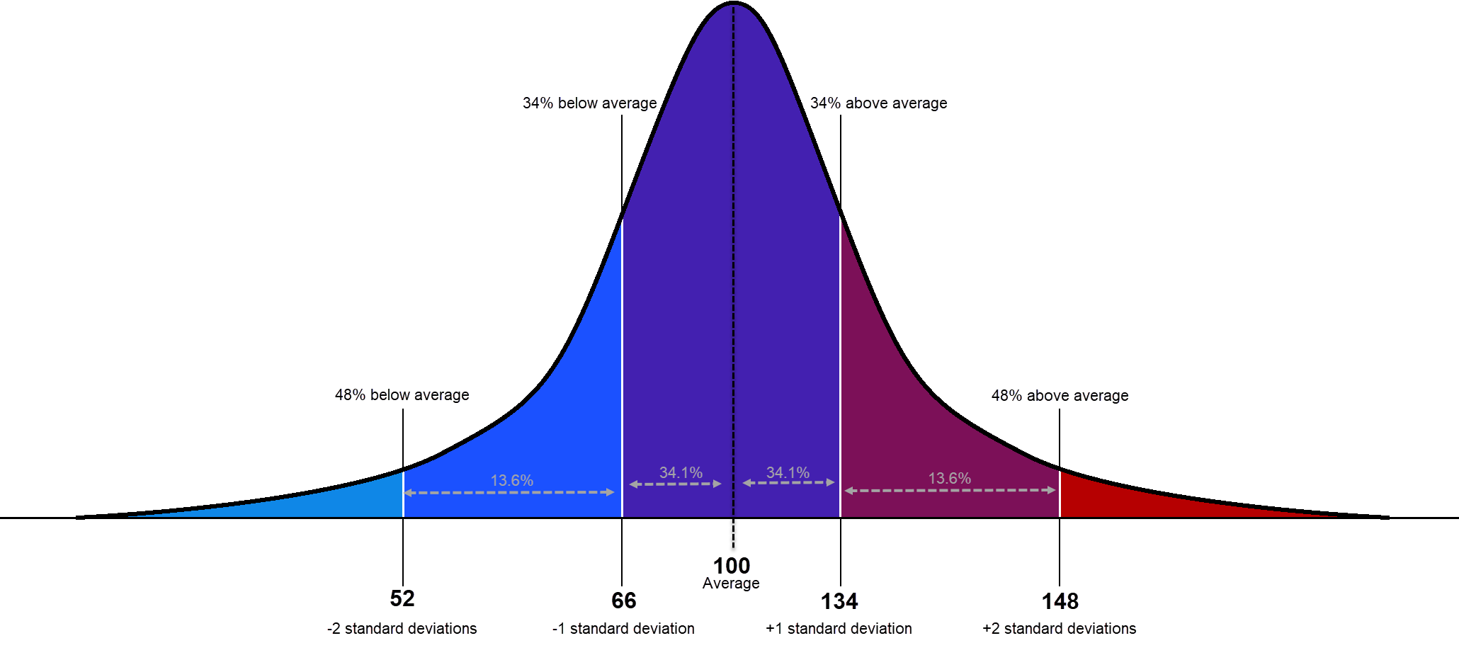
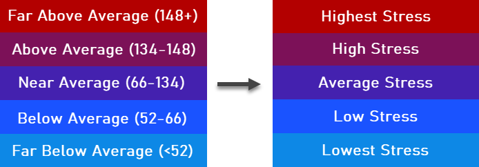
The breakpoints used in our example assume that the averaged values mimic a normal bell curve. Since 100 is our central normalized value, you can think of the breakpoints as theoretical standard deviations. Each breakpoints shows you a statistically significant pattern in comparison to all other values:
This index approach helps us better understand if a factor is above or below a comparison value, and by how much. Another way to think about each factor’s index score is how much higher or lower it is than the comparison value. Values that are similar to the average are closer to 100, while, a value of 120 represents a value 20% higher than the comparison value. A value of 80 would be 20% less than the comparison value.
For our map, we will use the following breakpoints based on general principals from the bell curve above:
To convert these numbers into understandable words, our example highlights areas of high or low stress:
Now that we have an understanding of the index values and breakpoints, let’s build the map.
What you’ll need:
- A hosted data layer with all the attributes you want to include in your overall index. If they are not included as a percentage, ensure the layer contains the proper normalization denominator such as total population. Need data? Consider using one of the Census ACS layers or CDC layers from ArcGIS Living Atlas of the World.
- From that layer, find the attributes you want to include in your overall index. If they are not already a percentage, find the proper normalization denominator. Keep in mind that total population is not always the correct denominator. For example, if your factor is “Population 25+ with a high school education”, then the proper denominator would be “Population 25+”. To see examples, check out this link or this link.
- Finally, find the figures you want to use as a point of comparison. For example, the US average, state average, or county average. Get these from the source, like from data.census.gov, the CDC website, etc. If you are working with policy-related topics, use the goal or threshold required by the policy.
Build the Index map
This map was built using features specific to the new Map Viewer in ArcGIS Online and the new Arcade pop-up elements (learn more here and here). There are four major steps to create the fundamental map:
1. Start the map
Start with a neutral basemap like the Light Gray Canvas, Dark Gray Canvas, Human Geography Basemap, or Human Geography Dark Basemap. Our example uses the Human Geography Dark basemap because it layers the details such as roads above the data to create key context about where humans live and move through space. Add your data layer into the map for now. We will start configuring the map after we build our Arcade expressions.
2. Build the basics of the index into an Arcade list
This map was built using the Arcade expression language included in ArcGIS. However, no arcade background is needed to create this map. You’ll need the attribute name, each corresponding comparison value, and a label to use in the pop-up. From these three things, you’ll get a pop-up summarizing the information for each factor as well as an overall stress index.
You can use the following snippet as your guide (note that you can use more or less than 5 attributes):
var fields = [
{ value: $feature["field1"], comparison: 1, alias: "Attribute Name 1" },
{ value: $feature["field2"], comparison: 2, alias: "Attribute Name 2" },
{ value: $feature["field3"], comparison: 3, alias: "Attribute Name 3" },
{ value: $feature["field4"], comparison: 4, alias: "Attribute Name 4" },
{ value: $feature["field5"], comparison: 5, alias: "Attribute Name 5" }
];
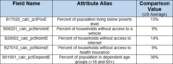
For our Houston example, there are attributes used in the index, along with how they would look in the Arcade snippet:
var fields = [
{ value: $feature["B17020_calc_pctPovE"], comparison: 13, alias: "Poverty rate" },
{ value: $feature["B08201_calc_pctNoVehE"], comparison: 9, alias: "Households without access to a vehicle" },
{ value: $feature["B28002_calc_pctNoIntE"], comparison: 14, alias: "Households without access to internet" },
{ value: $feature["B27010_calc_pctNoInsE"], comparison: 9, alias: "Households without health insurance" },
{ value: $feature["B01001_calc_pctDependE"], comparison: 38, alias: "Dependent population (Ages <18 or 65+)" }
];
Build out this list using something like Word, Notepad, Notepad++ or any text editor for now.
3. Add the fields list into these two Arcade templates:
Open the following templates in a text editor and insert the fields list you just generated. Replace “fields = []” with the list you created in the previous step:
For the pop-up, also make sure to specify the point of comparison. By default it says “US Average”, but change this if you are using a different reference value.
4. Apply the two expressions into the map
Symbology
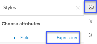
Instead of choosing a field from the data, choose +Expression to insert the symbology expression you built above.
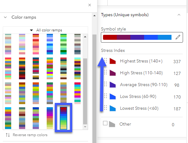
Go into the Types (unique symbols) options and order the resulting fields where the highest values are on top and the lowest are on bottom. Then, select the sequential categorical ramp highlighted in the image below.
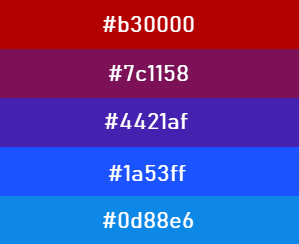
If you’re having trouble getting the colors correct, you can also manually input the hex values:
Pop-up
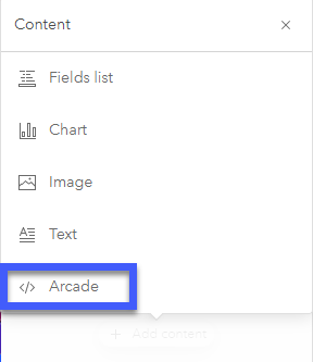
Go into the configure pop-ups toolbar and remove any other pop-up elements that might be there (but leave the title to explain the name of the feature). Choose Add content and select Arcade.
Name your expression something meaningful like “Stress Index” and remove any text within the expression box. Now, paste in the expression you created in the previous step and click OK.
Your map should now look something like this:
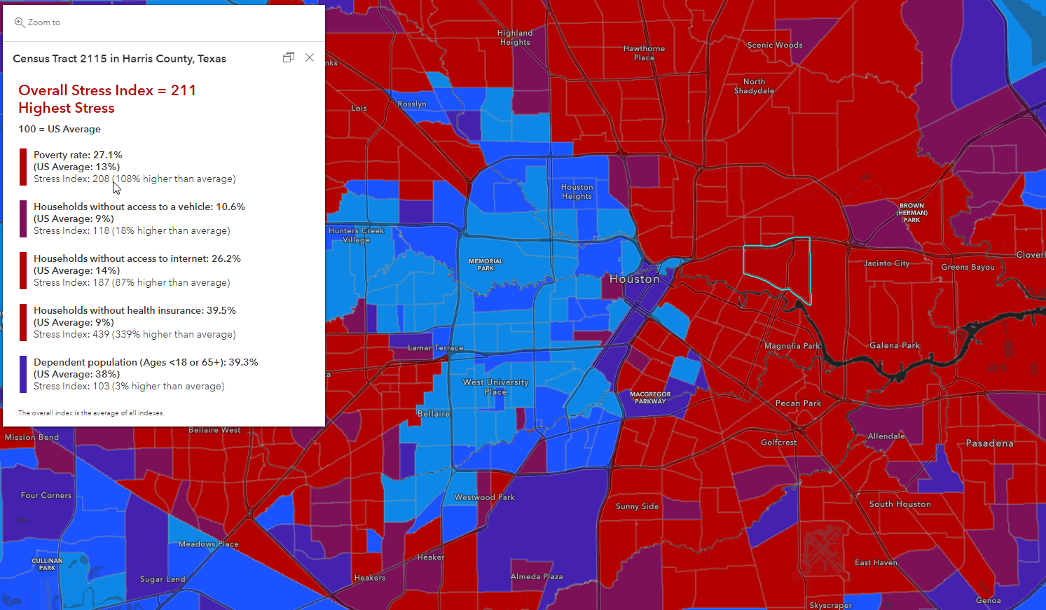
As it is, this map is useful and informative because you gain insight about which factors are higher or lower in each area, while also gaining a understanding of the overall pattern. The next section covers additional techniques which can increase the value of your map to the end reader.
Create Context in Your Map
To increase the value of your map and help create context around the subject, try these additional methods:
Blend the pattern with human settlement or buildings
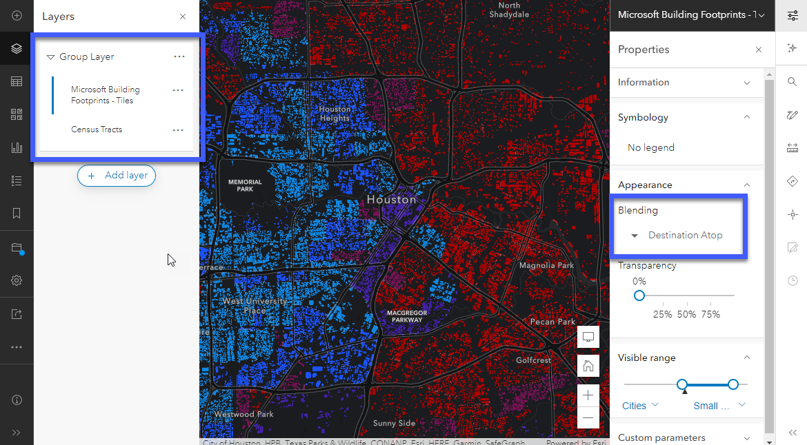
Administrative boundaries offer us a valuable starting point to understand spatial patterns, but they don’t truly represent where people live. To add context, we can see where people live with layers like this human settlement layer (works great for local or regional scales) or this building footprints layer (works great for neighborhood or citywide scales).
To accomplish this effect, add the layer of reference into your map and choose “Add to new group” from the layer dropdown properties.
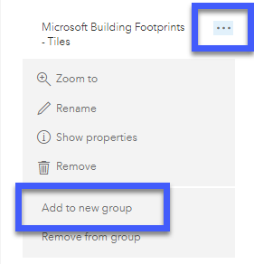
Then add your indexed layer (data layer) into the same group, ensuring that the reference layer is above the data layer in the list. Click on the layer to enable the properties panel from the right toolbar. Within the Appearance settings, choose the “Destination Atop” Blending mode. This will allow the reference layer to absorb the colors of the data layer, but only show them where people are:
For more inspiration, check out this blog by Jim Herries.
Add an additional layer of context
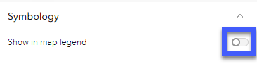
If you applied the technique above, you may notice large gaps in the map where people don’t live. This could confuse a map reader if they zoom in somewhere people don’t live. Instead of allowing the reader to think there is missing data, you can reinforce the polygon pattern we started with by showing it faintly behind the layer we just transformed in the previous step.
Add your data layer to the map below the grouped layer you just created, replicate the index symbology (you don’t need to do the popup) and add 50-60% transparency to the layer. To remove the duplicate legend, go into the properties panel on the right toolbar and toggle off the “Show in map legend” option so that they only see it once in the Legend:
To learn more about applying this technique, check out this blog.
Blend with terrain
If you live in an area with any terrain, this can have a huge impact on where people live. Like the technique used before, we can use a blending mode to add terrain into our map to help create context.
To apply this technique to our map, go into the current basemap layers by navigating from the Basemap option on the left toolbar. Choose +Add layer, and search from Living Atlas instead of My Content. Find the World Hillshade (Dark) layer and add it into your basemap layers. Ensure it is the top “Base” layer (not a reference layer). Select the World Hillshade (Dark) layer to enable the layer properties panel on the right toolbar. Within Appearance, change the Blending mode to “Soft Light” to blend the basemap with the other map layers.
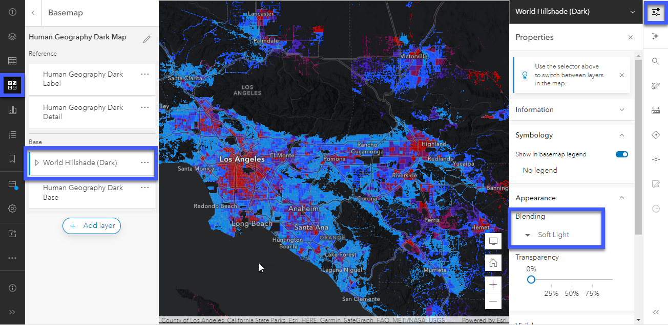
To apply this technique with a lighter basemap, use the “World Hillshade” layer with the “Multiply” blending mode instead.
For more information about blending modes, check out this blog by Mark Harrower.
To see what this final map would look like, visit the live map here.
Present your map
Now that you’ve created a beautiful and informative map for your audience you can use one of many applications to showcase the results. By creating an app, you provide the reader a way to interact with the map and help with decision support. For example:
- Instant Apps like the Media Map, Minimalist, or Sidebar allow the map to stand on its own and allow the reader to focus on the content rather than navigate an interface. These are great when working with non-GIS audiences who need answers quickly, such as policymakers.
- ArcGIS StoryMaps allow you to tell a narrative about the data and provide context for the topics included in the index. These are a great tool when advocating for change, especially with a broader audience who requires additional context.
- ArcGIS Dashboards allow you to summarize key information into infographics, allowing the map reader to explore the data in new ways such as charts and indicators. These are valuable if your audience is involved in decision support.
- ArcGIS Experience Builder helps you create a custom view of the data and map in new and interesting ways.
- And more! There are countless ways to share your map using ArcGIS. Try other options such as a custom JavaScript app, ArcGIS Insights, and Infographics to customize the story for your needs.
Make it your own
This blog provides a plug-and-play example, but with some edits to the Arcade expressions and the map, you can customize the symbology and pop-up to meet your mapping needs. There are many ways to visualize an index, and this method can be adjusted to use other methods.
A few examples of what you could do to customize your index map:
- Try different colors on your map if other ramps are more suitable for your project. You can easily adjust the hex values within the expression by changing them in the “calcIndexHex” function. Arcade does the rest!
- If the breakpoints used in this example don’t suit your needs, use different breakpoints by adjusting the breaks. In the symbology, make this change in the indexText variable. In the pop-up, make this change in the calcIndexText and calcIndexHex functions.
- Try a weighted approach to assign importance to each factor. With some changes to the Arcade, you can multiple each factor’s overall index by a weight. Assign values between 0-1 to each factor, ensuring that all values add up to 1. This will help focus the map on topics more or less pertinent to your project.
- Make the pop-up your own. Adjust the formatting and text within the pop-up by making adjustments to the pop-up Arcade expression. Keep in mind that it builds the final pop-up with HTML, so make sure to test the HTML output.
- Use an unclassed visualization technique. Instead of returning text values, adjust the symbology Arcade to return the overall index value instead. Anchor your map around the value of 100 using the Above and Below theme to allow the colors to blend out more naturally than hard breakpoints.
- Summarize by another boundary. To see an example, check out the Arcade behind the Census Populated Places layer in this template map.
- Try using layer effects such as a drop shadow to emphasize the patterns in the map against the basemap.
- Make an index using just one attribute. Do this for each factor included in your overall index. Use these as additional context within a Portfolio or tabbed story.
Considerations
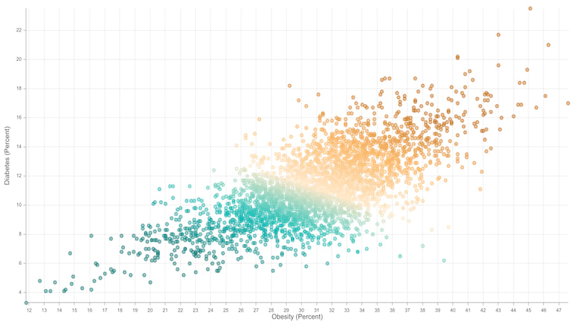
This approach is designed for attributes where higher numbers correlate to higher risk. This method as-is won’t accommodate areas where lower values represent higher risk, such as median household income. This would require some alterations to the Arcade.
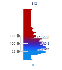
Another consideration is that the statistics for each datasets and attribute will have a different statistical skew. When we look at the histogram for the example above, the data has a skew toward the lower values. This may impact the approach we use to classify our map:
This is one example of why you might customize the map to your purposes.
Additional Resources
- Esri Maps for Public Policy
- Browse ArcGIS Living Atlas of the World
- ArcGIS Arcade Documentation: Getting Started with ArcGIS Arcade
- ArcGIS Arcade Documentation: Popup Element
- ArcGIS Learn Lesson: Get Started with ArcGIS Arcade
- ArcGIS Learn resources for policy mapping
- Blog: Your Arcade Questions Answered
- Blog: Part 1: Introducing Arcade pop-up content elements
- Blog: Part 2: Introducing Arcade pop-up content elements

Article Discussion: