Whenever people plan a weekend trip, a single number helps them plan what they will do: the forecast high temperature (or low temperature). Many check the forecast to see what the temperature range is predicted to be. The temperature predicted is a number they use to decide how what clothing to pack.
That number, temperature, is defined and expressed as a value on a scale defined hundreds of years ago. Specific numbers on that scale have a significant meaning in the real world. In the case of temperature, the value of 32 degrees on the Fahrenheit scale is the temperature at which water freezes, for example. You can read about the fascinating history of temperature measurement (example) but let’s stick with how people apply it. Whether people use Fahrenheit or Celsius, most likely do not know the actual scientific definition of temperature or its scales, but instead know how they use temperature in everyday life. Use is sufficient.
Smart travelers also factor in the wind. We think about where we are going and how likely we are to be caught out in a windy area, since that combines with temperature to make us feel colder, faster. So we check the wind chill information if available. We do that intuitively (well, some do anyway).
It wasn’t until 1945 that scientists thought to try to measure the effect of wind and temperature on how fast water freezes and how human skin reacts. From two independent measures (temperate and wind) comes a new measure: wind chill. Wind chill is an index.
Broadly speaking, an index is a thoughtful combination of two or more numbers that give us a single measure to use.
For many of us, wind chill has been an index longer than we have been alive. At some point in our lives, we were introduced to wind chill. If it resonated with our experience, we began to trust it. Today, we take it at face value and plan a strategy independent of the science behind wind chill calculation. Side note: the wind chill you grew up with is not the same as today’s wind chill, which was last adjusted in 2001. In my case, I was 55 years old when I read about its origins and definitions.
This chart helps visualize how the two measures of wind and temperature combine to create a “feels like” experience when you are out in those conditions. I like how this visually explains the concept, without showing the actual science and calculations involved.

Can an Index be Mapped?
A good index can make a great map. Chances are good that you have seen a wind chill map like the one below (from Weather Central May 11, 2022):

The map is how people use wind chill to plan things. The science behind wind chill is available to anyone interested, but the pragmatic value of an index is found in how it is used, how people react to the information it brings.
Perhaps you are a GIS analyst or someone who works with one. How can you bring a similar pragmatic index or composite score to bear on the topics you’re looking into?
I will share a typical way in which an index suggests itself for a map. In my daily work, I frequently make maps of individual measures relating to populations. I also make maps of indexes (or, if you prefer, indices).
One memorable example involved mapping obesity and diabetes measures. I mapped obesity rates from CDC to compare counties in the U.S. based on the percent of adult population designated as obese and made a second map showing percent of adult population diagnosed as diabetic. Given that obesity is a proven contributor to higher diabetes rates, I expected to see similar patterns in the two map layers when you view each independently:


At a glance, you can interpret either map successfully when you understand that darker colors mean higher rates of obesity (in blue) or diabetes (in magenta). You can focus on any one county to see the two colors that represent that county in each map. As your eye goes back and forth between the two maps for that county, your brain does the interpretation. If all you care about is that one county, it’s not too much to ask of a reader.
To better understand how these two measures interact, we might provide a “swipe” tool in our map, to help someone start to compare large areas with an easy user experience.

I really like the interactivity this brings to the two maps. The swipe tool helps the reader compare more than one county at a time, to start to see the pattern in a larger area. As you look at the swipe example above, what do you notice about the pattern in Kansas? Colorado? New Mexico? It’s the same two maps, but that ability to swipe engages your brain a little differently than starting at two separate maps can.
There is another way to engage the brain by using a single map to capture the relationship between these two attributes. This map shows a blend of the two colors to give a clearer picture of where both rates are high (dark purple). Equally interesting are the areas with high obesity yet low diabetes rates (light blue in this map).

So we’ve gone from asking you, the reader, to look at two maps and blend two colors in your mind, to blending the colors for you on a single map. How can we do even better?
Make an index map
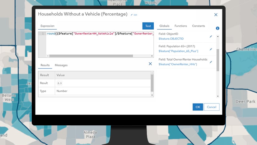
Remember the wind chill example, where the wind is combined with temperature to produce a new number you can use to think about your plan of action? Let’s do the same thing with obesity and diabetes. I chose this map in Map Viewer in ArcGIS Online to work up a simple weighted index of obesity and diabetes for each county in the U.S. I used an Arcade expression to calculate my index (or composite score).
For each county, the obesity rate needs to be compared to a standard of comparison. I chose to use the national rate (32.1%), so that we can understand where each county is relative to that national rate. For diabetes, the national rate is again used (11.1%). The Arcade expression below does the math, returning an index value of 100 if a county’s rates exactly match the national rates. Values below 100 indicate one or both county rates are lower than the national average, and values above 100 indicate one or both county rates are higher than the national average.
// get the attributes
var obesity = $feature["Obesity_Percent"];
var diabetes = $feature["Diabetes_Percent"];

// set the standard of comparison for the index to be based upon
var national_obesity = 31.2;
var national_diabetes = 11.1;

//calculate the simple index, equally weighted
var obesity_index = 100 * (obesity / national_obesity);
var diabetes_index = 100 * (diabetes / national_diabetes);
var weighted_index = (obesity_index + diabetes_index) / 2;
return weighted_index;
The result of this calculation for every county in the U.S. happens to be a very welcome sight: a nice bell curve, which always makes for a good, expressive map. The color ramp’s colors are “anchored” around the 100 index value (the national average). The histogram below shows on the right side the counties’ actual mean value and one standard deviation around that mean, and on the left side I’ve set the handles to a theoretical bell curve’s standard deviation values of 134 and 66 for an index whose mean is 100. (Read more about the power of the histogram in mapmaking here).

Counties struggling with higher rates are shown in progressively darker shades of brown. Counties with lower rates are shown in progressively darker shades of green.

This is what the data looks like in a scatterplot using the index map’s colors. I think it took me all of one minute to construct this chart in Map Viewer because the scatterplot chart automatically chooses the colors already being used in the map. The general trend is that as obesity rates go up, so do diabetes rates. However, the trends away from that pattern are equally interesting, and the colors help call that out.
Let’s say you were interested in setting a policy that counties with 30% obesity rates or higher would be eligible for special funding to curtail diabetes rates. A glance at this scatterplot below reveals that, at the 30% obesity rate, there are an equal number of counties with diabetes rates above and below the national diabetes rate of 11%. This means that some counties are already experiencing lower rates, so your policy/program may need to account for that in its method.

The resulting map begins to suggest that different strategies may be needed for tackling the related issues of obesity and diabetes rates. It is very similar in pattern to the bivariate relationship map shown earlier, but the Arcade expression gives much greater control over what is visualized on the map, and why. I chose values of 134 and 66 in the legend because those scores are one standard deviation around the mean (100). That choice more clearly illustrates which counties are truly abnormally high or low on this scale, while preserving the variation between 66 and 134. I value the variation because every county official is likely to want to know how their county is doing relative those surrounding counties. The pockets of green within otherwise brown areas stand out in this two-color map.
To improve this index and resulting map, a subject matter expert on obesity and diabetes is needed. Their input would help refine how the index is defined in the Arcade expression. A GIS analyst who creates and shows an index map, even one with simple weights like this example, can help cause conversations to occur about what a better equation might include to capture how these two rates operate. For example, if an expert were to indicate that health care costs for diabetic patients are 10 times higher than for obese patients, the Arcade expression could be modified to more heavily weight the diabetes rate.
What to Expect?
For decades, we have made maps of individual but related topics like obesity and diabetes. We dutifully showed a map of each topic and expected the reader to assemble the full picture in their mind. As a mapmaker or someone who directs what maps are made, your opportunity is to break through that limitation and show the reader something new to consider.
Make an index map to explore the patterns at work in each topic, and see how they amplify one another, or see where they cancel one another out. A region with high obesity rates but very low diabetes rates is as interesting as a region where both rates are very high. What would explain the differences?
An index map allows you to ask more questions about the intersection of those topics, and encourages further statistical analysis of the relationships at work. As you can see from the Arcade expression above, the level of effort to try this out is low, and the value of the conversations that index maps trigger is high.
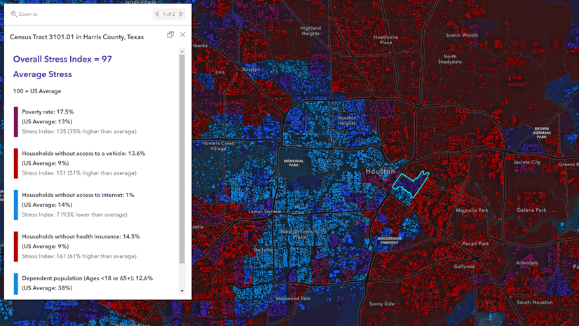
See this excellent blog by Lisa Berry in which she creates an index map applied to measuring overall stressors on your community.

Article Discussion: