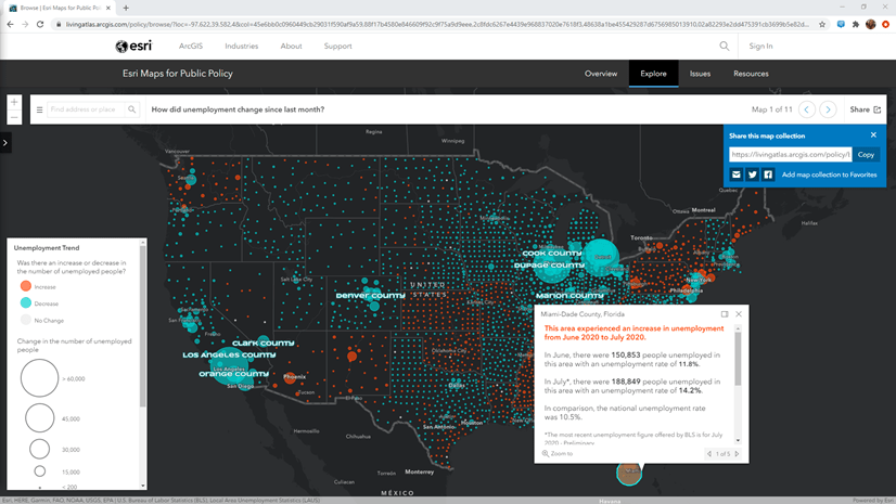
One of the mapping styles I use the most in ArcGIS Online is the Color and Size option. It is a powerful way to show two data attribute patterns within a single map. The Maps for Public Policy site has many maps that use this technique. This style of map highlights where there are opportunities to intervene because they help reinforce a pattern by using both color and size.
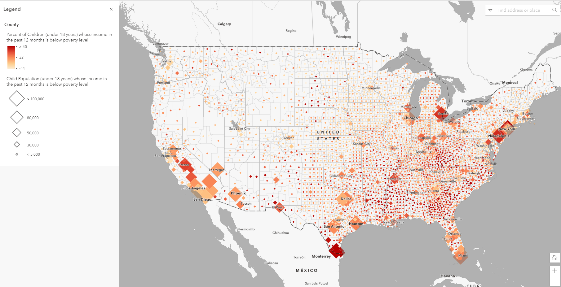
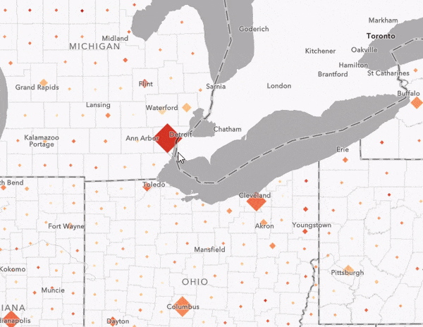
For example, this map from Living Atlas and the Policy Maps site shows the percent of children living below the poverty level using the colors in the map, and the total count of children in poverty are shown with size:
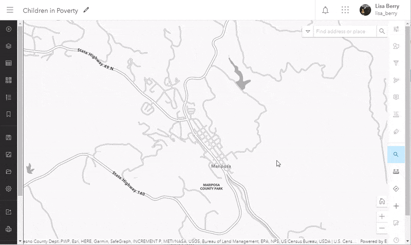
One day a colleague was exploring the policy website asked me, “Why isn’t there a value for my city in this map?”
The data for the map is national and goes down to the Census Tract level, so I knew there was data for her city in the map. When I zoomed to her city of Mariposa, California on the map, sure enough, it looked like there was no data because it is in a very rural area. I had to zoom out a few times before I ever saw a symbol.
This is by no means the fault of the mapping style, but rather the way I was trying to use the style. My map’s purpose was to offer the pattern at a national level for all map scales, but the color and size technique was only helping those who were zoomed out far enough to see the symbols in their centroids.
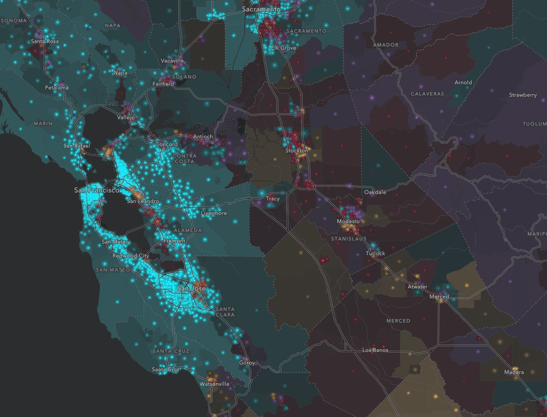
On another occasion, a different colleague was looking at their hometown of Chicago in the map of where people have Medicaid/means-tested healthcare. They asked me, “Are there Census Tracts missing from the map?”
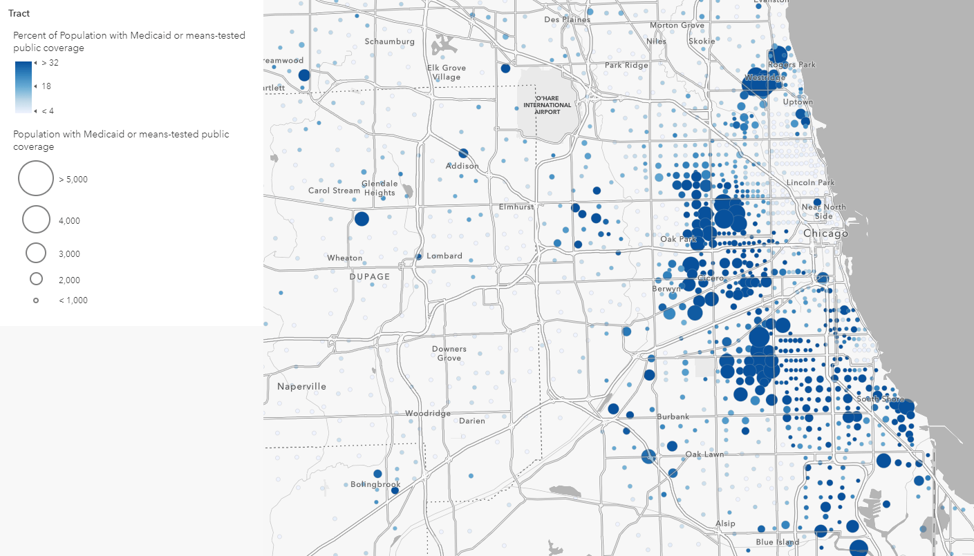
This person also brought up a good point. Even zoomed out, they couldn’t clearly see the colors for the smallest circles because of a cartographic choice I had made. I had chosen to emphasize areas with larger data values with larger circles, which incidentally punished the areas with less overall population.
In order to address both questions I had received, I came up with a plan:
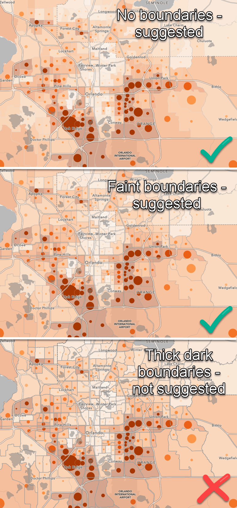
Solution: Add the color back into the map
By this, I mean layering the colors exactly as they are from the color and size map, but showing them faintly behind the other layer as a polygon fill in order to provide context.
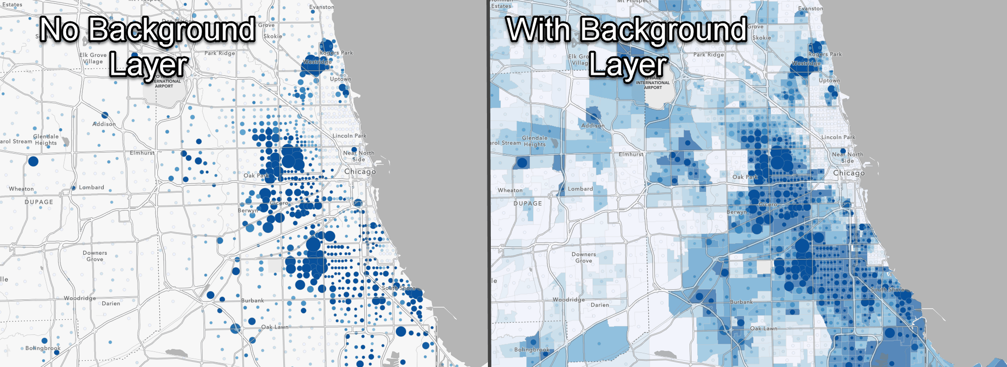
This cartographic technique helps the map in more ways than one:
- Where the size symbols are small, you can still see the color pattern
- When you are zoomed in, you wont just see the basemap and no data
- You can still identify the boundaries of the features
Try it with a Census ACS layer from Living Atlas:
Step 1: Search Living Atlas for “current year acs” and add a boundaries layer to the map
Step 2: Add the associated centroids layer above the boundaries layer in the map
Step 3: Start with your centroids layer and map with Color and Size using a percent for color and the count for size
Step 4: On the boundaries layer, match the variable used for Color with same breakpoints
Step 5: Add transparency to the boundaries layer (recommended 40-60%)
The video below shows you how to replicate these steps:
Note: if you replicate the cartography at the different geography levels, start with tracts and replicate the breakpoints from tracts for the state and county. Also note that you may have to reconcile the scale dependencies to make the boundaries and centroids layers match.
If using your own data, the steps will be similar:
Step 1: Add your data layer
Step 2: Symbolize the layer with color and size. If you have a normalized attribute, best practice is to use that for the color.
Step 3: Make a copy of the layer and remove the size attribute OR add the layer again and replicate the attribute, color, and breakpoints from Step 2
Step 4: Add transparency to the boundaries layer (recommended 40-60%)
Tips and Tricks
After playing with this technique over the past two years, here are a few pointers I have found for making this map style successful.
Balance your transparency
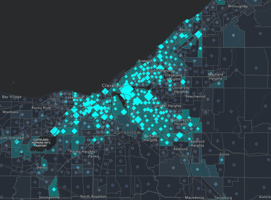
If you add too much (or too little) transparency to the polygon layer, the technique can make the map more confusing than clarifying. I have found that 40-60% transparency is successful in most cases. Below is an example by my teammate that uses a dark basemap.
You don’t have to show the polygons at all scales (but you can)
We live in a world of dynamic multi-scale online mapping. What ends up happening is that we have to evaluate our maps at various scales to see if a technique like this adds to the user’s understanding. In some cases I have found that the polygon layer isn’t needed until you zoom in to a local level. The color and size style stands on its own for most scales, and the polygon layer only turns on once it helps. Below is an example that only turns on this technique at a local level.
Try other combinations of color and size
Color and Size is not the only mapping style that can benefit from this method. A few more styles to try with this are:
Below is an example that uses both the predominant and size style AND the infamous John Nelson firefly symbols. I had to use a color picker to grab the colors from the firefly symbols, but as long as you match your colors between the two layers, you’re on your way!
Be aware of hue when mapping brighter colors
Colors in the vibrant ramps designed for the dark basemaps can display in a different hue once transparency is added. The transparency can make the colors start to look slightly different than the full strength color. The map below is an example where the bright colors and the transparent colors are starting to diverge. It isn’t a huge issue, but can start to take away from the clarity this technique helps create. If you experience this, I recommend trying a different ramp specific to dark basmaps.
Make your boundary outlines thin with transparency
Be careful not to let your polygon outlines overpower your map. I would recommend removing them for this style, or if you need to use them, use a light grey with 65% transparency. This can help the clarity of the map and remove distractions that draw attention from the overall pattern.
Resources
- How to Combine Color and Size Effectively in your Maps (Blog)
- How to Smart Map: Color and Size (Story Map Tutorial)
- Smooshing Graduated Size AND Color into an ArcGIS Online Symbol (John Nelson Blog)
Get inspired with these policy map examples
- Where were native persons (US citizens at birth) born relative to current residence?
- Where are Hispanic populations without health insurance?
- Where do People Have Medicaid/Means-Tested Healthcare?
- What is the predominant type of health insurance coverage for children?
- Predominant Highest Level of Education in the US (ACS)
- Children in Poverty
Article Discussion: