Data visualization is an attempt to answer questions about raw data. These questions typically start with words like what, how much, when, and of course, where. In addition to these, people frequently ask questions about how a data variable changes over time. Some examples include:
- How did population change from 2010 to 2020?
- Is the climate warmer on average over the last 30 years or cooler?
- How much did arctic ice increase and decrease over the last 10 years?
- Where has voter turnout increased since the last election? Where has it decreased?
In this post, I will compare data from Mexico’s 2020 census with data from Mexico’s 2010 census to demonstrate six ways you can visualize change over time using the ArcGIS API for JavaScript. Let’s get to it.
- Toggle layer visibility
- Swipe widget
- Side-by-side views
- Stacked rings
- Above and below theme
- Animations
Toggle layer visibility
The most classic way to compare change is to display the data in separate layers and toggle each layer’s visibility on and off.
The following app visualizes average educational attainment in 2010 and 2020.


Add both layers to a GroupLayer with an exclusive visibility mode to make the toggling easy for the user in the LayerList widget.
const layer = new GroupLayer({
  title: "Educational attainment 2010 vs. 2020",
  visibilityMode: "exclusive",
  layers: [
    new FeatureLayer({
      ...layerProperties,
      title: "2010"
    }),
    new FeatureLayer({
      ...layerProperties,
      title: "2020"
    })
  ],
});

view.ui.add(new LayerList({
  view
}), "top-right");
This approach works well when there are stark differences between the two layers that can be easily spotted when layer visibility changes. This is generally true of choropleth maps (polygons with a fill color). However, it is not as successful when using graduated symbols.
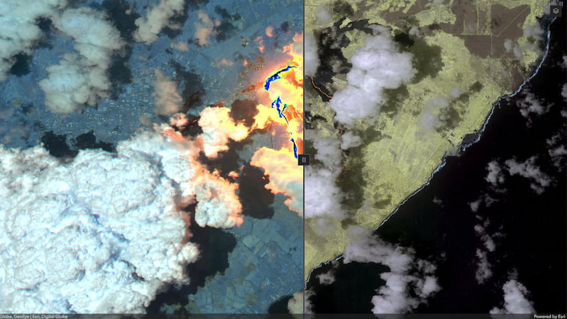
Swipe widget
You can also compare how data changes over time using the Swipe widget. The concept is very similar to toggling layer visibility, but instead you drag the Swipe handle to view the change, like turning the page of a book. Check out this blog post for more details about Swipe.

To create this experience, construct a Swipe widget instance. Then reference one of the layers in the leadingLayers and the other in trailingLayers.
Since the color ramps in each layer should match to make a fair comparison, you only need to display one layer’s style information in the legend. Otherwise, you will see information unnecessarily duplicated.
const legend = new Legend({
  view,
  // only display legend for one layer
  // and give it a generic title not
  // associated with a year
  layerInfos: [{
    layer: ppl2010,
    title: "Average occupants per room"
  }]
});
view.ui.add(legend, "top-right");

const swipe = new Swipe({
  leadingLayers: [ ppl2010 ],
  trailingLayers: [ ppl2020 ],
  position: 85,
  view
});
view.ui.add(swipe);

// indicate which year is displayed
// on each side of the swipe
view.ui.add("view2010Title", "bottom-left");
view.ui.add("view2020Title", "bottom-right");
This technique works well in the same scenarios as those described in the toggle layer visibility section. By contrast, with Swipe you can compare data from the same feature for both time periods by straddling the feature with the Swipe handle.

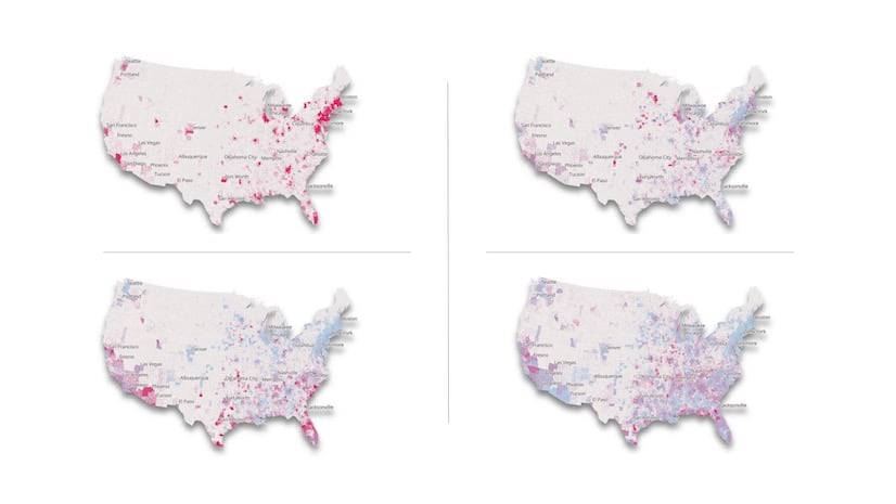
Side-by-side views
Sometimes viewing data in side-by-side views can be the most effective for comparing change over time. It doesn’t require any user interaction to view differences; they see it all in one glance.
The Capacity Analysis configurable web app template uses this approach to compare the output of two models predicting the demand for hospital beds as a result of the COVID-19 pandemic.

Showing the varied model results side-by-side is effective because it allows the user to easily see which scenario is better or worse over time, not just on a single date.
However, because this approach requires a lot of visual scanning between the two views, it does not work well when the differences between the two visualizations are subtle. It works best with small-scale phenomena that show significant changes over time. In most cases, you may be better off using a toggle or swipe approach.
Check out the Synchronize MapView and SceneView sample and this blog to learn more about adding side-by-side views to a web app.
You can also use this technique to show data in more than two time intervals. However, since most browsers support no more than 16 WebGL rendering contexts (one context is required per view), you’re limited to no more than 16 views in a single app.
The following app uses six views to compare data representing the probability of high tide flooding for the next 100 years. Read more about it in How many days will it flood?

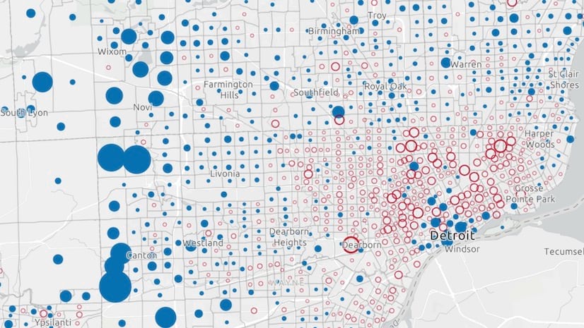
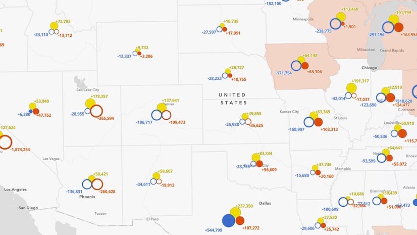
Stacked rings
When comparing total counts, you can use stacked rings to show a variable’s value in one year compared to that in another year. Rings of the same size indicate the variable experienced little or no change from the previous year.

To implement this technique, you need to set the style for the marker symbol to none and represent each year with different colors. The size variable configuration (i.e. stops) must be identical between the two layers.
This technique can be difficult for users to understand, so use it with caution. I find it works best with small, dispersed datasets. It will not be as successful in layers that have dense, overlapping icons.
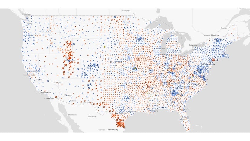
Above and below theme
You can also view growth or decline over time at one glance using the above-and-below theme for color and/or size. This approach involves calculating the change between the two variables (either total change or percent change), and visually indicating that with a single renderer.
The following map shows the growth and decline in homes with soil floors from 2010-2020.

This approach is described in detail in Visualize diverging datasets with size in web maps. It requires writing an Arcade expression to calculate the difference between two fields in the same layer and setting a midpoint of zero in the renderer break points.
You can do this with a color visual variable.
renderer.visualVariables = [{
  type: "color",
  valueExpression: "$feature.SoilHomes2020 - $feature.SoilHomes2010",
  valueExpressionTitle: "Change in homes with soil floors 2010-2020",
  stops: [
    { value: -6000, color: "red" },
    { value: 0, color: "white" },
    { value: 6000, color: "blue" },
  ]
}];
Or in a ClassBreaksRenderer to give the renderer a distinct above symbol and a below symbol.
const renderer = new ClassBreaksRenderer({
  valueExpression: "$feature.SoilHomes2020 - $feature.SoilHomes2010",
  valueExpressionTitle: "Change in homes with soil floors 2010-2020",
  classBreakInfos: [{
    minValue: -6000,
    maxValue: 0,
    symbol: belowArrowSymbol
  }, {
    minValue: 0,
    maxValue: 6000,
    symbol: aboveArrowSymbol
  }]
});
Or you can use the above and below theme in the univariate color and size smart mapping module and let the ArcGIS JS API pick a color scheme, symbols, and break points for you.
const params = {
  layer,
  view,
  theme: "above-and-below",
  valueExpression: "$feature.F2020 - $feature.F2010",
  symbolOptions: {
    symbolStyle: "arrow"
  }
};

const { renderer } = await univariateRendererCreator
    .createContinuousRenderer(params);

layer.renderer = renderer;
This approach only shows the delta between the two data values, not the totals for each year. So if viewing the value of the variable for each year is important, then you should add an option that allows the user to toggle between both styles.
Animations
Another way to view change over time is to create a data animation. This is effective for showing subtle, compounding changes over long periods of time.

As opposed to the other approaches, which only compare change between two dates, this technique allows you to view change for as many as hundreds of time periods.
The TimeSlider in this example isn’t used for filtering features with a date field. Rather, it is used as a tool for updating the layer’s renderer to point to a new attribute field (or Arcade expression) on each slider move.
slider.on(["thumb-change", "thumb-drag"], (event) => {
  const renderer = layer.renderer.clone();
  const colorVariable = renderer.visualVariables
    .filter( vv => vv.type === "color")[0];

  // update renderer to reference field
  // representing selected year on the slider
  const year = event.value;
  colorVariable.field = `$feature.F${year}`;

  renderer.visualVariables = [ colorVariable ];
  layer.renderer = renderer;
});
All you need to do is update the field name in the renderer to the column containing data for the selected year. No other renderer changes should be made!
My blog articles Animate and explore COVID-19 data through time and Mapping large datasets on the web describe additional details for configuring your data and writing the code to create fast, performant data animations.
Combinations
You can even do combinations of the above techniques, such as animating change over time on a layer that already visualizes change (in a smaller time interval) using the above-and-below theme.
The following map visualizes the change in year-to-year visits to U.S. national parks. You can use the time slider to select any year between 1905-2020 to view the change in park visits from the previous year.

A word of caution
Any time you compare data that changes over time in two separate layers, you must use the same renderer and visual variable configurations for both layers to ensure the comparisons make sense. The same stops and break points must be assigned to the same colors and sizes.
For example, the following map compares the total number of residents born in a different city in 2010 versus 2020 using stacked rings.

This visual makes it appear as if there was huge decline in residents from other cities in 2020 compared with 2010. Even though each layer represents the same variable, they use two very different data ranges, which misrepresents the actual pattern.
Since ArcGIS Online Smart Mapping tools suggest stops and break points based on the data range and distribution, suggested default styles will almost certainly not match when comparing data from two different years. For that reason, you need to intentionally ensure the data stops and sizes match one-to-one.
When it comes to comparing change over time using two layers, remember to always use the same renderer configuration for both layers. The only difference should be a reference to each respective field.
const rendererProperties = {
  type: "class-breaks",
  classBreakInfos: [
    { minValue: 0, maxValue: 25, symbol: symbol1 },
    { minValue: 25, maxValue: 50, symbol: symbol2 },
    { minValue: 50, maxValue: 75, symbol: symbol3 },
    { minValue: 75, maxValue: 100, symbol: symbol4 }
  ]
}

const layer2010 = new FeatureLayer({
  ...layerProperties,
  title: "2010",
  renderer: {
    ...rendererProperties,
    field: "Diversity_Index_2010"
  }
});

const layer2020 = new FeatureLayer({
  ...layerProperties,
  title: "2020",
  renderer: {
    ...rendererProperties,
    field: "Diversity_Index_2020"
  }
});
Conclusion
The ArcGIS JS API provides you with many ways to visualize change over time. All are valid, and depend on the final user experience and story you want to convey. The next time you need to map a variable as it changes over time, try several of the approaches listed above. The best option may not be the first you consider.
Check out these other apps that visualize change over time:

Thanks for sharing. I find this very informative. I am also very new to the Arc GIS api thing as well. I was wondering if the codes to the maps above are available somewhere so I can edit and embed on my website. Thanks and regards!
Yes! It looks like I am prevented from copying and pasting urls to the apps and source code in these comments. 🙁 All the images above link to the live apps. Just click the image to open the maps. The source code for the Mexico apps is here: https://github.com/ekenes/mexico-census-2020. (I had to type in that url). And the url to the national parks app is: https://github.com/ekenes/national-park-visits