The ArcGIS API for JavaScript (JS API) version 4.18 added support for generating renderers with size themes in web mapping applications. This includes generating proportional symbols for visualizing diverging data above and below a meaningful inflection point.

The following size themes were implemented in the createContinuousRenderer methods of the univariateColorSize and size smart mapping modules.
These themes are well suited for data variables that have a meaningful inflection (middle) point. For example, when mapping the change in population between two years, the significant inflection point would be zero. (i.e. Where did the population increase or decrease in this time span?)
Why size themes are needed
The concept of themes has been part of smart mapping’s color renderers since smart mapping was first introduced. Until version 4.18 of the JS API, themes were not part of the process of making a proportional symbol map (or continuous size). By default, the continuous size renderer creator assigns the minimum data value to the smallest symbol size and the maximum data value to the largest symbol size.

While this default “lets the data speak for itself”, it only looks good for datasets skewed toward the right.
Click the image to view a larger version of this map

However, this high-to-low approach doesn’t work well for datasets that more closely follow a normal distribution. The example below isn’t as effective because most of the data values are assigned similar sizes in the middle range, making spatial patterns difficult to see.
Click the image to view a larger version of this map
. Note the distribution as portrayed by the histogram. Normal distributions such as this one aren't effectively visualized in a high to low size theme.")
Maps with normal data distributions are more effective when the minimum size is assigned to features with a data point closer to the dataset average.
Click the image to view a larger version of this map
. Note the position of the lower breakpoint as portrayed by the histogram. Spatial patterns are more visible when the smallest symbol size is assigned a value closer to the data average.")
When mapping a variable as it changes over time, the default high-to-low theme doesn’t communicate anything meaningful or intuitive to the user.
In the map below, zero is the meaningful inflection point; the map reader most likely wants to see which parks experienced a decrease in visits from the previous year in contrast to the parks that experienced an increase in visits.
Click the image to view a larger version of this map
. Note the histogram shows a significant number of negative values. The high-to-low size theme doesn't adequately show which parks lost visitors and which ones gained visitors.")
Size themes are important for helping map authors and developers inuitively explore proportional symbol visualizations more appropriate for each of these scenarios.
Explore each size theme
Let’s explore each size theme (above, below, and above-and-below) using the Size visual variable themes sample from the JS API documentation. This sample uses the following Arcade expression to calculate the change in households from 2000 to 2010. (Sorry, 2020 Census data isn’t available yet ?).
// TOTHU10 = Total households in 2010
// TOTHU00 = Total households in 2000
$feature.TOTHU10 - $feature.TOTHU00
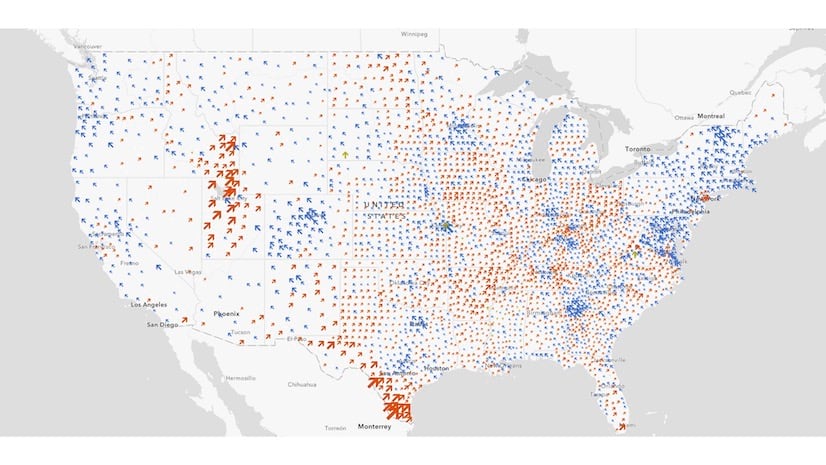
Above
In a map showing change over time, the above theme answers the question: Where did the number of households increase from 2000-2010? Simply provide the layer, view, expression or field name, and theme to the createCountinuousRenderer method.
const params = {
  layer,
  view,
  theme: "above",
  valueExpression: "$feature.TOTHU10 - $feature.TOTHU00",
  valueExpressionTitle: "Increase in number of households 2000-2010"
};

const { renderer } = await sizeRendererCreator.createContinuousRenderer(params);
layer.renderer = renderer;

This map shows size variation only in census tracts that experienced an increase in households (where the expression returned a value greater than zero). All other tracts are given a symbol with the smallest size.
Below
The output renderer created with the below theme inverts the size variable to emphasize where the variable diverges the most in a negative direction from the inflection point. Again, the createContinuousRenderer method correctly assumes the inflection point is zero. This theme answers the question: Where did the number of households decrease from 2000-2010?
const params = {
  layer,
  view,
  theme: "below",
  valueExpression: "$feature.TOTHU10 - $feature.TOTHU00",
  valueExpressionTitle: "Decrease in number of households 2000-2010"
};

const { renderer } = await sizeRendererCreator.createContinuousRenderer(params);
layer.renderer = renderer;

This theme only shows size variation in features that experienced a decrease in households from 2000-2010.
Above and below
The above-and-below theme allows you to show areas that experienced either an increase or a decrease in households (population) over time in the same map.
const params = {
  layer,
  view,
  theme: "above-and-below",
  valueExpression: "$feature.TOTHU10 - $feature.TOTHU00",
  valueExpressionTitle: "Change in number of households 2000-2010",
  symbolOptions: {
    symbolStyle: "arrow"
  }
};

const { renderer } = await univariateColorSizeRendererCreator.createContinuousRenderer(params);
layer.renderer = renderer;
.")
This theme is characterized by a distinct above symbol and a below symbol that are reinforced with a diverging color scheme. You can opt to color the symbols with solid binary colors (one color for above and one for below) or with a continuous color ramp.
The above-and-below theme equips you with 12 predefined symbol pairs for representing the diverging pattern. These are specified in the symbolStyle option of the symbolOptions parameter.
const params = {
  layer,
  view,
  theme: `above-and-below`,
  valueExpression: `$feature.TOTHU10 - $feature.TOTHU00`,
  valueExpressionTitle: `Change in number of households 2000-2010`,
  symbolOptions: {
    // Other symbol styles include the following:
    //
    // "caret" | "circle-caret" | "arrow" | "circle-arrow" |
    // "plus-minus" | "circle-plus-minus" | "square" | "circle" |
    // "triangle" | "happy-sad" | "thumb"
    symbolStyle: "arrow"
  }
};

const { renderer } = await univariateColorSizeRendererCreator.createContinuousRenderer(params);
layer.renderer = renderer;

I choose different symbol pairs depending on the theme of my map. For example, I prefer the circle pair in the above-and-below household map because the hollow rings on the negative side of the ramp convey a feeling of emptiness, similar to how a neighborhood might feel if it experienced a significant decrease in population.
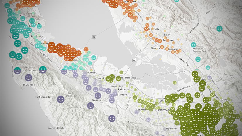
You can also specify your own above and below symbol pair. The following example uses a WebStyleSymbol with a house shape. I chose the same symbol shape for both the above and below symbols since color already communicates the above-and-below pattern.
Click to expand snippet
const houseSymbol = new WebStyleSymbol({
  name: "house",
  styleName: "Esri2DPointSymbolsStyle"
});

const params = {
  layer,
  view,
  theme,
  valueExpression: "$feature.TOTHU10 - $feature.TOTHU00",
  valueExpressionTitle: "Change in households (2000-2010)",
  defaultSymbolEnabled: false,
  colorOptions: {
    isContinuous: false
  },
  symbolOptions: {
    symbols: {
      above: houseSymbol,
      below: houseSymbol.clone()
    }
  }
};

const { renderer } = await univariateRendererCreator.createContinuousRenderer(params);

layer.renderer = renderer;
. This map uses a house web style and a diverging color ramp with size to indicate how much the number of households increased or decreased over the course of the decade.")
3D size themes
Size themes even work with volumetric symbols in 3D scenes. Here’s the same map visualized with cylinders.
const params = {
  layer,
  view,
  theme,
  valueExpression: "$feature.TOTHU10 - $feature.TOTHU00",
  symbolType: "3d-volumetric"
  // use '3d-volumetric-uniform' for spheres
};
const { renderer } = await univariateRendererCreator.createContinuousRenderer(params);

layer.renderer = renderer;
. Color indicates if there was a decrease or increase in households. Cylinder height indicates the magnitude of the change.")
. Color indicates if there was a decrease or increase in households. Sphere volume indicates the magnitude of the change.")
Customize the visualization
While the smart mapping methods generate good default renderers, you should always deliberately make decisions to represent the data in the best way possible. Don’t use the renderer creator methods as a crutch. Use them to get started, then make modifications to the output renderer as necessary.
I will use national park visitation data to demonstrate how to modify the suggested renderer to match desired sizes and colors to meaningful values.
Color
The colorScheme parameter in the renderer creators allows you to override the default red-blue diverging color scheme. Since green colors dominate official national park maps, I used the Esri Color Ramps guide page to find a scheme that best matches my subject. I found one named Green and Brown 1 which seemed to fit the bill.

Use the getSchemeByName function to provide the createContinuousRenderer method with the required colors and symbol properties for your desired color scheme.
const colorScheme = colorSchemes.getSchemeByName({
  geometryType: layer.geometryType,
  name: "Green and Brown 1",
  theme: "above-and-below"
});

const params = {
  layer,
  view: mainView,
  theme: "above-and-below",
  valueExpression: "$feature.F2019 - $feature.F2018",
  colorOptions: {
    colorScheme,
    isContinuous: false
  },
  symbolOptions: {
    symbolStyle: "circle-arrow"
  }
};

const { renderer } = await univariateRendererCreator.createContinuousRenderer(params);
Click image to view larger version of the map

Visualize change over time
Perhaps the most common scenario for the above and below size theme is to map how a variable changes over time. Of course there are other applicable scenarios as my colleagues Mark, Jim, and Lisa demonstrated in this post. But I’ll focus on change over time here.
I created a series of apps to visualize how park visitation numbers changed over time from 1905-2019. In each of the examples, I added a slider to explore how park visits changed from year to year.
You can visualize total change, percent change, or change in combination with other variables, like total visits. Each approach is valid depending on the story you want to tell.
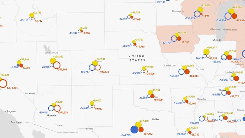
Total change
Total change simply represents the total increase or decrease of a variable, such as population, votes for a political party, or park visits.
Click image to view larger version of the map

Total change helps the user understand the overall magnitude of the change. How large was the change in each park’s number of visits compared to all other parks? Look at the difference in size between Channel Islands National Park and Great Smoky Mountains National Park. Clearly, Great Smoky Mountains National Park had a much larger total increase in visitors than Channel Islands National Park in 2014.
Click to expand code snippet
const year = 2014;
const previousYear = year - 1;
const valueExpression = `$feature.F${year} - $feature.F${previousYear}`;
const valueExpressionTitle = `% Change in park visitation (${previousYear} - ${year})`;

const colorScheme = colorSchemes.getSchemeByName({
  geometryType: layer.geometryType,
  name: "Green and Brown 1",
  theme: "above-and-below"
});

const params = {
  layer,
  view: mainView,
  theme: "above-and-below",
  valueExpression,
  valueExpressionTitle,
  minValue: -500000,
  maxValue: 500000,
  defaultSymbolEnabled: false,
  colorOptions: {
    colorScheme,
    isContinuous: false,
  },
  symbolOptions: {
    symbolStyle: "circle-arrow"
  }
};

const { renderer } = await univariateRendererCreator.createContinuousRenderer(params);
const sizeVariable = renderer.visualVariables.filter( vv => vv.type === "size")[0];

// increase size of smaller icons for better visibility
sizeVariable.stops = [
  { value: -500000, size: 40 },
  { value: -250000, size: 24 },
  { value: 0, size: 12 },
  { value: 250000, size: 24 },
  { value: 500000, size: 40 }
]

// Round the min and max numbers for a clean legend
renderer.authoringInfo.statistics = {
  min: -500000,
  max: 500000
};

layer.renderer = renderer;
Click image to view larger version of the map

Percent change
Percent change normalizes the change from the previous year by the previous year’s total. This is an effective way to indicate how abnormal or drastic an increase or decrease in visits was for each individual park within the context of itself.
It is characterized by the following Arcade expression.
(($feature.F${year} - $feature.F${previousYear}) / $feature.F${previousYear}) * 100
In creating the renderer, I set the min and max bounds of the data to -100 and 100. A 100 percent change indicates park visitation doubled from the previous year. A -100 percent change indicates park visits dropped down to zero.
Click to expand code snippet
const year = 2014;
const previousYear = year - 1;
const valueExpression = `(($feature.F${year} - $feature.F${previousYear}) / $feature.F${previousYear}) * 100`;
const valueExpressionTitle = `% Change in park visitation (${year} - ${previousYear})`;

const colorScheme = colorSchemes.getSchemeByName({
  geometryType: layer.geometryType,
  name: "Green and Brown 1",
  theme: "above-and-below"
});

const params = {
  layer,
  view: mainView,
  theme: "above-and-below",
  valueExpression,
  valueExpressionTitle,
  minValue: -200,
  maxValue: 200,
  defaultSymbolEnabled: false,
  colorOptions: {
    colorScheme,
    isContinuous: false,
  },
  symbolOptions: {
    symbolStyle: "circle-arrow"
  }
};

const { renderer } = await univariateRendererCreator.createContinuousRenderer(params);
const sizeVariable = renderer.visualVariables.filter( vv => vv.type === "size")[0];
sizeVariable.stops = [
  { value: -100, size: 40 },
  { value: -50, size: 24 },
  { value: 0, size: 12 },
  { value: 50, size: 24 },
  { value: 100, size: 40 }
]

renderer.authoringInfo.statistics = {
  min: -100,
  max: 100
};
layer.renderer = renderer;
Click image to view larger version of the map

Now compare Channel Islands National Park with Great Smoky Mountains National Park in this map. While Channel Islands National Park had a smaller total increase in visitors (+130,132) than Great Smoky Mountains National Park (+744,581) in 2014, the increase was more drastic compared to the previous year’s total.
Click image to view larger version of the map
 than Great Smoky Mountains National Park (+8.0%) even though the total increase for Channel Islands (+130,132) was smaller than the total increase for Great Smoky Mountains (+744,581).")
Bivariate color and size
Up to this point, the examples in this post showed how above-and-below color and size themes work together to effectively visualize a diverging data variable as a univariate (single variable) style.
When done carefully, you can map two variables simultaneously, and mix up the themes. In the following example, I use a high-to-low size theme to visualize the total number of visits a park received for the selected year. I add an above-and-below color variable to communicate if (and how much) that number increased or decreased from the previous year.
Click to expand code snippet
function createRenderer(year) {
  const colors = [ "#a6611a", "#dfc27d", "#f0f0f0", "#80cdc1", "#018571" ];

  const symbol = new CIMSymbol({
    data: cimReference
  })

  return {
    type: "class-breaks",
    field: `F${year}`,
    classBreakInfos: [
      {
        minValue: -9007199254740991,
        maxValue: 9007199254740991,
        symbol
      }
    ],
    visualVariables: [
      {
        type: "size",
        field: `F${year}`,
        legendOptions: {
          title: `Total park visits in ${year}`
        },
        stops: [
          { value: 100000, size: "14px" },
          { value: 1000000, size: "25px" },
          { value: 4000000, size: "40px" },
          { value: 10000000, size: "60px" }
        ]
      }, {
        type: "color",
        valueExpression: `
          var current = DefaultValue($feature.F${year}, 1);
          var previous = 0;
          if(${year} > 1905){
            previous = DefaultValue($feature.F${year - 1}, 1)
          }
          var val = ((current - previous) / previous) * 100;
          return val;
        `,
        valueExpressionTitle: "% Change from previous year",
        stops: [
          { value: -10, color: colors[0], label: "Fewer visits" },
          { value: -0.1, color: colors[1] },
          { value: 0, color: colors[2], label: "No change" },
          { value: 0.1, color: colors[3] },
          { value: 10, color: colors[4], label: "More visits" }
        ]
      }
    ]
  };
}
Click image to view larger version of the map

In this example, size is no longer used to show an above and below pattern. It only reveals how many visitors each park had for the given year. The color variable conveys the above and below pattern. The saturation of the color communicates the percent change from the previous year. Parks with dark brown colors saw a significant decrease in visits, while parks with dark green colors had a significant increase in visits.
The user can deduce the magnitude of the change relative to the total number of visits based on both of these variables. For example, in the following map of park visits in 2013, Great Smoky Mountains saw a moderate decrease in visitors, but was still the most visited park of the year.
Click image to view larger version of the map

Conclusion
Size themes allow you to visualize above and below patterns effectively with size in a single layer. A symbol’s size can powerfully communicate the magnitude of a numeric variable unit-for-unit compared with all other data points in a layer. You can also use it to effectively communicate rates to indicate how significant a value is for each individual feature.
You don’t have to be a developer to take advantage of size themes. Each theme was recently installed in Map Viewer beta. Be sure to check out this post, which demonstrates how to make maps with these themes in just a few clicks.
I’m excited to see the maps you make with these themes. Give them a try and share your maps! If you have any ideas for improvement, don’t hesitate to reach out.

Article Discussion: