ArcWatch: GIS News, Views, and Insights
August 2012
Making Snapping More Visual on Imagery
Imagery is now commonly added as a background layer and used to update map features. This process can sometimes be challenging because SnapTips in ArcMap, the text descriptions that interactively appear to indicate current snapping settings, are often hard to read against the background imagery. This tip will show you, step by step, how to make SnapTips (in ArcGIS 10 and above) displayed over imagery more legible.
SnapTips are short descriptions that appear and indicate the snap type (edge, end, or vertex) and layer you are snapping. SnapTip settings are made on the Snapping toolbar and are used throughout ArcMap while editing, georeferencing, or working with the Measure tool.
SnapTips are easy to read when editing features with solid symbology or a uniform background but harder to read when the background is an image. However, by making a few simple adjustments to snap options, you can significantly improve SnapTip legibility.
The illustration below illustrates a scenario in which river and canal lines and marsh and swamp polygons are being updated after a recent hurricane using newly acquired high-resolution imagery. The image is affecting the legibility of SnapTips because the tip text blends into the underlying image making the updating process challenging.
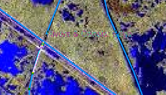
SnapTip Legibility Affected by Underlying Imagery
The simplest way to improve the SnapTip's legibility is to add a background to the text. A solid fill displayed behind the tip text will keep the SnapTip from blending in with the underlying image. The following section will walk you through the process of setting up snapping properties, including setting a background for SnapTips.
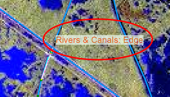
SnapTip with Solid Background
Step 1
Locate and launch the Editor toolbar by clicking the Edit button on the Standard toolbar in ArcMap. You can dock the Editor toolbar below the Standard toolbar.
Step 2
Click the drop-down arrow on the Editor menu and choose Snapping > Options.
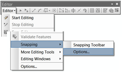
Snapping Options Menu
Step 3
To make snapping easier, there are several things you can do such as changing the tolerance and pointer color and customizing the SnapTip.
On the Snapping Options dialog box, specify a snapping tolerance.
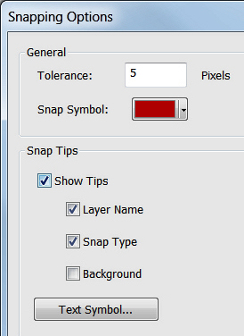
Set snapping tolerance.
For example, if you set the snapping tolerance to five pixels, this will ensure that the pointer will snap to another location within a five-pixel distance.
Step 4
Next, still in the Snapping Options dialog box, set the color used by the snap cursor by clicking the colored box next to Snap Symbol. By default, it is black. Changing it to a lighter color when you are working over a dark background or an image will make the pointer easier to see.
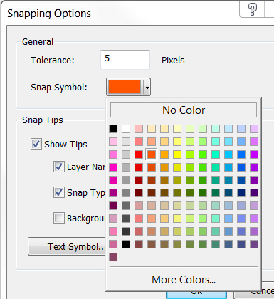
Choose a Snap Symbol color.
Because snapping elements are semitransparent, it may be simpler to experiment with different colors to find ones that are most easily distinguishable over the image.
Step 5
Now set the properties for the SnapTips. Check the Show Tips check box to enable SnapTips. Next, check the Layer Name and Snap Type check boxes. This will ensure that the SnapTip displays the name of the layer you are snapped to as well as the active snap type (edge, end, or vertex) in the SnapTip text.
Step 6
Now add a solid background under the SnapTip when it is displayed by checking the Background check box under Snap Tips.
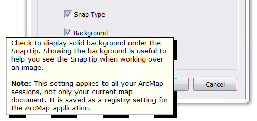
Turn on the background display.
This is one of the easiest things you can do to improve the snapping display over an image, since the solid fill behind the text won't blend in with the image.
Step 7
Finally, click the Text Symbol button under Snap Tips to access the Symbol Selector dialog box. Set the color, font, size, and other appearance properties for the SnapTip text. By choosing lighter or brighter colors or bold text with a larger font size, you can further improve the legibility of SnapTip text displayed over imagery. Click OK.
Legible SnapTips
You can improve the legibility of SnapTips by setting SnapTip options, such as a background, and experimenting with color and font choices for text symbols. This will make snapping more accurate and efficient during editing sessions.