It’s a new year and to start this year off strong, the first release of ArcGIS Business Analyst Web App, ArcGIS Business Analyst Mobile App, and ArcGIS Community Analyst is here! For 2024, we went BIG with some exciting new updates, enhancements, and features.
If you’re new here, welcome – we’re glad you’re interested in learning more about Esri’s location-based market intelligence tool! ArcGIS Business Analyst helps you make smarter decisions for market potential planning, site selection, and customer segmentation. You can identify under-performing markets, pinpoint the right growth sites, find where your target audience is located, and share the market research across your organization. If you’d like to learn more or want to try ArcGIS Business Analyst Web App, sign up for a free 21-day trial.
Now, let’s jump into the release updates. Below, I’ve listed the new features and enhancements. Make sure to read on to get all the details on how you can incorporate ArcGIS Business Analyst in your daily mapping framework.
- Redesigned suitability analysis workflow
- Hexagons available for mapping and analysis workflows
- Enhanced points of interest search
- New, updated, enhanced, infographics and reports
- Redesigned in-app guided tours
- Improved accessibility with Calcite design components
- ArcGIS Experience Builder: Business Analyst widget enhancements & improvements
- Data updates
- Important Changes – Features Deprecation
Identify the best location with the redesigned suitability analysis workflow
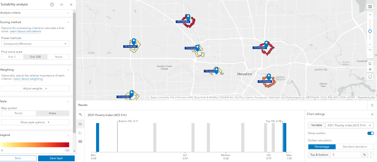
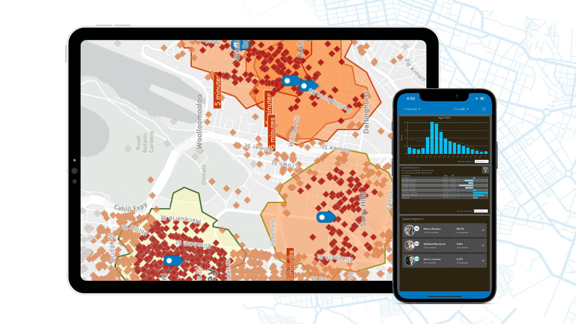
We know, we know, you all have been loving the suitability analysis workflow. Of course you would – it does all the work by ranking and scoring sites that meet your specific criteria. Now, we made it even better for you. This newly redesigned workflow lets you define, rank, and score your geographic area using geographic areas or the new hexagons option. With the new interactive Results pane, you gain more visibility, analysis and understanding of what’s on the map. You can now explore the data in a summary, histogram, bubble chart, or table. To top things off and make it even easier, we’ve added industry-specific variable lists to this workflow so you can quickly find important data for specific industries. Don’t forget, you can save your suitability analysis as a layer to use in infographics, stories, and other ArcGIS tools.
Want to learn more?Watch our latest video on how you can use the updated and redesigned suitability analysis workflow. Or you can take a deep dive into the calculations behind the new suitability workflow by visiting our reference topic.
Hexagons are now available for mapping and analysis workflows

We first introduced hexagons to ArcGIS Business Analyst Pro, which quickly became a popular tool for our users. If you don’t know what hexagons are, they are a uniform grid used in GIS that is made up of six-sided hexagons that help you better understand spatial patterns. For a quick primer on hexagons in Business Analyst Pro, read our “Got five minutes? Get to know hexagons” blog article.
You can now use hexagons in color-coded maps, smart map search, and suitability analysis to create a consistent-size grid across a given area. With hexagons, the size of the hexagons stay the same regardless of changes made to the traditional administrative boundaries such as census tracts, block groups, or Zip Codes. Start using hexagons today so you can eliminate the guesswork and perform an analysis that will stay relevant over the years.
Enhanced points of interest search
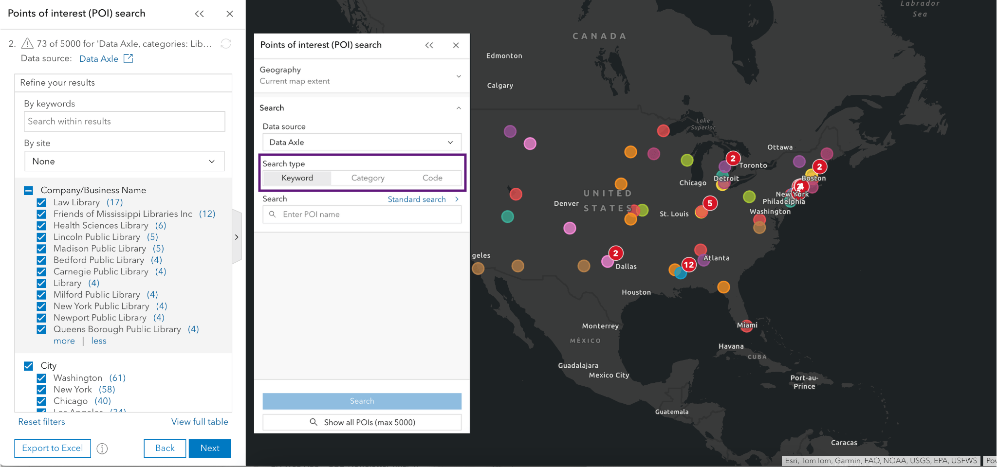
ArcGIS Business Analyst provides information about specific locations – such as businesses, government buildings, landmarks, tourist attractions, and more through points of interest (POI) data. With POI data, you can identify key businesses and community locations, plan for future expansion, identify market gaps, and perform competitive analysis.
There are big changes being made to the POI search workflow—that’s why we have broken up the enhancements into different phases. The first phase is here, which allows you to easily refine your search for the best results. Previously, when using the POI search workflow, you would have to first create your geographic site in other workflows and then jump over to the POI search workflow. Well no more – you can create a geographic site directly in the POI workflow as the first step. Simply set the analysis extent to the current map extent, geographic area (state or county), or select your sites. That’s not all: we also made enhancements to the search settings. You can now search by keyword (the default), category, or code as well as choose between ‘Standard Search’ or ‘Include Related POIs’ to perform a semantic search.
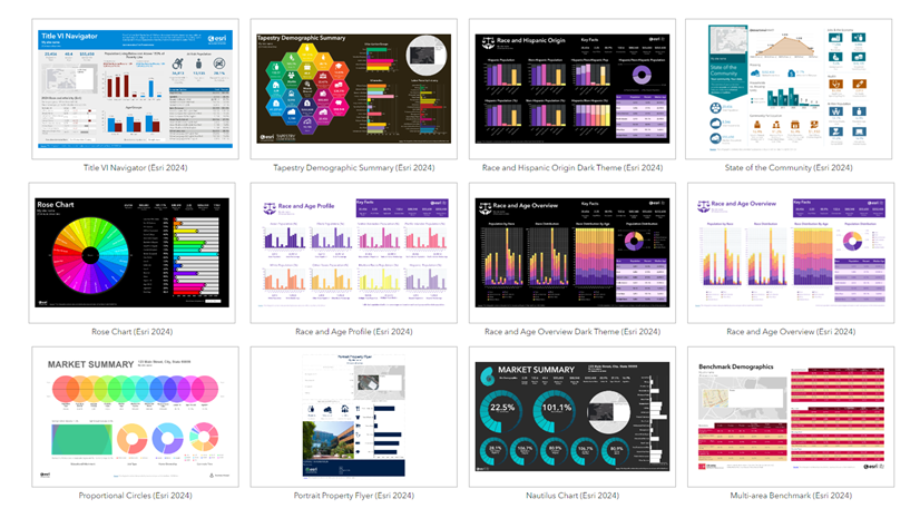
New, updated, enhanced infographics and reports
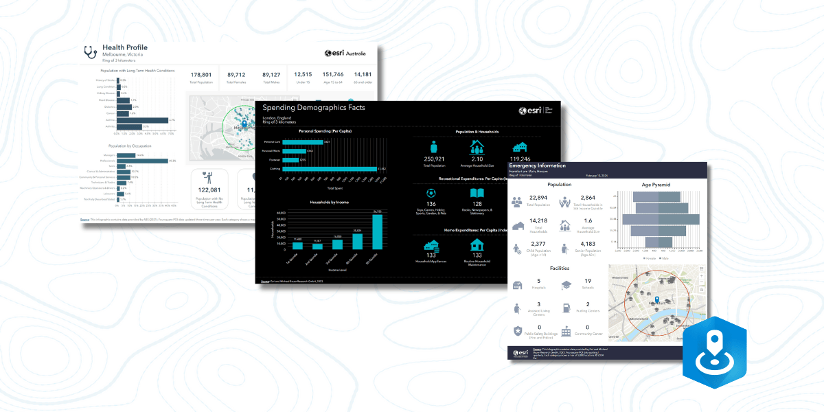
New infographics & reports:
The next time you log in, you will notice we have added to our infographic template gallery. Below is a brief description of each infographic, written by one of our product engineers.
International Version of Emergency Information Infographic (33 Michael Bauer Research countries):
The Emergency Information infographic provides an overview of people in a chosen area that may be at risk during a natural disaster or catastrophe, as well as facilities that may help in an emergency. This infographic includes demographic data (provided by MBR GmbH), and points of interest data displaying a maximum of 5,000 locations (provided by Foursquare).
Spending Summary Infographic (European standard infographic):
The new Spending Demographics Facts infographic has been added as a new standard template to allow more users in many countries the ability to ascertain spending information in a quick and easy workflow. This infographic contains data from Esri and Michael Bauer Research GmbH. The new template can be used in 30 different countries, including: Austria, Australia, Belgium, Switzerland, China, Columbia, Croatia, Czech Republic, Germany, Denmark, Spain, Finland, France, United Kingdom, Greece, Hungary, Italy, Luxembourg, Mexico, Netherlands, Norway, New Zealand, Poland, Portugal, Serbia, Sweden, Singapore, Slovenia, Slovakia, and South Africa.
Health Profile Infographic (Australia standard infographic template):
A new Health Profile infographic has been created for Esri Australia using the new Australian Bureau of Statistics (ABS) health data, which includes health conditions and age. This new infographic also contains points of interest provided through Foursquare, tying relevant health and medical locations of your analysis area to the new health data explored in the infographic.
Infographics enhancements:
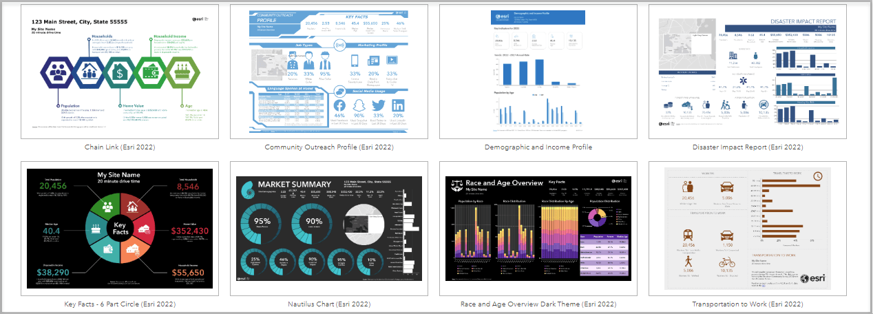
I know you’ll be ecstatic to hear: the infographic gallery is now accessible to Standard license users! This gallery includes over 50 additional specialized infographics designed to showcase eye-catching information. That’s not all, we’ve enhanced the editing experience in tabular infographics. In the Nearby Summary infographic, you will notice a new conditional icon and text option, as well as the ability to display the nearby summary icon as a picture bar option. But wait, there’s more! Other enhancements include improved editing experiences, improved configuration visibility, a layout preview mode in the infographic editor, and support for side-by-side infographic export to Excel. Woo, that’s a lot!
We’re taking in-app guided tours to the next level

In October of last year, we revamped levels 1-3 of the in-app guided tours to better assist your analysis journey and to provide a more modern look. With this release, we improved the rest of the guided tours, which include levels 4-5. The guided tours provide an overview of the workflows’ design, process, and will help you get started. All guided tours can be found by clicking on Account Details at the top right corner on the Web App.
Improved accessibility with Calcite design components
You may remember in June of last year, we introduced a new and improved interface. Our top priority continues to be focusing on delivering accessible software to our users. With each release, our focus is to improve usability for a wide range of our audience. With this release, we improved screen reader accessibility, keyboard interaction, visual display, high-contrast support, and more!
ArcGIS Experience Builder: Business Analyst widget enhancements & improvements
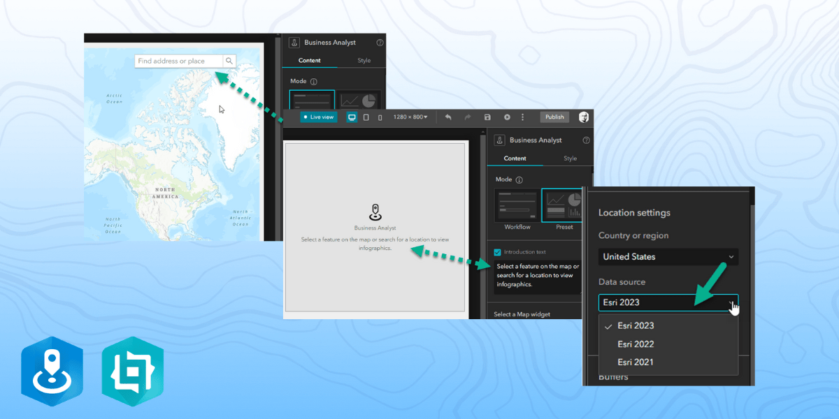
The Business Analyst widget in ArcGIS Experience Builder is a popular and well-loved tool that provides users with the ability to view additional information about any point or polygon feature on a map through the creation of reports and infographics. We made several bug fixes and enhancements this release. Check out some of the updates we’ve made:
- Add a placeholder text in Preset mode in order to add custom instructions for an app’s users before they view the infographics.
- Simply select a data source / vintage for countries that provide multiple data sources.
- Enable / disable the ArcGIS Business Analyst widget search bar on the map widget.
- Set a default infographic when using the widget in Workflow mode and this default information will then appear when using the app.
ArcGIS Business Analyst Mobile App updates
If you didn’t know, you could use ArcGIS Business Analyst on your phone. It’s a great tool to use when you are on the go or in the field. We’ve made some major changes in our mobile app. You can now select polygon or point features and run colorful infographics and reports on your designated site. Need the infographic in a PDF version – you can now export infographic to a PDF.
Data updates
ArcGIS Business Analyst data is what sets us apart and we are constantly updating our data to the latest and greatest. Here is the latest data update:
- Business locations for U.S., Canada, and Puerto Rico to Q4 2023 (Data Axle and SafeGraph)
- Global POI to Q4 2023 (Foursquare)
- Esri Thailand Business Points (Nostra)
- USA Traffic data to Q2 2023 (Kalibrate)
- Crime Indexes to 2023B (AGS)
- Advanced Demographics: Australia (ABS) 2021, Germany (Nexiga) 2023, Thailand (Esri) 2022.
- Standard Demographics for 21 European countries 2023 (Michael Bauer Research)
For more data update details, please view the “What’s New in Esri Demographics” blog article.
Important changes
There are some important changes that have happened with this release. Over the months, you were notified of the upcoming feature deprecations. With this release, ArcGIS Business Analyst Classic version is being deprecated and is no longer available to access from the application. With that, the classic color-coded maps has been deprecated and is no longer available in the application. Don’t worry, if you have been using the latest color-coded maps workflow, you probably noticed the great new features and latest updates. If you have any questions regarding these changes, please feel free to reach out to the ArcGIS Business Analyst team at businessanalyst@esri.com
Additional resources
We’re so happy to share the latest 2024 release updates of ArcGIS Business Analyst Web App with you! Below, we’ve added resources to help you with your ArcGIS Business Analyst journey:
- Business Analyst product overview page
- Review pricing and purchase Business Analyst
- Join our LinkedIn Business Analyst User Group
- Join our Business Analyst Esri Community
- Follow our weekly #BATipsandTricks posts on social media
- Read more Business Analyst blog articles on ArcGIS Blog
- Watch Business Analyst Web App videos
- Watch Business Analyst Mobile App videos
- Visit the Business Analyst Resources page
- Visit the Community Analyst Resources page


Article Discussion: