Well here I am in Michigan slowly but surely refilling my depleted energy reserves. What a UC that was! Getting to present with my wonderful colleagues and interact with our tremendous customers is a real blessing. I look forward to it every year, even though by Friday my life force has been drained to near-reboot-tripping levels. But in a broader sense it feels almost exactly not unlike when WALL·E turns his solar panels to the naked sun in the void of space. My batteries are charged for the full year to come. Thank you everyone for that!
I ran through a lot of demos at the conference, quickly and earnestly. I did this because it’s an opportunity to cover lots of ground and offer attendees a chance to catch ideas or muses, all with the promise that details a-plenty are available to them if they dig around. So to make good on that promise, or at least make the digging less effortful, here are some unearthed resources…
ArcGIS Cartography Demo Jam Fest
Co-presented with Ken Field, we had two sessions of this presentation (with no overlapping content between the two). I got through eight maps overall. Here they are…
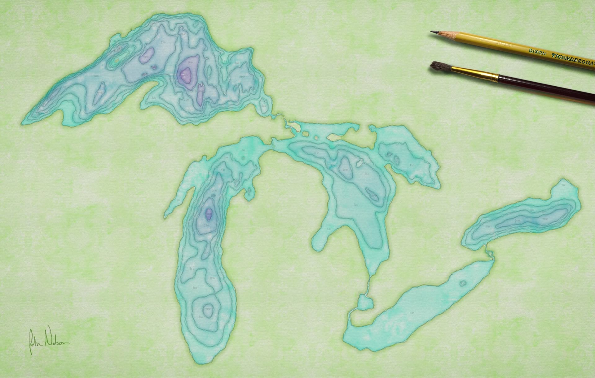
Vintage Hillshade
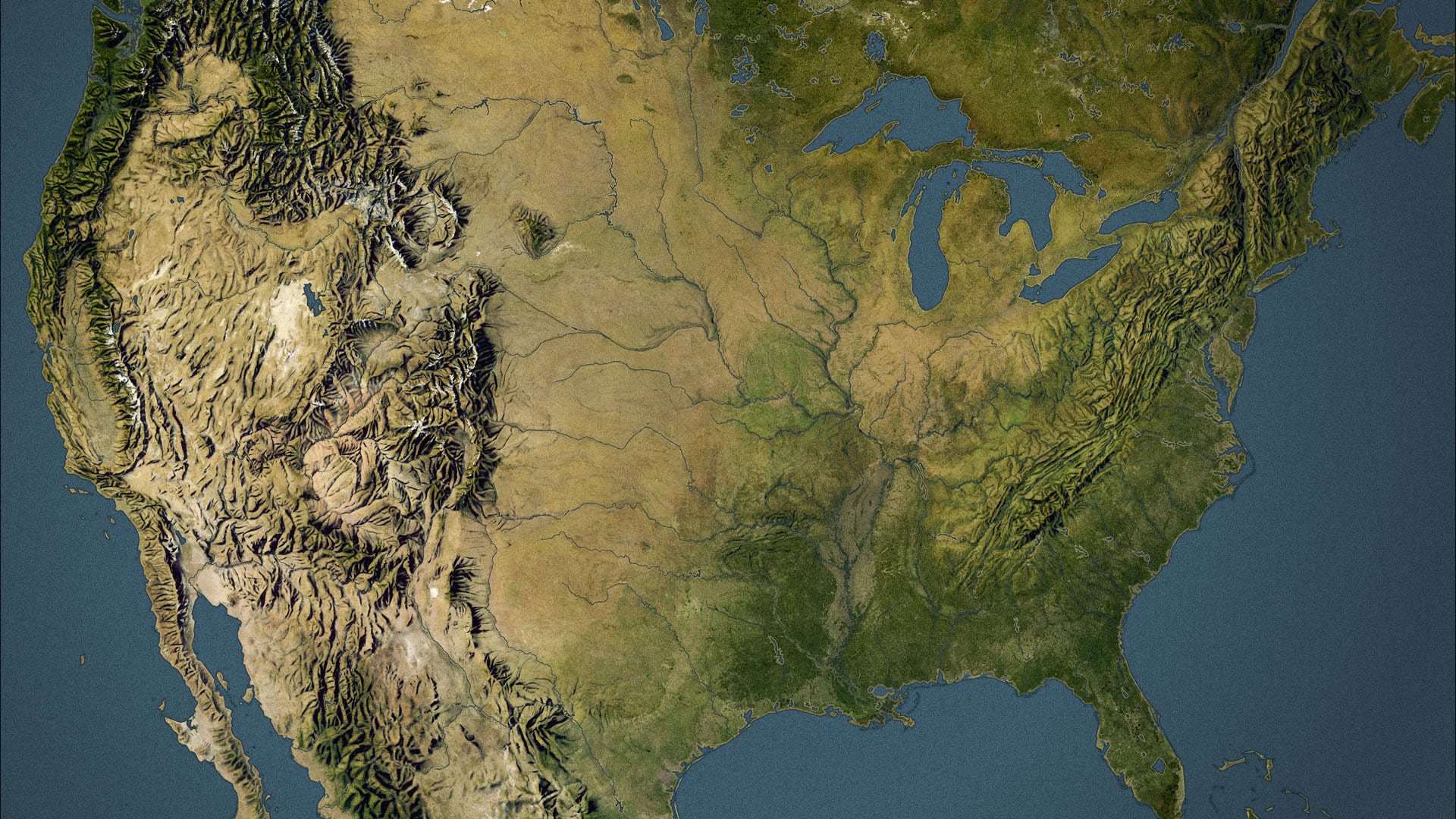
This is a mashup of a cartographic hillshade plate beautifully hand-painted by Herwig Schutzler five decades ago, and modern day satellite imagery. Here’s a how-to, with links to the source images, if you are, like me, inclined to collaborate with map makers from decades past. Or, if you prefer a video lesson narrated by this nasally Midwesterner, then who am I to prevent that?
Appalachian Trail Journal Map
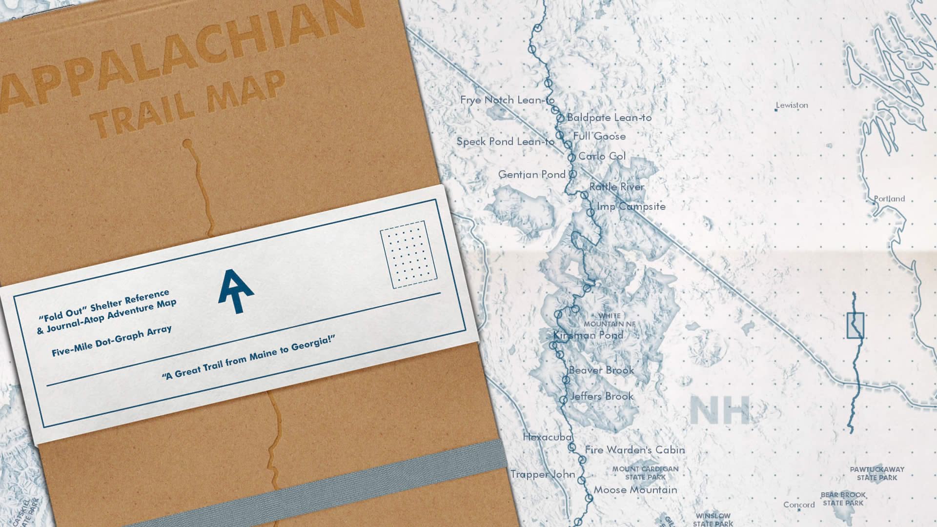
This is a nod to long travel maps of yesteryear and the spartan utilitarian beauty of the Field Notes brand. Here’s the how-to for making the map portion of this thing in ArcGIS Pro. And here’s a link to just the map. It was also inspired in part by a talk given at the NACIS conference by Daniel Huffman, who made a pretty strong case for the liberating constraints of monochrome mapping (which gave rise to the moniker “full huffman” for this style).
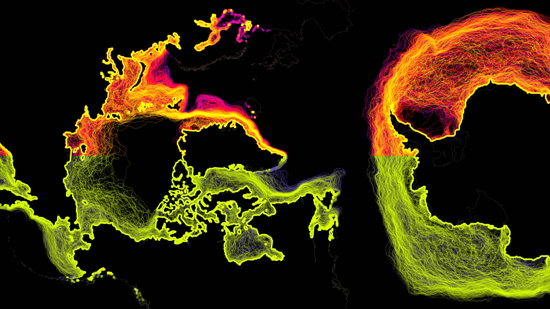
Iceberg Motion
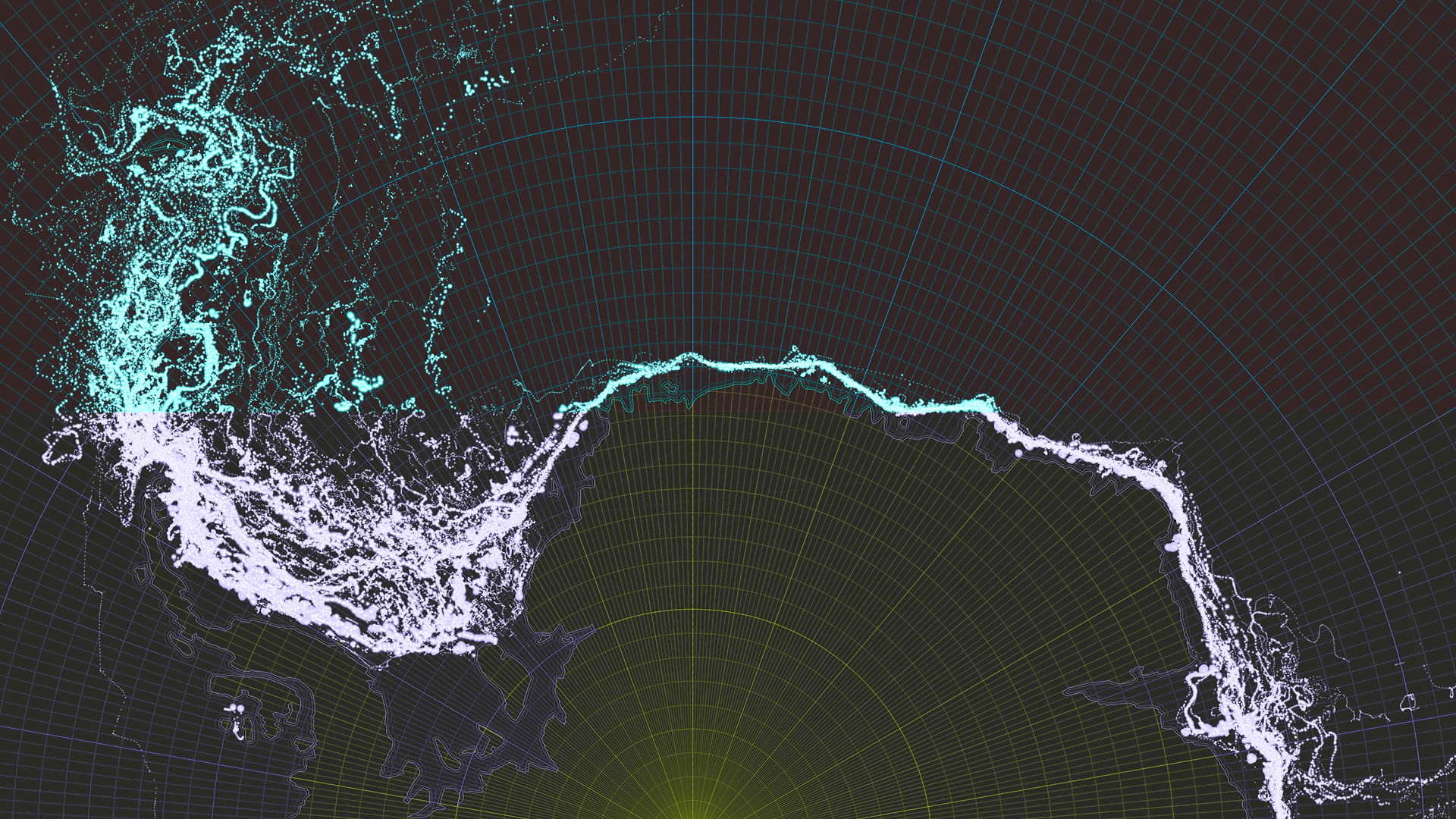
This is a rather minimalist map showing four decades of tracked Antarctic iceberg locations. There are two how-to posts for this thing. How-to part 1 has to do with the cartography while part 2 deals with animating it over, and through, time. They both include a YouTube video walking through the steps. I’m thinking of doing more of that sort of thing, if you’ll tolerate it.
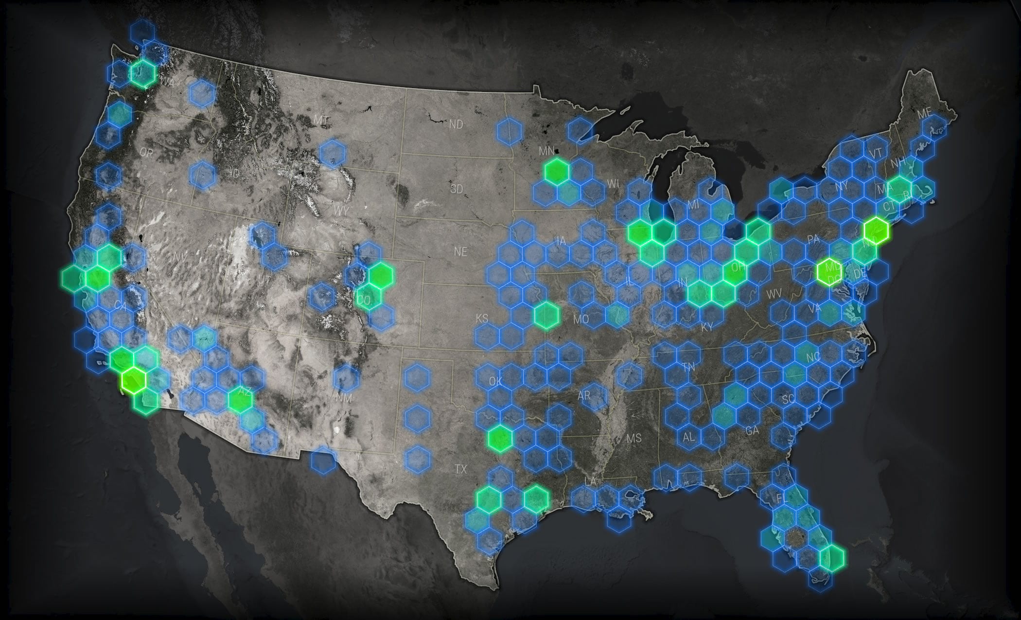
Antarctic Overview Globe
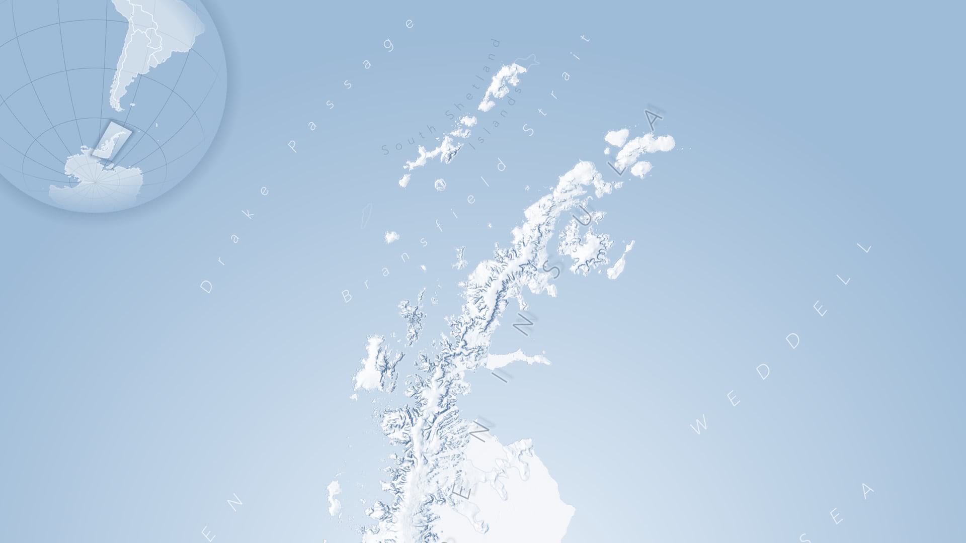
I rather enjoyed this demo since it was purely a nuts and bolts mapping how-to sort of thing. And I feel like the audience was serving up some good energy during this demo. How to make an overview look nice? Cool even? The fact that the map is showing the Antarctic Peninsula is really just set dressing for a sneaky lesson in the thoughtful use of gradient strokes. Actually, in this how-to post I apply the shadow effect to the round map frame while at the user conference I just applied the shadow effect to the globe itself (by giving a mega-handy world background layer a gradient stroke). Either way works.
Sea Ice Extents
Lots of Antarctic stuff, right? I don’t know, there’s just cool (wink) data out there. Anyway, I have to admit I haven’t written a how-to, specifically, but I did write a blog post splattered full of versions and variants of this map, which shows the extent of sea ice per month, across 40 years. I’ll write a proper how-to shortly. BUT, get this! Just now as I was writing, my lovely and brilliant daughter Willow (who designed this felt map) walked in and asked what the ice map was all about and I just explained to her, via the alternating animation of Arctic/Antarctic sea ice, how the North and South hemisphere’s seasons are reversed. I love Willow and I love the immense potential energy of maps to engage. Shoot, while we’re on it, I love you too.
Touchable Terrain / Vibrant Basemap
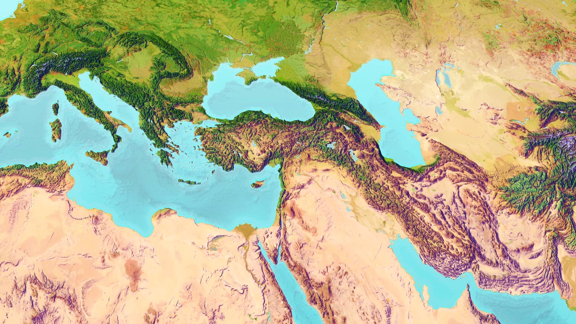
Ok ok, I have to admit, this was more of a how-to sneak peak, since I haven’t written the specific how-to for this basemap yet. But I will tell you it is a mash-up of the handsome and science-y Ecological Land Units, a bit of bumpified and colorized hillshade, and layer masks. And stuff.
Tattered Map Sandwich
Ah the fakely realistic map that looks like a real map for a fake prop, whose reality hinges on how well you can fake its realness. It continues to astound me how effective a bit of paper texture, especially when craftily applied to a map’s edges, can engage the populace! Here’s the how to, which includes the image assets (which I made with some roughed up drawing paper and olive oil) needed to make it look all Middle Earth and tattered, and a Pro style to make your layers match. Let me just throw out a guarantee here. If you make a map like this, it will absolutely attract attention, and that’s a big part of the game won already.
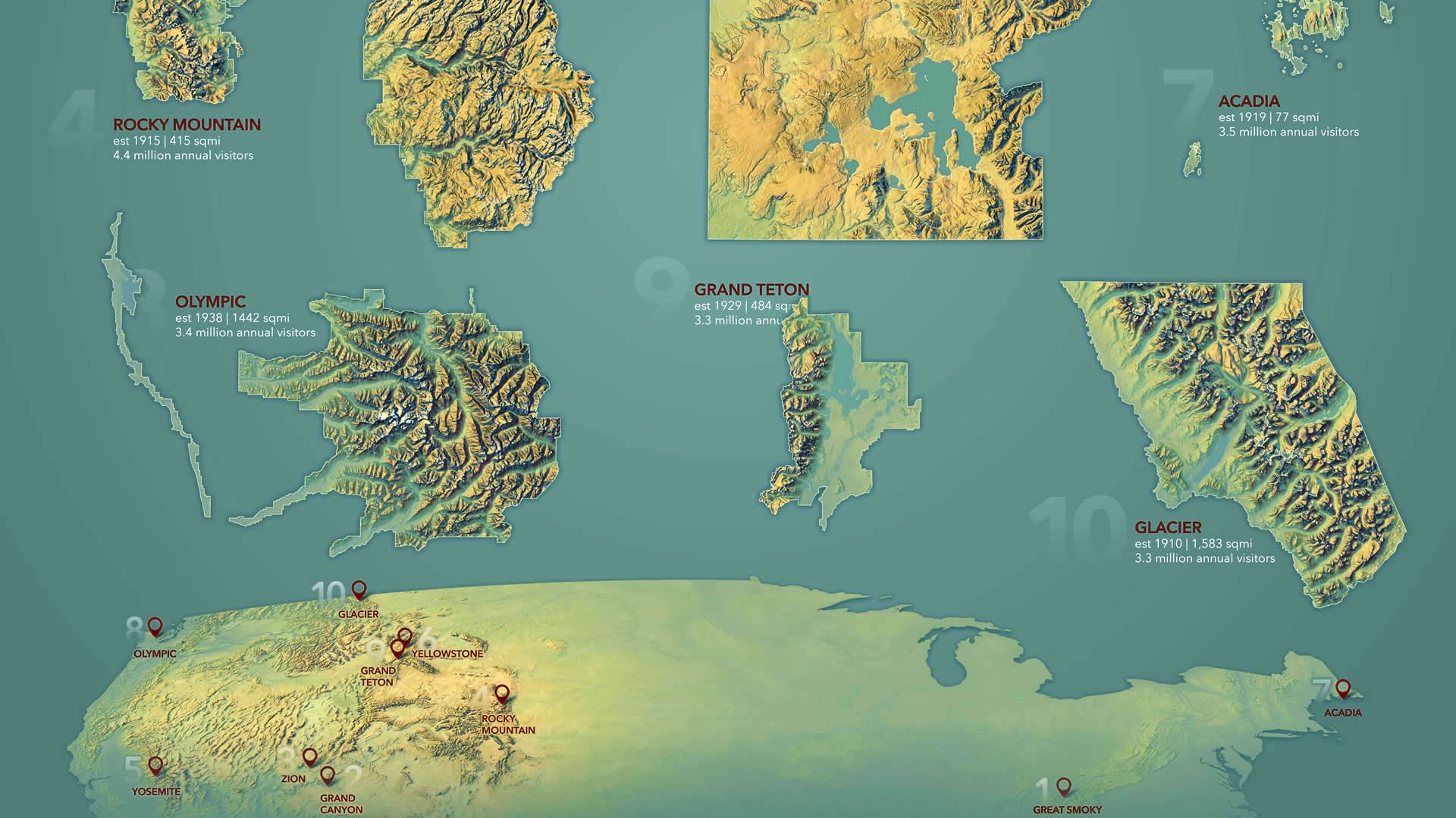
Grand Canyon Turned Inside Out
Is there a pedagogical term for the use of logical extremes and opposites? If so, this map uses that pedagogical approach. Here’s a how-to showing you how to turn the Grand Canyon inside out. Because maps! Please do not watch the YouTube version of this how-to.
Mapping With Style
Co-presented with Ken Field and Edie Punt. In this session, Edie provided all sorts of practical and useful information about using styles in ArcGIS Pro. Ken and I intermittently distracted the audience with examples. Here are the ones I shared (plucked from among these)…
Watercolor
Actually, Ken did this demo. But he used my watercolor style to fill out his amazing digital reconstruction of his charming mid-century map of Redlands. So I’ll take a bit of credit.
Beer Map
This was a tandem demo. Ken created a palette of color chips, based on the SRM color values brewers use to classify beers. Then he emailed the style file to me and I applied it to a county map of per capita beer spending. And so can you!
Firefly
Ah, what session on styles would be complete without a hurried demo of luminous revelry that is Firefly cartography? You can download the ArcGIS Pro style here.
Lego
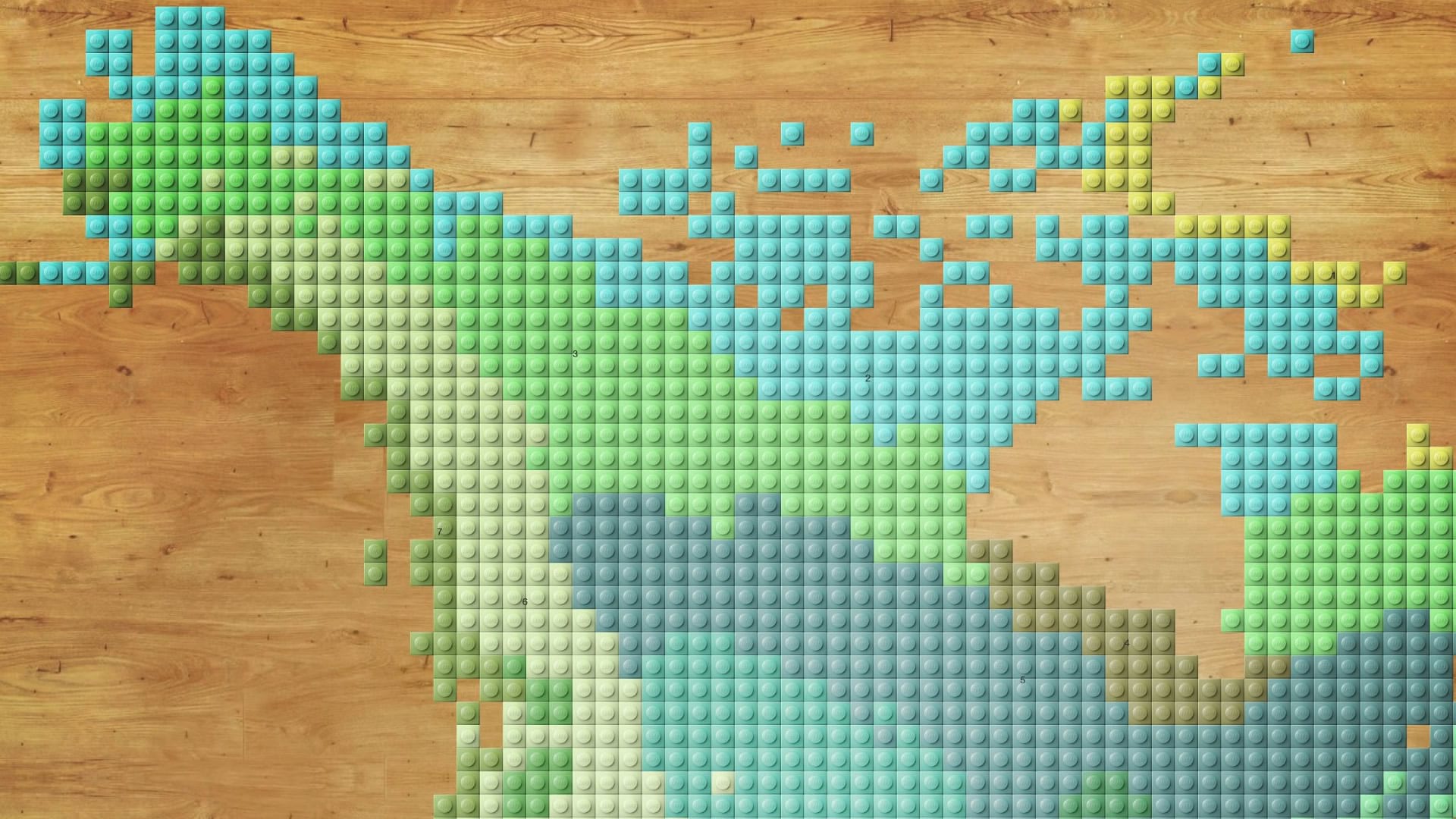
To illustrate the helpfulness of locking some symbol layers while leaving some unlocked, I built a Lego-like style, applied it to a world landcovers layer, then gave it a unique-value classification which automatically colored the studs by landcover type. You can find the Lego Map style here.
Imhof
In the first session, I started with just a DEM, then built hillshades and applied the Imhof color schemes to them. Took a couple minutes. In the second session I just applied the style to the already-made hillshade layers. That was like a 30 second demo. You can download the Imhof style and try it yourself, here. What even is an “Imhof” style? Get the steamy details here.
Election Cartography
In this session I was mainly the American foil so Ken, an Englishman, could present a series of maps that show the same US election data via a host of different methods. But I also showed a few maps of my own…
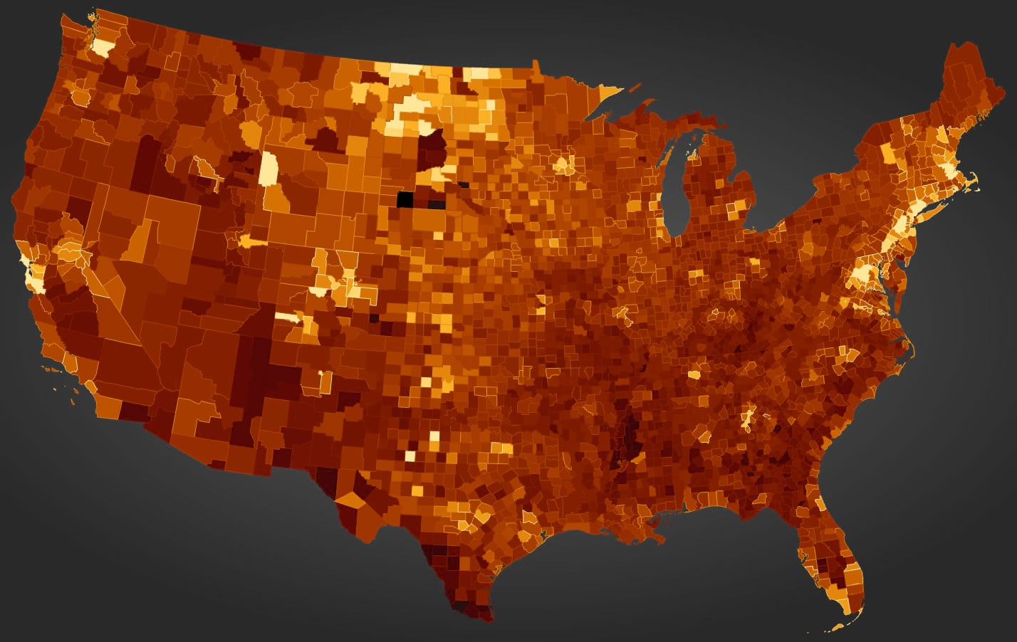
Blended America
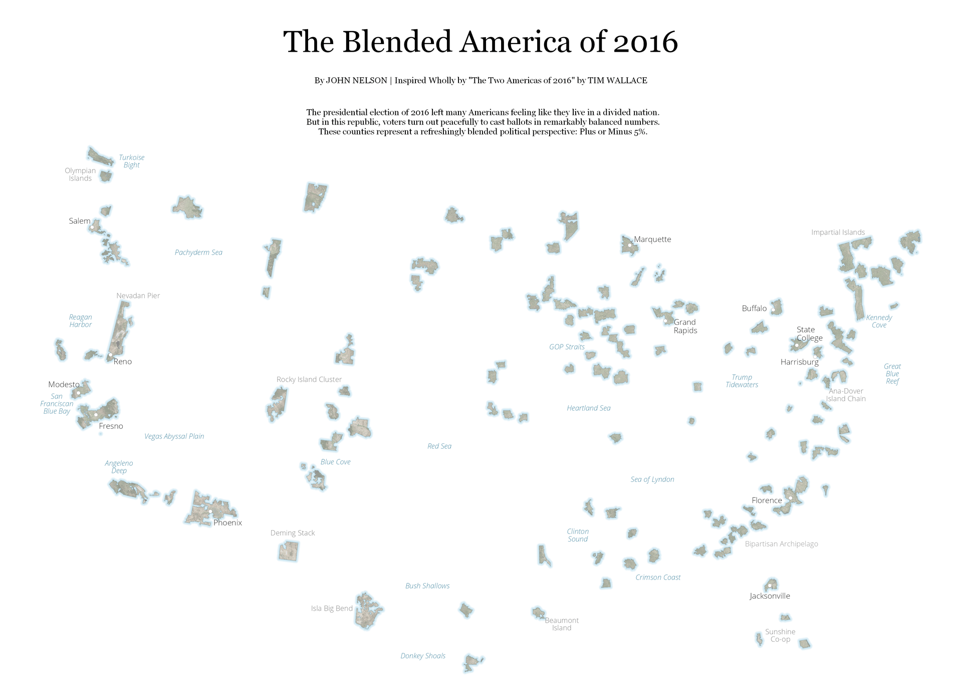
This is an optimist’s take on the “Two Americas” map set run by the NYT after the 2016 presidential election. Check the how-to here. If you’re like me and learn better from poking around the source files, you can download the Pro project package.
Split Bubbles
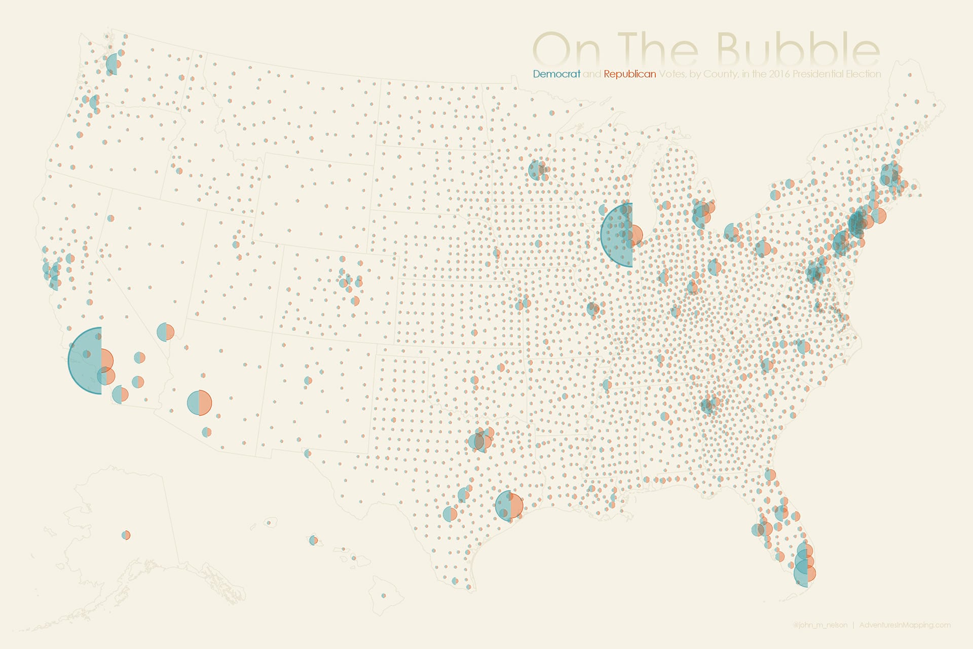
This map uses adjacent graduated semi-circles to show the Republican and Democrat votes concurrently/comparatively. Get the scoop on this symbol concept, but with different data, here. And download this election map’s Pro project package here.
Election Carto-Cube-o-Gram
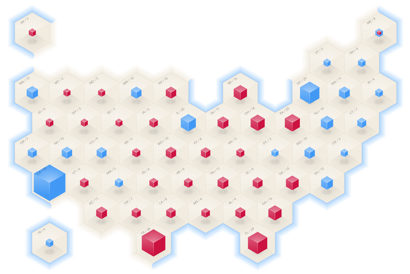
This weird thing is my favorite map of the election. You can tear it up and attach your own data for your own purposes, by downloading the Pro project package. And here’s a how-to for a very similar map. Super simple.
Thank You!
And that’s all the cartography demos I got to do at the 2019 User Conference! Hope you find some little corner of this interesting and/or useful. I have to say, it sure is an honor getting to meet and speak to so many of fellow map folks. I know I am fortunate. Because of that I try to share out as much of the joy and utility of mapping that I get to participate in, as I can. And, recursively, the sharing is even more rewarding than the making. It’s a blessing of blessings. A meta-blessing! Thank you for jumping in with me.
Happy Mapping! John Nelson

Commenting is not enabled for this article.