Using Web Maps to Tell Your Story
Highlights
- Use ArcGIS Online to tell stories with maps.
- ArcGIS Online now includes intelligent web maps and storytelling templates.
- Geographic data once secured within organizations can now serve new audiences.
For centuries, maps have been telling stories—chronicling discovery and conquest, documenting an understanding of the patterns and interrelationships that underlie human and natural systems. But only in the past few years have new technologies and new media vastly expanded the potential of maps to weave narratives.
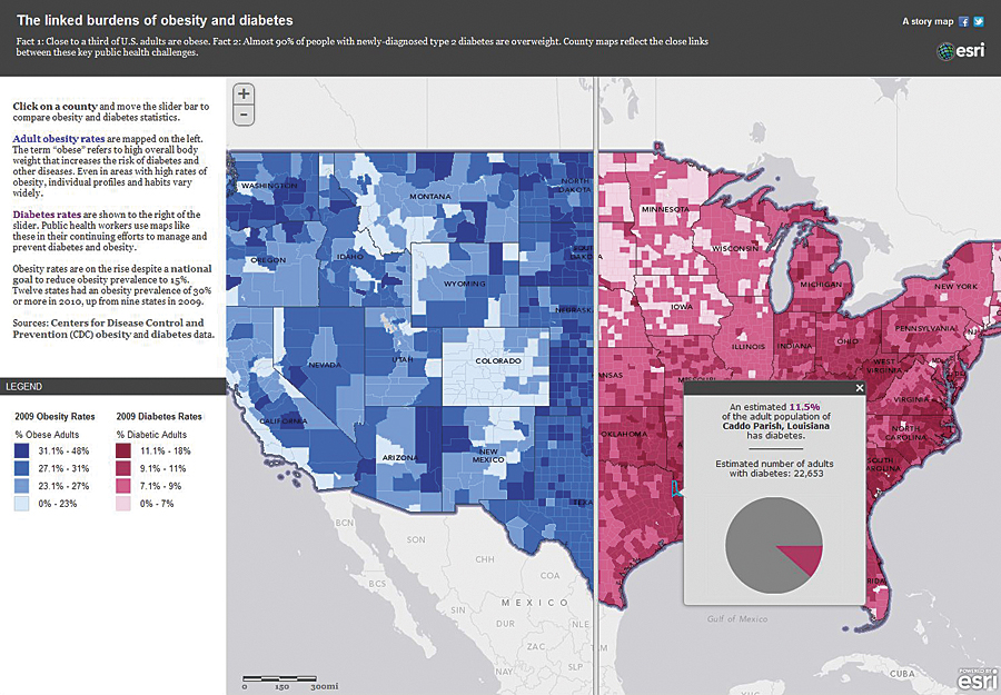
The swipe tool helps users quickly compare different maps—in this case, obesity and diabetes rates. Also, see the dramatic poster in the center of this magazine.
Maps are now interactive. They enable and reflect data analysis; they're constantly updated; and they're enriched with multimedia content. Maps are newly supercharged by digital technologies: GIS, the web, the cloud, and mobile communications. Now, maps can take users from globe to street corner in seconds; they can dynamically show change over time; they can organize and present charts, graphs, photos, and video. With the swipe of a fingertip across a tablet, map users can compare one theme with another, ask questions of maps, add their own information to maps, and cast votes on maps.
Some maps may still hang idly on walls and lurk in glove compartments, but more and more they flash and sparkle on web browsers, tablets, smartphones, and flat screens. The storytelling potential created by these exciting changes has barely been tapped.
Storytelling is rapidly becoming one of the most important reasons that organizations use GIS. A result is that GIS is emerging from the back office and becoming accessible—and useful—to everyone. Similarly, geographic data that used to be secured within organizations is being released by them to serve new audiences. The uses of GIS for analysis, planning, management, and decision support remain vitally important, but organizations now perceive the need to tell the story of their analyses, plans, and decisions.
Esri is exploring storytelling techniques and developing new tools to empower this new medium and to more fully enable organizations to build and publish their own map-based stories. The primary expression of this work is the story map.
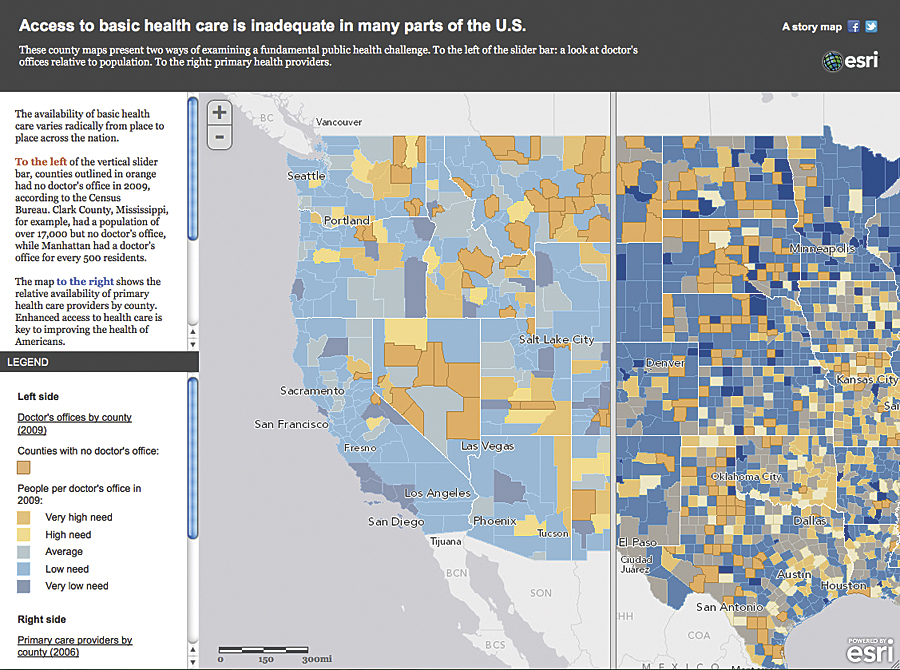
A swipe tool helps users view the distribution of health care in the United States.
What Is a Story Map?
Story maps are interactive and combined with text and other content to tell a story about the world. Typically, story maps are designed for nontechnical audiences. They include all the elements required to tell a story: web-enabled maps, text, multimedia content, and functionalities that enable users to interact with them.
Story maps can be built not only by graphic designers and journalists but also by GIS users, web developers, and anyone with a basic familiarity with web and mobile platforms. They can serve not only the general public but also other audiences, including managers, policy makers, special interest communities, and organizations.
ArcGIS Online to Tell Stories with Maps
Many map-based stories are custom produced by GIS professionals, web programmers, and other specialists who build map viewers and functionalities from scratch. Knowing that these skills are often beyond the reach of many users, Esri is facilitating storytelling by providing two key capabilities on ArcGIS Online: intelligent web maps and storytelling templates.
Users can build and edit web maps on ArcGIS Online from several components:
- A basemap is chosen from the gallery of options (including topographic, street, satellite, and reference maps) provided by ArcGIS Online. It's easy to change the basemap at any point in the process of creating a web map.
- A web map usually includes one or more map services. These might be chosen from among the thousands of existing services available on ArcGIS Online. Frequently, users will create a map in ArcGIS for Desktop and enable it as a map service to incorporate into a web map.
- Tabular data from a spreadsheet can be added to a web map. Spreadsheet data can include URL links to photos, statistical data to be visualized as charts and graphs, and text for titles and descriptions.
- Pop-up windows are a key component of web maps. A user's mouse click on a point or polygon spawns a pop-up window that can contain text, charts, and photos derived from elements of the map service and/or spreadsheet. ArcGIS Online allows story creators many ways to customize, or configure, these pop-up windows.
- Title and text descriptions accompanying web maps usually become a component of the story map.

Users can explore this story by clicking map icons or perusing a thumbnail list.
The process of creating web maps is described in greater detail in the ArcGIS Online resource center and in a Workflows and Best Practices document available at storymaps.esri.com.
The web maps are then published into templates that provide the remaining key story elements, including title and subtitle and places for text and map legends, as well as functionalities for interacting with web maps. Esri has developed a series of templates to enable various kinds of storytelling, summarized below.
This process of assembling raw materials, building web maps, and publishing them into templates makes it relatively easy to create story maps without a large investment and without needing special programming skills.
Esri Story Maps
Allen Carroll, former chief cartographer at National Geographic, leads a team at Esri that publishes story maps; they're viewable at storymaps.esri.com. Producing these stories helps Esri discover and develop storytelling techniques, tools, and best practices. More importantly, the stories have spurred development of templates and other resources with the goal of enabling thousands of people—GIS professionals, web developers, graphics specialists, and others—to build and publish their own story maps.
Kinds of Story Maps
Maps tell many kinds of stories. They can summarize a situation, trace a route, and show change over time. They can examine causes and effects and reveal interrelationships. They can help people make plans, predict or model the future, and support decisions. Different kinds of stories suggest different designs and functionalities. To that end, Esri is developing storytelling techniques and templates to support a variety of needs. Here are some examples.
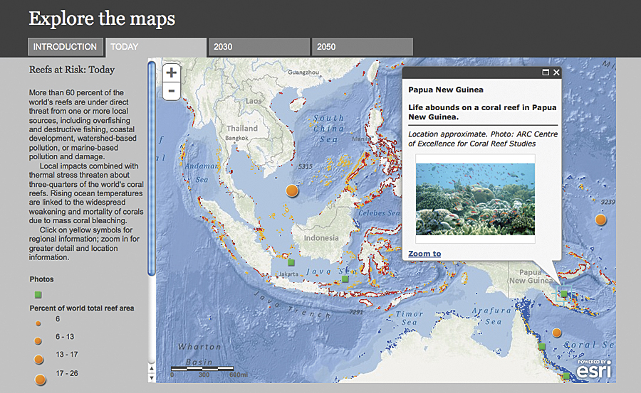
Tabs provide access to maps predicting coral reef risk levels.
Describing a place or a series of locations—Many times, a map depicts a location or region to give users a sense of its character. Combining a reference or thematic map with pop-up-enabled point features can vividly describe a place or places. See the San Diego location story map.
A playlist viewer goes one step further by adding a browsable list of thumbnails in a panel beside the map. In the story map at the far left, the playlist provides previews of photos and articles depicting America's watersheds.
Explaining a geography-related topic—Many maps are made to explain something: the extent of damage from an earthquake, the number of registered voters in an area, or the pattern of vegetation in a national park. Simple but effective stories combine a web map with clickable points or polygons within a template that displays a text summary and the map legend in a side panel. For an example, see the story map depicting 2008 US presidential election votes by precinct.
Comparing two or more themes—Story maps often compare and draw parallels between two or more phenomena or themes. Comparison maps can take many forms and serve many purposes. They frequently seek to explain a phenomenon or trend by comparing it to other themes that may be causes or influences on the subject being explored. The story at storymaps.esri.com/uninsured, for instance, relates patterns of health insurance coverage to the distribution of Hispanics and to median household income. Thematic web maps are published in a template that displays them in a series of tabs.
Another storytelling template uses a swipe tool to enable easy comparison of two themes. The template consumes a single web map with two thematic layers, exposing the layers to the left and right of the slider. The story shown on the cover compares obesity and diabetes rates (see storymaps.esri.com/stories/doctors).
A third alternative places two or three separate web maps next to each other. As users pan and zoom on one map, the other one moves along with it. A story at storymaps.esri.com/ac/diversity/ uses census data to highlight the rapid increase in ethnic diversity between 2000 and 2010.
Esri has developed a thematic atlas viewer that enables users to quickly browse a dozen or more map themes. A Health in America Atlas at atlas.esri.com/Atlas/Health_Atlas.html enables users to click on counties to spawn informational windows displaying clear, simple bar graphs.
Showing a distribution pattern—Many maps use points, graduated circles, or polygons to represent distribution or density. Story maps can bring topics like these to life. A map depicting the hometowns of Titanic passengers, for instance (see "Storytelling with Maps" poster), looks cool and dispassionate at first glance, but clicking the locations reveals passenger details that evoke human dramas of disaster and survival.
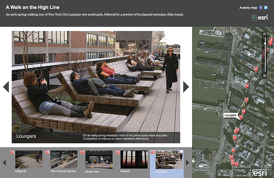
A narrative viewer presents a virtual walk in New York City.
Showing change over time—Most maps represent the earth's three-dimensional surface on a two-dimensional sheet or screen. Some maps also seek to represent the fourth dimension of time. Just as maps compress space through scale, temporal maps compress time by a variety of techniques.
An example is a story featuring the rapid adoption of cell phones around the world. Its simplified time slider enables users to view maps in rapid sequence, simulating an animation, and to pause to more closely study individual maps.
Then-and-now pairs of images or maps can effectively reveal change over time. This story provides a guided tour of locations around the globe that have changed dramatically in the last 20 years.
Forecasting the future—Stories can use similar techniques to show projected change. The World Resources Institute provided data for the above story map predicting a dire future for the world's coral reefs. It uses the tabbed theme viewer to present coral reefs today, in 2030, and in 2050.
Providing a place-based narrative—In some sense, all story maps are narratives. But some stories are best told by presenting a series of location-specific items in sequence. A story on New York City's High Line uses a format that combines a map, carousel (below) viewer, and series of photos and captions to document an early-spring walk through the park.
Summarizing a status or situation—Many professionals in fields such as emergency response, utilities, or facilities management use maps to monitor the status of systems or help keep track of an ongoing issue or crisis. This sort of map can be informative for general audiences as well. Esri publishes situational maps that combine near real-time data, such as earthquake epicenters, with location-based social media feeds.
Enabling participation—Web and mobile applications enable users to actively participate in mapping. OpenStreetMap is perhaps the best-known example of volunteered geographic information (VGI); VGI is also a key component of more specialized maps and applications that enable users to add their own content or express their own opinions. Esri's PollMap template enables users to place votes by location and has been used to map team loyalty for sporting events like the Super Bowl. This map invites users to share their voting persona.
Presenting a briefing—Story maps can assist managers and policy makers in understanding issues and making decisions. Traditionally, briefing documents have been static, with maps playing a minor supporting role. Briefing documents can now do much more, with web maps providing interactivity, allowing continual updating, and enabling users to sketch and comment on maps. ArcGIS Explorer Online lets users assemble PowerPoint-style presentations featuring interactive maps. An example is a guided tour of the National Geographic basemap.
Esri is developing a briefing book template that will combine a text narrative with one or more web maps. In fact, the story maps team is continuing to develop innovative ways to tap the power of maps to weave narratives. As these techniques are refined, new templates will be made available on the storymaps.esri.com site and ArcGIS Online. Some of these templates will be fully configurable, requiring no web programming skills. All will be available for download, enabling users to make their own modifications. Users are encouraged to develop and share their own storytelling tools as well.
As with any new medium, there is a time lag between the availability of new tools and their full and effective use. The Esri story maps team is exploring this exciting realm in hopes that thousands of people will soon be making and sharing their own story maps. In that event, society will surely benefit.
See also "Thinking About Story Maps."