ArcGIS Living Atlas of the World is the foremost collection of geographic information from around the globe. It includes curated maps, apps, and data layers from Esri and the global GIS user community that support your work. Living Atlas also includes analysis-ready layers and tools that work across the ArcGIS System. Visit the ArcGIS Living Atlas of the World website where you can browse content, view the blog, and learn how you can contribute.
Here’s what’s new since the last ArcGIS Living Atlas News (April 2021).
Quick links
Use the links below to jump to sections of interest. Use your browser back arrow to return.
- Living Atlas apps
- Basemaps
- World elevation
- Imagery
- Environment
- Demographics
- Policy Maps
- Analysis tools
- Community Maps
Living Atlas Apps
Content from ArcGIS Living Atlas of the World is used to make valuable apps for visualization and analysis. These apps can be found under the apps tab at the Living Atlas website or via search at the browse tab.
ArcGIS Living Atlas Live Feeds Status
Living Atlas Live Feeds Status is a new, simple to navigate page displaying the current service status for Esri live feeds. The page displays a summarized view of each service, showing the current status and usage trend, along with an RSS link.
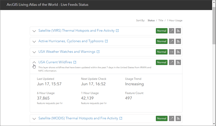
The drop-down displays additional details such as the time of the last update, usage trend, 1-hour and 6-hour usage rates, feature counts, and time of next update check. The Live Feeds Status page is refreshed every 15 minutes on the quarter hour. For more information, see Introducing ArcGIS Living Atlas Live Feeds Status.
Grocery Store Access
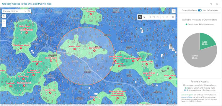
This app answers the question: How do people get to a grocery store in your city? Enter a ZIP code, city, or point of interest to learn how many stores people can reach in a 10-minute walk or drive. Interactive charts update as you move around the map or draw shapes.
UnemploymentPulse
UnemploymentPulse is an application that visualizes United States unemployment rates as compact trend lines. Updated monthly, it presents a moving 14-month window of unemployment data at the state and county level and shows them alongside national rates for comparison.
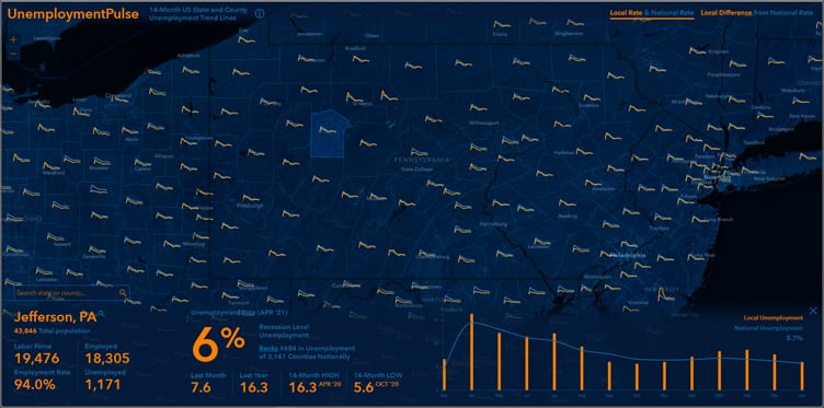
Unemployment descriptive ranges are sourced from the Bureau of Labor and Statistics. For more information, see Introducing UnemploymentPulse.
Evaluating the Digital Divide in the US with ACS
This dashboard lets you explore factors related to the major digital divide facing the US. Using American Community Survey (ACS) data, you can explore the population without computers or internet by income, education, employment, and more.
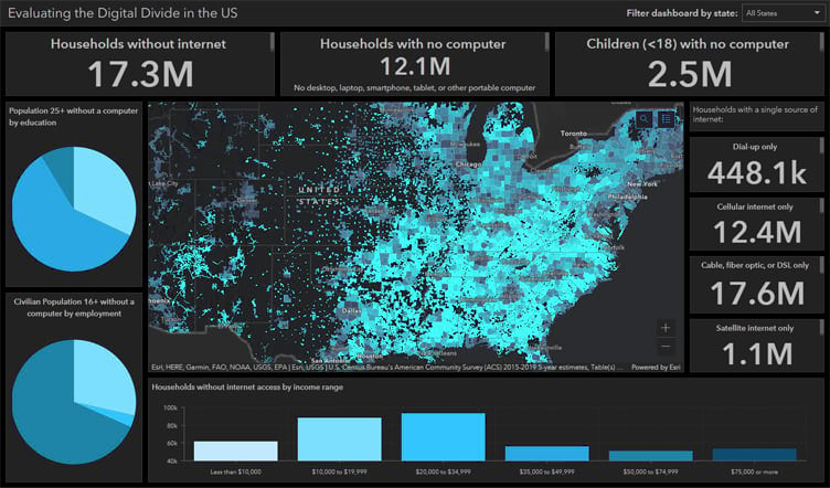
Using this dashboard you can learn more about the following topics:
- Population without internet or a computer
- Population groups without a computer (children, education level, employment status, income range)
- Population with a single source of internet (dial-up only, cellular only, cable, fiber optic, or DSL only, satellite only)
For more information, see the dashboard item details.
School district characteristics and socioeconomic information
This dashboard summarizes schools and local socioeconomic characteristics of school districts within the United States. Select a school district to learn more about the children and schools that fall in that area.
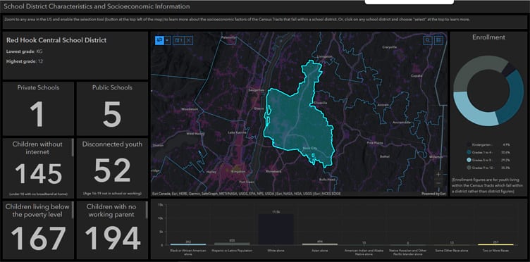
Using this dashboard you can learn more about the following topics:
- How many public/private schools fall within the district?
- What type of population density lives within this district?
- Socioeconomic factors about the Census Tracts which fall within the district.
For more information, see the dashboard item details.
U.S. Vessel Traffic
Released earlier this year and mentioned in ArcGIS Living Atlas News (February 2021), the U.S. Vessel Traffic application has been updated to include data from July through December, 2020 (also included in the underlying feature layer).

U.S. Vessel Traffic lets you explore the paths of vessels in and around U.S. waters. You can look for patterns and trends by time, vessel type, and place. The app provides a simple and efficient way to download manageable-sized, area-specific, data for further analysis.
For more information, see Introducing the U.S. vessel tracking app and Vessel traffic processing in ArcGIS Pro.
Basemaps
Esri basemaps are updated regularly with data from commercial, open, and community sources. All vector basemaps have been updated using data from HERE, SafeGraph Places, and content contributed to the Community Maps Program. In addition to content updates, basemaps supporting six additional languages have been released. For more information on recent updates, see the latest vector basemaps blog articles. You can view all vector basemaps by browsing Living Atlas.
Some hosted raster basemaps have entered mature support, with others scheduled to move to mature support later this year. For more information, see Esri’s hosted raster basemap services moving to Mature Support.
OpenStreetMap (OSM) Daylight
OpenStreetMap (OSM) is an open, collaborative project to create a free editable map of the world. Esri has produced and hosted an OSM vector tile basemap for several years.
With this latest update, Esri has incorporated the Daylight Map Distribution of OSM data, which is enhanced with additional data quality and integrity checks and supplemented with additional open data. Daylight is supported by Facebook and supplemented with buildings data from Microsoft.
All current OpenStreetMap vector maps (light/dark canvas, blueprint, street style, etc.) will be updated with Daylight distribution data. In addition, separate vector tile layers will also be published to supplement OSM offerings, which can be viewed in the OpenStreetMap Vector Basemap group. Moving forward, OpenStreetMap vector tile layers and web maps will continue to be updated on a regular basis, typically every few weeks, using the OSM Daylight distribution data.

Accessible basemaps
Several iterations of accessible basemaps – those with improved legibility of the basemap so that someone with a visual impairment can view the content – are available. The basemaps are designed to meet WCAG (Web Content Accessibility Guidelines) AA standards, and the US Federal Government Section 508. Color blind safe palettes are used where necessary. The gray maps are single-color, so color-blindness is not an issue.

For more information, see the following blog articles:
World Elevation
Living Atlas provides foundation elevation layers and tools to support analysis and visualization across the ArcGIS platform. These layers are updated quarterly with high-resolution elevation data from various sources and the Community Maps Program.
Terrain and TopoBathy have been updated, adding 50 cm and 10 m resolution LiDAR derived elevation for Switzerland from Swisstopo, USGS 3DEP 1 meter updates (approx. 515,000 sq. km), and 10 meter resolution updates for Italy from INGV.
Ready-to-use elevation tools (Profile, Viewshed, and Summarize Elevation) are also updated with 10 meter resolution data for Switzerland and Italy. To see the coverage extents of various source comprising World Elevation services, view the Elevation coverage map. For more information, see High resolution data updates to Living Atlas World Elevation Layers and Tools (June 2021).

Imagery
World imagery
World imagery has been updated with 30 to 50 cm resolution imagery and community contributions for major portions of the U.S. and major metropolitan areas. Worldwide, imagery has been updated across Europe with 50 cm imagery, India will be upgraded with 60 cm imagery from Maxar.
Landsat
Important changes are underway, representing a period of transition for Landsat content. In December 2020, the USGS released Landsat Collection 2, marking the second major reprocessing campaign on the Landsat archive. Collection 2 processing delivers several data product improvements that harness recent advancements in data processing, algorithm development, and data access and distribution capabilities.

Through June 2021, these new Landsat image services are being introduced in Living Atlas. Previously it was announced that existing services will be retired. However, that is no longer the case. All Landsat Level-1 image services will continue to be supported and updated in addition to publishing a new Level-2 service. For more information, see Introducing Landsat Collection 2.
Black Marble Nighttime
This layer presents a false color band combination of data collected by the VIIRS instrument on the joint NASA/NOAA Suomi-NPP satellite. The imagery is most useful for identifying nighttime lights from cities, fires, boats, and other phenomena.

See other layers from NASA’s Earth Science Data Systems.
Environment
New USA SSURGO layers
Two new image layers have been published by Esri using data created by USDA NRCS. These reveal the practical capability of soils in the United States in eight classes. The first layer, USA SSURGO – Irrigated Capability, classifies the potential of soils in the United States when irrigated. The second layer, USA SSURGO – Nonirrigated Capability, classifies the soil’s potential without irrigation.
For more information, see Analyzing soil capability for agriculture.

USA Drought Intensity
Two new layers have been added providing information about drought conditions across the United States. From the U.S. Drought Monitor, the data is published using the Esri live feeds methodology and is updated weekly on Thursdays.

USA Drought Intensity – Current Conditions shows the current week’s conditions, USA Drought Intensity 2000 – Present includes weekly data published since 2000 along with current conditions.
USA Wildfire live feed update
The USA Current Wildfires live feed has been updated with new fields and enhanced cartography. This layer presents the best-known point and perimeter locations of wildfire occurrences within the United States over the past seven days.

Wildfire points are sourced from Integrated Reporting of Wildland-Fire Information (IRWIN) and perimeters from National Interagency Fire Center (NIFC). The feed is updated every 15 minutes. For more information, see 2021 USA Wildfires live feed update.
Wildfire risk
A series of 15 new layers in ArcGIS Living Atlas of the World to help map and analyze risk from wildfires in your community.

Flood Factor Risk
This newly added feature layer provides aggregated flood risk statistics at the ZIP Code, County, Congressional District, and State levels from the online flood risk assessment tool, Flood Factor®. This is the complete dataset containing the full offering of flood risk statistics from First Street Foundation, a non-profit research and technology group defining America’s flood risk.

USDA Census of Agriculture
The Census of Agriculture, produced by the USDA National Agricultural Statistics Service (USDA), provides a complete count of America’s farms, ranches and the people who grow our food. The census is conducted every five years, most recently in 2017, and provides an in-depth look at the agricultural industry.
USDA Census of Agriculture 2017 – Federal Payments is a new layer that has just been added to the collection. The layer summarizes information on payments made to producers by the Federal government. For more information, see Explore the U.S. Census of Agriculture.
Esri 2020 Land Cover
Land cover maps that are detailed, accurate, consistent, current, and freely available are essential resources for decision-makers in government and industry. These maps improve our understanding of important topics such as food security, land use planning, water modeling, and resource management.
This new hosted tile image service displays a composite of global land use/land cover (LULC) predictions, produced by Impact Observatory, for the year 2020 at 10 meter resolution. The map is derived from ESA Sentinel-2 imagery. Classes include: built area, cropland, forests, water, flooded vegetation, grassland, scrub/shrub, bare, permanent snow/ice, and clouds.

Esri 2020 Land Cover will be updated regularly, and will become an important source for monitoring change due to human activities and other factors. The layer can be used by anyone using ArcGIS and can be downloaded freely via the Esri 2020 Land Cover Downloader.
For more information, see Esri 10-Meter Land Cover or A new land cover map of the world.
Landcover and vulnerability to change by 2050
Developed in partnership between Esri and Clark Labs, six upgraded imagery layers show how global land cover is predicted to change by the year 2050. The layers also include an index indicating how vulnerable the area is to change due to human activity.
These data are modeled at three different scales: global, regional (continent), and country. Each model output is slightly different since the country model can be more fine-tuned to the drivers in a particular area. Regional and global models have more spatially consistent weights. Country-level is new to this release. The layers are:
Land Cover Vulnerability Change 2050 – Global
Land Cover Vulnerability Change 2050 – Country
Land Cover Vulnerability Change 2050 – Regional
For more information, see New biomass and vulnerability layers in Living Atlas.
Global Land Cover 1992-2019
A time-series map of the surface of Earth from the ESA Climate Change Initiative, classified into 36 land cover types. These classes include agriculture, forests, grasslands, urban, and other categories.
This layer is a time series of the annual ESA CCI (Climate Change Initiative) land cover maps of the world. ESA has produced land cover maps for the years since 1992. These are available at the European Space Agency Climate Change Initiative website.
To learn how this layer can be used to analyze change, see Visualizing patterns of land cover change in Indonesia.

MoBI Imperiled Species
A collection of imperiled species layers published by NatureServ have been updated. The layers are part of the Map of Biodiversity Importance (MoBI) data collection. The collection builds upon habitat suitability models for 2,216 of the nation’s most imperiled species, and delivers information on range size and degree of protection derived from those models. The MoBI project provides a series of maps that can help inform conservation efforts and identify areas of high importance for protecting species from extinction in the contiguous United States.
Above and below ground soil carbon biomass
The UN Environment Programme World Conservation Monitoring Centre generates some of the most authoritative information for conservation and in a 2020 study they identified carbon biomass and soil carbon as an effective initial input for measuring overall biodiversity. Their analysis of Above and Below-Ground Carbon Biomass and Above and Below-Ground Carbon Biomass and Soil Organic Carbon is now included in Living Atlas as analytical image layers.

With the release of these new analysis-ready layers, you can examine the challenges and potential for achieving the Natural Resources Defense Council (NRDC) 30×30 initiative nearly anywhere in the world. For more information, see New biomass and vulnerability layers in Living Atlas.
Monthly Satellite Precipitation Estimates (IMERG)
The Integrated Multi-Satellite Retrievals for GPM (IMERG) dataset provides global precipitation estimated from NASA’s Tropical Rainfall Measuring Mission (TRMM) and the Global Precipitation Measurement (GPM) satellites. The layer is a mosaic of monthly precipitation rasters at 0.1 degrees spatial resolution from June 2000 to the present, with a data latency of 2.5 months. The IMERG image layer is updated monthly when new data become available.

WorldClim
WorldClim 2.1 is a dataset of climate variables downscaled to different spatial resolutions. The WorldClim image layer is a multidimensional layer displaying global monthly and annual mean precipitation estimates for the period between 1970 and 2000 at 2.5 arc minutes (approx. 5 km) resolution. Use various Map Viewer renderings and processing templates in ArcGIS Pro to view data for each month and the annual mean separately.

For more information, see Precipitation layers in ArcGIS Living Atlas of the World.
RESOLVE Ecoregions and Biomes
The RESOLVE Ecoregions dataset, updated in 2017, offers a depiction of the 846 terrestrial ecoregions for our planet. These ecoregions represent distinct assemblages of biodiversity—all taxa, not just vegetation—whose boundaries include the space required to sustain ecological processes. Ecoregions provide a useful base for conservation planning in particular because they draw on natural, rather than political, boundaries, define distinct biogeographic assemblages and ecological habitats within biomes, and assist in representation of Earth’s biodiversity.

Chlorophyll
Seven new multidimensional image services displaying ocean Chlorophyll levels have been added. These layers show levels in daily and monthly intervals and are suitable for analysis using ArcGIS Pro. A collaborative effort between UN, GEO Blue Planet, and Esri is using these observations to drive better decision making and planning in support of the Sustainable Development Goals, specifically SDG 14.1.

For more information, see the Chlorophyll Ocean Hub and Improving Our Coastal Ocean.
Demographics
A series of demographic map services from the results of the 2010 US census are being retired on June 9, 2021. A new set of demographic and lifestyle maps are available, replacing the retiring cached demographic layers. You can view these layers in the Demographics and Lifestyle group, which includes maps for the U.S. and many other countries around the world using the latest demographic data from Esri and other sources. For more information, see New demographic and lifestyle maps.
Policy Maps
Where do time zones affect sleep?
Sleep is associated with health outcomes such as obesity, cardiovascular disease, and other illness, as well as economic performance such as earnings. This new web map shows the percentage of adults who report sleeping fewer than seven hours per night on average, as well as how close they are to a time zone boundary. This map uses two layers found in ArcGIS Living Atlas: County Health Rankings 2021 and World Time Zones.

2021 County Health Rankings
This feature layer contains 2021 County Health Rankings data for nation, state, and county levels. The rankings are compiled using county-level measures from a variety of national and state data sources and include various measures of health factors and health outcomes. Some example measures are:
- Adult smoking
- Physical inactivity
- Flu vaccinations
- Child poverty
- Driving alone to work

Gross Domestic Product (GDP) 2019
This new feature layer contains 2019 GDP estimates from the Bureau of Economic Analysis (BEA) for the nation, regions, states, and counties. This ready-to-use layer can provides context when mapping economic and business topics.

A variety of maps authored using this layer can be found in Living Atlas and Esri Maps for Public Policy. For more information, see Gross Domestic Product (GDP) by industry now available.
Grocery Access in the U.S. and Puerto Rico
New layers, maps, and apps (see Living Atlas apps above) show which areas are within a ten minute walk or ten minute drive of a grocery store in the United States and Puerto Rico. Grocery store locations are from SafeGraph, and reflect current locations as of October 2020.

For more information, see Measure and Map Access to Grocery Stores and view all grocery access content in Living Atlas.
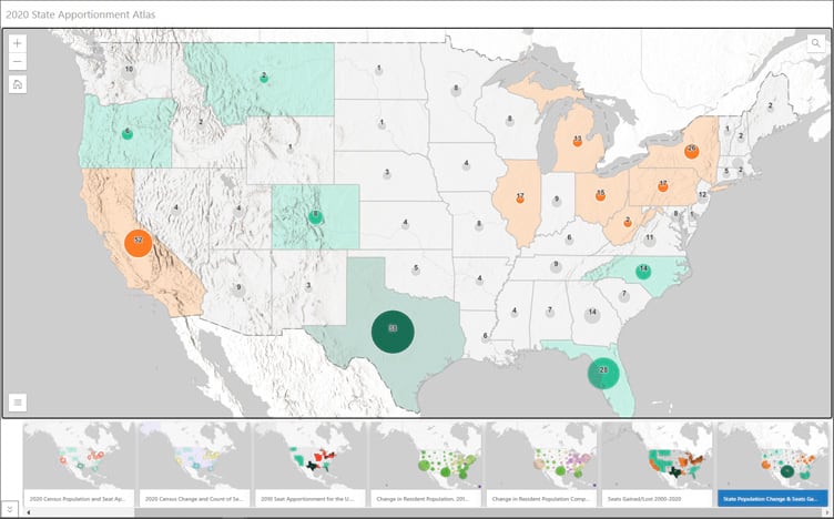
2020 Census State Apportionment
The 2020 Census State Apportionment layer contains data from the 2010 and 2020 Census apportionment for the U.S. House of Representatives. The layer contains information about the population, representative seats, and the change over time. Eight maps based on the layer that explore different facets of the data have been published and appear in the 2020 State Apportionment Atlas.
American Community Survey (ACS)
The Living Atlas Policy Maps team maintains a collection of 104 layers containing a wealth of data from U.S. Census Bureau’s American Community Survey (ACS). ACS is an ongoing survey by the U.S. Census Bureau that provides vital information on a yearly basis about our nation and its people.
New maps and apps based on ACS data have been recently published and are available in Living Atlas with maps available in Esri Maps for Public Policy. These include:
Where are senior households that have no internet subscription or computer?
Households with High School or Associate’s Degrees and No Computer
What is the predominant number of vehicles per household?
Households who spend more than 30 percent of income on housing
Where do veterans live in the US?
Population Living Below the Federal Poverty Level
Where do people speak Spanish at home?
Where are adults who are bilingual in English and any other language?
Where has the percent of those who are uninsured increased or decreased?
Predominant Internet Type for Households with No Other Type of Internet
Censo INEGI 2020
A collection of maps and layers have been published using data from Instituto Nacional de Estadística y Geografía (INEGI) National Institute of Statistics and Geography. The National Institute of Statistics and Geography is an agency of the Mexican Government serving to fulfill the National System of Statistical and Geographical Information of the country.
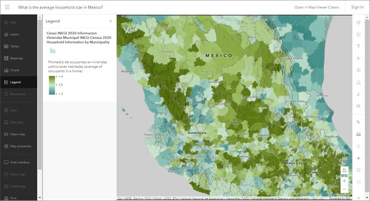
Note that many of these maps use capabilities introduced in Map Viewer that are not supported in Map Viewer Classic. For more information and other maps and layers, see the item details for the following:
Esri Maps for Public Policy
Policy maps clearly show where there is an opportunity to intervene. Esri Maps for Public Policy provides instant access to useful maps that illuminate areas where your work can make a difference. Free to the public to view and use, these policy maps give your team a head start understanding the people, organizations and issues in your community.
To get the most out of Policy Maps, resources are available for education, training, best practices, and industry perspectives that help raise your data literacy, provide you with models, and connect you with the work of your peers. See Esri Maps for Public Policy Resources.
Policy Maps Collections
Policy Maps collections gather stories and resources from the Esri Maps for Public Policy website to help you learn more about specific topics. The collections include forms for you to submit your own maps to expand understanding.
Analysis tools
Deep learning models
Ready-to-use deep learning models are now available via ArcGIS Living Atlas. These models have been trained on data from a variety of geographies, you no longer have to invest time and energy into manually extracting features or training your own deep learning model. As new imagery comes in, you can readily extract features at the click of a button and produce layers for mapping, visualization and analysis.

New pre-trained geospatial deep learning models have been added:
To learn more about the deep learning packages and how used, view the item details. Browse Living Atlas to view all deep learning packages, rule packages, and raster function templates.
For more information, see Introducing pre-trained geospatial deep learning models and Pre-trained depp learning models update (February 2021).
Community Maps
The Community Maps Program enables community contributions of authoritative data to help build the ArcGIS Living Atlas. You can provide feedback, create detailed features, and share data layers and services, contributing to Esri basemaps that anyone can use.
Over 120 new and updated communities have recently been contributed, spanning 3 continents. This content is used to enrich the Living Atlas basemaps and World Imagery service.
For more information, see Community-sourced content added to Basemaps and Imagery. To understand the value of contributing, see Building community through mapping.

If you don’t have a collection of data layers to provide, but still want to contribute, consider adding content through the Community Maps Editor app. Edit parts of the Esri Community Maps basemap to add detailed features for universities, schools, parks, landmarks, and other special areas of interest.
More information
For more information, see the following:

Commenting is not enabled for this article.