In ArcGIS Pro 2.8, we’ve enhanced the Density-based Clustering tool. The Density-based Clustering tool under the Spatial Statistics toolbox (Mapping Clusters toolset) helps us to explore the spatial pattern in point data and finding clusters and noises. The strength of this tool is that it is able to detect point clusters with arbitrary shapes and it does not require a predetermined number of clusters.
However, the previous version of the Density-based Clustering tool does not consider time information, which has become increasingly valuable in modern spatial-temporal data collection. To respond to this problem, the Density-based Clustering tool now has the capability to incorporate the time dimension with either DBSCAN or OPTICS methods. In other words, this tool can now detect spatial-temporal clusters and tackle problems such as:
- identifying where and when taxi pick-up demands emerge and help connect drivers with potential customers;
- identifying where and when the wildfires happen frequently to facilitate future fire hazard response planning;
- or even, detecting the movement path of animals or vessels without a corresponding identifier (ID).
Furthermore, we provide several ways to visualize spatial-temporal clusters for you to better interpret the clustering results. In this blog article, I will demonstrate how the enhanced Density-based Clustering tool answers the three questions above.
Data used in this blog article
- The yellow and green taxi trip records can be downloaded from The New York City Taxi and Limousine Commission (TLC) website. https://www1.nyc.gov/site/tlc/about/tlc-trip-record-data.page
- The historical wildfire data can be accessed at the United States Department of Agriculture (USDA) website. https://data.fs.usda.gov/geodata/edw/datasets.php?xmlKeyword=MTBS
- The AIS Vessel Tracks 2018 is provided by the U.S. Department of Transportation Bureau of Transportation Statistics, and it can be accessed at https://marinecadastre.gov/data
1. Where and when do more people take a taxi in New York City?
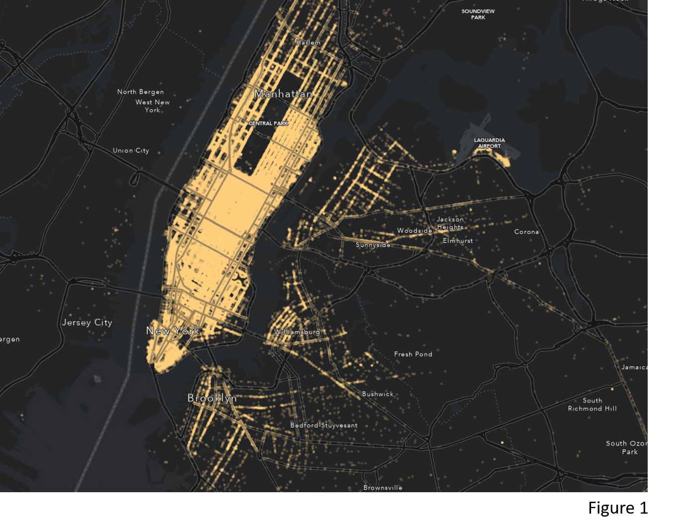
Identifying spatial-temporal clusters of taxi pick-up points can be useful in traffic management planning or connecting drivers with potential customers. Figure 1 shows the yellow cab taxi pick-up points in New York City on Saturday, Jan 16th, 2016 and it is very unlikely that one can identify the spatial-temporal concentration of demand by looking at the map. The enhanced Density-based Clustering tool serves as a powerful tool for this problem.
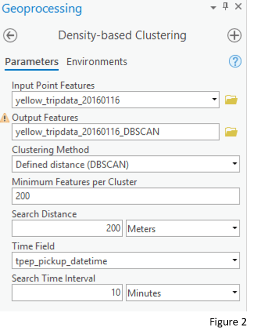
Assuming that all clusters have similar densities, I choose Defined distance (DBSCAN) as the Clustering Method. Also, I provide 200 as the Minimum Features per Cluster, 200 Meters as the Search Distance and 10 Minutes as the Search Time Interval. The parameters of Minimum Features per Cluster and Search Distance together define the minimum spatial density of the returned clustering result. Similarly, the Minimum Features per Cluster and Search Time Interval together define the minimum temporal density of the returned clustering result. The selection of these parameter values is set only for this example and should be adjusted for different dataset/questions based on your domain knowledge. (Figure 2)
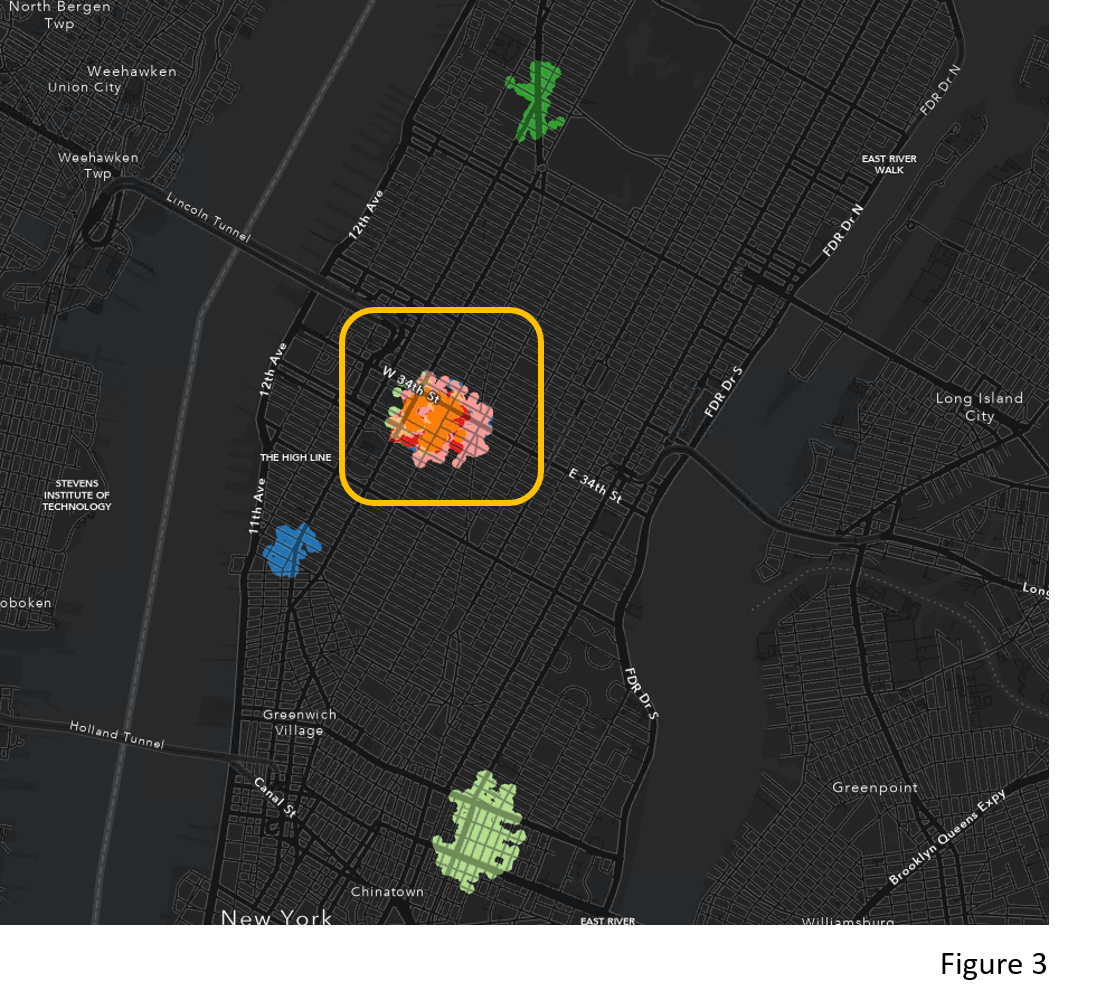
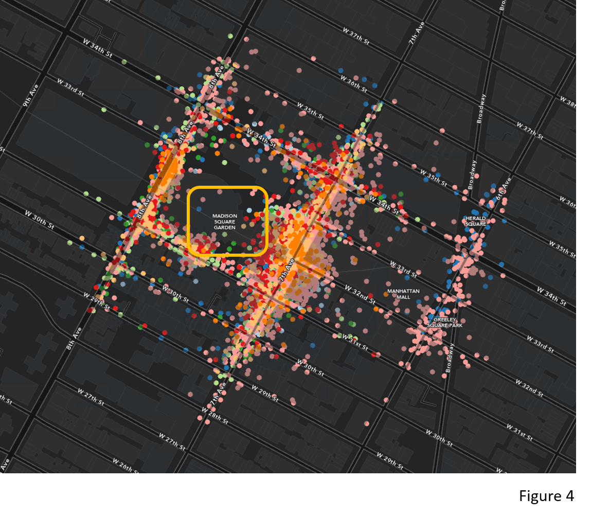
The tool generates clusters of points and noise. Figure 3 is the clustering result after excluding noise points. You might notice that there are many overlaying clusters (The clusters in the yellow box). Let’s zoom in to those clusters (Figure 4). These clusters are located around the Madison Square Garden, which sits above one of the main railroad stations in New York City (Pennsylvania Station). This could indicate that many people come into the city by train and then continue the travel to other places by taxi. Also, the various colors in Figure 4 tell us that there are multiple taxi pick-up clusters at different times of the day. This temporal detail is available because the tool incorporates time attributes using the provided Time Field and Search Time Interval. Taking time into account is important for taxi pick-up data. It differentiates when taking a taxi is in great demand around the Madison Square Garden, which is not able to be achieved if we used Density-based Clustering without time.
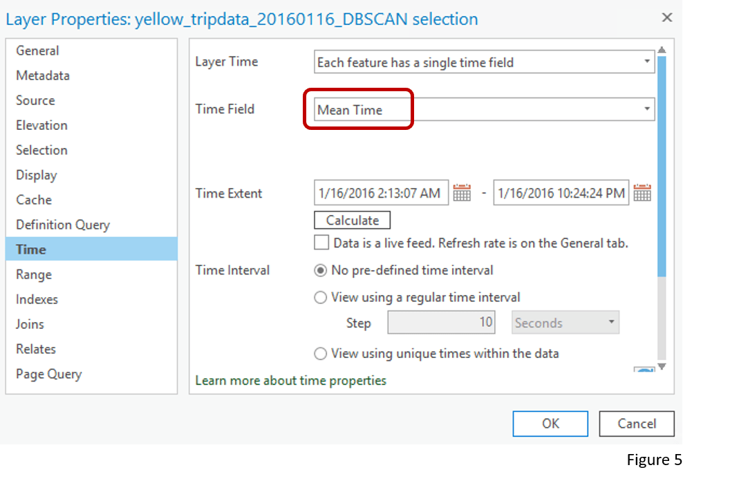
In ArcGIS Pro 2.8, we provide three ways for you to explore these spatial-temporal clusters. First, the tool returns the Start Time, End Time, and Mean Time of each cluster in the attribute table. Therefore, we can set the output layer to be time–enabled by choosing the Mean Time as the time field (Figure 5).
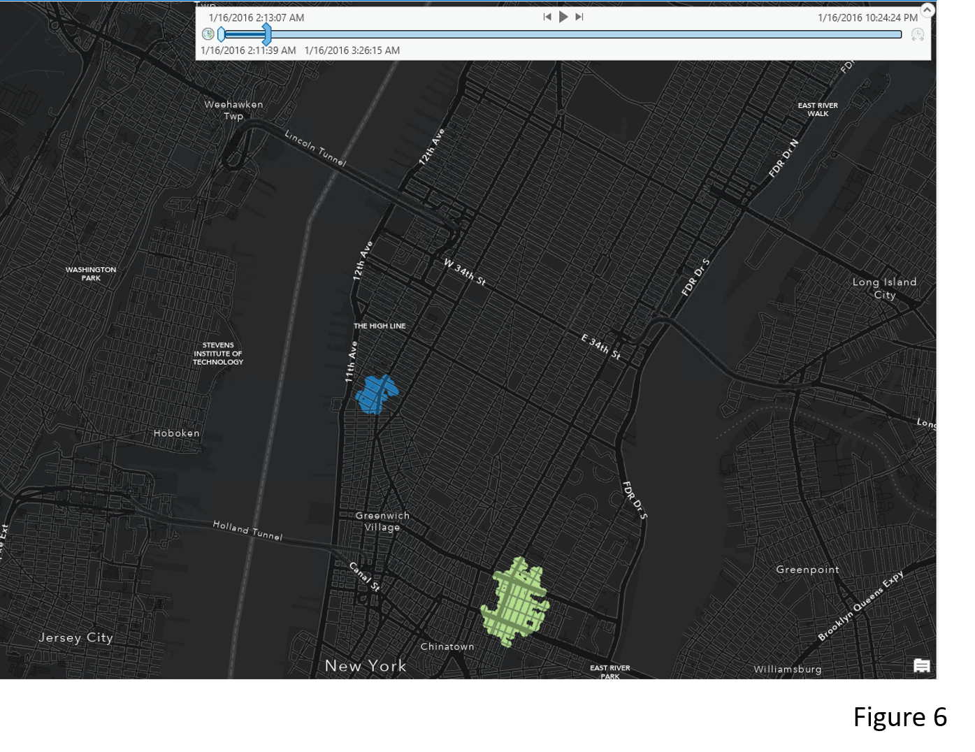
After the output layer becomes time–enabled, a Time Slider should appear at the top of the map (Figure 6). Then we can click play to see the clusters popping up at different times.
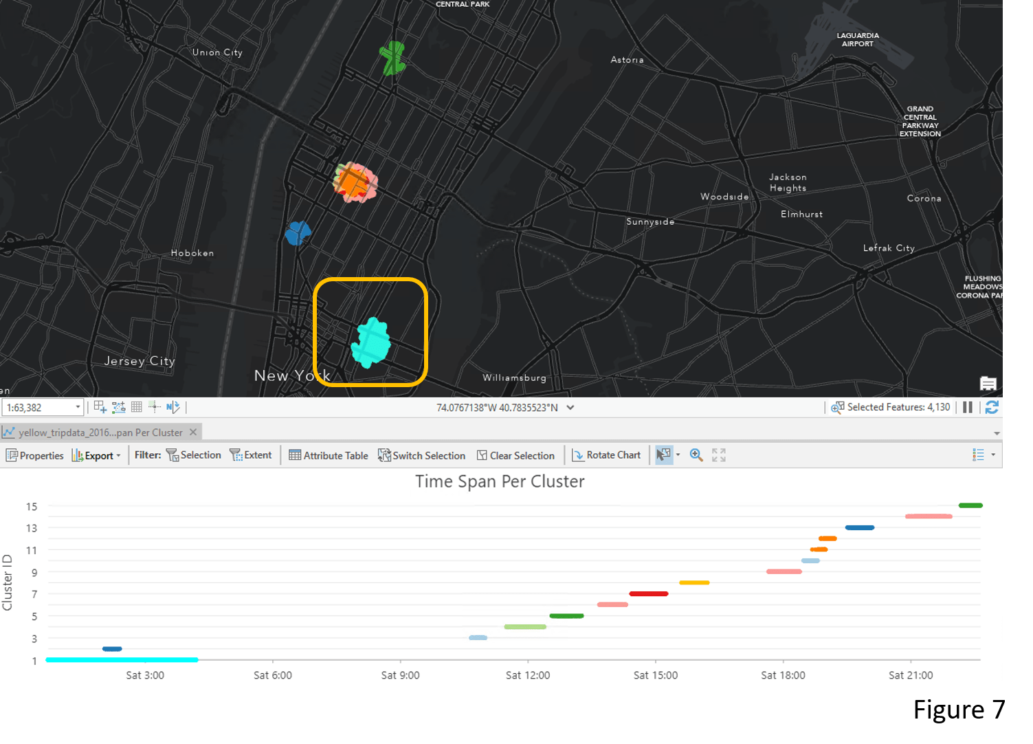
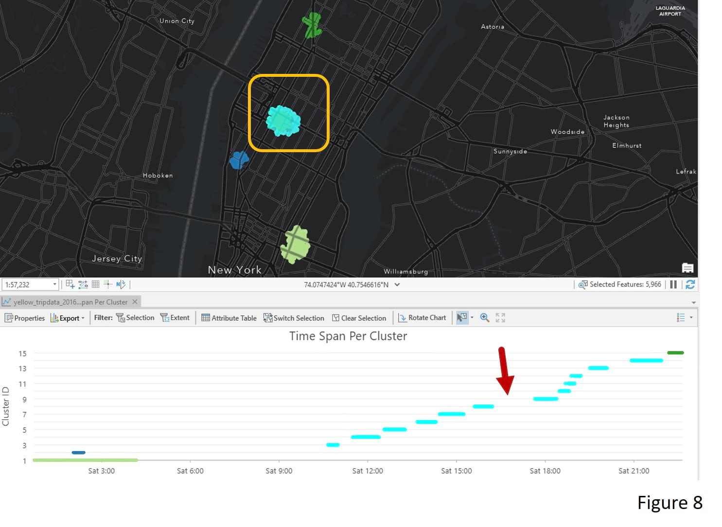
The Time Span per Cluster chart that comes with the output layer is another way to explore the clustering result. Each line in the chart represents a cluster from its start time to its end time. For example, there is a taxi pick–up cluster near the Lower-East Side between midnight and 4 AM (Figure 7). In Figure 8, by selecting clusters around Madison Square Garden, we see clusters start to appear around 11 AM and end around 10 PM. This means people frequently take a taxi during this period. However, there is a noticeable gap between 4 PM to 5 PM that needs more investigation.
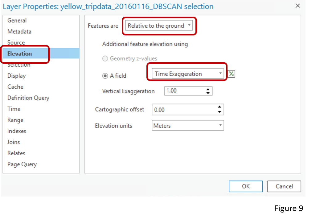
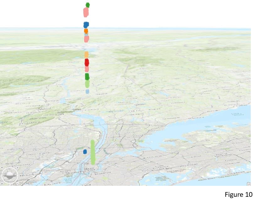
Apart from the chart, we can also visualize the clustering results in a 3D scene. When adding the output layer to a Local Scene, choose Elevation and select Time Exaggeration as the feature elevation (Figure 9). The Time Exaggeration field is a field the tool creates for the purpose of 3D mapping of the results. Earlier times have lower values, and later times have higher values. So when this field is used as an elevation source, taxi pick-up points closer to the ground are earlier in the day and higher points are later in the day (Figure 10).
2.Where and when do wildfires happen more frequently in the US? How can we identify areas with denser fire clusters to facilitate future fire hazard response planning?
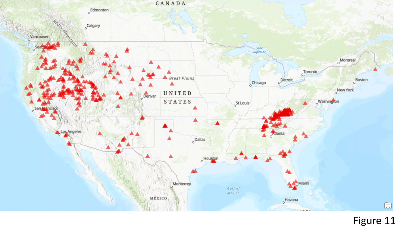
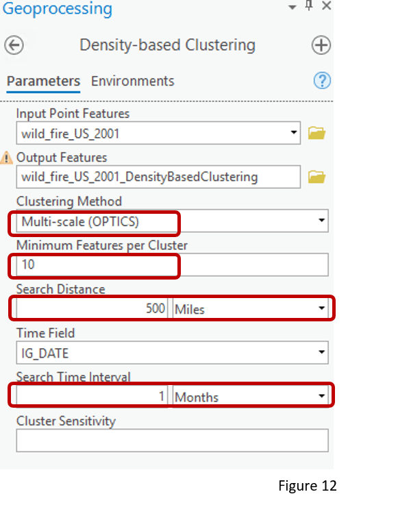
Different from DBSCAN, the other method – OPTICS – constructs a density-based clustering structure that is able to identify clusters with different densities, and easy for us to explore the density pattern of our data. Here we have all the wildfire incidents in 2001 across the contiguous United States (Figure 11). Picking OPTICS as the Clustering Method, I set the Minimum Features per Cluster to 10, and select 500 miles as the Search Distance (Figure 12). Unlike DBSCAN, Search Distance does not impact the result much and only helps us to reduce the processing time. I also set Search Time Interval to 1 month. By providing a smaller Search Time Interval, we will find clusters with higher temporal density.
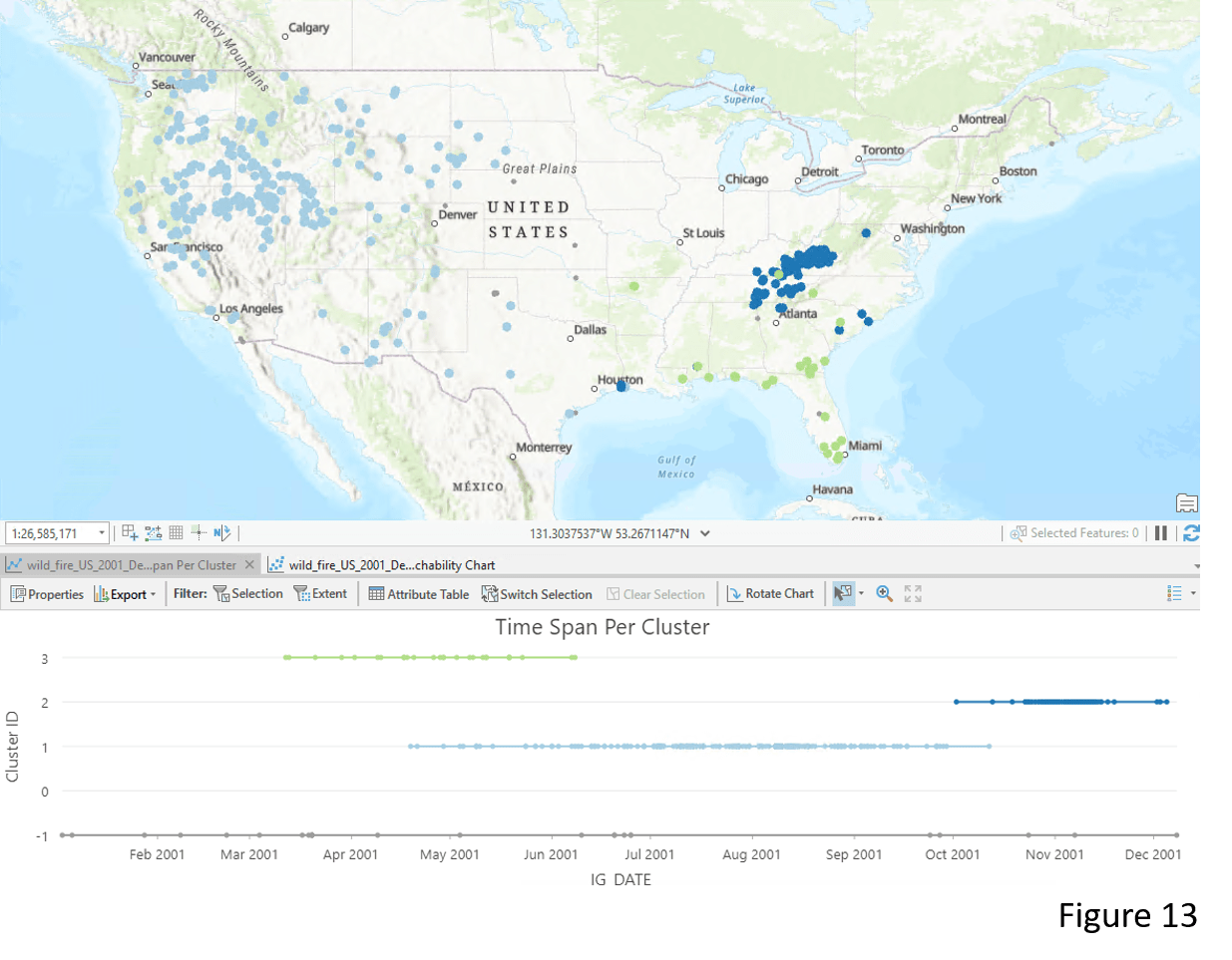
The tool identifies 3 spatial-temporal wildfire clusters that are different in densities (Figure 13). Cluster 1 (light blue) in the West region has the lowest density and Cluster 2 (dark blue) in the East part has the highest density. The Time Span Per Cluster chart also tells us the temporal characteristics of these three clusters. Wildfire incidents in the West (light blue) happen frequently from mid-April to mid-October. Whereas most wildfire incidents surrounding the Appalachian Mountains happen during fall and winter.
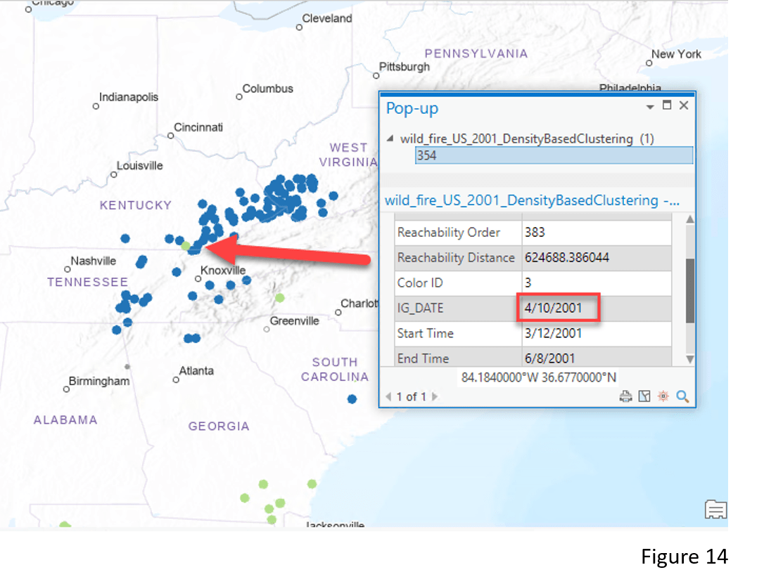
Looking closer at the Appalachian Mountain area (Figure 14), you might notice some points belonging to Cluster 3 (green color) appear to be in Cluster 2 (dark blue color). This is because the enhanced tool takes into account the temporal aspect of the wildfire incidents. For example, wildfire incident #354 is identified as a member of Cluster 3 (green color) but not Cluster 2 (dark blue color) because it happened in spring (April 10th ) but not fall or winter.
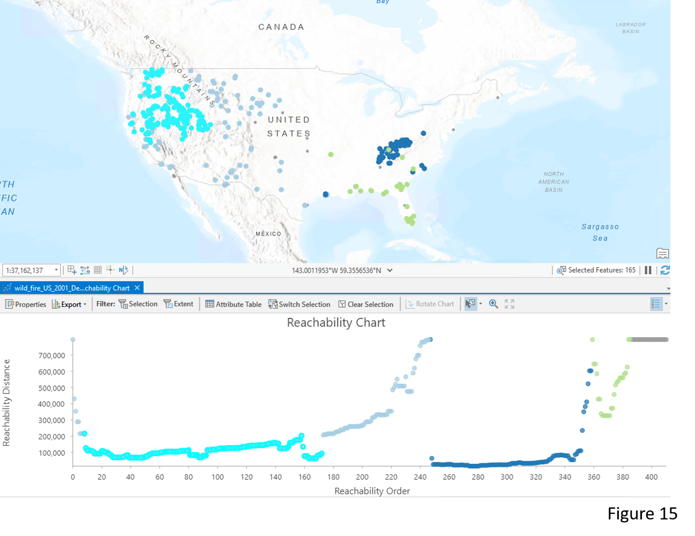
The OPTICS method outputs another chart called the Reachability Chart, which helps us to identify the clusters and their densities. In the chart, Reachability Distance indicates how close points are from others. The deeper the valley (lower value in the reachability distance), the denser the cluster is. For example, in Figure 15, Cluster 2 (dark blue color) has the highest density among the three clusters and thus it has the deepest valley in the Reachability Chart.
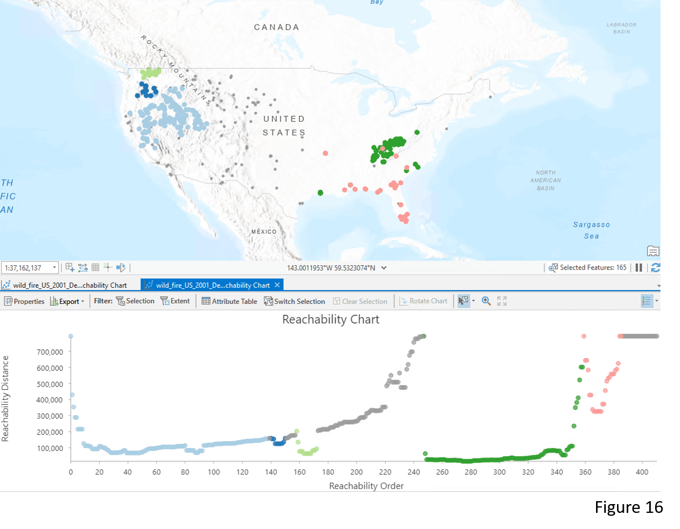
We can also use the Reachability Chart to dynamically explore details of the clusters. When selecting the low-valley points of Cluster 1 (light blue) in the Reachability Chart, those points that are most dense in the cluster are interactively shown on the map (Figure 15). Another way to further identify details in the clusters is by adjusting the Sensitivity value. In Figure 16, the original Cluster 1 is now divided into three denser clusters after I increased the Sensitivity value. Please refer to the documentation for more details about reachability distance and sensitivity.
In summary, using the OPTICS clustering method with a search time interval, we can identify the regions that have been frequently impacted by wildfires. The findings can be useful in allocating resources for the recovery effort and adjusting strategies for future fire hazard response.
3.How can we detect the vessel paths?
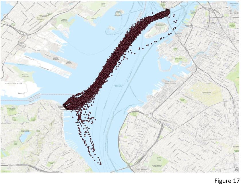
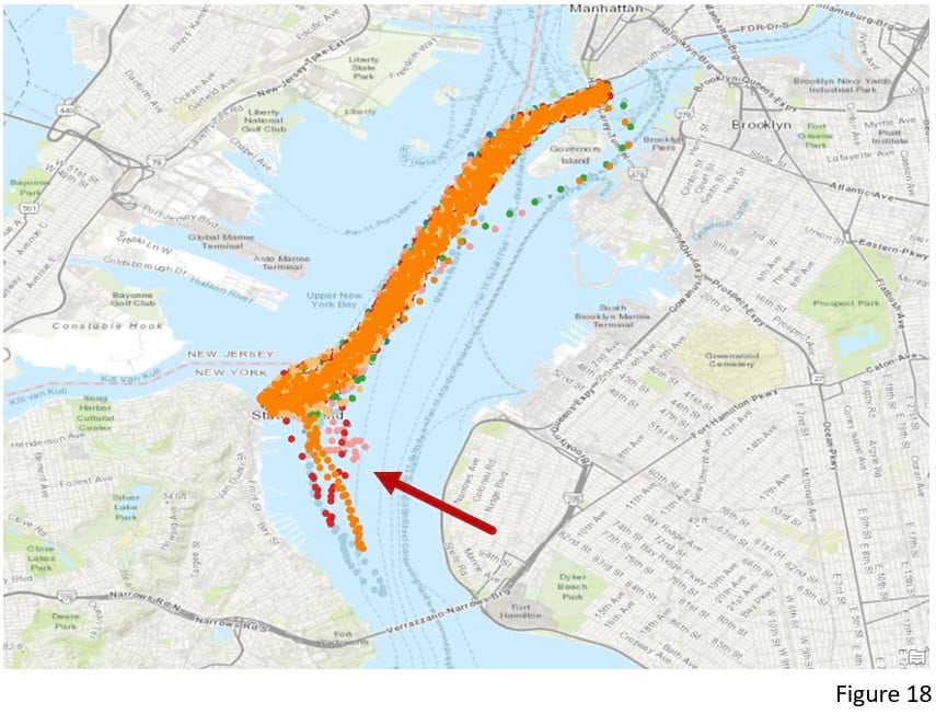
Since OPTICS is able to detect clusters with different densities, it can also be used to identify the movement of objects even if they are traveling at different speeds. Figure 17 is a ferry route dataset where each point was collected every 5 minutes. Without knowing which points belong to the same vessel, using OPTICS with a 5-minute Search Time Interval, this tool captures the path of vessels with normal and abnormal routes correctly identified (Figure 18).
Conclusion
In ArcGIS Pro 2.8, the enhanced Density-based Clustering tool based on ST-DBSCAN (Reference 1) and ST-OPTICS (Reference 2) methods incorporates time into the algorithm. It now has the capability to identify spatial-temporal clusters and can even capture movement from point data. This blog article demonstrates how to interpret the chart outputs and how to visualize the clusters with a time-enabled layer and a 3D scene.
Moreover, several studies that enhance Density-based Clustering with Time also can be applied to line data and to identify clusters of movements. T-OPTICS (Reference 3), for example, is an algorithm based on OPTICS that can group trajectories and also return reachability charts to help understand the cluster movement patterns. For example, T-OPTICS can be applied to historical hurricane trajectories and identify the common trajectories. TRACLUS (Reference4) is another popular one for grouping sub-trajectories with similar behavior and find the representative trajectory of each clusters. Instead of clustering the hurricane trajectories as a whole and identify the common trajectories, TRACLUS detects similar patterns of sub-trajectories. Thus, it will identify many hurricanes turn in the same direction when they passed a certain terrain.
References
- Birant, D. & Kut, A. (2007, January). “ST-DBSCAN: An algorithm for clustering spatial–temporal data.” In Data & Knowledge Engineering (Vol 60, No. 1, pp. 208-221).
- Agrawal, K. P., Garg, S., Sharma, S., & Patel, P. (2016, November). “Development and validation of OPTICS based spatio-temporal clustering technique.” In Information Sciences (Vol 369, pp. 388-401).
- M Nanni, D Pedreschi (2006). “Time-focused clustering of trajectories of moving objects.” Journal of Intelligent Information Systems (Vol 27, No. 3, pp. 267-289)
- JG Lee, J Han, KY Whang (2007). “Trajectory clustering: a partition-and-group framework” In Proceedings of the ACM SIGMOD Conference on Management of Data. ACM, 593–604.

Commenting is not enabled for this article.