 In our first smart mapping blog we talked about how Esri has made it easier than ever for you to create attractive maps quickly and with confidence. Now, we explore the new continuous size and continuous color maps you can make with ArcGIS Online and with Portal for ArcGIS (included with ArcGIS for Server).
Smart mapping is about authoring visually powerful maps that let the data speak for itself. As one piece of that, we introduced new ways to apply size and color to your data to tackle long-standing issues with data classification, while simultaneously overcoming some of the well-known limitations of unclassed maps.
As a map author you now have the ability to fine tune how you apply colors and sizes to your data using a histogram-based interface. It’s time to raise your cartographic game!
Moving Beyond Outlier-Driven Cartography
For years in cartography there were two choices when dealing with numeric data: Class your data into a few ranges (e.g., 0-10, 11-20, 21-30, …) or apply a continuous size or color ramp from the lowest to highest value. The problem is that both options have well-known limitations. For example, classification can mask important details by overgeneralizing, and many authors aren’t sure how many classes to use or which classification method is best for their data. On the other hand, unclassed maps can be made useless by one or two extreme values (outliers) making everywhere look the same except for one giant or tiny outlier. In print maps, it can be hard to match a color on the map with one in the legend. Fortunately, in this interactive digital age, we can click on our maps to see precise values whenever we need them, further reducing the need to classify our data.
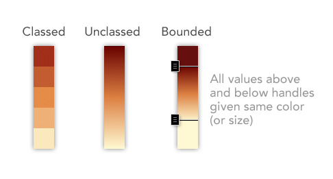
With Smart Mapping, we’ve introduced a third choice! It combines the best of both approaches and is now the default experience when authoring color or size maps in ArcGIS Online or Portal for ArcGIS. We call it “bounded” continuous size and “bounded” continuous color.

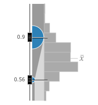
In this map showing the world’s largest cities, the upper handle has been set to 20 million people—all cities larger than that will be shown using the same size circle—and the lower bound is set to 4.5 million people. With bounded size maps you can now visually explore your data and fine-tune the message of your map using the histogram and slider handles.
Setting the Handles to Fine-Tune your Map
If your data does not already have styling associated with it, we automatically analyze your data and place the upper and lower handles at one standard deviation around the mean. We found this does a nice job of showing variation across the data, while not being overly influenced by extreme values. Though these smart defaults handle positions are a great starting point, we definitely encourage you to manually drag the handles to fine-tune the message of your map. It is quite amazing how subtle patterns will emerge in a few seconds of adjustments.
Going Further
If making a size map (proportional symbol) the ArcGIS map viewer will automatically make an informed guess to set the size in pixels of the largest and smallest circles. You can, of course, adjust these sizes yourself. If you zoom when mapping data associated with polygons, you click “suggest” and have the map automatically re-calculate appropriate sizes for your symbols, saving you time and effort. And as always, while the map viewer will default to circles you can use any symbol/shape you like. If making a color map (choropleth) try different color ramps and themes. Themes are an exciting new enhancement to the map viewer (which we will explore in another blog post).
Where to Find These New Size and Color Maps
In the map viewer for Online and Portal, if you have numeric data you can apply Counts and Amounts (Size) or Counts and Amounts (Color) from the layer context menu associated with your data layer.
Have fun exploring your data and stay tuned for further blog posts!

Commenting is not enabled for this article.