Continuing with the recent mini-series on using the Image Analysis Window with spectral indices, today I’m going to show you a quick workflow for detecting change. You could take something like NDVI from two points in time, subtract the earlier from the latter and see what change occurred. However, there’s another useful ratio called the Normalized Burn Ratio (NBR) that when differenced reveals interesting information on not only where burn scars are, but also on how vigorously the vegetation is regenerating.
So, in keeping with the Landsat 8 theme, your bands for calculating NBR are:
NBR = (Band 5 – Band 7)/(Band 5 + Band 7)
For other multispectral satellites, use the NIR and SWIR2 bands.
To calculate the difference:
dNBR = NBRprefire – NBRpostfire
What’s cool about differencing this ratio from before and after a fire is that negative numbers will show you where vegetation is regenerating, or was not burned if it’s close to 0. Positive numbers will show you burned areas where vegetation has not begun to regenerate. The more extreme the negative or positive the values are, the more vigorous the regeneration or stress, respectively.
Here’s a table that give more specific guidelines on interpreting the outputs, courtesy of the USGS:
| SEVERITY LEVEL | dNBR RANGE |
| Enhanced Regrowth, High | -500 to -251 |
| Enhanced Regrowth, Low | -250 to -101 |
| Unburned | -100 to +99 |
| Low Severity | +100 to +269 |
| Moderate-low Severity | +270 to +439 |
| Moderate-high Severity | +440 to +659 |
| High Severity | +660 to +1300 |
For this case study, I looked at the Black Saturday Fires of 2009 near Melbourne, Australia. My prefire image was from 2008 and the postfire was from 2010. Recent research indicates that trying to do this analysis immediately after a fire may not be very successful, so I gave it a year after the fire to pull out better information. Because of the timing of the fire, I chose to use Landsat 7, despite its scan line errors. Although it has gaps in the data, from a land management perspective, it’s still very useful. Because I used Landsat 7 you’ll see bands 4 and 7 in my screenshots, instead of 5 and 7 as described above.
You’ll notice that the scan line errors are not in the same place for each image. Presumably, the gaps have shifted due to slight alterations in the satellite’s tilt/orbit over time. You’ll have to mask them out for each image, which can be done using Local Function in the Image Analysis Window. Select each image individually and click the function button. Right click on Identify Function and insert a Mask Function. For the NoData values, type 0.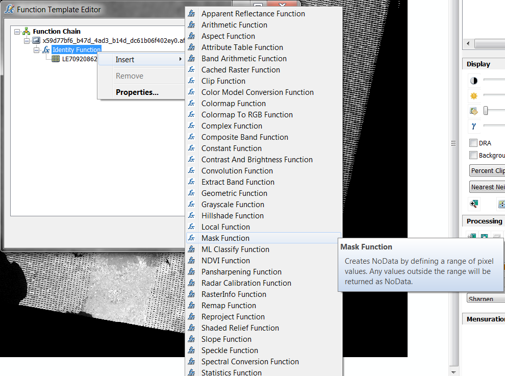
A couple of weeks ago, we talked about how important the ordering is in the TOC. Band 4 should be above Band 7 in the TOC for both years. Select the bands for 2010 and click the NDVI button, and repeat this for 2008. Then, select both of the NDVI outputs, and select the Difference button. ![]() You can use the table above to reclassify the image using the Remap Function. I elected to simply choose a different color palette. Although the aesthetics for the image suffer from the scan lines, when you zoom in, you can see the burn scars from the fire and where regeneration is occurring.
You can use the table above to reclassify the image using the Remap Function. I elected to simply choose a different color palette. Although the aesthetics for the image suffer from the scan lines, when you zoom in, you can see the burn scars from the fire and where regeneration is occurring.
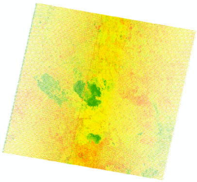
Green areas show where vegetation is regenerating, red areas are burn scars.
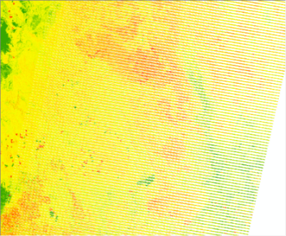
Zoomed into an area of burn scars that are behind scan lines.
I’m in the process of putting together a cheat sheet for next week of the band specifications for Landsat 7 and Landsat 8, along with some common RGB combinations for Landsat 8.
Written by Kevin J Butler

Commenting is not enabled for this article.