Updated January 7, 2022: Whether you’re new to ArcGIS StoryMaps or have been using it since its days in beta testing, there’s always room to improve your storytelling skills. This list of short, simple tips will help you get the most out of the story builder, especially when it comes to smaller features you may have overlooked. I’ll be adding more tips periodically, too, so be sure to check back every now and again if you find these tidbits helpful. Use this table of contents or keep on scrolling to learn how to:
Adjust your story’s look and feel
- Add your logo to the header of your story or collection
- Add media to a minimal cover
- Choose how to display the story’s date
- Customize text color
- Add story credits
- Enable story navigation
- Use heading and subheading links to create an in-story table of contents (new)
- Drag and drop story components to reorder them (updated)
- Use a single-event timeline block as an aside or call-out (new)
- Adjust the weight of a Google Font
- Change your theme’s hyperlink style
- Upload a custom separator graphic
- Start a new story with a custom theme
- Share themes within your organization
Work with media, generally
- Add alternative text to your media
- Set the focal point for images and videos
- Float inline media to the right
- Provide attribution for media items (updated)
- Change the layout of an image gallery
- Add a photo from the web to an image gallery
- Replace media instead of deleting it entirely
- Disable click-to-expand for inline images
- Specify embedded content height with iframe code
- Customize embed cards and small screen appearance
- Enable immediate interaction with embeds
- Copy the reference for embedded web content
Work with maps, specifically
- Toggle your map legend on or off
- Disable map navigation
- Trigger map actions with in-text links
- Adjust layer names for the maps in your story
- Change an express map’s basemap
- Use a custom symbol for express map points
- Reorder numbered points in an express map
- Change annotation styles in express maps
- Choreograph your express maps in immersive blocks (new)
- Add search and current location widgets
Fun with immersive blocks
- Hide a slide in an immersive block
- Change the style of a slideshow narrative panel
- Adjust the width of sidecar and explorer tour narrative panels
- Use a web map as the basemap for a map tour
- Add points to a map tour from search results
- Skip the media in a map-focused guided tour
- Upload geotagged media to place a map tour point
- Switch between guided and explorer tour
- Use point data to create a map tour
- Configure a zoom level for an entire map tour
- Add buttons to map tour points to link to related reading (new)
- Fit or fill images in a swipe block
- Add a swipe block to a sidecar slide
- Duplicate entire immersive blocks to experiment or reiterate (new)
Share your work
- Add almost anything to a collection via URL (new)
- Link to a specific item in a collection
- Hide the cover for a story in a collection
- Use buttons to pull readers through a collection
- Preview a collection
- Print or save a PDF-version of your story
- Open a collection item in a new tab
- Publish a story to a shared update group
- Duplicate a story or collection
- Designate a story’s official language and date format
____________
Adjust your story’s look and feel
Add your logo to the header of your story or collection
Branding can be an important element of a polished story, and nothing more clearly shows off your brand than a logo. If you want, you can have your logo appear in the header of your story or collection, right next to the title, so it’s always visible as readers scroll through your narrative.
To do this, enter the builder for your story or collection and click Design in the header. At the bottom of the design panel you’ll find the option to upload a logo; click the + and select your desired image. Once it’s uploaded, you’ll see it appear in the top corner of your story/collection. You’ll also see additional fields appear at the bottom of the design panel—use these to add alternative text for your logo and to link it to a website of your choosing.
Add media to a minimal cover
The minimal cover is a great option for how-to articles, thought pieces, or press-release-style updates. For these kinds of stories, the subject is what will hook your readers most, so a big, dramatic cover image can be overkill. But, if you want to keep the emphasis on your title and still add a little visual flair, you do have that option.
In your story, open the design panel, select Minimal from the list of cover options, and close the design panel. Above your title, in the upper right corner of your story, you’ll see + Add cover media. Click it to upload a photo or video. Your media will display in a panoramic aspect ratio; for images, you can open the Properties menu and move the focal point to the area of the image you want to be visible across screen sizes.
Choose how to display the story’s date
While the ArcGIS StoryMaps builder will automatically update the date in your story’s cover every time you re-publish it, you have the option to instead display the story’s original publication date or hide the date altogether if you’d prefer. This can be useful if you’ve made an evergreen resource that will stay relevant no matter how many weeks, months, or years have passed since you created it.
To change the presentation of the date in the story cover, enter the builder and expand the More actions menu (three dots) in the story header. From there, select Story settings and you’ll see Date on cover with a drop-down menu below it that contains the three date options: original publication, most recent update, or no date showing. Choose the one you want and click Save.
Customize text color
Sometimes you need to draw your readers’ attention to a specific word or phrase in your story text, and want to use a splash of color to do so. This can be especially useful for calling out important statistics or explaining different categories on a map. As of January 2020, this is now possible in ArcGIS StoryMaps, with an update in July that enabled coloring of headings and subheadings, as well.
To change the color of any kind of text (with the exception of a quote block), highlight it in the builder and select the palette icon from the text editing menu. The dropdown that appears has four recommended color options: The first is the standard text color for your theme, while the others are the theme-specific recommended accent colors. If you’ve added a custom accent color in the design panel, that will also appear as a fifth option. Need an entirely different color? Just enter its hex code et voilà!
Add credits to the end of your story
Open the story builder and scroll down to the end of your story and you’ll now see a section for story credits. You can use this space to provide more information about the author or organization behind the story, provide links to the data used in it, list photo credits, or anything else you can think of. Simply highlight text anywhere in this section to hyperlink it.
If you don’t enter anything in this section it will be hidden in the published version of your story. If you do add content here but aren’t sure whether or not you want to show it to your audience, you can toggle the credits section on and off from the design panel. Hiding the credits section will preserve any content you’ve already added, so no need to worry that you’ll have to redo that work if you choose to display the credits later.
Enable story navigation
For longer stories, or for those that don’t necessarily need to be read linearly, it’s nice to provide readers with an easy way to hop between sections of the narrative. Story navigation makes this possible, using heading text to generate points to which readers can jump. You can also add headings to sidecar slides and the credits section to include them as jumping points.
To toggle on story navigation, locate its button in the design panel. If you’ve already placed headings, the builder will automatically add links for them (up to 30) in a navigation bar that appears just below the story header. If you don’t have any headings in your story, the bar will appear with text prompting you to add some.
Click Properties on the navigation bar (the gear icon that shows up when hovering over it in the builder) to customize the text for each nav link—especially helpful for longer headings, which are automatically cut off using an ellipsis if they are too long—or to choose to hide some of the links. If you decide to turn off story navigation in the design panel, then toggle it back on later, any changes you made in the properties panel will be preserved.
Use heading and subheading links to create an in-story table of contents
The ability to retrieve a direct link to any heading or subheading in a story (via the little link icon that appears in the left-hand margin when hovering over a heading or subheading) has many uses, but one especially nifty use is to create an in-story table of contents. The story navigation feature does serve a similar purpose, but on their own, the clickable links there may not provide all the context you’d like to introduce to your readers before they begin a story. By copying the desired heading and subheading links and arranging them at the beginning of the story, say, with a bulleted or numbered list, you can give a brief synopsis of the major elements of your story, and readers can have the option to jump straight to a section that most interests them.
An even more fun trick for geographically-oriented stories is to set up an express map to orient readers to the settings within your story, then place the relevant heading and/or subheading links inside the pop-ups for the appropriate drawn features.
Drag-and-drop content blocks to reorder them
Say you’ve added a sidecar or guided tour in your story, filled it with content, and then realized you actually want it to come much earlier (or later) in your narrative flow. Don’t panic—you can easily move entire immersive blocks! With the slide panel expanded, grab the little handle in the bottom left, then click and drag the block-turned-thumbnail to your desired location and release. Boom, immersive bock relocated.
You can also drag-and-drop any kind of inline media block, as well as individual text blocks—the same handle icon will appear to the left of any block while hovering over it in the builder.
Use a single-event timeline block as an aside or call-out
The timeline block is great for relating sequential information, like a chronology of events, step-by-step instructions, or a ranked list. There’s another fun, outside-the-box use for timeline, though: using it to create an eye-catching “aside” within a story, containing a brief fact, definition, or recap. To achieve this effect, just add a timeline block, select the Condensed layout, and then delete one of the two blank events. Populate the remaining event with a title, description, and add an image if you’d like, and you’ll have a tidy-looking call-out in the flow of your story.
Adjust the weight of a Google Font
The addition of Google Fonts to theme builder has given storytellers a huge amount of flexibility when it comes to the aesthetics of their story. On top of choosing from hundreds of font families, a number of those families can also have the weight, or thickness, of their regular and bold styles adjusted. Most fonts that have this capability are already populating the initial, curated list of Google Fonts that you see upon clicking Add from Google Fonts in theme builder. After selecting a family, a preview of that family will appear to the right of the font list . Above that is a pair of drop-down menus with which you can adjust the regular and bold weight of that font—if that font allows—before bringing it into your theme.
Change your theme’s hyperlink style
Another possibility in theme builder is to change the appearance of hyperlinked text in any story using that theme. The ArcGIS StoryMaps standard is to represent a hyperlink with a solid underline beneath the linked text. However, under the Links tab in the theme builder, you’ll see two additional options: one changes the solid underline to a dashed line, and the other adds a background fill behind the text. The initial color for all three styles will be the theme’s primary accent color, but you can opt to assign a custom color instead if desired.
Upload a custom separator graphic
While the theme builder offers three standard separator styles and the option to align them however you like, you also have the flexibility to upload any image to serve as a custom separator. With the Separators tab unfurled in the theme builder, simply click on the photograph icon beneath the three standard choices to summon a file explorer from which you can upload your own image—including animated GIFs! Like the other separators, you can opt to align a custom separator to the left, right, or center. Or, you can select the full-width option to repeat your graphic across the width of a text block.
Start a new story with a custom theme already in place
If you’re about to begin work on a new story and you have a custom theme in mind for it that you’ve already made with the theme builder, you can start a fresh story from scratch with that theme already in place. Just navigate to your themes page, then find the card for the theme that you want to use. Click on the three dots in the lower right corner of the card to access the Quick actions menu, and you’ll see that one of the options is Start a new story. Select that to jump into the story builder with a blank, but already-themed story.
Share themes within your organization
One great use for theme builder is to create an aesthetic standard to complement an organization’s brand or regulations. Themes can be shared throughout an organization by setting up a group to serve as an “approved themes” repository. Configuring this group just takes a few steps:
- Create a group in your ArcGIS organization that will serve as the approved themes group and populate that group with the desired themes (look for the StoryMap theme item type).
- An organization administrator can then select that group from Organization settings inside the profile menu that’s accessible at the far right side of the page header on any ArcGIS StoryMaps page when signed in.
- Once an approved themes group has been designated, anyone in the organization can browse the themes inside it by clicking the My Organization tab while applying a theme to a story through the design panel.
For more detail, see the second section of this tutorial.
____________
Work with media, generally
Add alternative text to your media
Making your content accessible is an important part of authoring inclusive stories. That’s why we’ve designed ArcGIS StoryMaps to meet common accessibility standards. We’ve also included features to help authors cater to individuals using assistive technology like screen readers. Alternative text is one of these features—you should use it to describe any functional media in your story so that those with visual impairments can still follow along.
Adding alternative text to any piece of media is simple. Just open the Options panel for that piece of content (you may need to hover over it to reveal the media toolbar) and the field to enter your description is front and center if it’s inline, or in the Properties tab within the options panel if it’s in an immersive block or image gallery. Click Save when you’re done and you’re good to go.
Set the focal point for images and videos
When you add photos or videos to your story’s cover or immersive blocks, the asset automatically fills the container it’s given. Depending on the screen size of a reader’s device, this means they may not always see the full media. If there’s a key area of your photo or video you want to remain visible (like a person or the most dramatic part of a landscape), open the Options menu on the media and click on the area you want to stay visible across devices. You’ll see the focal point indicator and media previews adjust to reflect your selection. (You can also select the Fit option instead to ensure the entire image or video is present across all devices.)
Float inline media to the right to create visual balance and hierarchy
Setting media to float in the body of a story is a nice way to keep the narrative flowing around the media while still incorporating relevant images, graphics, videos, or audio clips. However, only floating media to the left can cause a story to feel visually imbalanced. Instead, consider alternating left and right floats to help maintain a more even-looking story. Floating media to the right also helps keep the narrative as the primary focus if desired, given that for readers of most Western languages, our eyes are trained to focus on the left first.
Provide attribution for media items
Make sure credit is given where it’s due by always providing the creator and/or source information for the images and videos in your stories. For any media item in a story—including the story cover, inline images and videos, an image gallery, or immersive blocks like slideshow, sidecar, and map tour—you can add an attribution through the media’s Options panel; just add the necessary text to the attribution field found there. Note that you can also format an attribution with bold or italic text, or add a hyperlink to it. When you’ve finished, you’ll notice a little (i) now in the upper left-hand corner of the media. Hovering over or tapping on that will reveal the attribution info.
Change the layout of an image gallery
When you first create an image gallery, it automatically arranges the images into a Jigsaw formation, in which the builder adjusts the apparent size of the images to align them into rows without cropping them. There’s an additional layout option, however, which you can find inside the gallery options (the gear icon in the toolbar that appears when hovering over the gallery in the builder). Inside the options modal, you’ll see under the Display tab that there is also a Dynamic squares setting. Choosing this will crop the images into equal-sized squares. (Remember, you can always adjust each individual image’s focal point so that the crop centers on the important parts of the image.)
Add a photo from the web to an image gallery
While the image gallery creation workflow directs storytellers to first upload photos from their computer, once you have a gallery in place, you can add additional images via web URL. Click Add media (represented by the + icon) in the toolbar that appears at the top of the gallery in the builder. You’ll again see the file uploader, but you’ll also see a tab above it that says Link. Within that tab, you can paste an image’s URL to pull it into your gallery. As always, make sure you have permission to use any images you’re including!
Replace media instead of deleting it entirely
Say you’ve positioned some media (a photo or video) just where you want it within a story or immersive block, and have written up a thoughtful, illustrative caption for it, but you come across an even better picture or video afterwards. Instead of deleting the media outright and starting over from scratch, you can simply replace just the media item itself, preserving the block size and any caption (though attribution and alternative text will need to be re-entered). Simply click the button with three dots that appears when hovering over a piece of media in the builder and select Replace image/video, as the case may be.
Disable click-to-expand for inline images
Inline images in ArcGIS StoryMaps automatically have click-to-expand functionality when they’re come across in the live story. However, some images probably don’t need to be expanded, such as small decorative icons or section dividers. Inside the image options (the gear icon in the toolbar that appears at the top of an image in the builder) there’s an Allow readers to expand image checkbox. Uncheck the box, and that image will no longer expand when clicked—you’ll notice the cursor no longer turns into a magnifying glass when hovering over it in the live story.
Specify the height of embedded content with iframe code
When embedding external web content in your story, the story builder will automatically set the size of any content you add. However, when adding embedded content as an iframe, you can use height and width parameters to ensure your content displays at your desired aspect ratio. This is especially useful if you have tall content—like a form where you want the full list of questions to appear without the reader needing to scroll within the embed frame.
The width of the iframe you add is controlled by the block size you select, but you can specify your content’s height or aspect ratio if you’d like it to be something other than 16:9 (the ratio the builder automatically uses).
Here’s an example of an iframe code with height and width parameters set manually.
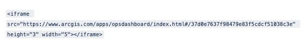
In the code snippet above, the author has chosen to define an aspect ratio of 3×5 for their dashboard; they could have also done this by using set pixel amounts or percents for both height and width (so long as their units match).
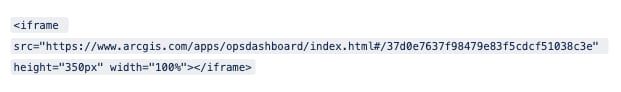
To adjust only the height and of your content, set the width to 100 percent, and specify your desired height in pixels:
Customize the cards and small screen appearance for your embeds
If you’ve embedded web content and displayed it as a card in your story, you can customize the thumbnail, title, and description. To do this, hover over the card and select Properties. In the panel that appears, you’ll see a preview of the card as it is configured currently, as well as fields to adjust the text and a button to upload a new thumbnail image. As you make changes to these elements, the card preview will update to reflect them. You can also use the arrow next to Card details to restore the information originally provided by your external content’s metadata.
If, instead of a card, you’ve chosen to display your embedded content live, you’ll notice a few more options in the properties menu. At the top of that panel you can choose how your embed will appear on small screens and mobile devices. If you select Card, you’ll have all the options to adjust those card details that I just mentioned. If, instead, you choose Image, you can choose some alternative media (like a screenshot of the live embed) to appear instead. Just click Save to commit your changes when you’re done. You can see how this embed will appear on different screen sizes by taking advantage of the story preview, accessed via the builder header.
Enable immediate interaction with embeds
When you embed most live content into a story, readers viewing that story on larger screens are first prompted to click once in order to be able to interact with that embed. This mechanism prevents readers from getting mired in embedded content that requires extensive scrolling or otherwise might be difficult to navigate past. However, storytellers can choose to deactivate that click-to-interact functionality. This feature comes in handy for more basic embeds—such as simple infographics or brief surveys—that are unlikely to interfere with the reading experience of the story if they are live right off the bat.
To disable the click-to-interact prompt, simply navigate to the embed Options (the gear icon in the toolbar that appears when hovering over an embed in the builder) and check the box beside “Allow readers to directly interact with the embed.”
Copy the reference for embedded web content
If you’ve embedded web content into your story and want an easy way to retrieve the reference you used to add it initially—maybe you want to tweak the iframe parameters, or move the content to an immersive section—you can grab this info right within the builder. Simply open the Properties menu for the embed and click on the Properties tab within it. There you’ll see the reference used to draw in that content, and a handy button to copy it to your clipboard.
____________
Work with maps, specifically
Toggle your map legend on or off
Some maps display a variety of data, so your readers will need a legend to make sense of what’s what. Other maps, meanwhile, are nice and straightforward, and it can be nice to hide the map legend in these instances to reduce visual clutter.
Turning a legend on our off is the same whether you’re configuring a web map, 3D scene, or an express map. Start by opening the map designer and navigating to the Settings tab of the side panel. There, you’ll see a switch to show or hide the legend; simply toggle it on or off depending on your map needs. Your map will update instantly to reflect this change.
Disable map navigation
If you’ve added a map to your story and want readers to be able to click on pop-ups or see real-time data, but you want to keep their attention focused on a particular area, you can always disable map navigation. This setting locks down the map extent, preventing readers from panning or zooming, and is available for any express map, web map, or 3D scene. To disable map navigation, open the map designer and navigate to the Settings tab. You’ll see Allow map navigation is automatically toggled on—simply click the adjacent switch to turn it off.
Trigger map actions from in-text links
Since early in 2020, storytellers have had the ability to prompt readers to interact with a web map in a sidecar via buttons, called map actions, which change the view extent and/or visible layers of the map when clicked, according to specifications preset by the author. As of December, 2020, however, you can now also present map actions directly through the accompanying text.
Simply highlight the portion of text you’d like to trigger the map action (as long as it’s sharing a sidecar slide with a web map), select the little lightning bolt symbol from the text editing toolbar, configure the desired view extent and layer visibility, then save the action. That text will now appear like an underlined hyperlink that will become bold and change the map as specified when clicked. Once it’s been configured, hover over the map action text in the builder to get at the options to edit or remove the action.
Adjust layer names for the maps in your story
Have you ever wanted to adjust the layer name as it appears in a map legend for a particular story, but not have that change affect the map in other places? Maybe the layer name is really long, or the story is for a particular audience that’s used to specific terminology. Whatever the reason, customizing map legend terms in your story maps is 100 percent possible.
To adjust the name of a specific layer, open the map designer and locate that layer in the Map layers tab of the side panel. Click on the layer name to activate the text editor, then rename that layer however you like. If your legend is turned on, you can see the new layer name appear right there in the map designer; your readers will also see it once you publish your story. Click Place map to save your changes when you’re done.
Change an express map’s basemap
The style of express maps is automatically synced with your story’s theme, so you can always be confident that they’ll harmonize with the rest of your content. But did you know you can choose from a multitude of basemaps when creating one of these simple maps?
To change your map’s basemap, open the map designer and navigate to the Settings tab on the side panel. At the bottom you’ll find a basemap picker. Inside, you’ll see three theme-based basemap options, plus a catalog of other in-house choices. Or, click Browse more maps to access your own library of web maps or ones that you’ve favorited, web maps that have been shared within your organization, plus the deep font of content available through the Living Atlas. When you’ve settled on a basemap, click Done to save your express map.
Use a custom symbol for express map points
Add an extra touch of personality to your express maps by uploading any graphic you want to use to represent a non-numbered point in an express map. First, click the symbol representation to the left of the point’s name in the drawn features panel to bring up its style panel. Then, under Symbol, select the icon to the right (resembling a little photograph of a mountain). This will bring up a file explorer, which you can use to upload the desired image file from your computer to serve as the symbolization for that point. Like other non-numbered points, you can also adjust the size of the new symbol as it appears in the map, from three choices: small, medium, and large.
Reorder numbered points in an express map
Say you have an express map with five numbered points representing places you visited on your latest vacation. You added the points for each place in the order in which you visited them, but now you’ve changed your mind and want the numbers to serve as a ranking for enjoyment at each destination. Don’t panic, there’s no need to delete your points and start over. In the Map layers tab of the map designer’s side panel you’ll see your points listed with point one at the top and point five at the bottom. To reorder your list, click and drag the point name for each place, dropping them into your preferred sequence. The numbers for each point on your map will update as you make changes in the side panel, and all that pop-up information you already added for each point is preserved just as you had it.
Change annotation styles in express maps
You can refine the look of your express maps not only by adjusting the color of drawn points, lines, and areas, but by changing the style of text annotations and arrows, too. To change an annotation’s style, select it, then use the options available in the panel that appears. For arrows, you can adjust the color and choose between a solid stroke or two dashed options. For text annotations, you can choose between a light, dark, or transparent background for your text, as well as adjust the stroke of leader lines if you’ve included them.
You can set the look of each annotation individually, but if you’d like to apply the same styling to multiple annotations, save yourself some time by holding Shift on your keyboard, selecting all the annotations you want to look the same, and then making your style adjustments. Because the styling options differ depending on whether you’re working with arrows or text, this multi-select shortcut only applies when all the annotations you have selected are the same type.
Choreograph your express maps in immersive blocks
Map choregraphy—using a sequence of the same or similar map(s) to show changes in data, time, or geographic focus—has long been a powerful storytelling tool in ArcGIS StoryMaps. Storytellers can even enact map choreography using their own express maps. Any sidecar or slideshow slide containing an express map can be duplicated as many times as necessary, and the author can modify each new slide’s express map to show the desired changes, whether by adding or deleting drawn features and annotations, changing their colors, switching the basemap, or adjusting the map extent.
Map actions can also be used in conjunction with express maps in sidecar slides to give readers a way to change the focus of the map as they read through the narrative portion of the slide. See this blog post for more information on map actions and how to configure them.
Add search and current location widgets to maps
If you have a map that’s packed full of data, you might want to invite your readers to explore it in greater detail, starting with the places that are most relevant to them—whether that’s wherever they happen to be at the moment, or a location that holds a special place in their heart. Either way, as an author you have the option of adding two widgets to your maps that make this exploration easy: search and current location.
To turn on either (or both) of these widgets, open the map designer and navigate to the settings tab of the side panel. From there, simply toggle on the widgets of your choosing and place the map to save these changes. The search widget will appear in the upper left corner of the map, while the current location widget will appear above the map’s zoom controls.
____________
Fun with immersive blocks
Hide a slide in an immersive block
As you’re working on an immersive block in a story (whether that’s a sidecar, slideshow, or guided tour), you may find yourself wanting to temporarily remove a slide from the published version without losing that content entirely. In these instances, hiding that slide is the solution you’re after. To do this, expand the slide panel for your immersive block and click the … menu on the thumbnail of the slide you want to conceal. Click Hide and you’ll notice the thumbnail change in appearance to indicate the slide is now hidden. As you move through the immersive, you’ll also see how that content is seamlessly skipped over. If, at any point, you want to add it back into the mix, open the same menu, click Show, and the slide will appear again, just as it was when you first hid it.
Change the style of a slideshow’s narrative panel
When you add a slideshow to your story, you might notice that the narrative panel background and text color are designed to match your current theme. But there may be instances where having a fully transparent panel background, and either light or dark text, may be the better design choice for a particular slide. The narrative panel style options for slideshow, added in our January release, give you this ability.
To change your panel style, click the dropdown at the top of the narrative panel. The themed style is (of course) already selected, but you’ll find two transparent background options just below it. You can set these styles individually for each slide in your slideshow, depending on what style works best for the content in the media panel.
Adjust the width of sidecar and explorer tour narrative panels
Sometimes, when authoring a sidecar or explorer tour, you might want to give your narrative text more space. Good news—in both layouts of sidecar and explorer tour, you have the option of adjusting the narrative panel width. In the docked panel layout or both explorer tour layouts, click Change panel size (the single two-headed arrow between the panels) to toggle between the three available sizes: small, medium, and large. For explorer tour, an added benefit to extending the narrative panel is to make a stop’s associated media appear larger. These sizes are also available in the floating panel layout of sidecar; find them under the style menu at the top of the narrative panel.
Use a web map or Living Atlas map as the basemap for a map tour
You can customize a map tour experience by choosing a web map or a map from the Living Atlas to use as the basemap. Just enter the map settings and click the thumbnail beneath Select basemap to get to the basemap picker. You’ll see the standard list of Esri basemaps, but click Browse more maps to access your own library of web maps, web maps shared within your organization, and maps from Esri’s Living Atlas. (Note that pop-ups for any of these options will be disabled when used in a map tour.)
Add points to a map tour from search results
When adding points to a map tour, save some time by using the search tool instead of manually panning and zooming to find the right spot. While in the tour point location selection map, type an address or point of interest into the search bar in the upper right-hand corner and click the desired result to jump to that location on the map (wait for results to load fully to ensure you’re clicking on the right result). Then click Add to map to do just that! You can also use search to add non-numbered points to express maps.
Skip the media in a map-focused guided tour
You may be familiar with the two available layouts for guided tour: map-focused and media-focused. What you may not know is that the map-focused layout is so focused on the map that media is optional. You can make an entire tour without any photos or videos, or simply skip the media component for a handful of tour stops. No media, no problem; the media panel will be hidden for any tour places without this content and your tour will still look great.
Upload geotagged media to place a map tour point
Some images and videos, especially those taken with a smartphone or other mobile device, come with geographic attributes—the coordinates where the photo was taken—embedded in their data. Uploading such media into a map tour will automatically initially place the point for that media at that location (a tooltip on the upload screen will inform you when the image or video has locational information). Keep in mind that you can always manually move the point later, if you wish. Also, note that adding geotagged media to a point that has already been manually placed will NOT overwrite that location.
Switch seamlessly between guided and explorer map tour formats
Released in September, 2020, explorer tour gives storytellers more latitude than ever when it comes to immersing your readers in a geographic journey. However, this power also opens up the question of whether to use explorer, or its complement, guided tour. The good news is that it’s not a permanent choice—it’s actually remarkably easy to switch between the two map tour formats. In any map tour, click the gear icon at the bottom left of the slide panel and you’ll see a change layout option. Select it to not only change between the layouts of your current tour format, but to switch to the other format entirely without losing any of your tour points or their attributes! (Guided tour will automatically order the points based on their order in the map tour, and vice versa).
Use point data to create a map tour
The map tour block has long been a great option for allowing readers to explore a series of places that are relevant to your story. Now you can use an ArcGIS feature layer that contains point data to automatically populate a tour. When you go to insert a fresh map tour, just pick the option to Connect to data. Navigate to the desired feature layer or view in your own account, your favorites, your organization, or groups and select it to bring that data into an explorer tour.
From there, you can choose how to sort the points (up to a maximum of 100 will display), opt to only display points that have associated media, and determine which attributes to use for the point titles and descriptions. You can also change between a list or grid tour layout, or even switch over to a guided tour. Note that if the underlying data set changes—for instance, if it’s being generated by an ongoing Survey123—any map tour using it will automatically update as entries get added or modified.
Configure a zoom level for an entire map tour
When a new map tour is created, it automatically determines a zoom level for the whole tour that fits all of the points within it. You can, of course, select the zoom level for each point, individually, by clicking Edit location. However, you can also set a zoom level to act as the default for all points in the tour. This feature is accessed through the Map options button in the upper right-hand corner of the map panel (the same place you can change the tour’s basemap). At the bottom of the options panel you’ll see Initial zoom level, with toggles for Automatic and Custom. Select Custom, then pick the desired view from the drop-down menu beneath it. (Note that this will not overwrite any points whose zoom level has already been set individually).
Add buttons to map tour points to link to related reading
When putting together a map tour, sometimes it can be helpful to provide additional information for each stop on the tour. For instance, a guide to restaurants in a city might benefit from a link out to each restaurant’s homepage so readers can view a full menu or up-to-date hours of operation. Buttons are a great way to call out important links in ArcGIS StoryMaps in a slick-looking way, and you can incorporate them into the narrative portion of a map tour point, too. In the narrative panel, you’ll see the familiar + icon for the block palette. Inside is a limited menu of things you can add to the tour point—among them are buttons (along with text and inline audio). Just add the button and fill out its URL and description like you would for a button elsewhere in the story.
Fit or fill images in a swipe block
As with other forms of media in the ArcGIS StoryMaps builder, when configuring an image-based swipe block, you have the choice to fill the block with the two images (meaning they will be cropped in some way), or to fit the entirety of both images into the block, which will adjust their sizes accordingly. Just click the gear icon over the block to see these options in the block’s properties menu.
Note that the fit/fill choice applies to the entire block, and that, unlike other forms of inline and immersive media, there is no option to set a focal point for images on the fill setting; they automatically center themselves in the middle of the block. If you select fit, you will also have a selection of background colors to choose from for the portions of the block that the image doesn’t cover.
Add a swipe block to a sidecar slide
The swipe block is a powerful way to directly compare two maps or images side-by-side. This block can be added anywhere within the body of a story, but it can also be added to a sidecar slide (both docked and floating layouts). One advantage of using a sidecar to exhibit a swipe block is the built-in presence of a space to provide narrative context about the maps or images you’re comparing. When you add a sidecar slide and expand the Add media dropdown menu, you’ll see Add swipe at the bottom of the list. From that point, configuring a swipe block is exactly the same as putting one together outside of a sidecar (see this tutorial for more information).
Duplicate entire immersive blocks to experiment or reiterate
Storytelling is a process full of decisions to make, and the best way to determine the right decision is usually to experiment with different options. In ArcGIS StoryMaps, storytellers can duplicate entire immersive blocks, which allows them to play around with different configurations, choreographies, and treatments in order to find the best fit for the story, without having to worry about overwriting other possibilities. The ability to duplicate a sidecar, map tour, or slideshow can be found in the More options menu (represented by the three dots in the lower-left corner of the slide panel when it’s expanded).
Thanks to the builder’s drag-and-drop capability, duplicating immersive blocks can also be handy for repeating or recapping certain information, possibly with some alterations, later on in a story.
____________
Share your work
Add almost anything to a collection via URL
ArcGIS StoryMaps collections are a great way for storytellers to bundle together related content. That includes content from all over the web, not just within the ArcGIS Online universe. While you can, of course, add Insights pages, apps, dashboards, and other ArcGIS Online files, you can add virtually any embeddable site from anywhere on the web, too. Under the Add to collection drop-down menu, select Embed, then paste in the URL to the desired content. You can also link to, or even directly upload, individual images, videos, or PDFs.
As a reminder, always be aware of any copyright or other sharing permission issues involving content that doesn’t belong to you!
Link to a specific item in a collection
Collections are useful for bundling together related stories and other ArcGIS apps. You can share links with your audience that send them to the collection overview (where they’ll see a gallery of cards for each item available to them) or to the presentation view (where they’ll see items one-by-one as full-page interactives). The general presentation view link will always open to the first item in the collection. If, however, you’d like to point readers to a specific item, you can also generate a link that will open the presentation view on that app or story.
There are two ways you can generate this link. The first is by navigating to the collection overview, clicking on the card of the item to which you want to direct your readers, and simply copying the URL from your browser once the presentation view loads.
You’ll notice that this link includes /present, indicating that you’re pointing to the presentation view of a collection. It also includes ?item=n, where n is the number of the item in that collection. So, if you want a bit of a shortcut for linking to a specific collection item—let’s say the fourth item, for example—simply grab the collection link and add /present?item=4 to the end of the URL (or whatever number applies to your desired item).
If you’re not sure of the item’s number in the collection, simply open the presentation view, navigate to your item of choice, and you’ll see the specific item number in the header alongside the total number of items in the collection.
Hide the cover for an story in a collection
For anyone using a collection for something like a presentation, where the content can speak for itself and/or be introduced by a presenter, it can be useful to hide the cover of a story or multiple stories within that collection. When editing a collection, just click on the gear button that appears when hovering over an item in the collection to access the Custom item details panel. In that panel is a checkbox to Hide story cover. Note that this only applies to the story as it appears in that particular collection, and does not affect the actual story itself.
Keep readers clicking through a collection with a customized button
One great use for collections is to present a series of sequential stories. The navigation header helps readers keep track of where they are within the collection, but if you really want to encourage them to make the jump from the end of one story to the beginning of the next one, add a Button from the block palette to the bottom of each story. Label it “Read the next installment” or something similar and set the URL to be the link to to the collection itself, then at the end of the URL add the parameter “?item=x” where x is the position in the collection of the next story.
Preview a collection
As part of our June release, you can now preview collections the same way you preview stories. While you’re in the collection builder, simply click Preview in the header. From there you can navigate through the collection overview and any content you’ve added to see how everything looks on different devices and with the different styles of navigation options (compact, tabbed, bulleted). You can also get there from the design panel when selecting the navigation option.
Print your stories or save them as a PDF
For those of you needing a hard copy of your story, or an offline archival version, the new print capability (currently in beta) can help meet those needs. You can print a story while in the builder, or while viewing the published version. In either case, open the More actions menu in the header and select Print (beta). Your browser tab will refresh with a configuration of your story that’s optimized for printing. You can scroll down through it to adjust the extent for any express maps, web maps, or 3D scenes as needed. When you’re ready, use your browser’s built-in print options to print or save as a PDF on your computer.
Open a collection item in a new tab
When browsing an ArcGIS StoryMaps collection, you may realize that you want to pass on a link to a specific item within it. Or, you may want to print just one of its stories. To make that possible, there is a way to open a collection item in a new tab. Simply open the More actions (three dots) menu in the collection header when viewing the desired item within it. You’ll see an option to Open in a new tab. Click it, and that item will launch directly, outside of the collection, in a new tab in your browser. From there, you can get that item’s direct URL or print it/save it as in PDF from, if applicable.
Publish a story to a shared update group
Collaboration in ArcGIS StoryMaps is easier than ever, thanks to the ability to publish stories and collections to an ArcGIS Online shared update group (see this informative blog post for more information on what a shared update group is and how to create one). When you go to publish a story or collection, you’ll see at the bottom of the sharing settings a blank field underneath a Set group sharing heading. Clicking on that field will unfurl a list of the shared update groups to which you have access; if that’s a lot of groups, you can also type into the field to narrow the list of groups down. An [edits enabled] tag will appear to confirm which groups are shared update groups. Once you’ve published to a group, you can browse and search your groups for ArcGIS StoryMaps content from your Stories or Collections library page—it’s one of the tabs alongside My Stories, My Favorites, etc.
Duplicate a story or collection
Whether you’re experimenting with alternative ways to organize your content, need to adapt an existing story for a highly specific audience, or want to use a story as a template for a recurring series, duplicating a story—as opposed rebuilding it from scratch—can be a huge time saver. To copy your entire story or collection enter the builder and open the More actions menu in the header, then click Duplicate story (or Duplicate collection). In just a few moments, your content will be copied over (including any unpublished changes), and you’ll find yourself in the builder for the newly duplicated piece. Even if the story you duplicated was published, the copy will exist as a draft until you decide to publish it.
For an even quicker way to duplicate, you can also do so directly from the Quick actions menu (the three dots) on a story or collection’s item card in the My stories/collections page.
Designate a story’s official language and date format
ArcGIS StoryMaps is truly a global tool, with support for writing in close to 40 languages. There’s also a behind-the-scenes feature that helps web browsers immediately recognize what language a story is intended to be written in. This helps in-browser translators and other translation services or apps know how to most effectively translate the story. First, enter the Story settings panel (accessed via the More actions (three dots) menu in the builder header). You’ll see a Story Language section at the bottom with a field for Language; simply select the desired language from the drop-down menu. There’s also a menu to select the Number and date format that is appropriate to your region.
____________
Cover photo: Diz Play, via Unsplash


Article Discussion: