- Part I: Pixels to Grain
- Part II: Pro-ification
- Part III: Custom Fonts
- Part IV: Wild With Styles
Use ArcGIS Pro to digitally re-create the woodcut map aesthetic
Heather Smith’s exquisite block-print map of the Annapolis River is a hands-on cartographic feat that most of us are content to appreciate visually and vicariously. In part one of our series, she described this fascinating and old process for block-printing maps, that requires sharp tools, fine straight timber, and a determined hand.
Block-print maps were the first means of rapid re-production and dissemination of maps. But now we live in a whirlwind of digital tools and a worldwide communication network that prints at the speed of light. Is it possible to lovingly craft a map that pays homage to the timeless beauty of woodcut maps, like Heather’s, with the virtual grain of pixels laid down with keystrokes and mouse-clicks?
Well we can darn well give it a try. The map below was created in ArcGIS Pro…

Here’s a closer look, in Pro…
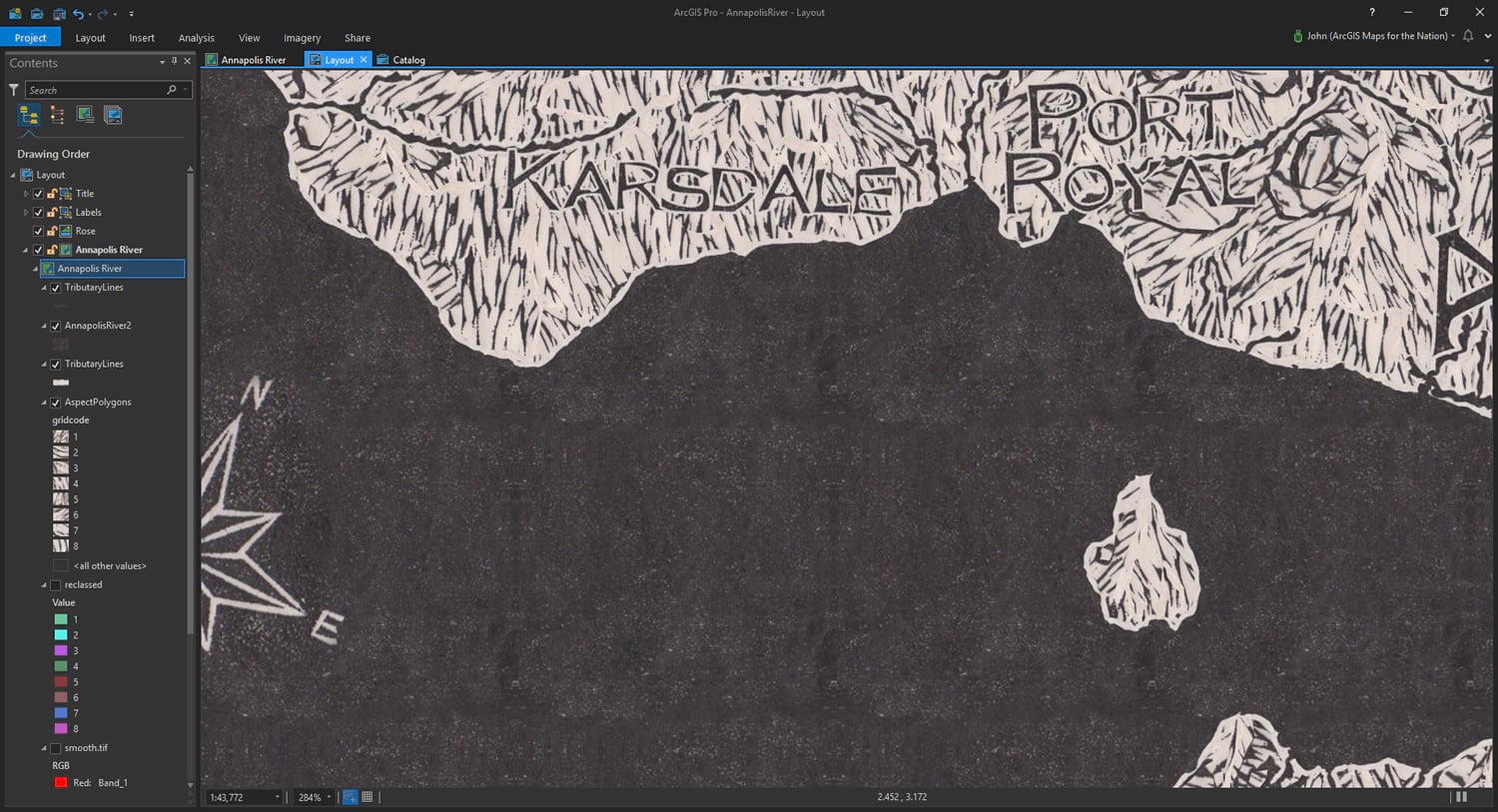
It was created in two general steps…
- Find the area of interest, the Annapolis River in Nova Scotia, and generate an aspect (which way is this hillside facing?) layer.
- Fill the aspects with textures sampled from Heather’s map.
But you aren’t here for generalities! Yours is a precise curiosity, keen to tease out the process whereby you can whip up digital woodcut maps of your own! In that case, let’s blow these two steps up and see what they’re made of.
Aspect Map and Smoothing
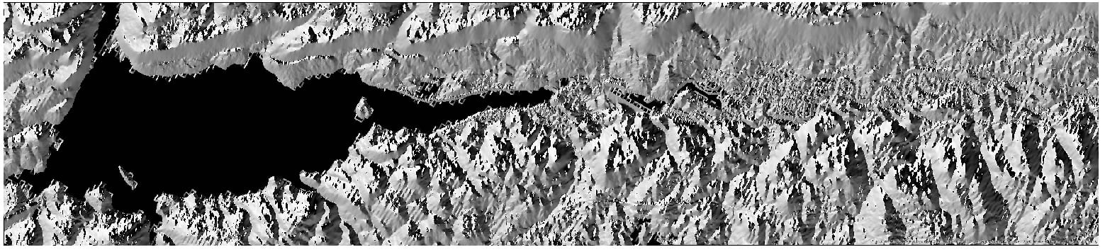
Like Heather, I found the Annapolis River polygon, and tributary line, shapefiles in the succinctly-named Nova Scotia Topographic and Geographic Names Database. But the beast of burden for my map is the magnificent “Terrain: Aspect” imagery service for the area of interest, which I exported from the Living Atlas.
I noticed in Heather’s map that the grooves she carved sort of followed the rolling aspect of the terrain (particularly the island in her map). While her carving was more representative of a landscape, it was a clue to me for how to get going on a digital version.
Here is the aspect export for the area. This aspect image shades each pixel by what geographic direction it is facing.
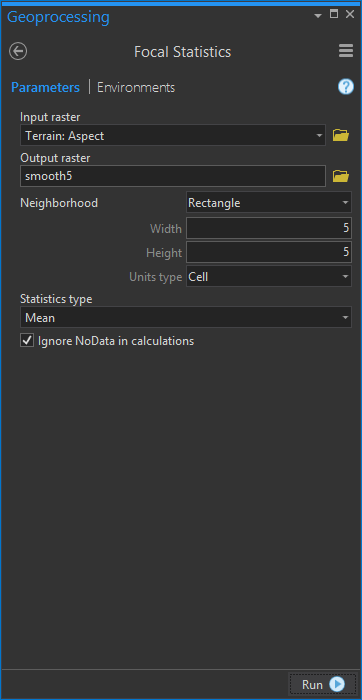
One of the bevy of carto-tricks I’ve learned from Ken Field is to first smooth an DEM-sourced image before doing any sort of vector-tracing steps, so the result is devoid of suspiciously pixel-shaped corner artifacts. It just makes the results smoother and more fluid. Also, I wanted to push back a bit of the resolution of the aspect image to more closely match the broad swaths of directional grooves Heather carved in her map.
In the geoprocessing tools, I fired up “Focal Statistics” which lets me apply a smoothing function to en-bluri-ify the imagery.
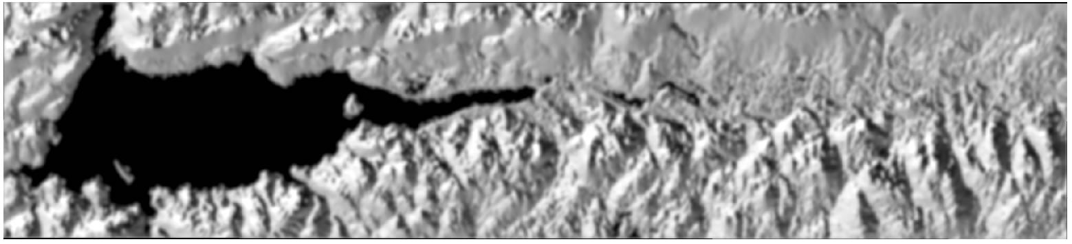
The smoothed up image looked like this…
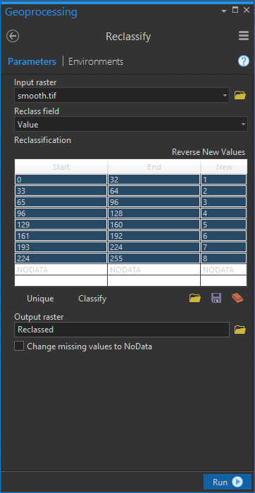
Reclassifying to Discrete Directions
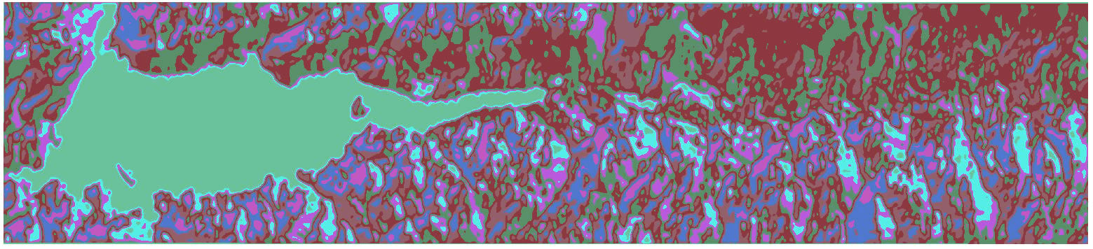
Next was to chop this smooth aspect image (with pixel values ranging from 0 to 255) into some discrete angles. I ran the Reclassify tool to re-map the image’s pixels into eight intercardinal (NNE, ENE, ESE, SSE, SSW, WSW, WNW, NNW), directions, so that I would have eight tidy angles left in my image.
Resulting in this sort of neat-looking image…
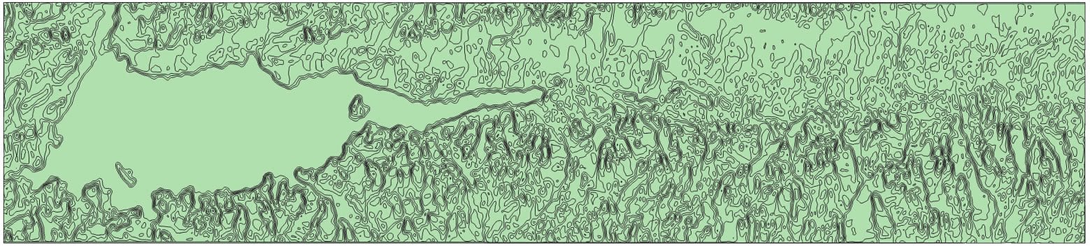
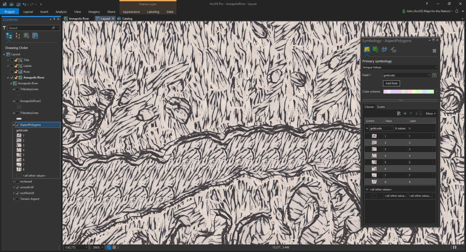
But it’s still an image. I had a mind to apply some sneaky picture-fill symbology to these angles, so I first needed to convert this raster layer into a polygon layer. Handily, there’s a tool for that, too.
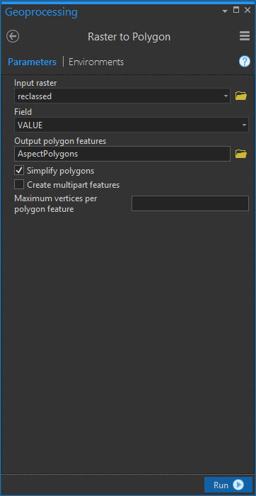
Here was the handy-vectory polygon result…
Texture Stealing
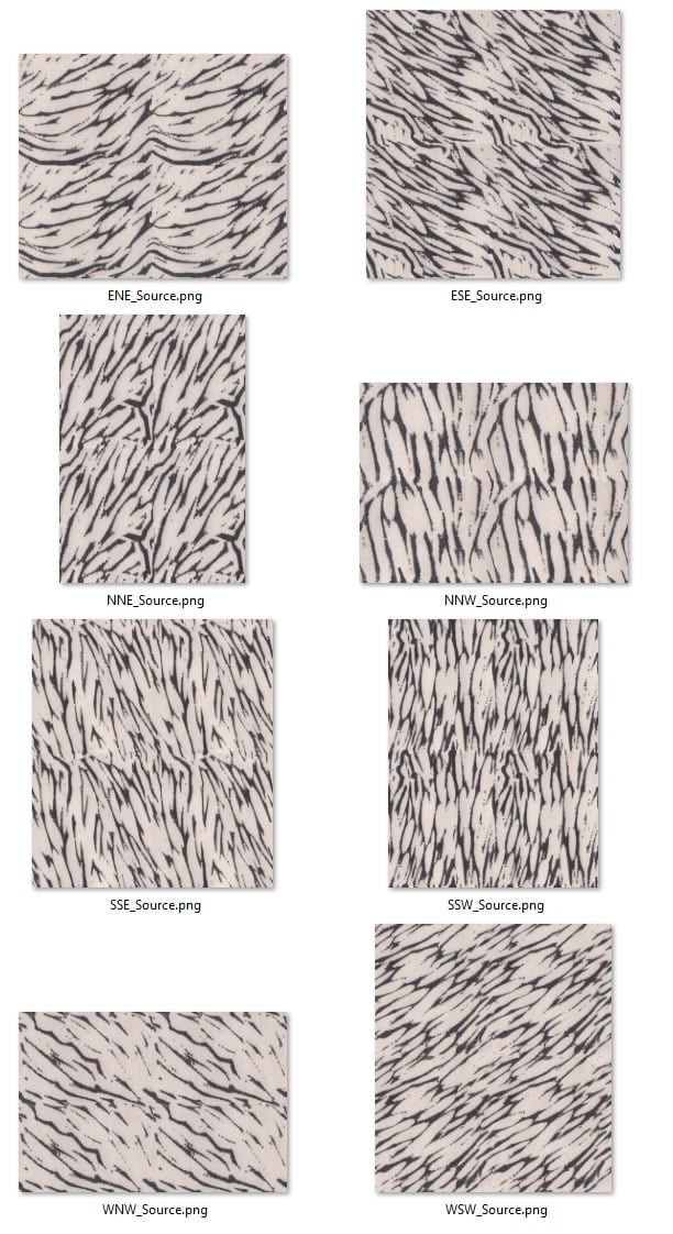
Ok, I was sitting pretty with a polygon layer of eight intercardinal aspect directions. Now the extra-fun part (these previous steps being fun, but seriously, what can compare to what follows). I opened up Heather’s beautiful map in Photoshop and sampled portions of it that corresponded to my eight directions. Here’s a little diagram I made as I went along…
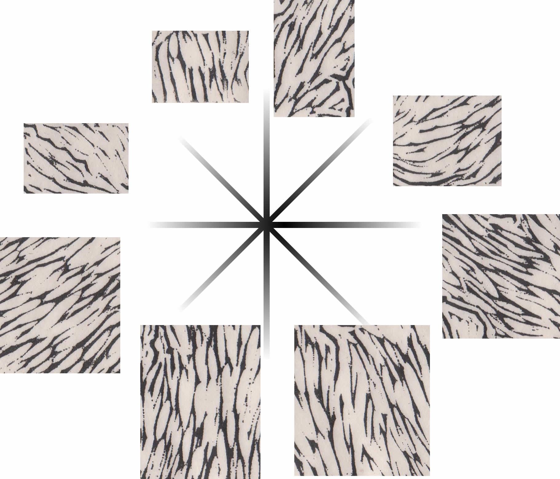
I was careful to craft their edges so that they repeated next to each other without super-obvious borders. This is a separate sort of art and I won’t get into the details here. Frankly, it was the most difficult and time-consuming part of the process. Nothing to do with GIS and everything to do with Cartography.
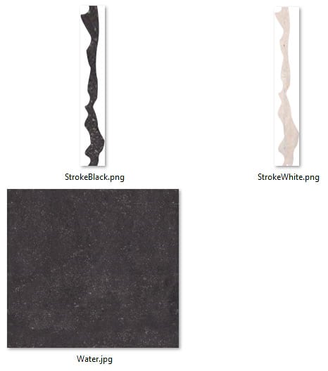
I also sampled a bit of dark (inked areas on Heather’s map) and a bit of light (un-inked paper showing through) so I could use them later on in Pro as wobbly lines. I also grabbed a big inky chunk of the river.
Vector Symbology
Alright, let’s get down to the nitty gritty! All of our homework is out of the way and we can apply these images to layers in Pro. The mega-fun stuff.
I applied the directional swatches I sampled from Heather’s map as picture fills for each of the eight discrete intercardinal direction polygon classes. Here’s a look…
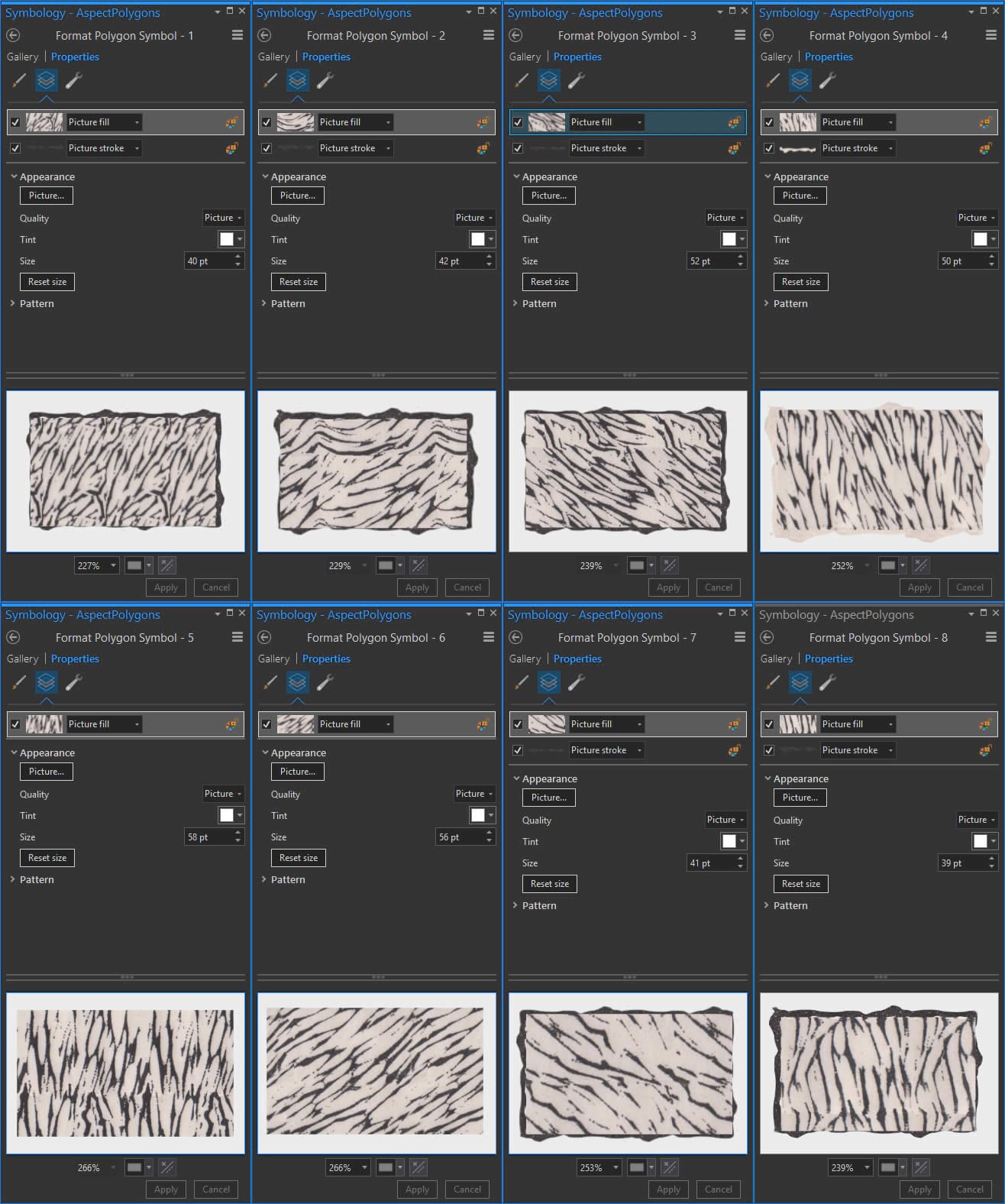
Honestly, it doesn’t look so hot right now. But when you feel this way in your cartography, push on. I’ve learned by watching other makers (ceramics, painting, etc) that about half-way through, when I would be tempted to stop in dissatisfaction, they keep adding detail and feathering in design. So just keep at it and things tend to turn a corner.
Anyway, then I brought in the river polygon and gave it that inky swatch as a picture fill, and the dark and light picture strokes along its perimeter. Now we’re getting somewhere!
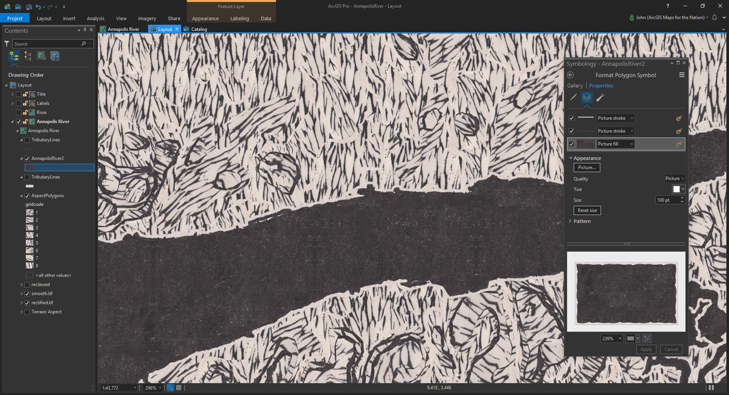
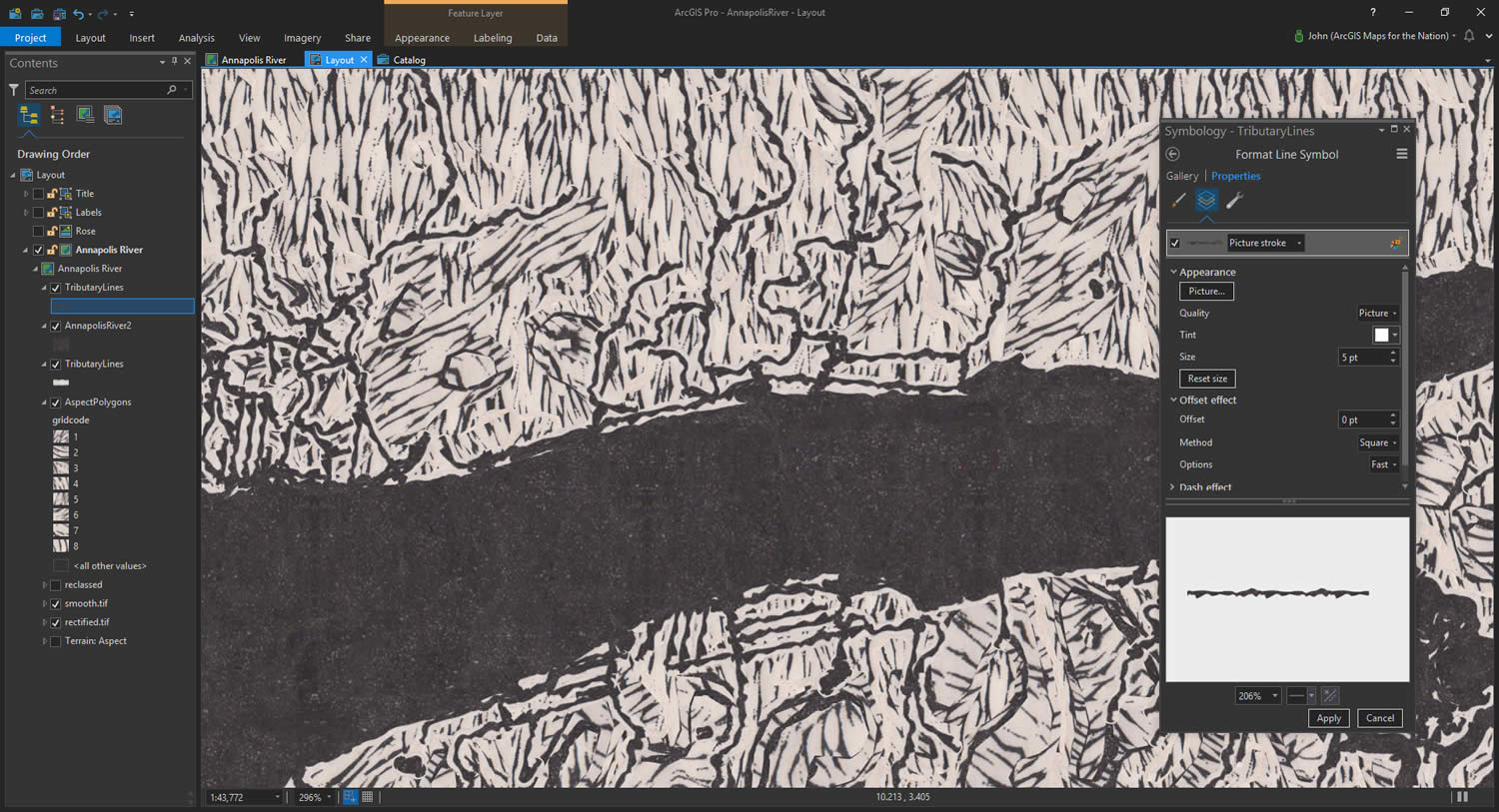
The tributary line layer got a similar treatment. I made two copies of this layer to sandwich the river polygon layer. The bottom tributary layer is a very thick light stroke and the top tributary has a slightly thinner inky stroke. This helps make the features look double-stroked, the lines having an un-inked space between them and the underlying grooves. Top-tip: play with making copies of your layers and symbolizing them for different levels of your layout. Here they are…
Labeling
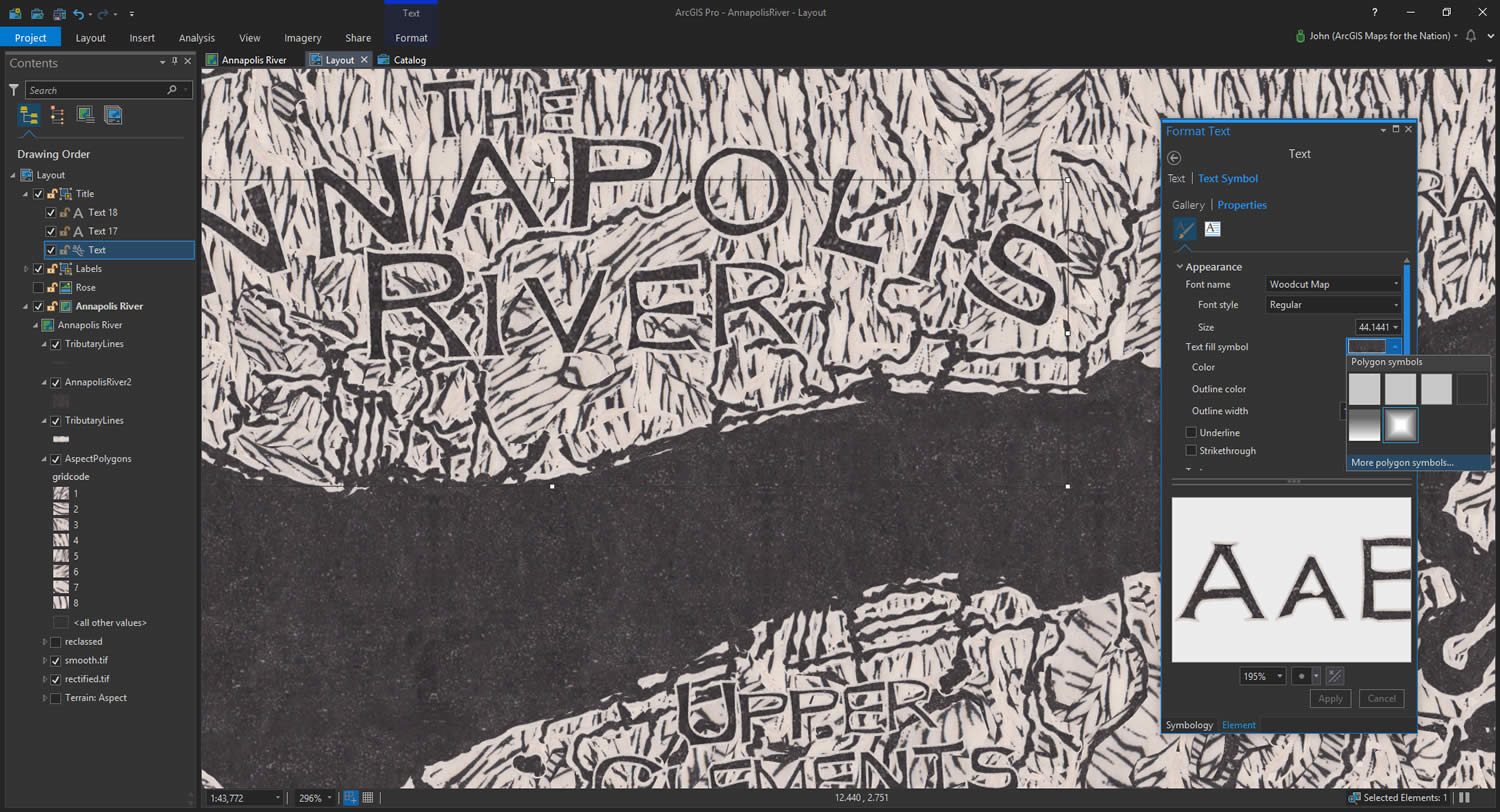
And that’s it for the physical layers. All that’s left now is labeling. But how to achieve the woodcut effect of Heather’s actually-carved letters? Well, conveniently, Heather actually created a digital woodcut font based on her carving. She’ll tell you all about it in the next post in this series.
Applying a solid color for the text body and outline quickly wrecks the effect and looks too-perfect, out of place in this full-textured map. So I just applied the same symbology that I used on the river polygon, which I had saved as a style, to the labels! Isn’t that great?? These labels render as image fills and image outlines harvested from the actual map. This way their imag-y texture blends with the other layers and the labels become a part of the map just as the aspect grooves and river features do.
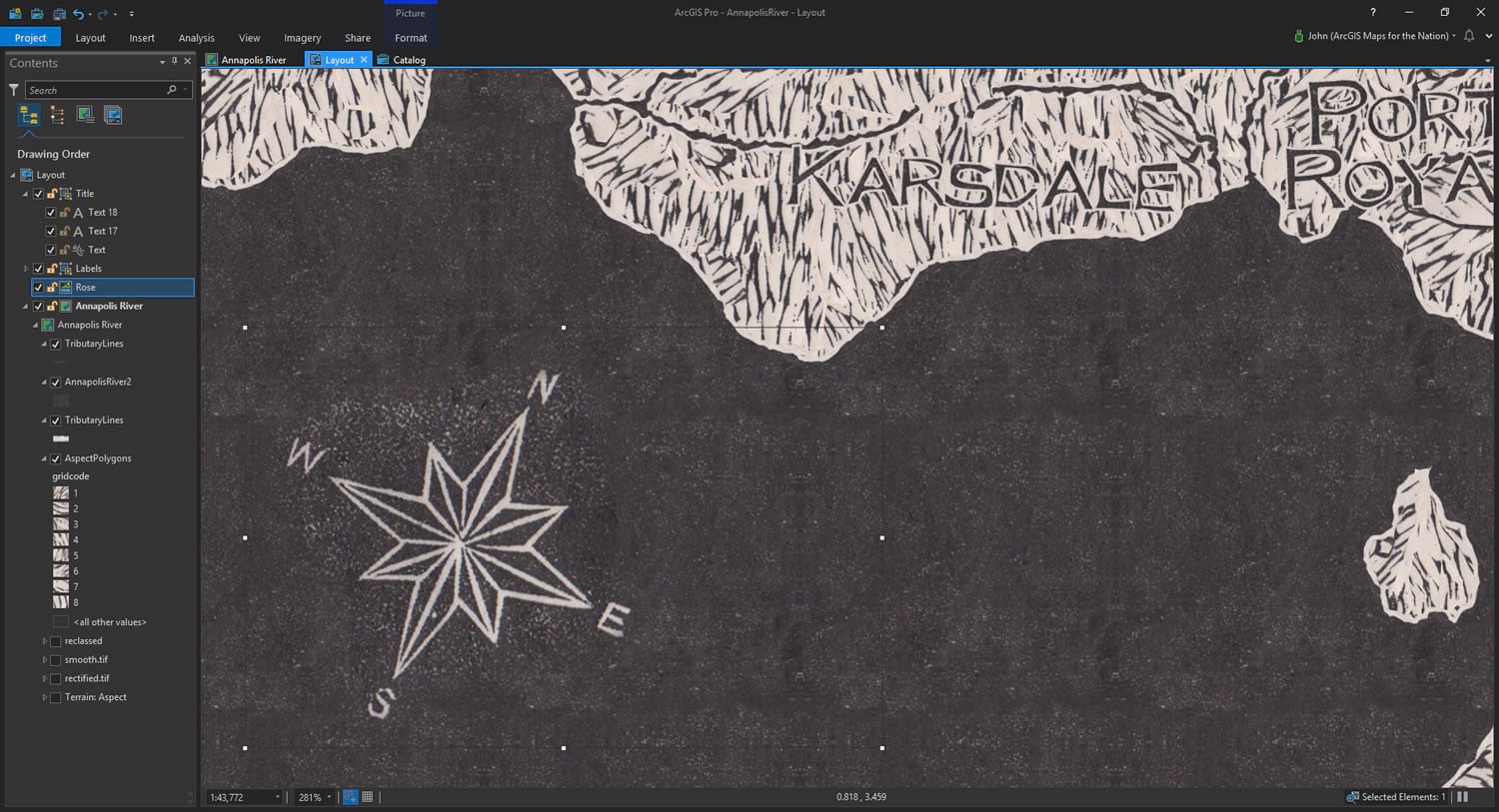
Lastly, I took a screen-capture of the compass rose that Heather carved into her river and added the image to my own layout.
And that’s where I called it. Done! Here’s the completed map, sneakily rendered in ArcGIS Pro from sampled image textures of Heather’s actual map…
Thanks for following along!
If you enjoyed this, stay tuned for the next post in this series, where Heather shows you how she created the woodcut-looking font for this map and explores the wonderful world of text in ArcGIS Pro. Get ready to live. Until then…
Happy Woodcut Mapping! John

Commenting is not enabled for this article.