In part 1, we looked at how to leverage data expressions to combine three serial charts, each powered by a different data layer, into a single chart element. Now, let’s look at how to enhance a list by displaying data that just makes sense.
Display current data and weekly trends using a list
Have you ever tried to create a list element using a spatiotemporal dataset and ended up with a list with repeating list items?

The data table that is driving the element above looks something like this:

What we want is a list that summarizes the vaccination status for each state, rather than one that simply displays the raw data. By leveraging data expressions and advanced formatting, we can display useful metrics such as the latest vaccination status and weekly vaccination trends for each state.
Access layer item as a FeatureSet
Like any data expression, we can access the portal item as a FeatureSet using the FeatureSetByPortalItem function.
// Access data layer as a FeatureSet from the portal
var portal = Portal("https://www.arcgis.com/");
var fs = FeatureSetByPortalItem(portal,"570d812fd23a4fc981e028e9f1ed7275",0,["date","location","daily_vaccinations","people_vaccinated_per_hundred","people_fully_vaccinated_per_hun",],false);
Then, we can create an empty dictionary with defined field names and types to store feature attributes for our restructured FeatureSet.
// Create empty dictionary
var dict = {
  fields: [
    { name: "location", type: "esriFieldTypeString" },
    { name: "current", type: "esriFieldTypeString" },
    { name: "week_ago", type: "esriFieldTypeString" },
    { name: "people_vaccinated_per_hundred", type: "esriFieldTypeDouble" },
    { name: "people_fully_vaccinated_per_hun", type: "esriFieldTypeDouble" },
    { name: "list_custom_order", type: "esriFieldTypeInteger" }
  ],
  geometryType: "",
  features: [],
};
Now, we can utilize a series of Arcade functions to query our data to compare the vaccination status according to the latest updates and from one week ago.
Find date values based on the existing date field
First, we can find the most current date using the Max function, then parse the value to a date object using the Date function. We can then store the current date value in a variable, currentDate. Using the Text function, we can convert the date value to the appropriate date format such as "YYYY-MM-DD"for filtering later on.
// Find the most current date from original FeatureSet
var currentDate = Text(Date(Max(fs, 'date')), "YYYY-MM-DD");
Now, we need to find out the date from exactly one week ago relative to currentDate. To achieve that, we can use the DateAdd function, specifying the exact number of days to add to currentDate. Finally, we can store the value in a variable,weekAgo.
// Find date from one week ago
var weekAgo = Text(DateAdd(currentDate, -7, "days"), "YYYY-MM-DD");
Filter the FeatureSet by date
Using the Filter function, we can filter the original FeatureSet based on the currentDate and weekAgo values in a SQL condition. As shown below, this will return two FeatureSets where the date field matches currentDate and weekAgo, respectively.
// Filter using currentDate value
var today = OrderBy(Filter(fs, "(date = @currentDate) AND (location NOT IN ('Veterans Health','Dept of Defense','Federated States of Micronesia','Guam','Indian Health Svc','Long Term Care','American Samoa','Bureau of Prisons','Marshall Islands','Northern Mariana Islands','Puerto Rico','Republic of Palau','Virgin Islands'))"), 'location');

// Filter using weekAgo to retrieve rows that correspond to a week ago
var lastWeek = OrderBy(Filter(fs, "(date = @weekAgo) AND (location NOT IN ('Veterans Health','Dept of Defense','Federated States of Micronesia','Guam','Indian Health Svc','Long Term Care','American Samoa','Bureau of Prisons','Marshall Islands','Northern Mariana Islands','Puerto Rico','Republic of Palau','Virgin Islands'))"), 'location');
Return filtered FeatureSet
Finally, we can use a nested for loop to iterate through the today and lastWeek FeatureSets. We store their features’ attributes in the empty dictionary, which we return as a FeatureSet to power the list element.
// Loop through processed FeatureSet and store its attributes
var i = 0;
for (var t in today) {
  var location = t["location"];
  for (var l in lastWeek)
    if (l["location"] == location) {
      var feat = {
        attributes: {
          location: location,
          current: t["daily_vaccinations"],
          week_ago: l["daily_vaccinations"],
          people_vaccinated_per_hundred: t["people_vaccinated_per_hundred"],
          people_fully_vaccinated_per_hun: t["people_fully_vaccinated_per_hun"],
          list_custom_order: IIf(l["location"] != "United States", 1,0)
        }
      };
      dict.features[i] = feat;
      break;
    }
  i++;
}
return OrderBy(FeatureSet(Text(dict)), "list_custom_order");
Below is a preview of the data table we constructed using data expressions, with the following fields:
location – Name of the region or state
current – Most recent raw vaccination count
week_ago – Raw vaccination count from a week ago
people_vaccinated_per_hundred and people_fully_vaccinated_per_hun– Latest metrics on the percentage of vaccinated populations
list_custom_order– Custom list order index (optional)

Configure list using Arcade advanced formatting
Now, from the enhanced data table, we want to extract three key metrics to display on our list:
- Percent of state population that received at least one dose
- Percent of state population that received two doses
- Weekly change in doses administered
In this last step, we will use advanced formatting to enhance the list content and layout.
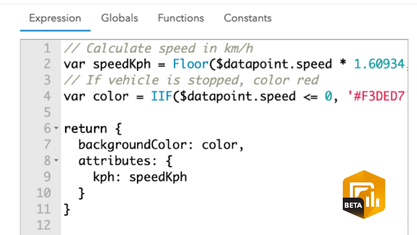
From the List tab, we can enable Arcade and create an expression that controls the formatting properties of the list. With advanced formatting, we can provide visual indicators such as progress bars and arrows, as well as classifiers using different colors to communicate how each state is doing with regards to vaccination.
Create a copy of the COVID vaccination status dashboard to see how the list below was created using a combination of advanced formatting and custom HTML.
In addition, check out how else you can push the limits of this functionality in this blog post.

Using data expressions, we were able to uncover key metrics from our dataset and visualize them in a meaningful and intuitive way. You now have more control over how to transform data to fulfill your specific dashboard requirements. I hope that you, too, can take your dashboards to the next level through the seamless integration of dashboard data expressions.


Article Discussion: