Data comes in all shapes and sizes. Sometimes, despite our best intentions, the structure of the data that we use poses various challenges that hinder us from building our ideal dashboard.
With dashboard data expressions, dashboard authors will be equipped with the power to reconstruct datasets to drive any dashboard element. From combining multiple datasets in a chart to extracting only relevant records to display in a list, data expressions extend the capabilities of dashboards to a whole new level. If you are new to this concept, get started by watching the following video for a sneak peek of what we will cover in this post.
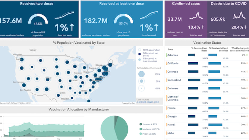
At the end of this two-part blog post, you will have learned how to author this dashboard, that visualizes the current state of COVID-19 vaccinations for each state and across the United States. Follow along part I to learn how you can visualize data from multiple data sources using data expressions.

Combine multiple datasets to create a stacked chart
Below is a group of serial charts that show how many vaccinations each manufacturer allocated per week. Behind each serial chart is a feature service layer containing vaccine data specific to that manufacturer.

Using data expressions, users now have the flexibility of combining datasets from separate feature layers to power a single dashboard element. To combine our data, we will first group each dataset based on the manufacturer name (i.e. Moderna, Pfizer, and Janssen) and calculate how many total doses were allocated each week. The diagram below demonstrates such data transformation.

Now let’s see how we can achieve this using data expressions.
Access each layer item as a FeatureSet
First, we can use the FeatureSetByPortalItem function to access each layer item as a FeatureSet. We can then use the GroupBy function to aggregate features based on the week_of_allocations to calculate the sum of first and follow-up doses allocated by each manufacturer.
var portal = Portal("https://www.arcgis.com/");
var moderna = GroupBy(
  FeatureSetByPortalItem(portal,"a30a91d7ef394aca83ea8f6ca8e2130e",0,["*"],false),
  ["week_of_allocations"],
  [
    { name: "moderna_1", expression: "F_1st_dose_allocations", statistic: "SUM" },
    { name: "moderna_2", expression: "F_2nd_dose_allocations", statistic: "SUM" },
    { name: "count_of_doses" ,expression: "F_1st_dose_allocations+F_2nd_dose_allocations", statistic:"SUM" }
  ]
);

var pfizer = GroupBy(
  FeatureSetByPortalItem(portal,"eb84b1b87bcb4a79b6dd39b9f64910b0",0,["*"],false),
  ["week_of_allocations"],
  [
    { name: "pfizer_1", expression: "F_1st_dose_allocations", statistic: "SUM" },
    { name: "pfizer_2", expression: "	F_2nd_dose_allocations", statistic: "SUM" },
    { name: "count_of_doses" ,expression: "F_1st_dose_allocations+F_2nd_dose_allocations", statistic:"SUM" }
  ]
);

var janssen = GroupBy(
  FeatureSetByPortalItem(portal,"f2607276692c471d941a95adc043a4a5",0,["*"],false),
  ["week_of_allocations"],
  [{ name: "janssen", expression: "F_1st_dose_allocations", statistic: "SUM" }]
);
Combine multiple FeatureSets
Once we have a FeatureSet for each manufacturer, we can iterate through each feature of the FeatureSet to store its attributes into an empty dictionary. After we iterate through all features, we can convert the dictionary containing all features and their attributes into a FeatureSet to power the serial chart.
var combinedDict = {
  fields: [
    { name: "manufacturer", type: "esriFieldTypeString" },
    { name: "week_of_allocation", type: "esriFieldTypeString" },
    { name: "count_of_doses", type: "esriFieldTypeInteger" },
  ],
  geometryType: "",
  features: [],
};

var i = 0;
// Loop through each FeatureSet and store its attributes
for (var m in moderna) {
  combinedDict.features[i++] = {
    attributes: {
      manufacturer: "Moderna",
      week_of_allocation: m["week_of_allocations"],
      count_of_doses: m["count_of_doses"],
    },
  };
}

for (var p in pfizer) {
  combinedDict.features[i++] = {
    attributes: {
      manufacturer: "Pfizer",
      week_of_allocation: p["week_of_allocations"],
      count_of_doses: p["count_of_doses"],
    },
  };
}

for (var j in janssen) {
  combinedDict.features[i++] = {
    attributes: {
      manufacturer: "Janssen",
      week_of_allocation: j["week_of_allocations"],
      count_of_doses: j["janssen"],
    },
  };
}

// Return dictionary cast as a FeatureSet
return FeatureSet(Text(combinedDict));
The above data expression returns a FeatureSet that summarizes the total number of doses allocated per week by each manufacturer. Create a copy of the COVID vaccination status dashboard to see the full expression.

Configure serial chart powered by the combined FeatureSet
We can now use the combined FeatureSet as our serial chart’s data source. First, set the x-axis by pulling categories from Grouped values and set the Category field to week_of_allocation. Then set Statistic to Sum and Field to count_of_doses to display the total number of doses allocated per week along the y-axis. Finally, split the values by manufacturer to compare weekly allocations among different manufacturers.

Instead of displaying our data in three separate elements, we have summarized them into one comparison chart.
From the Series tab, we can easily turn this chart into a stacked line chart. For the Stacking option, select Stacked, and set the Type as Line. Toggle on Connect gaps and increase the Fill opacity. Now, you have an area chart that visualizes changes and trends in vaccine allocation over time.

Using data expressions, we now have a simple comparison chart that shows not only the cumulative count of vaccines allocated each week but also how many doses were allocated by each manufacturer.
Follow along in part 2 of this post to learn, step-by-step, how you can leverage data expressions and advanced formatting to visualize hidden data using an informative and intuitive list element.


Came here again, this topic really helped me a lot and is a great solution to my struggle. Many thanks to Soobin!
I’ve been wondering how to accomplish a stacked line chart for a work project & this post blog post was exactly what I needed. Thank you!