Business Analyst Web App (BA Web) infographics are incredibly powerful ways to summarize data in visually stunning ways. One of the most popular features is the chart widget. BA Web allows users to create a range of bar, line, ring and donut charts.
I frequently customize these charts to produce more compelling visual presentations by comparing the site I am analyzing to a predefined set of target conditions. For example, the site might require 15,000 people within a 5-minute drive or a median income over $40,000. In the screenshot below, I am using a traffic light system (green=go, orange=caution, red=stop) to show when the variables are above, between or below a set of predefined value ranges.
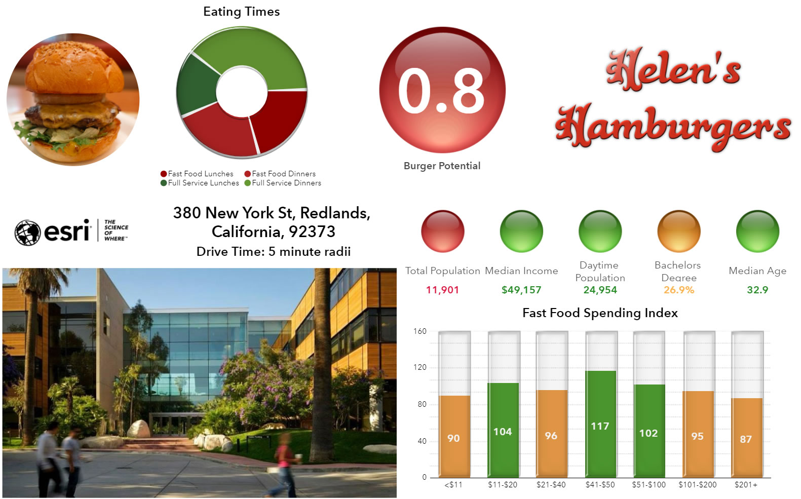
This blog explains how to customize charts using conditional tests, to recreate the fast food spending chart shown in the bottom right corner of the burger potential infographic show above.
Using Conditions in Charts
The chart is built using fast food spending data which is automatically grouped into 8 categories, ranging from under $11 to over $200. I want to color code each bar based on how the area compares to the national average, so I must use Index values for the spending variable rather than absolute number or percent.
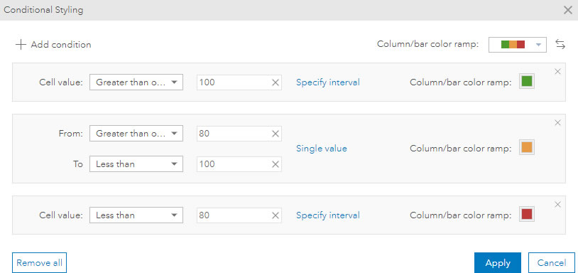
Areas that spend more than the national average (index over 100), independent of how much is spent, will be colored green. Areas between 80 and 100 will be orange and below 80, red.
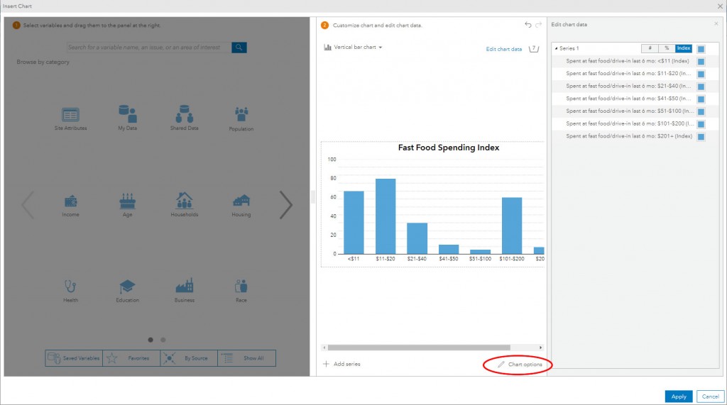
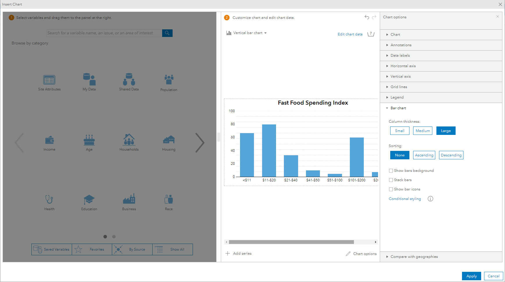
After dragging and dropping variables into the chart widget in BA Web, select Chart options, then Bar Chart to set the bar color styles for whole chart using the bar chart,
Note: Do not use the Edit chart data color options in the data viewer panel as conditional styling overrides these settings.
Once in the Bar chart panel, select the Conditional styling option and then Add condition in the new panel to create the appropriate color and range rules.
In this case, I created 3 sets of conditions, which symbolize each bar based on the following intervals; <80 red, 80-100 orange and >100 green.
Once applied, save the infographic.
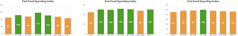
The thumbnails above highlight the variations between the 8 spending categories using a 5, 10 and 15-minute drive time.
Further Chart Customization
As a final touch, I like to add the data values to each bar and a custom background graphic to the chart to show the horizontal grid lines as dotted rather than solid lines. I also removed the vertical axis in the examples above.
To enhance the chart further I added a 3D effect to the chart, in keeping with the overall style of the infographic. BA Web supports floating images and panels, which are drawn above charts and other infographic elements. The 3D effect was achieved by adding a custom glass rectangle image over each bar. Here’s a link to see the final result live.


Article Discussion: