Your feedback inspired us to add new coloring conventions to the ArcGIS API for Python! We’ve incorporated these coloring options into the functions that generate renderers, and they’re particularly helpful when using the Spatially Enabled DataFrame’s plot method. Take a look!
Colorbrewer
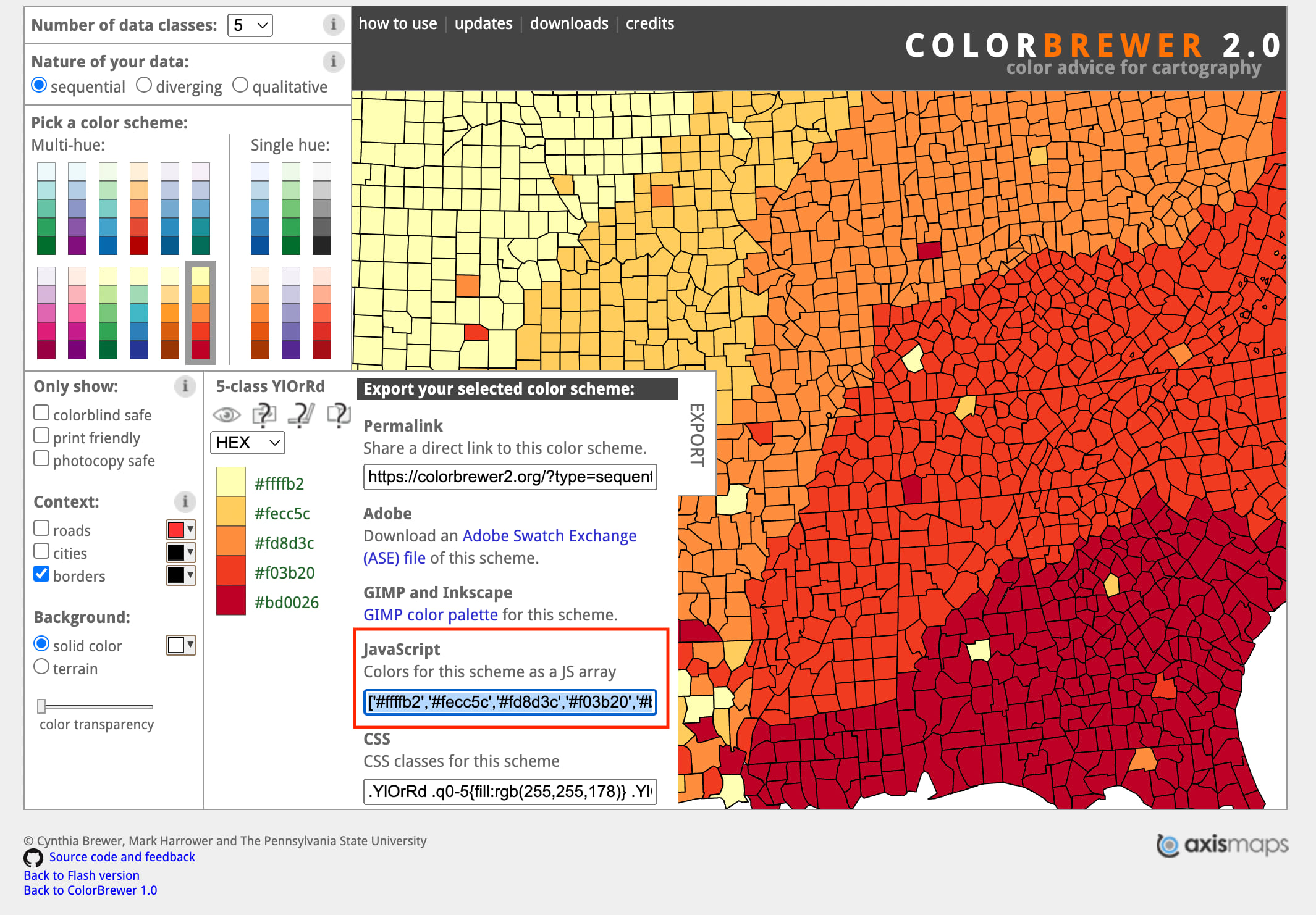
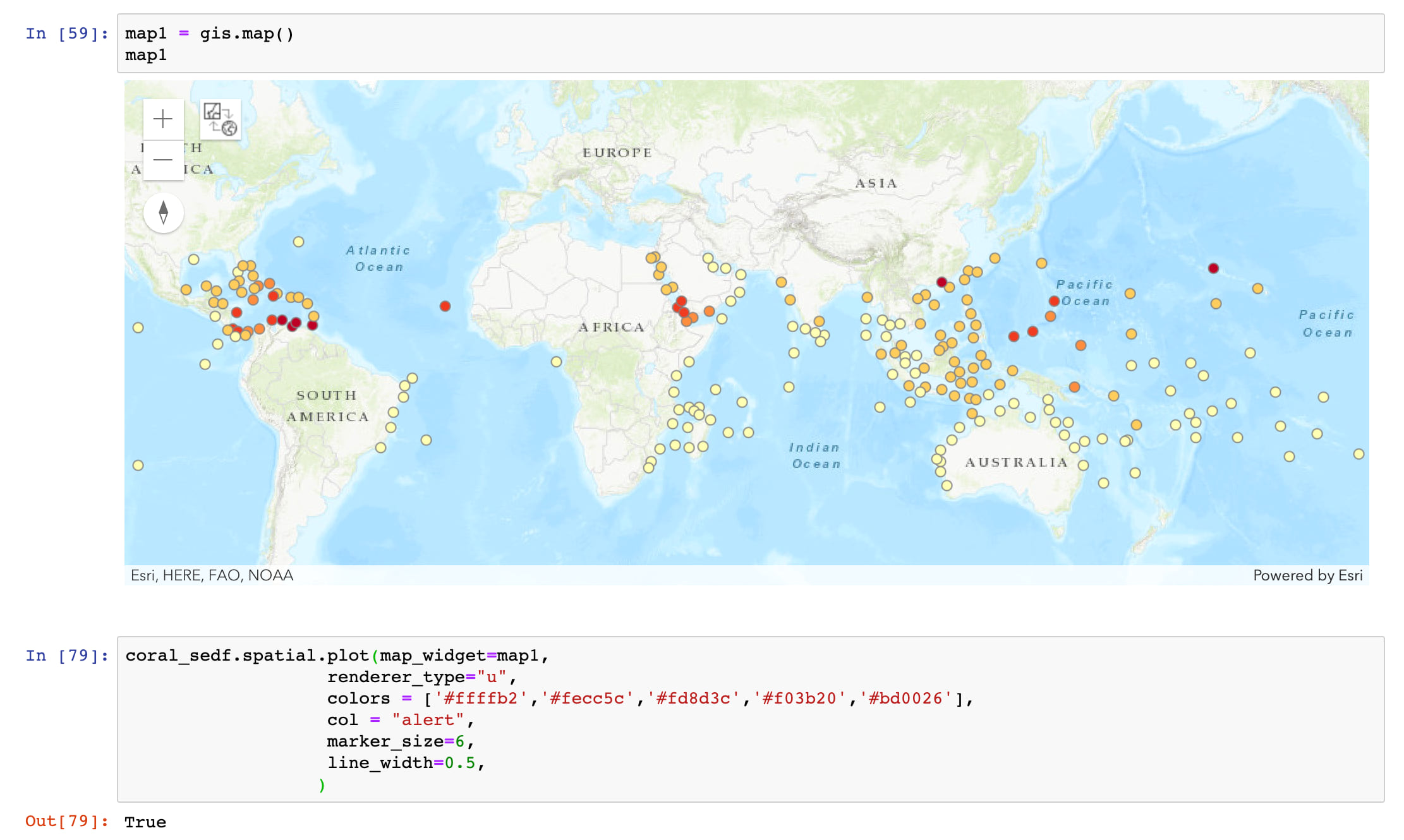
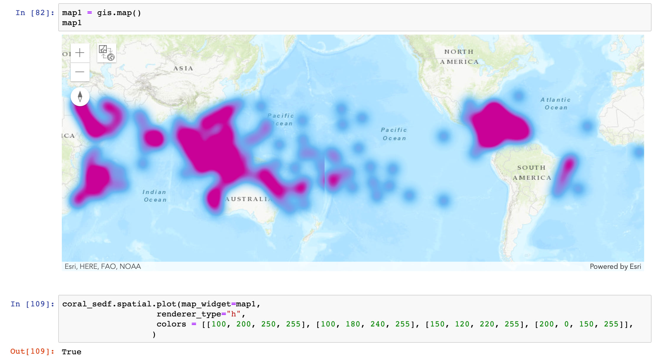
A little while back, some Esri Community members asked for compatibility with colorbrewer palettes, which we’ve now incorporated into the API. Colorbrewer is a popular online tool based on peer-reviewed research that helps cartographers and data scientists choose the most optimal combination of colors to visualize their data. It provides an extremely useful assortment of different color palettes for sequential, diverging, and qualitative data. You can customize these palettes for up to 12 different data classes and filter them by colorblindness, printers, and photocopier compatibility. Using these palettes is easy: you create a palette online, and then copy and paste the JavaScript array found under the “Export” tab into the ‘colors’ parameter of your dataframe plot() or rendering method. All of the functions work with both RGB and HEX. Below, check out the selection of a palette to display coral reefs at risk of harm from high ocean temperatures.
Palettable
We didn’t stop there. We also added compatibility for another useful option to color your symbols: Palettable objects. Palettable is a python library containing tons of different color palettes, including all of the colorbrewer palettes. Palettable objects contain the data for a given palette in various forms, including RGB tuples, HEX strings, and Matplotlib colormap objects (more on those later).
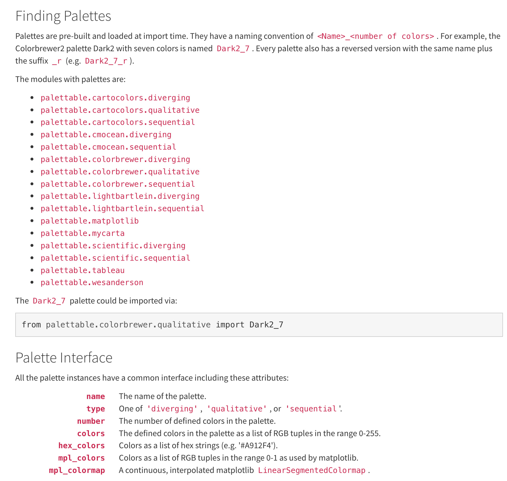
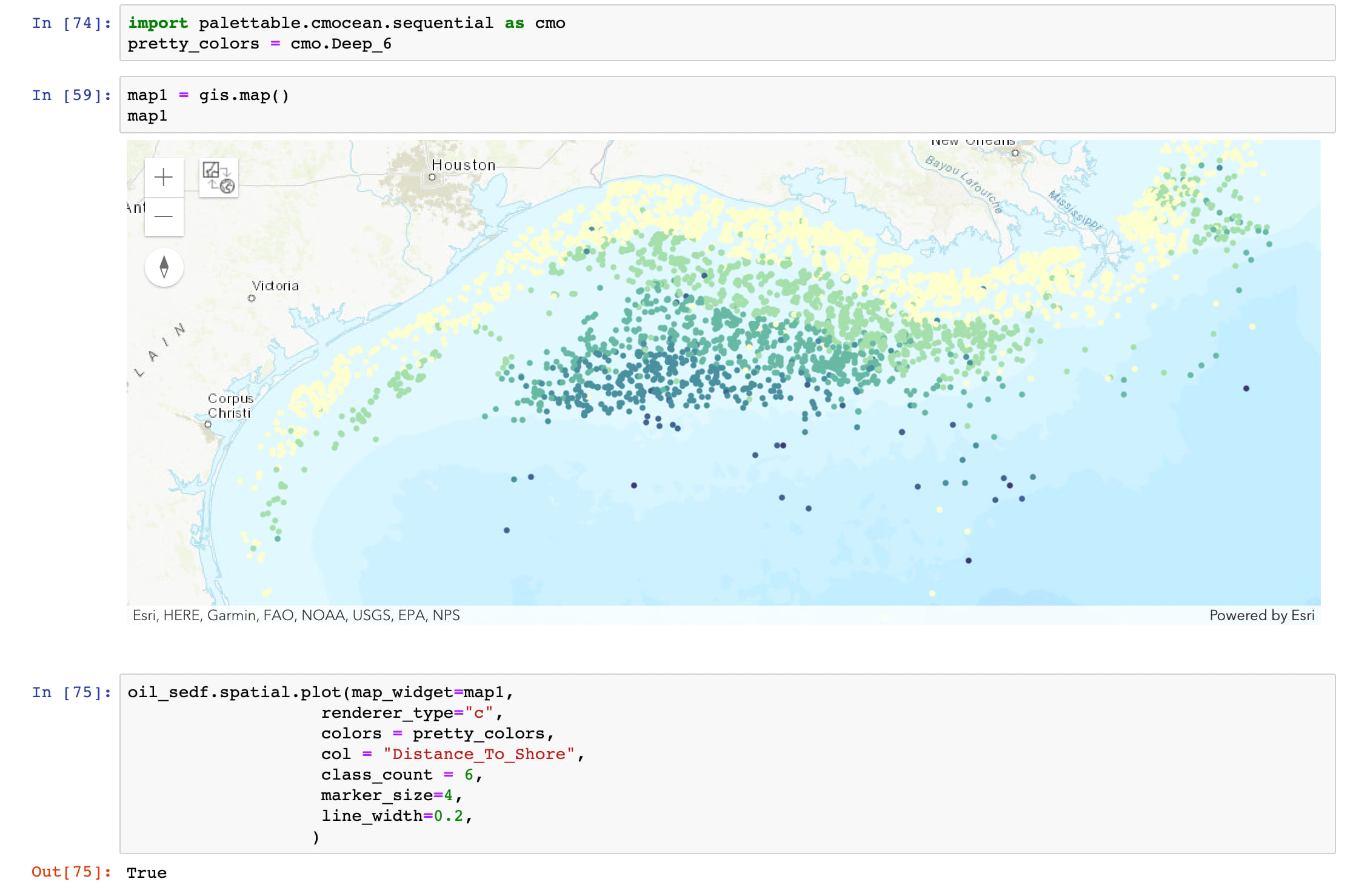
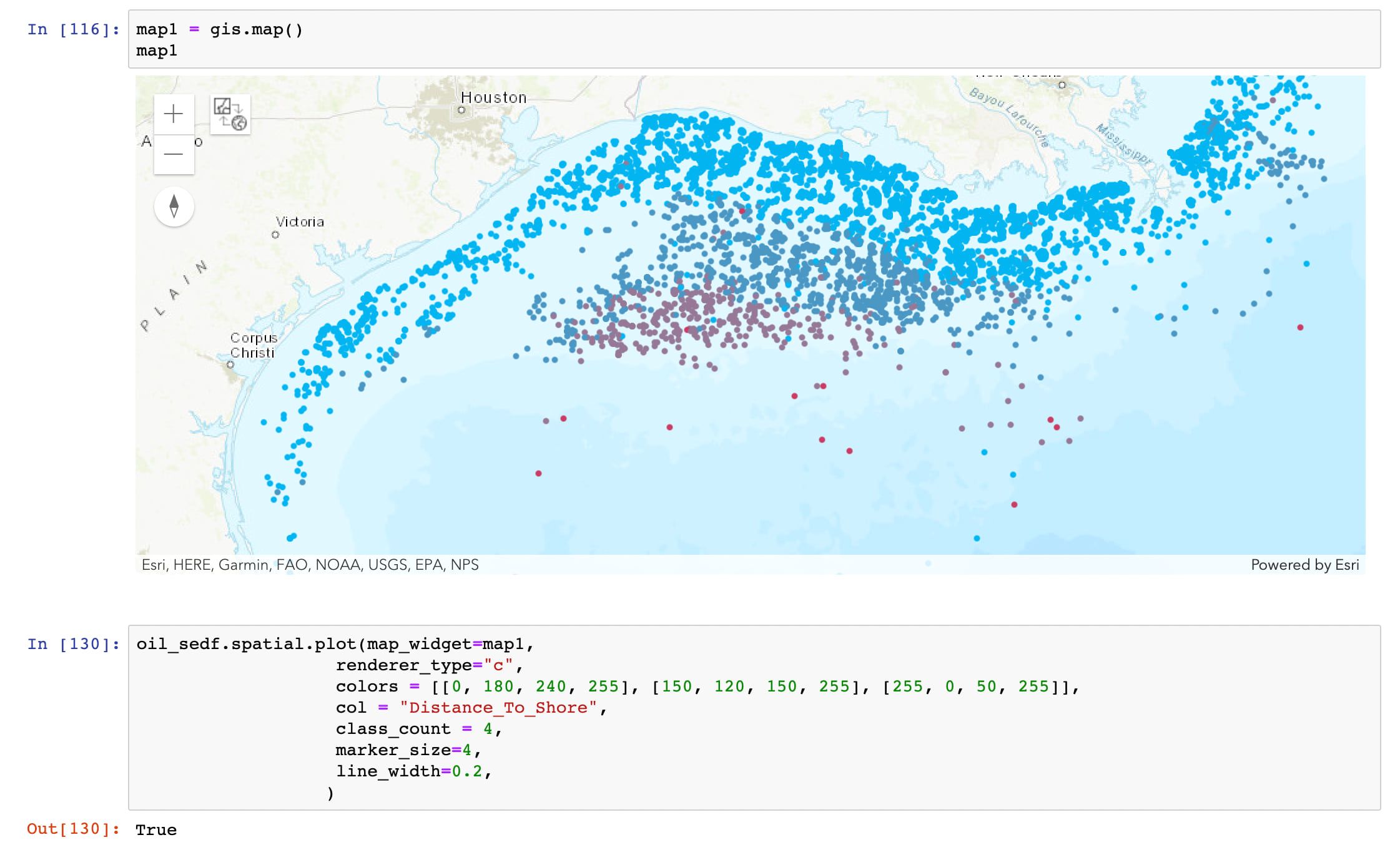
To use a Palettable palette, you must first install palettable via a package manager (conda, pip). Then, you’ll import the desired palette from the library and pass it as an argument into the ‘colors’ parameter of your method. Below, we’ll import a palette to display oil platform shore distance in the Gulf of Mexico.
Enhanced Custom Coloring
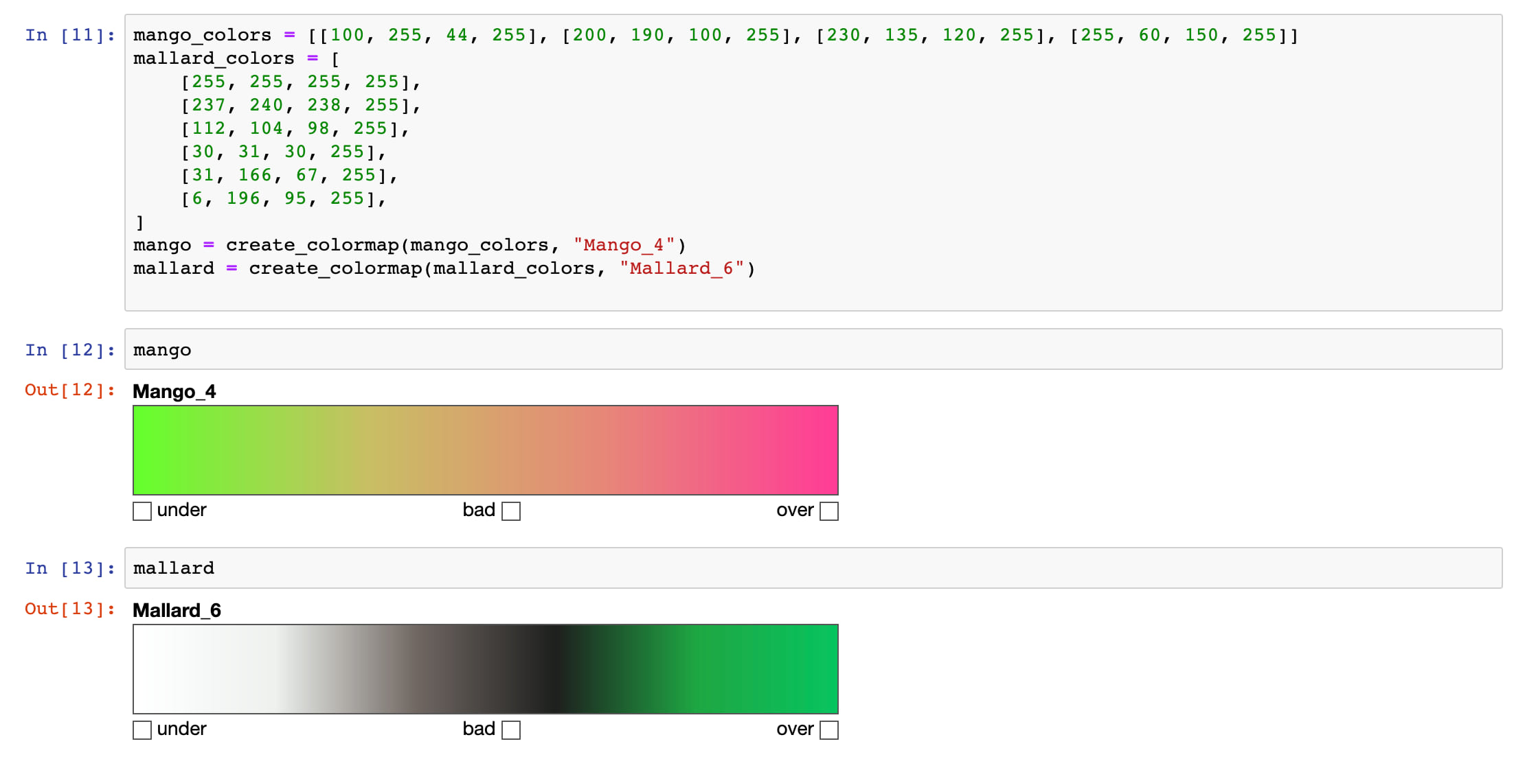
Beyond those two great new coloring methods, we also increased the flexibility of our current coloring conventions. For the renderers that take color input (heatmap, unique, classbreaks, and simple), they all now handle both traditional input types: lists of RGB + alpha arrays, and the string names of recognized Matplotlib colormaps. A colormap is a Matplotlib object that contains RGB data for a set gradient of different colors; there are 256 different colors in each one, which you can access by calling colormap(x, bytes = True). Colormap objects can also be displayed visually in a Jupyter Notebook. Examples of both can be seen below.
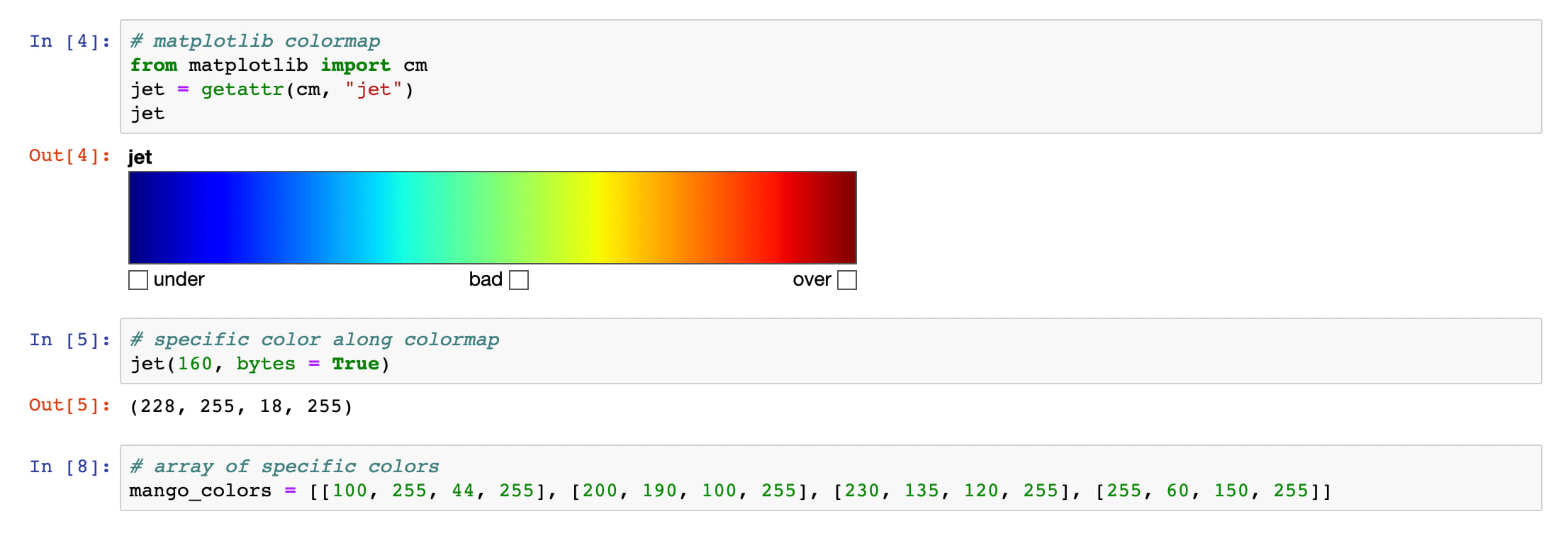
As you can see, the data in a colormap and a list of color arrays isn’t very different. We’ll get a visual idea of what the mango colors look like later.
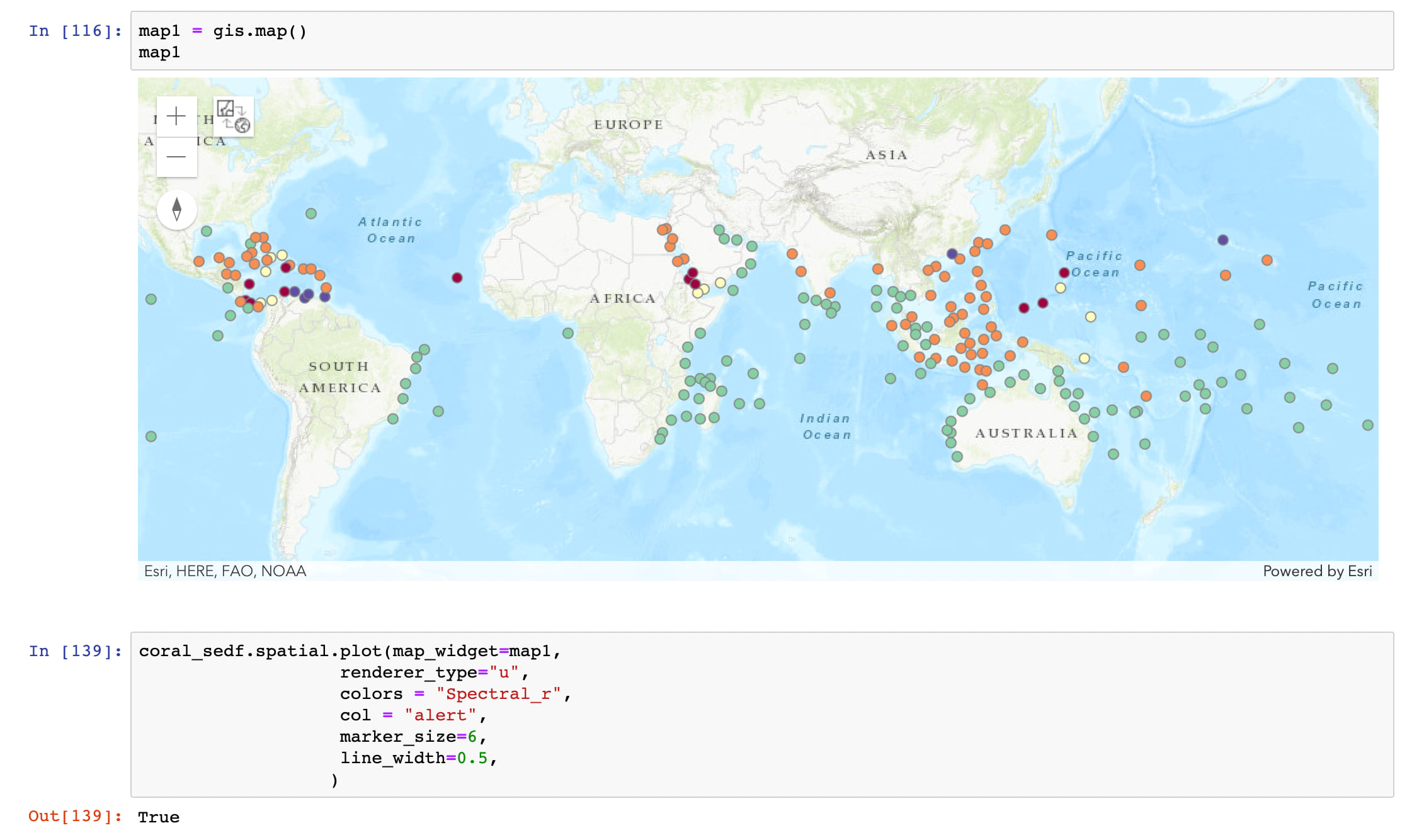
This increased flexibility improves the renderer functions in important ways. For a heatmap, you can now define custom colorstops as a list of RGBA arrays in the ‘colors’ argument, giving you complete control over the displayed colors without needing to know the underlying JavaScript API’s renderer structure. In addition, classbreaks renderers can now take a list of RGBA arrays that will define the colors of the data bins; this works by creating a colormap object internally from the list and dividing it up based on the specified number of bins. This allows you to create any number of unique bins from the same list of colors you provide. Lastly, now you can pass a colormap name while creating a unique renderer with no risk of repeat or overly similar bin colors. Below you can see examples of all 3 in use.
Finally, we want to introduce a handful of new functions. At long last, we added separate utility functions for various renderer types: generate_simple(), generate_heatmap(), generate_classbreaks(), and generate_unique(). You can still call generate_renderer() and specify the renderer type, however. We also added another utility that gives you the power to make your own custom colormaps: create_colormap(). As demonstrated below, this function allows you to visualize colormaps made from custom color arrays, giving you an idea of how your renderers will look.
Happy plotting!

Article Discussion: