As the map-maker, you are the most valuable tool when creating a narrative around your data. An important way to get the intended reaction out of your audience is to be conscious about what colors you use in your map. Color is a powerful instrument when mapping your data, because it can help create clarity about the underlying message your map shows. Your color choices can make the difference between confusing your audience and convincing them.
This quick guide introduces quick, easy ways to tell captivating stories with your maps by using the color options within smart mapping.
As you create your map in ArcGIS Online or ArcGIS Enterprise, you have the opportunity to go beyond the smart mapping defaults to create a story centered around your knowledge of the subject and the data. So how do you know which options to use?
It’s as easy as 1-2-3!
1: Plan it
2: Basemap it
3: Color it
1: Plan it
This step is a mental exercise. It only takes a moment, but can help you later when you are making your color choices. Think of your map as the interface to your data. You have been tasked to create this interface, so it is important to be as clear as possible for your audience.
You want to relay an important message, so take advantage of color to tell your narrative, rather than just dumping data onto the map. Really consider why you are making your map:
Are you answering a question?
Are you trying to convince someone to take action?
No matter your purpose, make sure to take a step back as you make your color choices, and think “what is this map telling me?” When looking through the options, consider that certain colors, like red, might unintentionally bring on negative or string emotions. Color can make people feel differently about your topic, so consider what you want your audience to feel when they look at the map.
2: Basemap it
Smart mapping will offer color ramps suitable for each basemap, so it is good practice to choose your basemap first. It only takes seconds, and helps create context for your map. You can make a choice from the Basemap Selector, the Living Atlas, or your own custom basemap.
You can also use transparency on your basemap and the reference labels in order to draw more attention to your data.
3: Color it
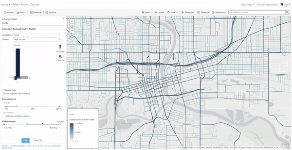
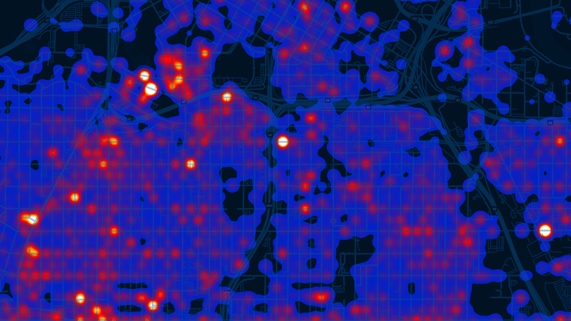
Smart mapping will automatically provide you a map using a “High to Low” theme. This is a great way to emphasize the highest and lowest values in your data using a gradient of colors, or two distinct colors (one for the highest and one for the lowest). For example, if the city of Des Moines, IA wants to map the annual average daily traffic on its roads, the default High to Low theme highlights which roads have the most traffic with the darkest color in the ramp.
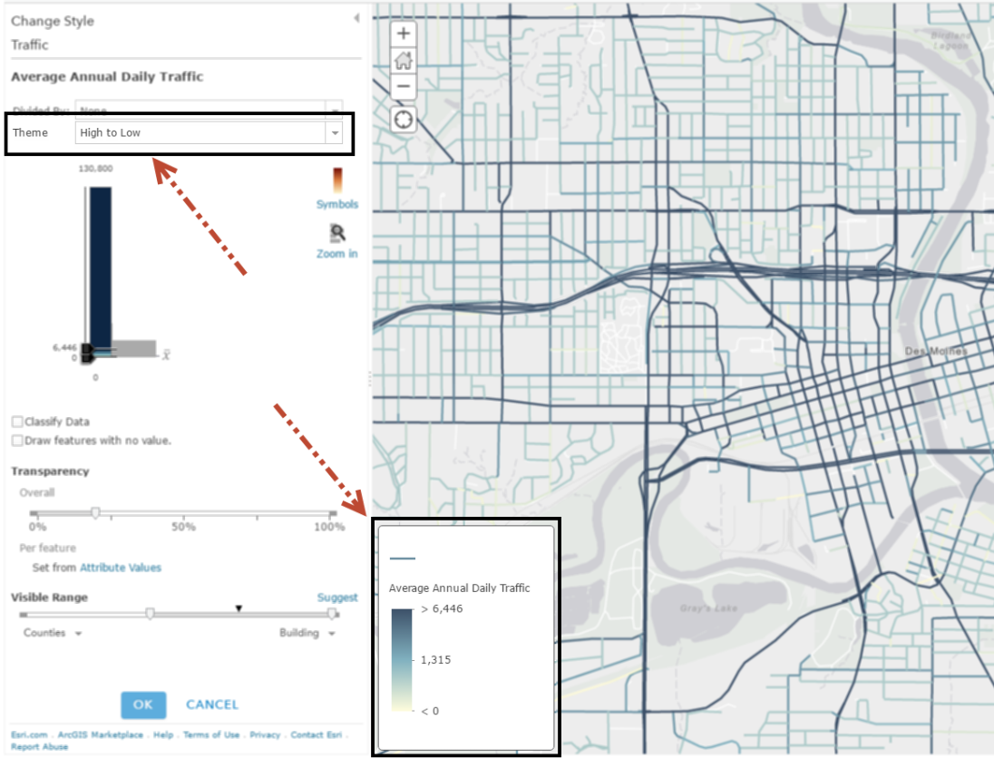
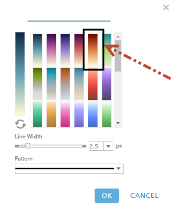
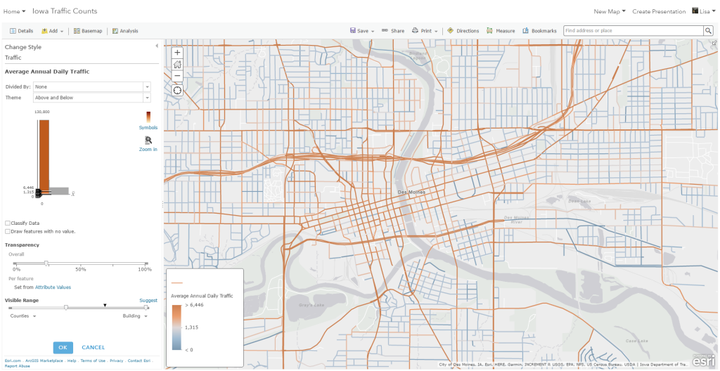
Remember our first tip? Let’s put it into action. We can select one of the many color ramp options to change the roads from the default blue to a brown. The use of brown instead of blue might make more sense to the audience in the context of the map showing roads and car traffic.
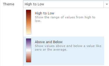
Another way to change the story being told, is to change the theme option to Above and Below. This centers the map around an central value, using color to show which features have values above or below the specified value. By default, smart mapping uses the statistical average of your data, but you can also adjust the center to a value which you know is meaningful to the map subject.
For example, if the city of Des Moines wants to know which roads have above-average daily traffic, they could use the Above and Below theme to easily highlight the pattern. When using this technique, smart mapping provides color ramps that diverge into two different colors, where the value you choose to center your map will be the point at which the colors split. In this map, we can easily see that the brown streets have daily traffic levels that are above average, while blue streets are below-average.
Small adjustments can make a world of difference within your maps. While smart mapping can create a valuable default map for you, these basic tips can help you create more informative narratives using your knowledge of the data.
For the full interactive guide of these tips, visit this story map. For more ways to make great maps, check out these 6 Easy Ways to Improve Your Maps.

Article Discussion: