This blog article was last updated on Oct 18, 2024
Pivot tables are one of the most valuable features in Excel. In the latest release, ArcGIS for Excel added support for Pivot tables. A Pivot table is a Microsoft Excel tool that can be used to create a summarized table of aggregated data. Data can be sorted, filtered, and rearranged dynamically to emphasize different aspects of your data. ArcGIS for Excel can now add the data from Pivot tables for visualization on the map.
Did you know? The pivot table was actually invented by Pito Salas in 1986 at Lotus Corp
Create Pivot table in Excel
Using a sample dataset, in tabular format we can look at using a pivot table to aggregate data to areas to create a map in Excel.
The sample dataset contains 100 records with 6 columns, with data for US (United States) store locations, customers visiting those locations, and store sales by customer. It is best practice – Instead of creating a pivot table from raw cell ranges, try to convert your data into a table format. A table format dataset will help you greatly when it comes to updating your Pivot table with new data in the future.
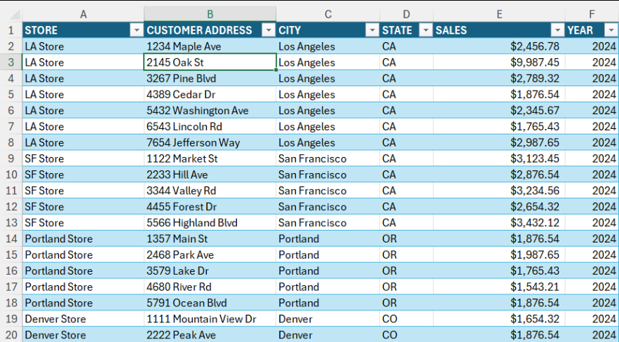
To insert a Pivot table, click inside your dataset. We have a table of sales data of store locations spread across United States in our sample dataset. In Excel, go to Insert tab and click Pivot table. Place the Pivot table in a New Worksheet. Then click on OK.
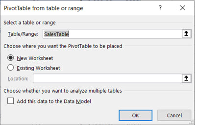
Once you click OK, you get a Pivot table in the new sheet. One of the benefits of using a Pivot table is the ability to create and choose fields you wish to analyze. In the Pivot Table Field List Task pane, the field names are headers from the data set – STORE, CITY, YEAR, SALES, etc., are listed. The selected field can be placed in one of four sections – Filters, Columns, Rows, and Values.

Drag the fields to relevant sections – Rows, Columns, and Values based on the type of report you want to create. You can summarize your data in a Pivot table by placing a field in ∑ Values section in the Pivot table Field List Task pane. By default, Excel takes the summarization as sum of the values of the field in ∑ VALUES area. However, you have other calculation types, such as, Count, Average, Max, Min, etc. Here we are creating a report where Rows are the Cities, Columns are Sales, and the ∑ Value inside the pivot table would be the Sum of Sales by Stores and Count of Store. The Count of Store indicates the number of customers who purchase items from the Store. In the ∑ Values section Count of Store, the field name is renamed to Total Customers. Apply the Currency formatting to the Sum of SALES column. The fields in the Rows section would be used as a Location type in ArcGIS for Excel to create a map. Now it is easier to analyze the information. Each store location is listed once, total sales are calculated, total customers counted are calculated, and grand total sales from all the stores are also counted in the Pivot table. The Pivot table would look like the screenshot below.
Create ArcGIS for Excel Map using Aggregated Pivot table data
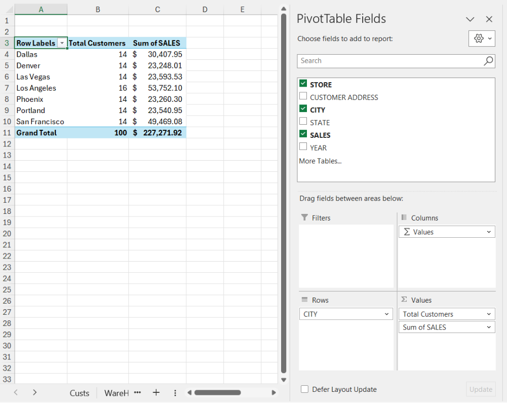
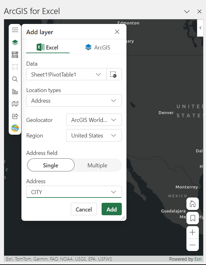
With ArcGIS for Excel, you can create a map that includes data from Excel, ArcGIS Services, and Pivot table. In our Pivot table, the city field in the Rows section is the geographical field that would be used to render data on the map. The fields in the Rows section of the Pivot table would be used as a Location type in ArcGIS for Excel to create a map. The Sum of SALES and Total Customers are aggregated fields in the Values section of the Pivot table. In the dataset, open ArcGIS for Excel task pane, Sign-in to ArcGIS for Excel, and select add layer from the data from the Excel spreadsheet. In the Data drop-down list, the newly created Pivot table would be listed.
In the Data drop-down, select Pivot table, and select Address in the Location types drop-down list. And in the Single column tab, select CITY from the Address drop-down list. Then click on Add to map.
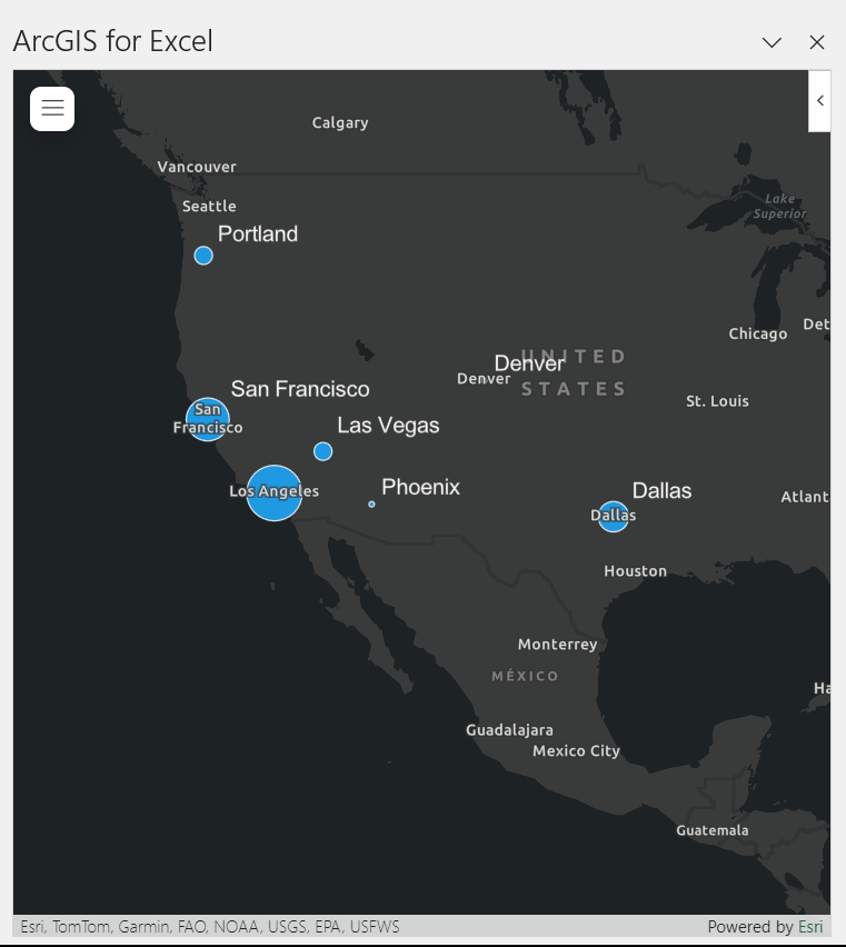
Cities representing the Store location are geocoded on the map. Now we apply the Counts and Amounts (size) smart mapping layer styling to the features using the SALES data attribute. The Counts and Amounts (size) layer styling helps to compare the SALES between the stores. For example, the largest symbols on the map are for Los Angeles and San Francisco stores, suggesting that the highest sales happen at these two store locations.
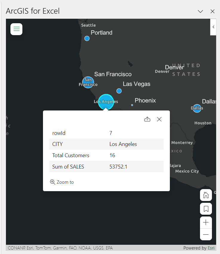
To visualize the Sum of SALES and Total Customers by store location on the map – select the feature on the map, and a pop-up window opens. The pop-up contains descriptive information about the feature, and here the Sum of SALES and Total Customers of the store location is displayed.
To Summarize …
Microsoft Excel Pivot table is an excellent tool for data aggregation. With the Pivot table, you could also aggregate your duplicate areas data in a way that is easier to analyze – by average, sum, or count. With ArcGIS for Excel, you can now visualize and analyze the aggregated Pivot table data on a map. To learn more about the ArcGIS for Excel analysis tools, please check the ArcGIS for Excel Help.

Article Discussion: