A key part of the Science of Where is sharing your results in a way that allows others to understand and build on your work. As a Living Atlas curator for the Environment Team I work closely with users submitting nominations to help them share and maximize the scientific value of their work.
My philosophy for designing geographic information products focuses on the end user and providing value to them. This can be much more challenging than it appears at first. I work with users ranging from hard-core academic researchers and GIS specialists to citizen scientists, planners, and managers who may have some subject matter expertise but need a little more help interpreting what they are viewing.
A well-designed product puts the end user first and anticipates what they need to understand your work and build on it. This is an important point that many people overlook. For items that we accept into Living Atlas we look for great cartography, solid information design and clear, concise writing.
When designing or reviewing layers my assumption is that a user will discover the layer, explore it a little in a map, dig into the details, especially if they are a researcher or GIS person, and quickly see the value of the layer. If all goes well, they will be able to understand the layer and how it will be useful to them. In the modern internet era you only have seconds to communicate all of this. People tend to scroll and scan quickly rather than read beginning to end. The harder each of those steps is for the user the more likely the user is to move on.
Discovering Your Layer: Title, Summary, and Thumbnail
When a user searches for layers in the ArcGIS platform the results include the title, summary, and thumbnail. This is the key point where a user will recognize the potential usefulness of your layer and investigate further.
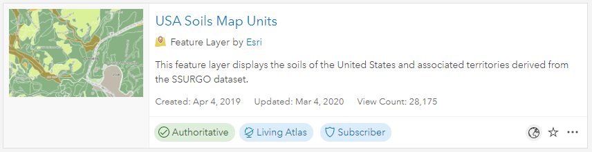
Typical search results contain the thumbnail, title, summary, and other information about the layer.
Your title should be clear and concise. Italicize scientific names and avoid acronyms, parenthesis, and jargon that may not be familiar to the users.
The summary should expand on the title and provide a mini-abstract. It should be direct and written to answer questions such as what does this layer show, what is the data source, what time period or version was used to create the layer, what is the extent of the data? Space is limited to 250 characters so you must carefully craft a summary that tells the potential user what they need to know to determine if the layer will be useful for their needs.
Humans are visual creatures and a good thumbnail is an important part of communicating the value of a layer. A potential user will consciously or unconsciously infer much about the quality of a layer from the thumbnail. I like a thumbnail that tells the user something about the data. By carefully crafting a thumbnail you can indicate information about the scale, feature density, level of detail, extent or region covered by the layer. I often use the human geography base map and try to include a place name that may be familiar to potential users to give them clues about the layer. In other cases an image might be useful for example a photograph of a rare species that is mapped in the layer or a picture of a bicyclist for a layer that contains mountain bike trails. Many users include organizational branding in their thumbnail which helps tie collections together especially if they are an authoritative data source.
Description: The science behind the layer
I find that writing the description is one of the harder parts of the publishing process but particularly with scientific data is important for communicating with your users. The description is also generally the last thing we all work on so you tend to be out of gas when you get to it. However, a well-written and formatted description gives your layer the professional polish that reflects the quality of your work and provides the user with the critical information needed to understand the layer. Without basic information on the source and methods behind the layer it fails as science and will be of little value for future work.
In cartography and design, we use a visual hierarchy to emphasize the most important features and deemphasize others. When I am designing the description, I use a similar approach to create an informational hierarchy. I try to think of the most important thing that the user should know about the layer and start from there. One way to design the description is to use a journalistic inverted pyramid style where the description is organized into short paragraphs and ordered from most important to least important information.
Generally, I recommend telling the user what they are looking at followed by how it can be used and then paragraphs detailing the methods. Think about the five Ws from journalism and try to include information about Who, What, When, Where, and Why. Use hyperlinks to connect the description to journal articles or other sources that describe how the layer was created.
Finishing Touches: The Pop-Up
So imagine the user has discovered your layer, they understand the science behind it, and appreciate the clear cartography. They click the map to open a pop-up and get an unformatted mess of meaningless field names and information that is not useful or relevant to the question that the user wants answered. Pop-up space is limited so choose what you include carefully.
I apply the same inverted pyramid approach to pop-up design that I use in the description: the most important information goes on top in big, bold text and then is followed by secondary information in progressively smaller and lighter fonts.
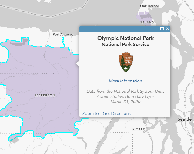
This pop-up from the USA National Park Service Lands layer provides an excellent example of an inverted pyramid design. Starting at the top, the pop-up uses large, bold fonts to answer the question “What is this thing on the map that I just clicked?”
This layer doesn’t have many attributes to work with so the title is followed by the U.S. National Park Service logo. The logo provides a visual clue to the user that reinforces the idea that this is a National Park. Its arrowhead shape also compliments the inverted pyramid design.
Below the logo is a link to Olympic National Park’s web page followed by details about the source and vintage of the data in small, light-gray font. The design leads the viewer’s eye from top to bottom. The user is lead to the top, reads down and can disengage at any point depending on their level of interest in this feature.
I like to put a link at the bottom of pop-ups. This provides a natural flow for the user: they view the map, ask it a question by clicking and getting a pop-up. Most users will be finished with the map at this point, others will pan and zoom to another location they are interested in, but the high-value user who wants to build on your work will want to know more.
I often use gray italics at the bottom of the pop-up to provide background information and to indicate the end of the pop-up. The bottom of the pop-up is a great spot to lead this person from your map to further details about the data or to a higher level view of the project. Rather than leaving the advanced user in a blind alley at the bottom of the pop-up give them a path forward.
As a final note on pop-ups, I strongly suggest learning some simple Arcade expressions to control the values and formatting in your pop-ups. Simple things like controlling the number of significant digits displayed and removing headings and units for records with no data values go a long way to giving your pop-up a professional look and feel. If you are just getting started with Arcade or even if you are not, this awesome blog by Lisa Berry is a fantastic resource.
Working collectively and the Science of Where
You have put in a ton of time collecting data, running analyses and building maps so go the extra mile and consider how you can make your information products easy to use and understand. Ensure that they are documented in a way that will allow others to follow your work flow and build on your efforts. This transparency and repeatability puts the science in the Science of Where. Science advances incrementally as we build on the work of others, be sure your contributions are ready to be used to increase our understanding of the world around us.
Article Discussion: