Analysis tools are now in Map Viewer. This includes a new, powerful tool: Find by Attributes and Location–a combination of Find Existing Locations and Derive New Locations from Map Viewer Classic. Find by Attributes and Location allows you to make spatial and attribute expressions all in one analysis run.
This blog will use the Find by Attributes and Location tool to demonstrate a combination of spatial and attribute queries. The example below will look for areas in the contiguous United States that are potentially hazardous for human health based on air quality.
Being exposed to high levels of particulate matter in the air increases the risk of many respiratory and cardiovascular diseases. According to the World Health Organization, exposure to fine particulate matter that is under 2.5 micrograms (PM2.5) in a density above 10 micrograms per cubic meter can significantly impact human health. The main source of PM2.5 is emissions from combustion, including wildfires and the burning of fossil fuels. Coal power plants, for example, are a big contributor to PM2.5. While particle pollution can travel hundreds of miles from its source, providing short-term exposure to PM2.5, residents within about 30 kilometers of sustained emission sources experience long-term exposure to PM2.5. In the following workflow, you will use both short-term and long-term exposure to PM2.5 to assess current locations of hazardous air quality.
Get and Prepare the Data
To find out where the thresholds for PM2.5 are being exceeded in the United States, add data for air quality, power plants, and U.S. boundaries to Map Viewer.
- In the layers tab, click the Add button and select Living Atlas in the dropdown. Search for three layers:
-
- AirNow Air Quality Monitoring Site Data (Current) by the Office of Air Quality Planning and Standards
- USA Counties Generalized Boundaries by Esri
- Power Plants in the U.S. by Federal User Community
Notice that the air quality layer is grayed out in the layers tab. This is because it isn’t visible at the current scale of the map.
- Select the layer, then scroll to Visibility in the Properties pane. Select the Countries drop down and change the selection to Continent. The layer is now visible and is not grayed out in the layers pane.
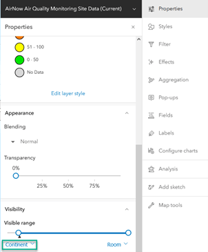
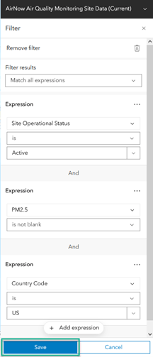
Next, filter the air quality data so that only features that meet certain requirements are shown on the map. You only want to analyze actively collected data where the Site Operational Status is Active, PM2.5 is not blank, and where the data (Country Code) is in the US.
- On the Settings (light) toolbar, click Filter, then click Add expression.
The default expression is EPA AQS ID is 100010002. Change it to the filter criteria for this scenario.
- Change EPA AQS ID to Site Operational Status.
The expression now reads Site Operational Status is Active. This is the correct expression.
- Click Add expression. Change the field in the second expression to PM2.5. Change the operator (is at least) to is not blank. Now only features with readings for PM2.5 will be shown.
- Add a third expression for Country Code is US.
Ensure that the Filter results dropdown is set to Match all expressions. The filter is now showing air quality monitoring sites that match all of the specified criteria.
- Click Save.
Analysis
You will now begin to perform analysis to find what areas in the contiguous U.S. are hazardous to human health. To begin, it’s important to choose an appropriate projection for the data extent and analysis. Since you are using data across the contiguous U.S., choose USA Contiguous Lambert Conformal Conic. This projection is suitable for midlatitude data at a continental scale in an east/west configuration. You will also restrict your analysis to features within the desired study area by setting the processing extent using the map display.
- On the map, zoom in until only the contiguous U.S. is shown.
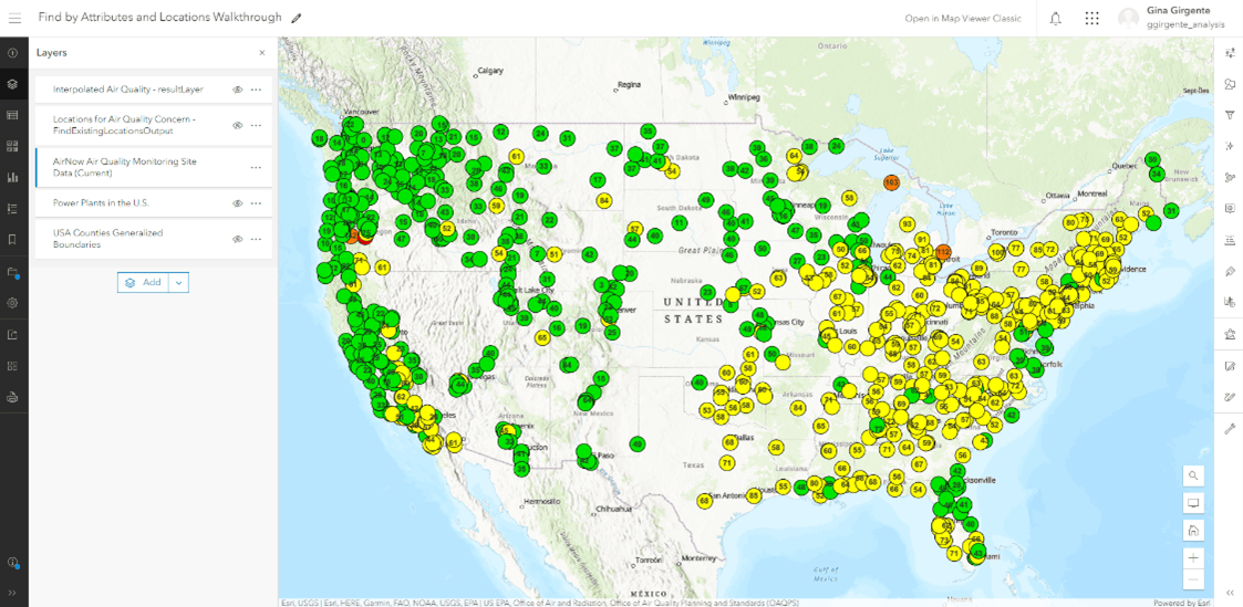
- On the Settings (light) toolbar, click Analysis, then click on the Analysis settings button at the bottom of the pane.
- In the General settings section of the Analysis settings pane, select Choose coordinate system in the dropdown of Output coordinate system. Search for USA Contiguous Lambert Conformal Conic.
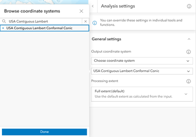
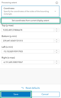
- Next, click the dropdown in the Processing extent section and choose Coordinates, then click the Set coordinates from current display extent button. Click Save. All of your analysis will now be performed using only the features found within this extent. Note, the coordinates below are an example and yours may not match exactly.
Once the new Analysis settings have been saved, you can run your analysis. You want to know air quality values at new locations based on the existing air quality layer, so you need a tool that can predict new values.
- In the Analysis pane, click Tools.
- In the search bar of the Tools pane, type “predict”.
- Select the Interpolate Points tool.
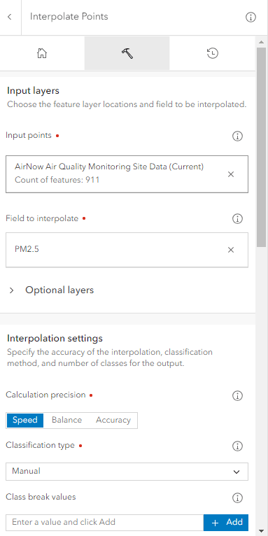
You are looking to interpolate the PM2.5 field of the AirNow Air Quality Monitoring Site Data (Current) layer so that you can approximate the amount of particulate matter throughout the U.S. Notice the red dots beside parameters that are required, like Input points. Be sure to fill out any required fields, otherwise the tool won’t run.
- For Input points, choose the AirNow Air Quality Monitoring Site Data (Current). For Field to interpolate, choose PM2.5.
- If you don’t mind sacrificing some accuracy, changing the Calculation precision to Speed will make the tool perform faster. Do that here.
- The Classification type section allows you to control how the data is symbolized. To control the number of classes the data will be put into, choose Manual.
- Add the following Class break values: 5, 10, 15, 20, 25, 30, 35.
- For Output features name, type “Interpolated Air Quality”.
- Scroll down to the Environment settings and notice that they have been automatically populated with the values you set before in the Analysis settings pane. Below are the input parameters:
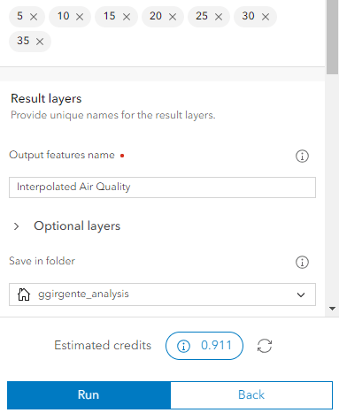
- Click Estimate credits. Since the air quality layer is live, the amount of features used in analysis between different tool runs will change, meaning that the estimated credit usage will also change.
- Click Run. Once the tool completes, you will have a layer of predicted air quality values across the contiguous U.S. and can move onto the next step.
Use the Find by Attributes and Location Tool
Next, you’ll find locations of concern in the U.S. that meet various attribute and spatial-based criteria that represent short-term and long-term exposure.
- Click the back arrow in the Interpolate Points pane to return to the Tools pane.
- In the search bar, type “criteria”. Select the Find by Attributes and Location tool.
To query for places currently exposed to lower air quality, you will find features from U.S. counties that intersect the Interpolated Air Quality layer with PM2.5 values above the threshold of 10 micrograms per cubic meter. You’ll complete this by first adding a spatial expression.
- Click the Build new query button and choose Spatial expression. Click Next.
- In the Find features from dropdown, select USA Counties Generalized Boundaries.
The default spatial expression is USA Counties Generalized Boundaries intersects Interpolated Air Quality. This is the correct expression. However, you only want intersecting locations where the air quality is above a certain threshold, so you will add an attribute expression for the air quality layer.
- Click Expression and choose Attribute expression from the dropdown. You are now creating a group expression.
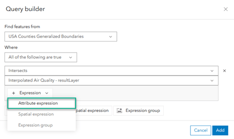
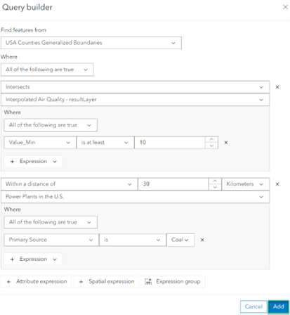
- Create a query that finds features where Value_min is at least 10 micrograms per cubic meter. This expression represents short-term exposure by finding the counties with predicted PM2.5 values above 10.
Next, you will add a second group of expressions representing long-term exposure. Create an expression to find locations that are within 30km of coal-burning power plants.
- Click the Spatial expression button at the bottom of the page to create a new expression. Fill out the expression to find U.S. counties that are within a distance of 30 Kilometers of Power Plants in the U.S.
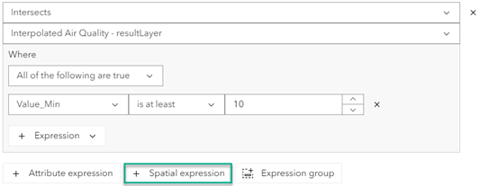
- Refine your query to only look at coal power plants by adding the following attribute expression within the second spatial expression: Primary Source is Coal.
- Make sure your completed query looks like the image below, then click Add.
- For Output name, enter “Locations for Air Quality Concern”.
- Click Estimate credits. The credits consumed will vary based on the number of interpolation classes created.
- Click Run.
Symbolize the Data
Turn off all the layers except the two result layers. You now have a map with locations of both long and short-term exposure to poor air quality (symbolized in blue).
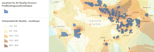
Note, since the air quality data layer is constantly updating, your results may look different.
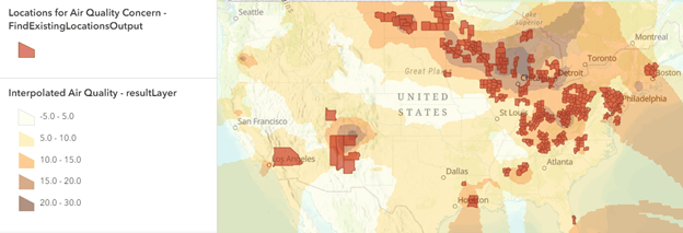
To better show which areas may be hazardous to human health, change the color of the Locations for Air Quality Concern layer. Red is commonly recognized as the color to symbolize danger, so select red from the color options in the Styles pane.
Conclusion
In conclusion, you now have a map that provides more insight into areas of the United States that may be dangerous to residents’ health. You created this map using the new tool, Find by Attributes and Location, which supports spatial and attribute expressions in one single run. The Find by Attributes and Location tool can be used for a variety of use cases, such as site assessment and selection, preparing and cleaning data, and more. This is just one of many tools available in Map Viewer.
If you found this article helpful, please consider leaving feedback and questions in the comments section.

Article Discussion: