When authoring web content, one of the more critical design aspects is ensuring that content is accessible so it can be available to all users. The use of common accessibility standards, such as the Web Content Accessibility Guidelines (WCAG), supports the creation of content that is accessible to all people including those who may have an impairment or limitation when using technology. ArcGIS Online and Enterprise offers a plethora of options for creating informative content, such as web maps and apps that can be shared with audiences across the world. When authoring web content, accessibility should be prioritized to ensure the information presented is available to all users.
The use of accessible labels for images and graphics allows users of assistive technology, such as screen readers, to interact with and understand visual content on the web. As digital cartographers, we build maps and apps that can contain complex visual elements. It can be challenging to describe complex maps and features using text and it is often discussed among map designers on what is the best approach for adding accessible names.
Consider the following questions when deciding how to author your accessible labels:
- What information is the map, image, or graphic communicating?
- Who is the audience?
- What other sources of information are provided?
- Is the map, image, or graphic decorative?
Accessible labels
ArcGIS web apps aim to equip authors with the ability to add accessible labels or names to their maps to support a more diverse set of users. Accessible names can serve as a means to provide context to those using assistive technology, where the description provided can depict in words what could be interpreted visually.
Using alternative text (alt text) to describe the purpose of the map, its data source, and in consideration of the audience can have a powerful impact to assistive technology users relying on its description. Supporting the visualization of the data is critical to understanding what can be learned from the content. For instance, in 2022 NASA started adding detailed alt text to its images on its social media accounts, such as:
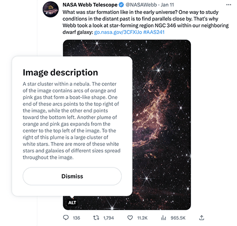
“The image is divided horizontally by an undulating line between a cloudscape forming a nebula along the bottom portion and a comparatively clear upper portion. Speckled across both portions is a starfield, showing innumerable stars of many sizes. The smallest of these are small, distant, and faint points of light. The largest of these appear larger, closer, brighter, and more fully resolved with 8-point diffraction spikes. The upper portion of the image is blueish, and has wispy translucent cloud-like streaks rising from the nebula below. The orangish cloudy formation in the bottom half varies in density and ranges from translucent to opaque. The stars vary in color, the majority of which, have a blue or orange hue. The cloud-like structure of the nebula contains ridges, peaks, and valleys – an appearance very similar to a mountain range. Three long diffraction spikes from the top right edge of the image suggest the presence of a large star just out of view.” -NASA
For creating accessible names to more complex maps, it is recommended to focus on describing the map’s patterns or key takeaways to provide an equitable experience for assistive technology users. Below are some explorations of map descriptions across ArcGIS web apps, where symbology, basemap information, and even depicting a snapshot of the data’s story can provide users with a more meaningful experience, regardless of how they may access the app.
Decorative images
Not all images or maps may need to provide additional context to assistive technologies. While a decorative image adds visual interest for sighted users, it may not be necessary to understanding the content being presented. Therefore, these images can be skipped by assistive technologies with a null, or empty label or alt text. When accessible labels are not provided, ArcGIS web apps aim to treat images without a description as null, so assistive technologies ignore, or skip over the content. For instance:
<img src="family-walking-street.png" alt="">
<h1>Global Pedestrian Access</h1>
<p>Explore urban centers pedestrian accessibility, measured by the percent of the population within 15 minutes of access to public services.</p>

While its up to the author to decide if an image should be considered decorative, the image should meet the following criteria defined by the WCAG:
- Serves only an aesthetic purpose to provide visual enhancements, decorations, or embellishments
- Provides no information
- Has no functionality, beyond aesthetics
In the above example, the cover photo fits all of the criteria, and could be considered as decorative in an ArcGIS StoryMap app to provide a better experience to a wider audience.
Purpose and audience
While authoring an app and it’s content, it’s important to provide meaningful accessible labels with context to maps and images in order to reach more diverse audiences. In this section, we’ll explore a few examples of how accessible labels can be used to present your content to more individuals with ArcGIS web apps.
Let’s start by looking at how three different web apps could be created that utilize an example global pedestrian accessibility dataset. Each app targets a specific purpose and audience.
| App | Purpose | Audience |
|---|---|---|
| ArcGIS Instant apps | Create a custom app to fit the global pedestrian accessibility data. The app can support viewing and editing of the data, similar to a desktop GIS solution provided via the web with more advanced GIS capabilities. | Organizational GIS staff who can view and edit the global pedestrian accessibility data. |
| ArcGIS Dashboard | Provide a high level snapshot of the global pedestrian accessibility data to users unfamiliar with geospatial technologies, where information is updated as the data changes. The app could provide context and drive project funding and support. | Organizational leaders, management, and key stakeholders to get a summary on global accessibility data. |
| ArcGIS StoryMap | Communicate context from the global pedestrian accessibility data, what the data is interpreting, and provide a summary to folks who are familiar, or unfamiliar with geospatial technologies by providing a more in-depth summary with applicable images, text, and/or maps. | Organization and external users who wish to explore and learn more about global pedestrian access. |
Below are a few examples of how accessible labels can be used to present your content to more individuals with ArcGIS web apps.
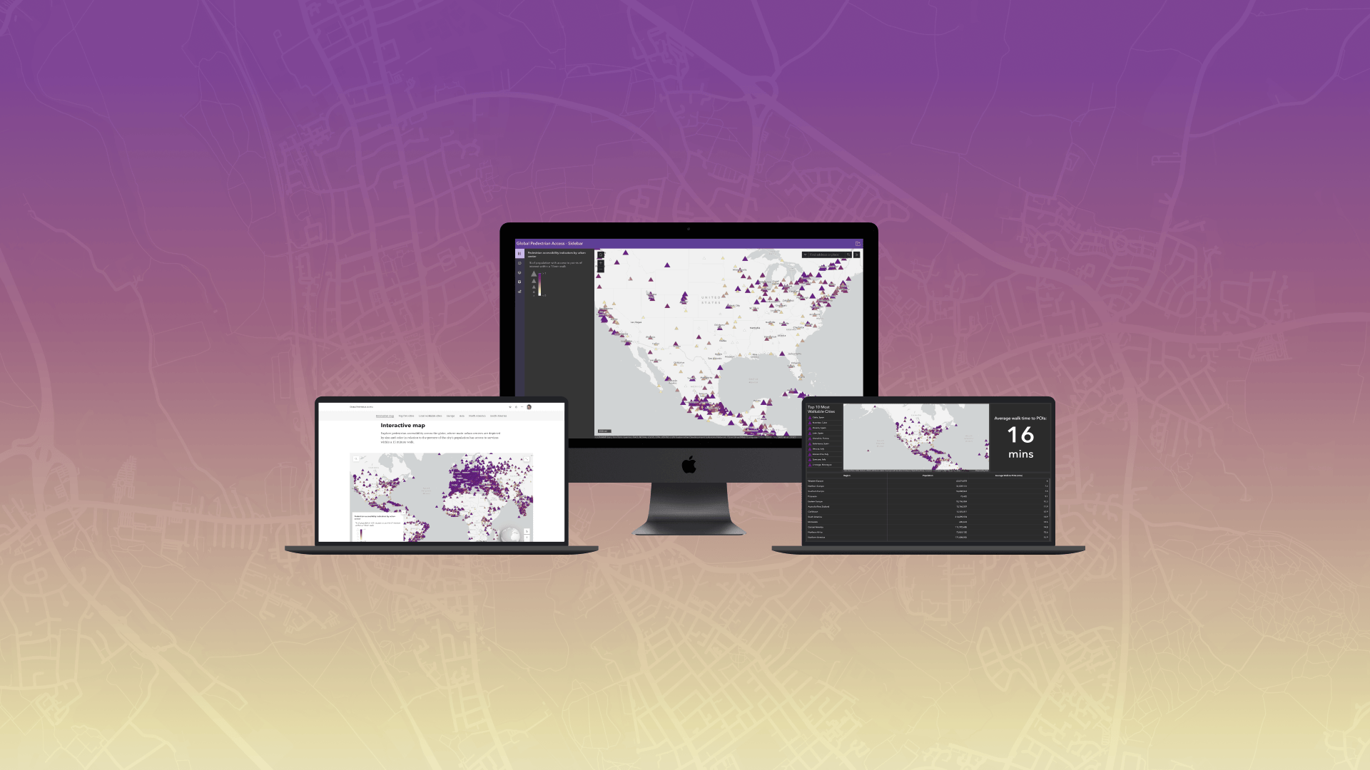
Instant Apps
ArcGIS Instant Apps offers a set of templates that allow authors to quickly create web apps that make it easy to interact with maps and data. Built and designed with accessibility in mind, Instant Apps offers the option to set a custom accessible label for a map.
One of Instant Apps’ templates, Sidebar, allows the app’s author to display a map alongside tools that support editing, filtering, and data interactions. The template supports the map with minimal supporting text and the user can interact with the data to better understand the information in the map.
As a result, the Sidebar template allows the author to provide the following to its users:
- Support data export, allowing the user to export the data as a table in a CSV format
- Provide a description of the map via a text alternative, which adds context about the map and data present. Since there is a data export option available, this information could also be provided to the audience.
Exporting data in alternative formats
Since the audience is aimed at GIS professionals, who will be viewing and editing the global pedestrian accessibility data, alternative data formats could provide a different perspective and insight. In providing content via a map, and table, users will be able to view data through different ways to support their workflows.

Adding a map description
For the first map in the story, the map includes a pedestrian accessibility worldwide dataset. Since the global pedestrian accessibility data and map is the primary focus of the app, we could provide more context to our users via an accessible name, such as:
Map displaying pedestrian accessibility indicators for urban centers globally. Point symbols indicate percentage of population with access to points of interest within a 15 min walk. Open Layer list to view and export data as a table.

Solution
Check out the ArcGIS Instant Apps app with global pedestrian access data using the Sidebar template.
Dashboards
ArcGIS Dashboards provides the ability to configure multiple elements in a page, allowing users to view data from maps and layers at a glance. Dashboards offers the option to configure an accessible name for all elements, including the map elements.
Adding elements
Dashboards use a series of configured elements to communicate information about layers in different formats. For instance, the following shows the data configuration of a list element to display the Top 10 Most Walkable Cities in the dataset.

Providing element descriptions
Dashboard elements include an Accessibility section with the option to include an accessible label for the element, which will be read by a screen reader while the element is in focus. When using a text focused element like lists, you may choose to add a short description of the element and the element type, such as:
List of top 10 most walkable cities

Adding map descriptions
In this case, since the global pedestrian accessibility data and map is a portion of the dashboard’s focus, we could provide more context to our users with an accessible name when the map is in focus, such as:
Map displaying pedestrian accessibility indicators for urban centers globally. Point symbols indicate percentage of population with access to points of interest within a 15 min walk. Interact with elements in the dashboard to learn more about that data.

Solution
Visit the high level snapshot of the global pedestrian accessibility data with ArcGIS Dashboard.
StoryMaps
ArcGIS StoryMaps is a story authoring app, which can combine interactive maps with multimedia content and text to tell stories about the world. StoryMaps offer the option to configure map descriptions so a user is provided with more context as they interact with the map.
Adding content item descriptions
Supplying a cover photo to a StoryMap can provide more visual context to users but may not provide additional context to assistive technology users. In the app’s case, the cover photo is serving only an aesthetic purpose without functionality and provides no information. So in not providing an alt text, assistive technologies will skip over the graphic.
However, the cover photo could also be a compelling way to bring in more diverse users with an alt text provided to more audiences, where the description sets the tone for a story and could draw in your users. For instance:
“Three people walking down a pedestrian-only accessible walkway in the middle of a city as the sun rises in the background.”
Providing accessible labels is ultimately up to the author, in alignment with WCAG, to determine if an image’s intent should be communicated to assistive technologies.
Compliment a story with data

Providing data visually with a map and supplementing some of its key takeaways in tabular format can drive the table’s purpose further. To do so, add in a concise table, to provide a different perspective to the data, such as a top five list to users.
Providing map descriptions
In this case, since there are multiple maps present to showcase a story across the globe, providing an accessible label for the different maps would provide additional context to our users, where:
| Map focus | Accessible label | Caption |
|---|---|---|
| Global with interaction and a legend shown by default | Interactive web map showing pedestrian access in urban cities worldwide with European countries showing a high percentage of their urban populations with access to points of interest within a 15 minute walk. | Pedestrian access in urban cities worldwide. |
| Zoom set to Europe | Non-interactive map zoomed in on Europe showing a high percentage of their urban populations with access to points of interest within a 15 minute walk. | |
| Zoom set to Asia | Non-interactive map zoomed in on Asia showing a stark difference of accessibility in its urban populations with access to points of interest within a 15 minute walk. | |
| Zoom set to North America | Non-interactive map zoomed in on North America showing a stark difference of accessibility in its urban populations with access to points of interest within a 15 minute walk. | |
| Zoom set to South America | Non-interactive map zoomed in on South America showing a stark difference of accessibility in its urban populations, where the coastal cities have higher accessibility and inner continental centers have lower accessibility percentages, with access to points of interest within a 15 minute walk. |

Solution
Explore the ArcGIS StoryMaps solution showcasing global pedestrian access data.
What’s next
Accessibility and Artificial Intelligence
Artificial Intelligence (AI) has become a tool in our daily lives, and it can also serve as a resource in the creation of accessible labels for maps. AI may even generate an accessible name that sighted authors might not consider, such as the basemap’s color or context in relation to the data presented. However, when using AI-generated accessible labels authors should verify and where needed, modify the content to ensure the map’s purpose and its audience needs are upheld.
Further reading and discussions
Web accessibility is a consistently evolving topic and it can be challenging to know what the best solution can be for your app. It is important to continually evaluate the accessibility of your content and find ways to improve experiences for your users.
Curious to learn more? Navigate to some additional resources, including:
- Using alternative text for equitable storytelling
- Getting started with accessible storytelling
- Writing accessible ArcGIS StoryMaps content
For any questions, feedback, or requests related to accessibility, please contact Esri Accessibility. Feel free to leave a comment on this post letting us know how we can provide guidance on creating accessible web content with Esri products.


Article Discussion: