As map-makers, we are entrusted to make strong, ethical, and data-driven decisions when creating our maps. Our decisions help communicate the statistical and analytical stories about our data which wouldn’t have otherwise been seen. Therefore, the histogram of our numeric data is crucial to our mapping decisions. Map Viewer has recently been given a facelift to help you make stronger choices when showing numerical data in your maps. Let’s explore these updates along with some tips for using them effectively.
An enhanced histogram
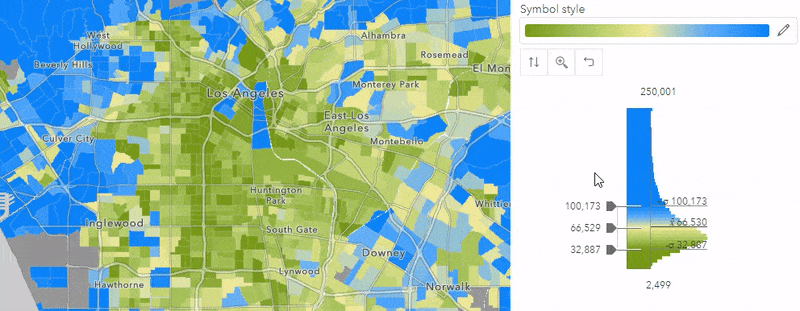
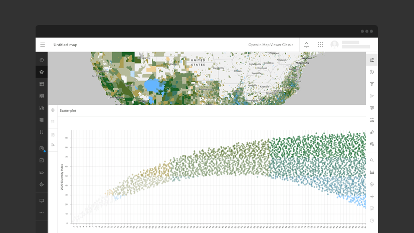
Important statistics labeled
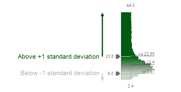
In the past, we were able to see the statistical average value of our data (x̄) labeled on the histogram, but now we can also see where +/- 1 standard deviation falls within our data’s histogram.
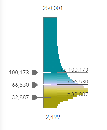
Did you know that smart mapping immediately shows you statistically significant patterns when you choose to map a numeric attribute from your data? By default, when you choose a Counts and Amounts (Color) drawing style, an unclassed mapping style is suggested. The color breaks are based on the mean, and 1 standard deviation above and below the mean. These settings ensure that the statistically extreme values and outliers don’t overly dictate the map’s colors. The unclassed color ramp tells you that the color variation is applied over the spread of data values, representing 90% of your data. The outliers and statistically significant values are emphasized, helping you find important patterns in your data.
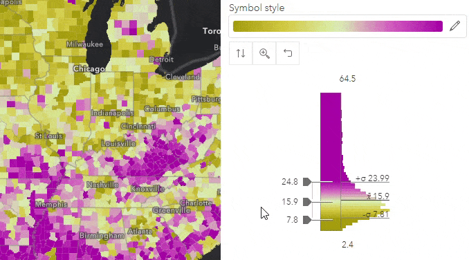
Large numbers? No problem
If you’re mapping numeric values that are extremely large, for example the national Gross Domestic Product (GDP), these can be difficult to grasp when there are so many significant figures. The histogram now presents these in an easy-to-read format. But don’t worry, you can still control the exact numbers that appear in your legend. Simply click into the number to view or change the value.
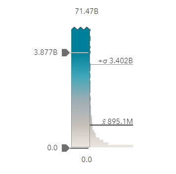
Simple guide: M for millions, B for Billions, T for Trillions. Non-English local languages set within your organization settings will display appropriate abbreviations.
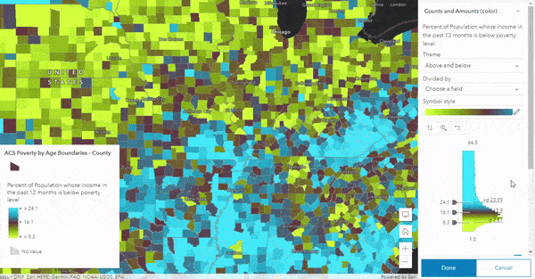
More bars, and colors to match the map
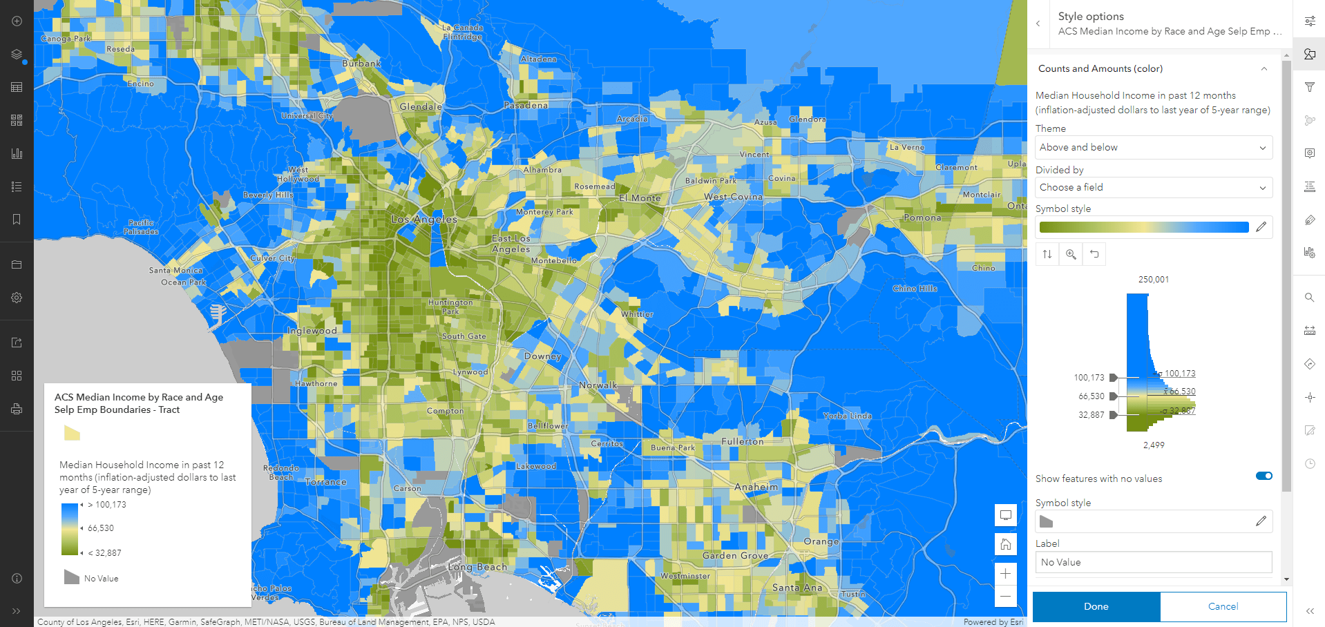
To create an integrated experience between the map and the data, the histogram now shows where the data aligns with the colors used in the map when mapping with an unclassed ramp. This small change can help us better understand the colors being used. The map, the color ramp, and the data’s histogram are now working in unison, making it easier to unlock great maps.
When mapping with classed or unclassed methods, there are also more bars that appear within in the histogram, providing a better representation of the data’s spread.
Reset button
The reset button, while not new, has been moved to a more obvious location so that you can easily revert to the settings you started with. This makes exploring your data a pleasant experience when exploring your data using an unclassed ramp. As you explore patterns with different values, you can always revert back to the original placement of the handles.
Easily interact with the data
You can now seamlessly control which colors associate with the data in your map. Whether you used a classed or unclassed approach, the handles can now freely move. This makes it easy to control specific values you may want to use in your map.
When using an unclassed approach, you can work with the histogram in many different ways when mapping with Counts and Amounts (Color):
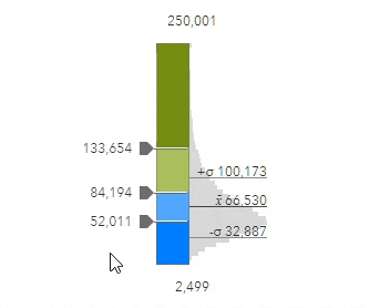
- Slide all handles together and maintain the +/- 1 standard deviation interval between the handles
- Slide one handle at a time, to any position
- Type in specific values for each handle

Interact with your data and see the changes instantly apply to your map. This interactivity allows us to pair our data-driven decisions with the map creation process like never before:
Maintaining the +/- 1 standard deviation interval can be helpful if you want to change the value on which you center your colors while preserving the statistical spread of the data itself. This helps us emphasize an important value such as a national figure or a threshold. For example, if I am mapping the percentage of population living in poverty, I may want to emphasize which areas on the map are living above or below the national average. We can maintain the statistical spread while re-centering the map around the national percent, which in this example is 13%. Below you can see that the synced behavior is used to drag all handles at once, and the map can be finalized by typing in the final value.
When working with classed data, you can now drag the handles into any position. This can be helpful when a map needs specific breakpoints such as a standardized method that need to be applied to your map.

Article Discussion: