The point dilemma
Quite often, a map will show hundreds or even thousands of points that overlap. This hides the very patterns that a map ought to reveal. In some cases, the points have different locations but overlap due to the scale of the map. In other cases, the points are literally on top of one another. For example, a database containing a single address for an apartment building with multiple units will experience stacked points.
This overlap is a real problem. While you may be able to get a sense of where things are concentrated, you cannot tell how concentrated they are. You need a smarter way to show points on a map.
The solution? Clustering.
With the updated clustering capabilities in ArcGIS Online’s Map Viewer, you can easily uncover hidden patterns in your data. It is a lot faster and can handle significantly more points compared to the 50,000 point limit in the Classic Map Viewer.
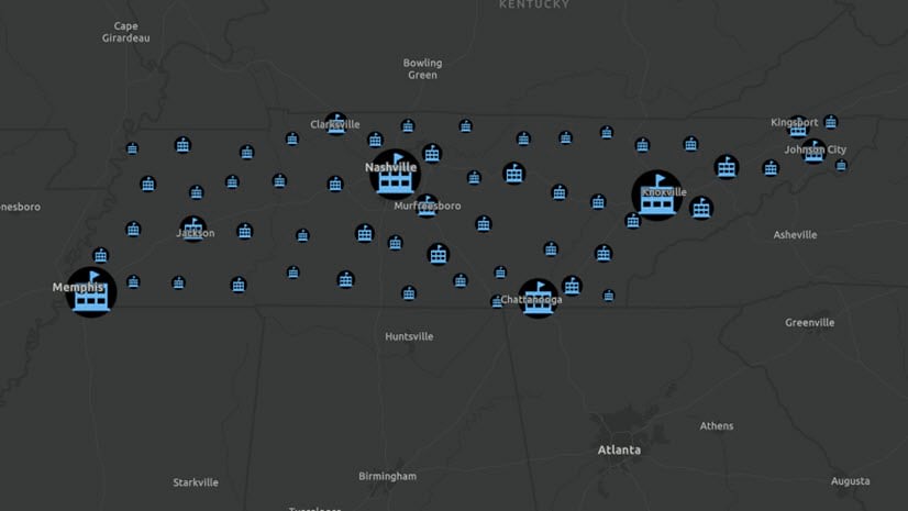
Let’s see an example, using a layer of nearly 100,000 trees in Eugene, Oregon. This layer is created by the City of Eugene Parks and Open Space GIS. The patterns are somewhat difficult to decipher because the points overlap on the map.

Let’s toggle on the clustering option for this layer. The map responds immediately. Clusters are proportionally sized by the count of features within each cluster. In other words, smaller symbols have fewer points within them, and larger symbols have many features within them. Use the slider bar to determine how many clusters you’d like to show at the current map scale.

As you zoom in and out, the map recalculates how many clusters are needed at each scale and map extent. The benefit is that as you zoom in and the points begin to separate, you start to see those individual points. As you zoom out, and the points begin to get closer together. Most importantly, clusters appear where they are needed.

A pop-up for every cluster
Every interactive web map deserves a great pop-up. When you turn on clustering, it comes with its own pop-up.
In our trees example, the default pop-up reveals the number of features and the predominant or most common tree type in each area. The second sentence changes depending on the type of attribute visualized in the map. In the image below we see that there are 164 trees in the selected cluster and that the most common tree species in this area is the cherry tree.

If the attribute visualized is a number, the pop-up will reveal the average value in the cluster. In the example below, there are 121 trees in the cluster and the average tree height in this area is around 34 feet.

Clusters provide greater insight into your point datasets, making your maps more legible and patterns identifiable. The pop-up reveals valuable information about your attributes and offers an interactive and exploratory experience for your viewers.
Add a filter
To gain greater insight into your dataset, try adding a filter or multiple filters. The animation below shows a filter on a specific tree species. As you interact with the filter, the map immediately updates with live results. The animation continues with a second filter that highlights cherry trees with a larger than average diameter.

You may also want to know
Clustering does not perform complex statistical analyses so the features described above should not be interpreted as statistically significant. It is a great summary of the data that helps you identify potentially significant patterns.
More sophisticated spatial analysis workflows in ArcGIS Online include tools such as Aggregate Points, Calculate Density, Find Hotspots, and Find Outliers.
Here are some other exciting enhancements:
- Add a label indicating the number of features in each cluster
- Use the aggregation capabilities of the feature stores to cluster billions of features
- Cluster features and display them on a map in any projection
- Filter based on cluster statistics
- Apply different styling for clusters
Explore clustering in Map Viewer Beta
Map Viewer makes it easy for you to uncover new patterns and gain insight into your data.
Join the Map Viewer GeoNet community for discussions, updates, and blogs.


Article Discussion: