Within Map Viewer, you can now easily map your date and time fields. Visualize new patterns within your data to show which features are older or newer. You can show time with two different techniques:
- Continuous Timeline (is this thing older or newer?)
- Age (how old is this thing?)
Let’s explore each type and some of the available options that help us answer questions about time.
Continuous Timeline
This option showcases your date values within the map by the order in which they occur. You can instantly see the chronological order of your data within the map. This helps answer questions like “when did this happen?”.
Use color to show when something happened
Here is an example that shows buildings in Rotterdam, Netherlands. By simply selecting the “Year Built” date field from the data, it is recognized as a date field and mapped using the Continuous Time (Color) style by default. The map immediately answers the question “when were the buildings in Rotterdam built?” You can see in the legend (bottom left), that the darker blue buildings were built more recently.
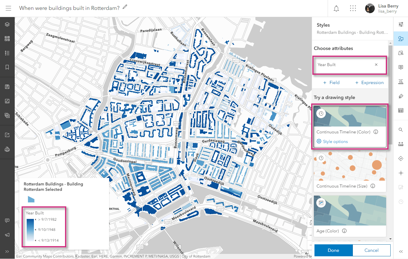
What if I want to tell a different story about the buildings using the “Year Built” field? No problem! Easily adjust your map by going into the Style options. Here, you can make adjustments based on what you want shown in your map. Let’s see what else can be done.
Map what happened before and after a point in time
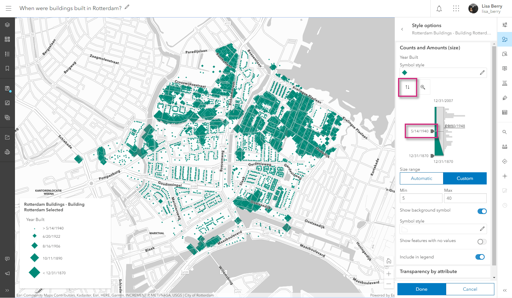
Imagine I want my map to show which buildings were built/rebuilt after the Rotterdam Blitz during World War II. This happened on May 14, 1940, so I want the map to clearly show which buildings were built before and after that date. To do that, change the Theme to “Before and After”, and choose May 14, 1940 as the pivoting date in the data slider. In just a few clicks, we easily changed the narrative about this map to help answer the question “which buildings were built or rebuilt after the 1940 Blitz of Rotterdam?”. These can be easily seen by the buildings in orange, showing us that much of the city probably had to be rebuilt after the war.

Use size to emphasize patterns of new/old
If I instead wanted to emphasize the oldest buildings in Rotterdam, I could use the Continuous Timeline (Size) map style to emphasize older or newer buildings.
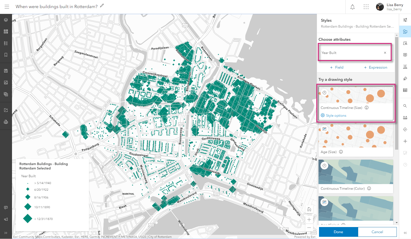
In this version of the map, I want to answer the question “where are the oldest buildings in Rotterdam, built before WWII?“. To do this, I swap the largest size to be the oldest features, and use the same 5/14/1940 date in the slider option in order to emphasize the oldest buildings, specifically those built before the peak of the war in this area.
We just saw three different ways to map the same date attribute, and each method helped answer a different question about the data. By simply considering what we want emphasized in the map, we are able to tell different stories with just a few clicks. Click here to open the web map and see the different styles and settings.
Age
Another way to map time is to show the age of the features in your map. You can think of age in a few ways:
- What is the time gap between two date fields in my data?
- What is the time gap between a field in my data and a particular date/deadline?
Showing the age of features within the map helps to quantify how long ago a date or time has occurred. Whether you want to show how old a building is, determine the change in time between two events, or showcase how long it has been since an event has happened, the age option uses a specific unit of time to highlight patterns in your data. In the past, this type of representation could only be done by calculating fields, but the age mapping style allows you to simply choose the dates that are important to you, and quickly show them on the map.
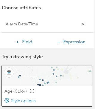
Like the continuous time mapping styles we saw earlier, the age map styles can be shown using color or size. Let’s explore an example of both.
Show age with color to compare two date fields
For example, the Johns Creek fire department wants to better understand their response times to Emergency Medical Services (EMS) calls. To show this, they would need to visualize the difference in time between when the alarm goes off in the station to when the fire truck arrives on site. They want to answer the question “where are response times the highest?”
Using the Age (Color) style, the department can quickly compare the “Alarm time” and the “Arrival Time” fields from their data. To compare two fields from your data, start by mapping the first time chronologically, which here is the alarm time.
To compare the two fields, go into the Style options and choose the “to field” to be the Arrival Date/Time. You can change the unit of time to be years, months, days, hours, minutes, or seconds. In this example we will use minutes.
If the goal for the station is to respond within 6 minutes, we will center the map around this value. To really see where calls are taking longer, we set the higher slider value at 8 minutes in order to emphasize the calls that are taking the longest to respond to, and the lower slider value to be 4 so that we can see which calls are happening the quickest.

This method helps us quickly identify where calls are taking longer to answer. The brightest orange dots on the map show where calls are taking the longest to answer. When overlaying the layer with fire station locations, it is apparent that the calls closest to the station are being answered quickly (the darkest colored dots).
Map age with size to emphasize the oldest features
Another way to use age is to highlight the oldest or newest features. Larger symbols can help draw the map reader’s eyes toward the features you want to emphasize.
For example, the Johns Creek station may want to see which calls in their database were over 10 years ago. They can use the Age (Size) mapping style to easily show this.
Within the style option, choose the custom date (in this example 4/21/2020, because that is when the chief wants to compare the date), and the unit (years). To make the map more meaningful, choose an age that is important to your data. In this map, the chief wants to see any calls over 10 years old as of this date, so this is used in the slider so that only calls older than 10 years are shown with large sizes on the map.
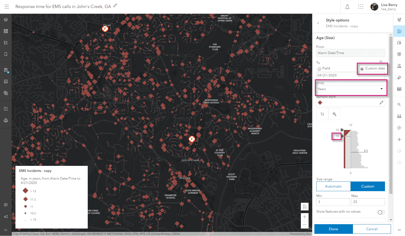
The map now helps us answer the question “where are the oldest calls in our records?“. Like our first example with buildings, a single layer of data can help answer multiple questions. To see the web map and the different styling options, click here.
Try it in your next map
There are many different combinations in which you can use color, size, age, and continuous timeline in order to show your date or time attributes. You can even use time within your transparency settings to add additional emphasis to the map and reinforce the patterns being shown with color or size. Check out this map to see how that can be done.
Depending on your audience, and what you want to highlight, the new smart mapping time capabilities in Map Viewer help to show your temporal data in an easy-to-understand way.
To find more resources about mapping with time, check out these links:


Article Discussion: