The latest update to the new Map Viewer allows you to define the order that features are drawn on the map. This means that when a layer contains overlapping data, you can now control which features are drawn on top based on a particular field. For example, you could sort features by date to ensure that the most recent features are always display above older ones, or sort a layer containing Air Quality data by the highest AQI to have areas with poor air quality stand out.
Feature display order can be set using any numeric or date field and can be sorted using ascending or descending values. To access the feature display order settings in the Map Viewer, open the layer properties pane for your selected layer from the Settings (light) toolbar. (Feature display order is supported in Map Viewer for feature layers, CSV layers, and OGC feature layers). By default, features in a layer are displayed by object ID (features with higher IDs are displayed on top).
Let’s go through some more examples exploring how feature display order might be useful!
Unique Values
When a layer contains many overlapping features, it can be difficult to interpret the meaning of the map and notice important trends.
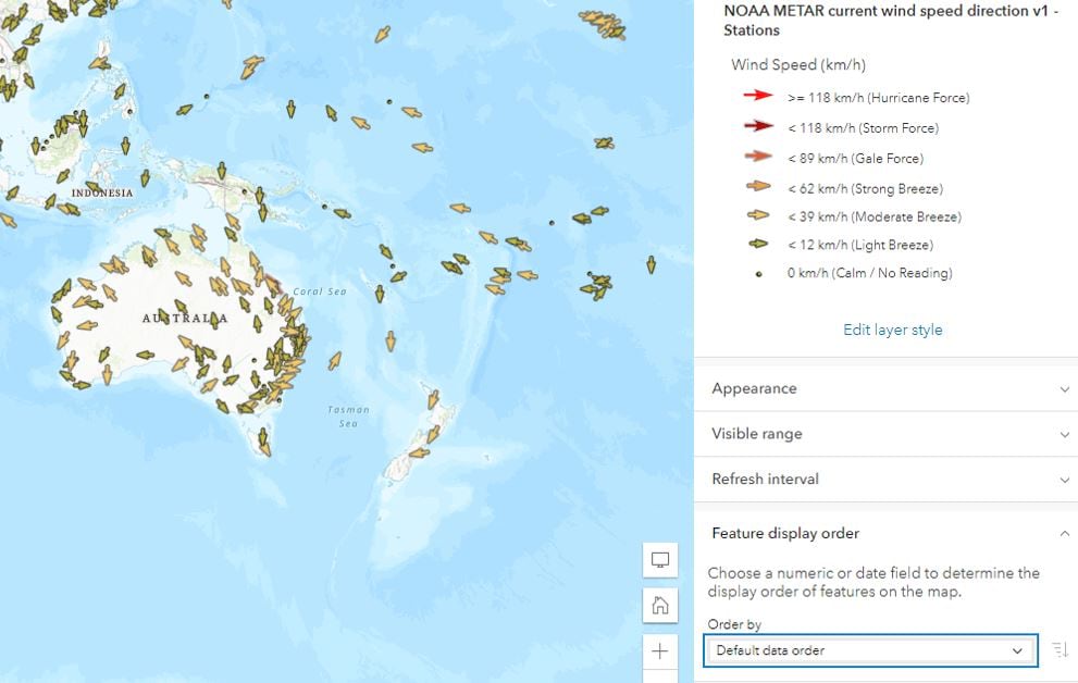
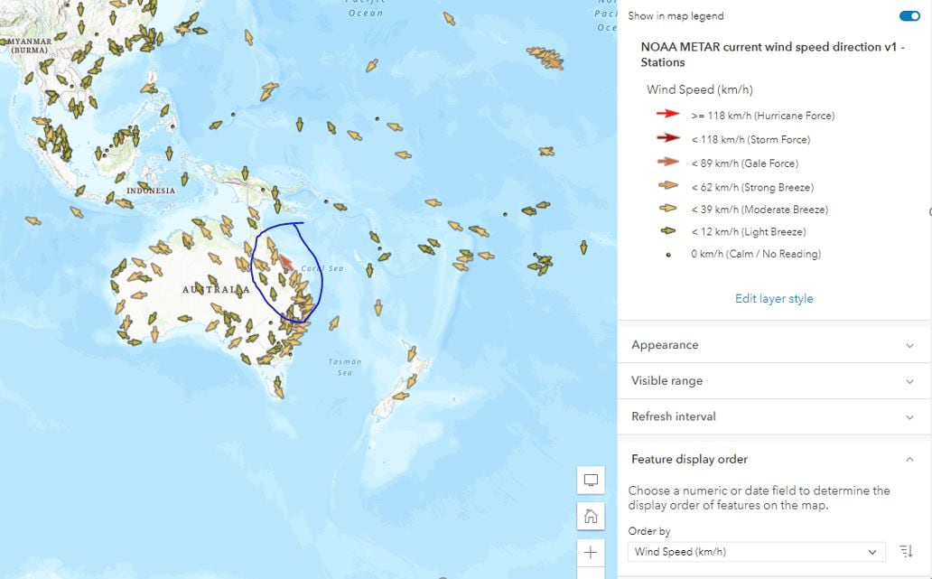
The Living Atlas layer of current weather and wind station data contains almost 5000 points (one for each observation station). The wind speed at each station is symbolized with different colored arrows that also illustrate the wind direction, but the large number of arrows on the map means that some really windy areas might be obscured depending on the zoom level. Choosing wind speed as the field to define feature display order, and sorting by largest values on top, means the windiest stations will now draw above other features.
Proportional Symbols
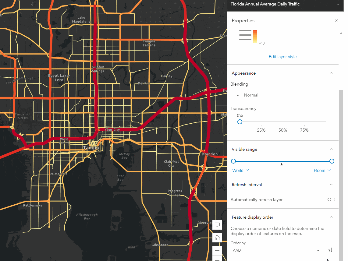
Feature Display Order can also be useful when working with layers rendered with proportional symbols, such as this layer showing the average daily traffic in Florida. Visual hierarchy is especially important here, and in many cases it might be preffered to have the smaller symbols drawn on top so they are not obsured by the larger feaures.
This can be easily accomplished by using the same field for feature dsplay order as you use to define the renderer and then sorting the data in ascending order.
Switch the sort order and your map suddenly looks very different. Now, the busiest streets stand out on the map while smaller, less trafficked streets are hidden.
Date Fields
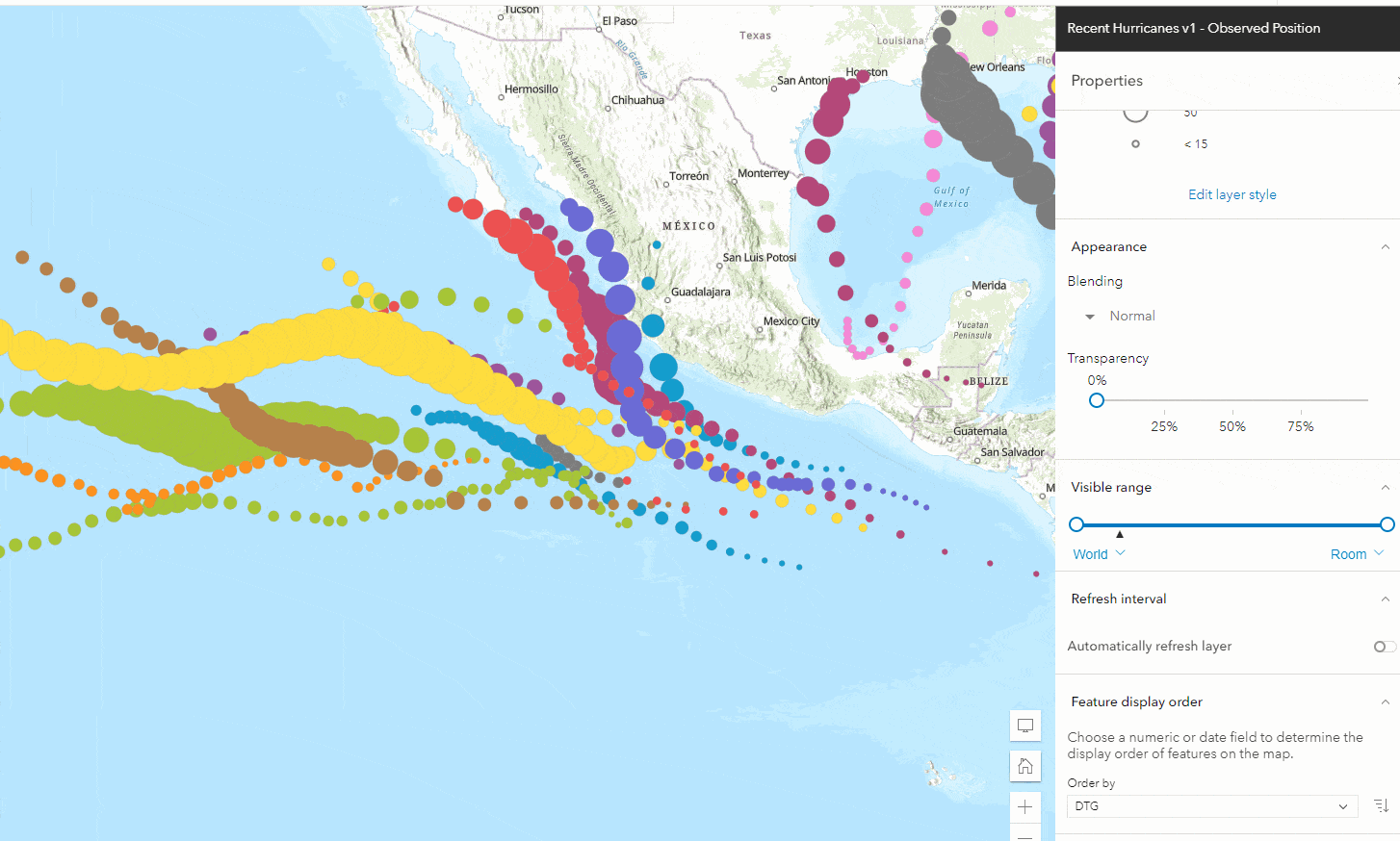
Feature display order is also important to consider when working with layers that have date fields. Setting this property can ensure that the most recent features are always drawn above older ones. In this map of recent hurricanes, the hurricane position is symbolized by the storm name and the intensity of the storm, but the attribute data also includes the date of each observed position.
Choosing the date field as the one that determines sort order ensures that the most recent storm is drawn on top.
To sort, or not to sort? That is the question.
Of course, most datasets contain numerous attributes and multiple options for defining feature display order so it’s important to consider what exactly is most important to show on your specific map.
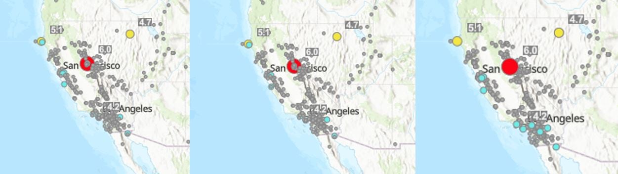
With this Recent Earthquakes layer from the Living Atlas, there are a number of options to consider.
Is seeing all features at once the most important? Or would it be ideal to the most recent feature on top? Maybe it is better to highlight the strongest earthquake instead?
As with other settings, it is always important to think about your data and what exactly you want your map to show before committing to something. While feature display order might be useful in certain scenarios, there are other cases where clustering, filtering, or simply changing the layer order in your map might be a better option.
And in many cases, feature display order works best when combined with other tools to create an especially meaningful visualization. The speed and ease of discovery in the new Map Viewer makes it easier than ever to explore your data and all the different options before committing to a final map.

Article Discussion: