The new filtering experience and smart attribute summaries in Map Viewer Beta make data discovery and mapmaking easy and fun. You no longer need to be an expert on the data to make a great map. As you explore the layer through filtering and attribute information, the map immediately updates. This provides greater understanding which helps you make smarter mapping decisions.
Smart summaries
After adding a layer to the map, the first step is to choose an attribute to symbolize. Sometimes a layer may have hundreds of fields which makes it difficult to find the attribute of interest. Map Viewer Beta provides a helpful search bar and sorting option to locate fields quickly. The image below shows the fields available in a United States Airports layer.

In many cases, the field name itself may not give as much detail as needed to understand what the data represents. View the attribute information to learn more.

Top Values
The attribute information for the OWNER field helps the mapmaker understand the data. The description states that there are five types of owners: public, private, Air Force, Navy, and Army. “Public” airports are owned and operated by local, regional, and state authorities. There are 873 airports and none of the records are empty. Since this field is a string, or text, the attribute information panel calculates the top values. This helps the mapmaker understand the organization and patterns of the data. For example, most airports in the United States are publicly owned, followed by the Air Force, then privately owned.

Numeric statistics
Next, the mapmaker views the attribute information for the Enplanements field. The description states that this is the number of passengers who board a plane at a specific airport in one year. Because it is a Double, or numeric, field the attribute panel provides important numeric statistics such as minimum, maximum, average, and standard deviation. The average number of enplanements is around 800,000 passengers per year. Viewing the maximum value, the mapmaker learns that there is an airport in the dataset that experiences close to 45 million enplanements in one year!

Date fields
Lastly, if a field is in date format, the attribute panel returns the oldest and most recent record, the average date, and the timespan. The image below is an example of a date field from a layer that shows car accidents in the United States in 2017.

Note: The field description and the field value type will be empty unless it is set by the layer creator in the layer’s item details page.
The mapmaker can get a better understanding of the layer by exploring additional fields. For example, when the mapmaker selects the State field, the attribute summary shows that Alaska has the most airports of any state. The map below visualizes enplanements centered around the average discovered in the attribute information panel.

Fast filtering
Filtering provides a path to finding the most important features quickly and easily by limiting the visibility of other features in the layer. The new filtering experience reveals more information about the layer which leads to smarter decisions. This helps lower entry barriers people may have originally had especially if they are not an expert on the data in the map.

In the above animation, the mapmaker filters the map to only show public airports. During this process, the mapmaker sees Air Force airports scattered throughout the United States and Navy airports along the coast.
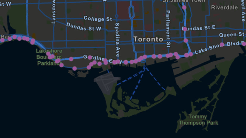
Next, the mapmaker creates a filter expression to show only airports above one mile in elevation. High altitude airports have thinner air and low atmospheric pressure. This affects the speed at which the airplane needs to take off as well as the required length of the runway. The histogram provides an understanding of data distribution and helps the mapmaker fine-tune the features being filtered within the map. Notice how the filters are immediately applied on the map as the mapmaker authors them.
Discover new patterns
There are hidden patterns in every layer. With smart summaries and fast filtering, Map Viewer Beta makes it easy for you discover new insights into your data.
Join the Map Viewer Beta GeoNet community for discussions, updates, and blogs.


Article Discussion: