When Americans move from one state to another, their change of residence is recorded by the Internal Revenue Service (IRS) when they file taxes in a new state. To visualize this movement of population, the Esri Policy Maps Team used the aggregated counts of individuals who moved to and from each state between 2015-2016 (the most recent data released by the IRS). To follow along in an interactive Story Map, click here.
State Migration
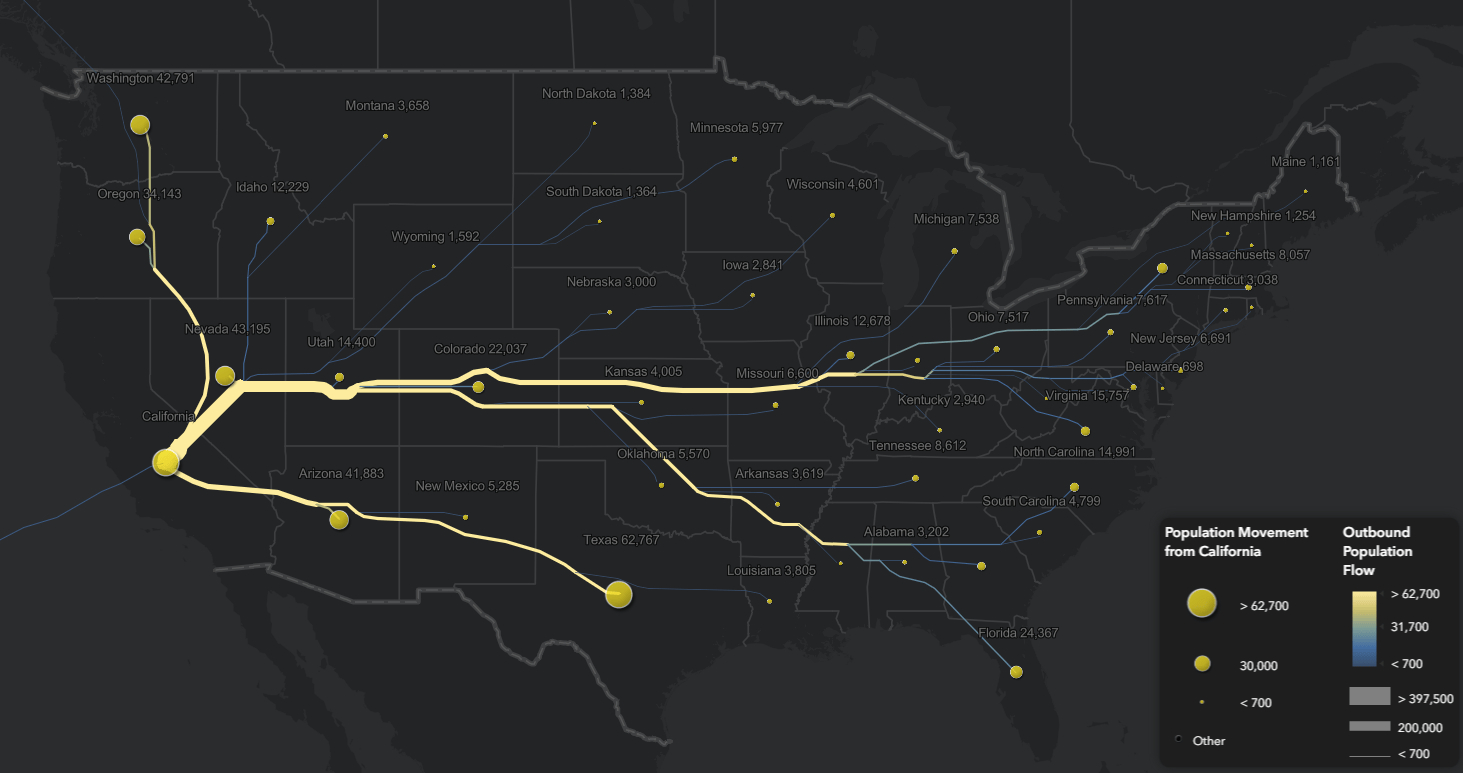
The data was processed through the Distributive Flow Lines tool for each state to visualize the quantity of population migration in both the inbound and outbound directions. This allows us to see where people are moving to and where they are coming from. Seeing population as a flow line helps to reinforce that population in the United States is never stagnant.
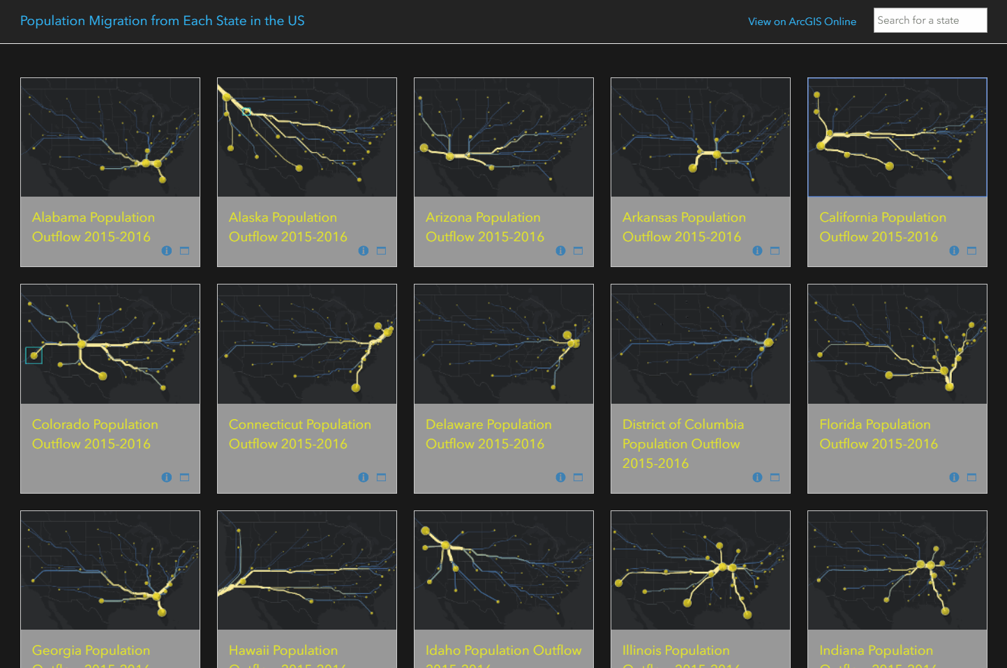
The app below shows how population is moving from each state to all other states and allows you to search for your state. The flow lines are not literal paths that people took, but rather a directional flow. The pop-up for each state shows how population migration has changed between 2011-2016 for each state.
The app below shows how population is moving toward each state from all other states. Notice how many of the overall inflow patterns are similar to their outflow migration.

County Migration
The IRS also offers the migration data at a county level. So, to learn more about which counties have the most population movement in and out, the flow tool was used for the top 20 sending and receiving counties.
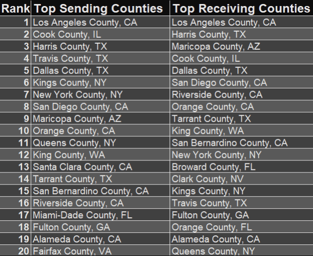
You’ll notice that many of the heaviest outflow and inflow population movements are coming from the same counties. These counties in fact are some of the most populated counties in the US, so this influx/outflux makes sense.
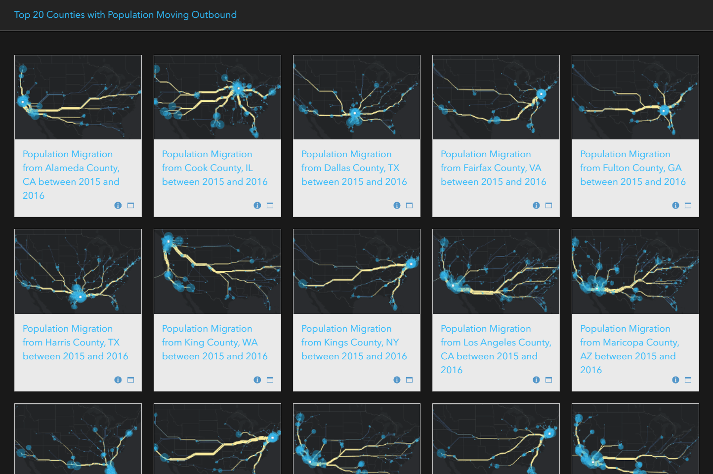
Now let’s see these visualized on a map. Below are the top 20 counties with population moving outbound.
For comparison, here are the top 20 counties with population moving inbound.

Make your own flow maps
All four of the state and county apps above can also be found in the Living Atlas.
You can make your own flow maps using the Distributive Flow Lines tool. Use the IRS migration data as seen in the maps above, or try something new. You could think of flows as funding that moved from a state capital to each county, flows of goods moving across state lines, or flows of graduates from a particular university moving to different job locations.
Happy Mapping!

Article Discussion: