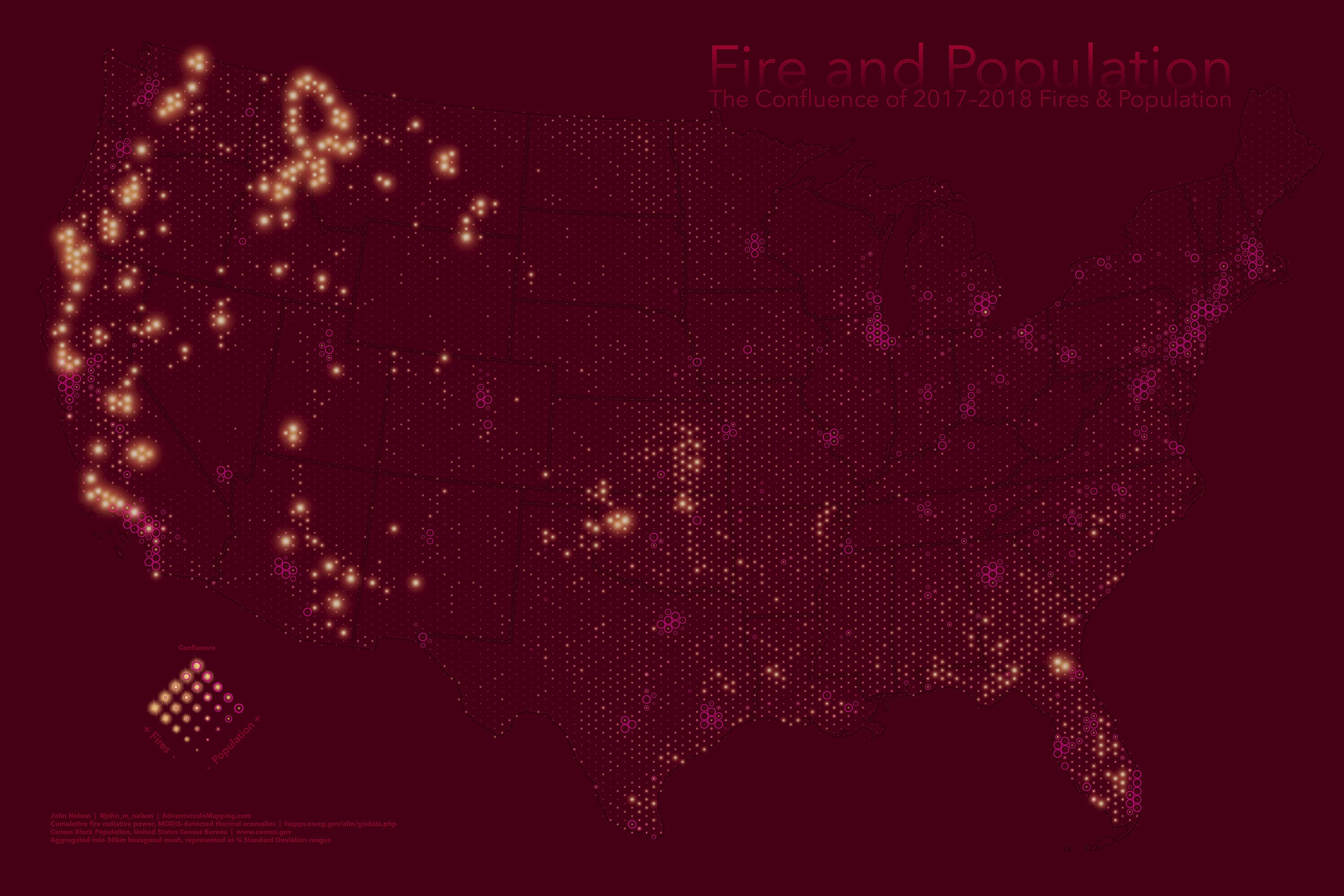
Here is a map of the lower 48 United States. It shows population as graduated ring symbols and cumulative fire (2017 – 2018) as graduated…fire symbols. Both are spatially represented within the same hexagonal mesh. This is so discrete comparisons can be made. While the layers’ symbols overlap one another, they are designed to be viewed concurrently so a visual relationship can be inferred by the map reader pretty readily.
Data
Fires
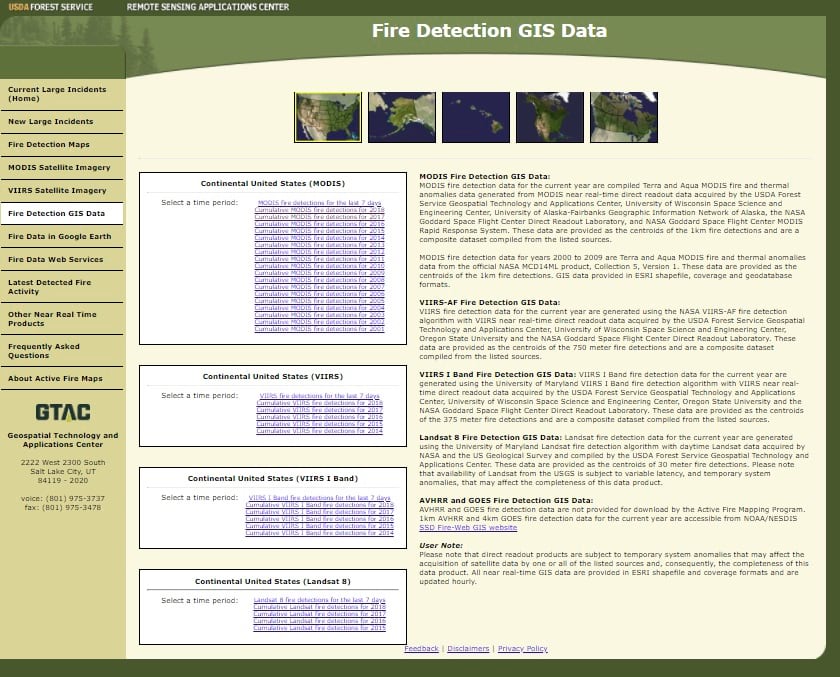
The fire data comes from the multi-talented MODIS satellite system (thanks yet again, NASA!) and is brokered and made available by the US Forest Service. I downloaded all of 2017 and 2018 (up to the date of download, which was late April). Its lidless unresting robo-eye looks down at the earth and sends back instances of “thermal anomalies” including the “fire radiative power” which tells you how scorching the fire is (not all fires are equal).
Population
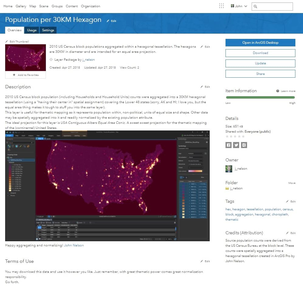
The population data is a fun thing. I took the massive massive set of census block populations and spatially joined them to a hexagonal mesh. Why? Because hexagons rule and because it is a fantastic base for making equitable thematic maps. All the hexes are the same shape and the same size, isolating so many problematic variables inherent in political polygons, plus the inclusion of population data means it’s all ready for normalization! You can download this snazzy little thematic building block here.
How To
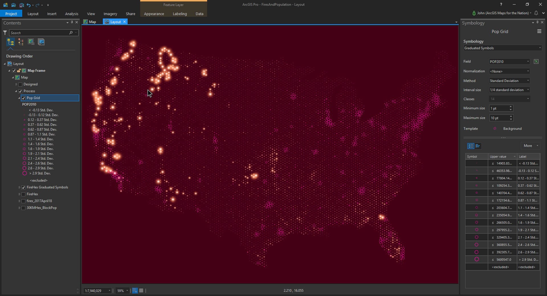
Let’s fire up ArcGIS Pro and take a look at our layers…
Here’s that hexagonal population layer.
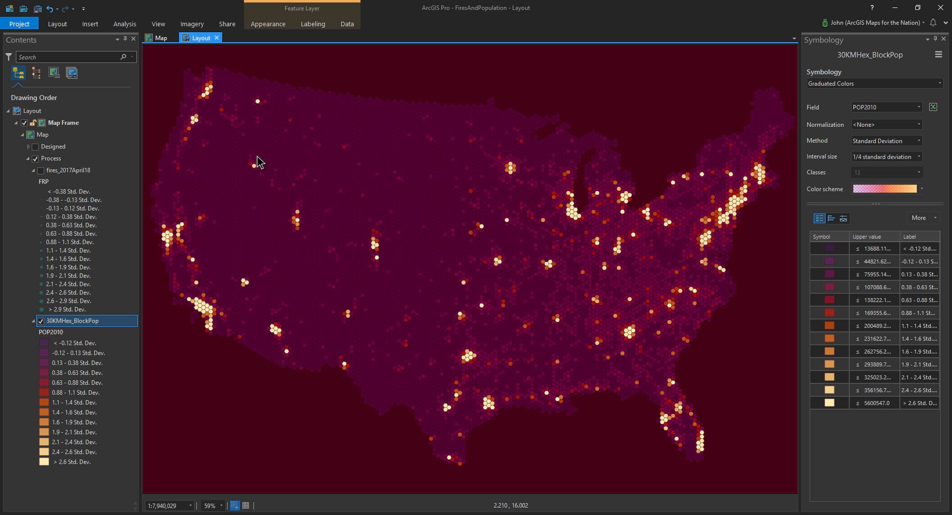
And on top of this I’ve added in the fire data.
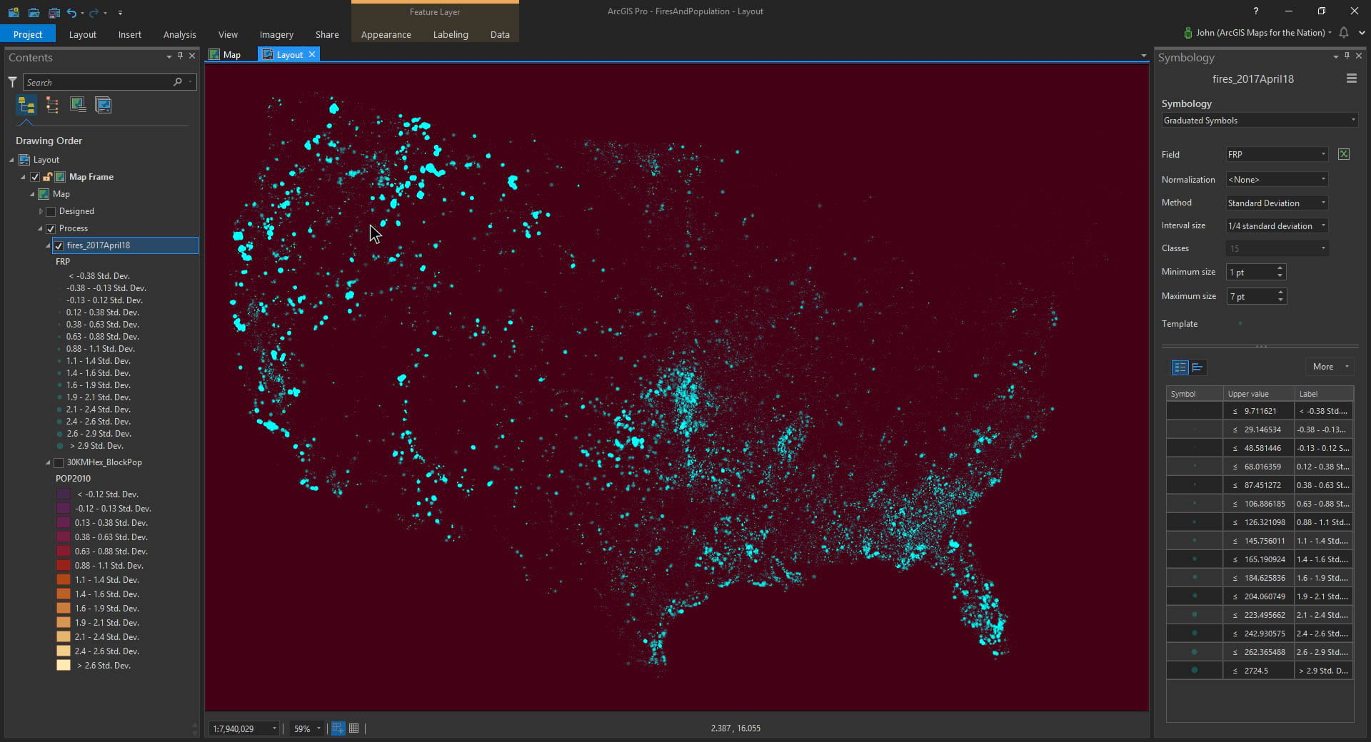
These two layers, when shown simultaneously, give a hint at the eventual goal. Fires in the context of population. [non sequitur moment: these colors look inadvertently like the Loyola Marymount basketball team uni’s in the 1980s]
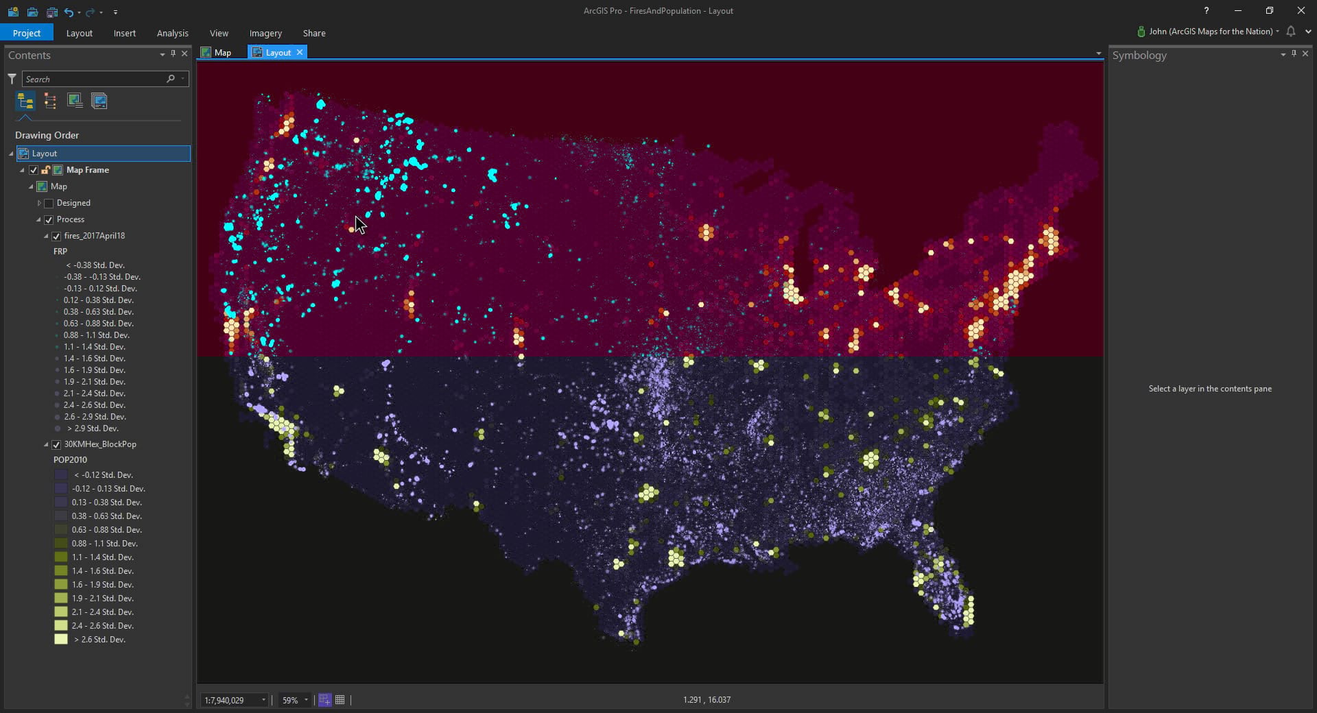
But, where the fires tend to be extra dense, and severe, they cover up the population layer. This sort of defeats the purpose of making a comparative map of the two layers. But, we cartographers have lots of tricks up our sleeves, and all the tricks have a common goal: to increase visual communication. In this case, I think it would help if fires were also binned up into the hexagons, just like population. Then, with a single layer containing two attributes of interest, it’s just a matter of symbology. Let’s roll those fires into the hexagons…
Spatial Join (fires into hexagons)
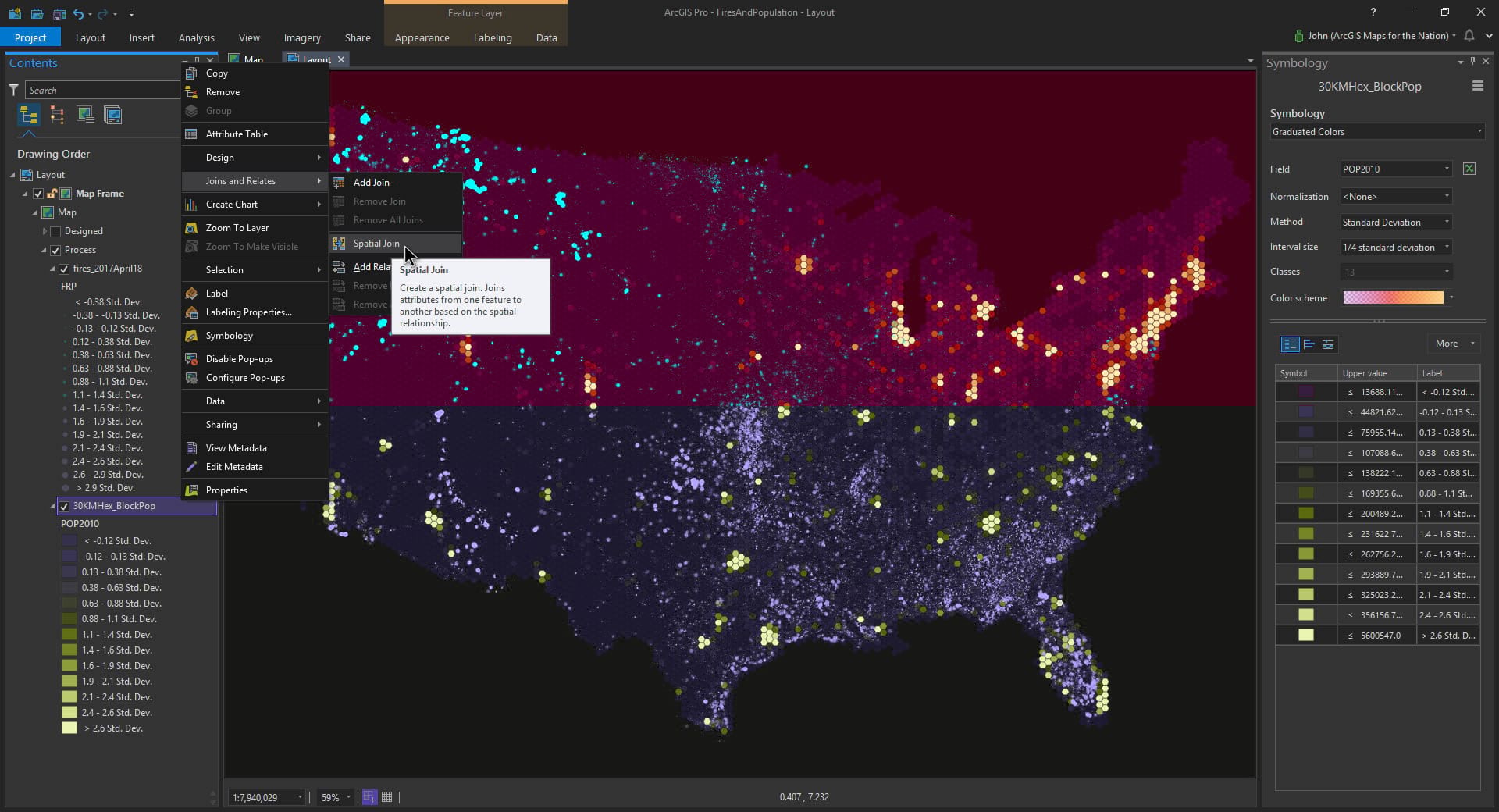
A spatial join lets you push the attributes of one layer into the shapes of another layer, based on location. I still think of this as a sort of magic. I want to pull the fire data into the population hexagons. So I right-clicked the hexagon layer and chose Spatial Join.
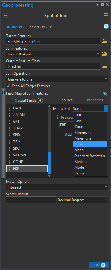
Then you can point the shapes in the direction of the layer whose attributes they are to devour. When combining the attributes of lots of point features into any one hexagon shape, you get some aggregation options. I chose to “sum” the FRP attribute. FRP is fire radiative power, so adding them all up into their destination hexagons is the right thing to do to get a cumulative amount of the fire-power experience in that area.
And there you have it! Now I’ve got a hexagon layer with both population counts AND fire power. Here’s what the newly mushed-in fire data looks like with graduated colors…
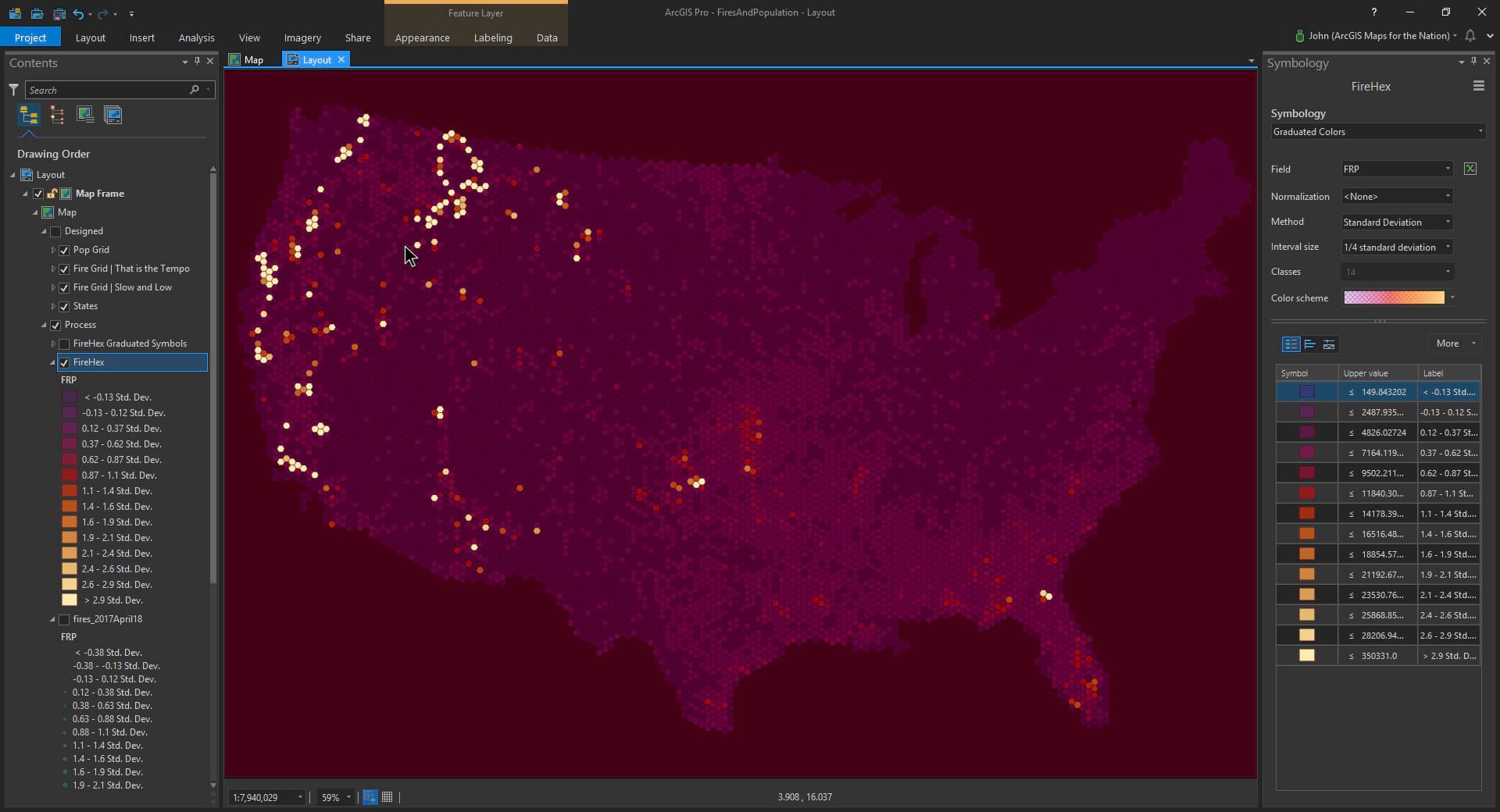
Fiery. But, not all of the hexagons actually experienced any fire over the past couple years, so we’ll want to exclude those from the visualization using a definition query. In this case, I just want to show hexagons where fires actually happened, preventing tiny little symbols of no-fire from hogging our minds’ visualization horsepower..
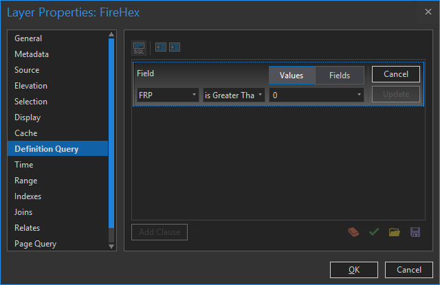
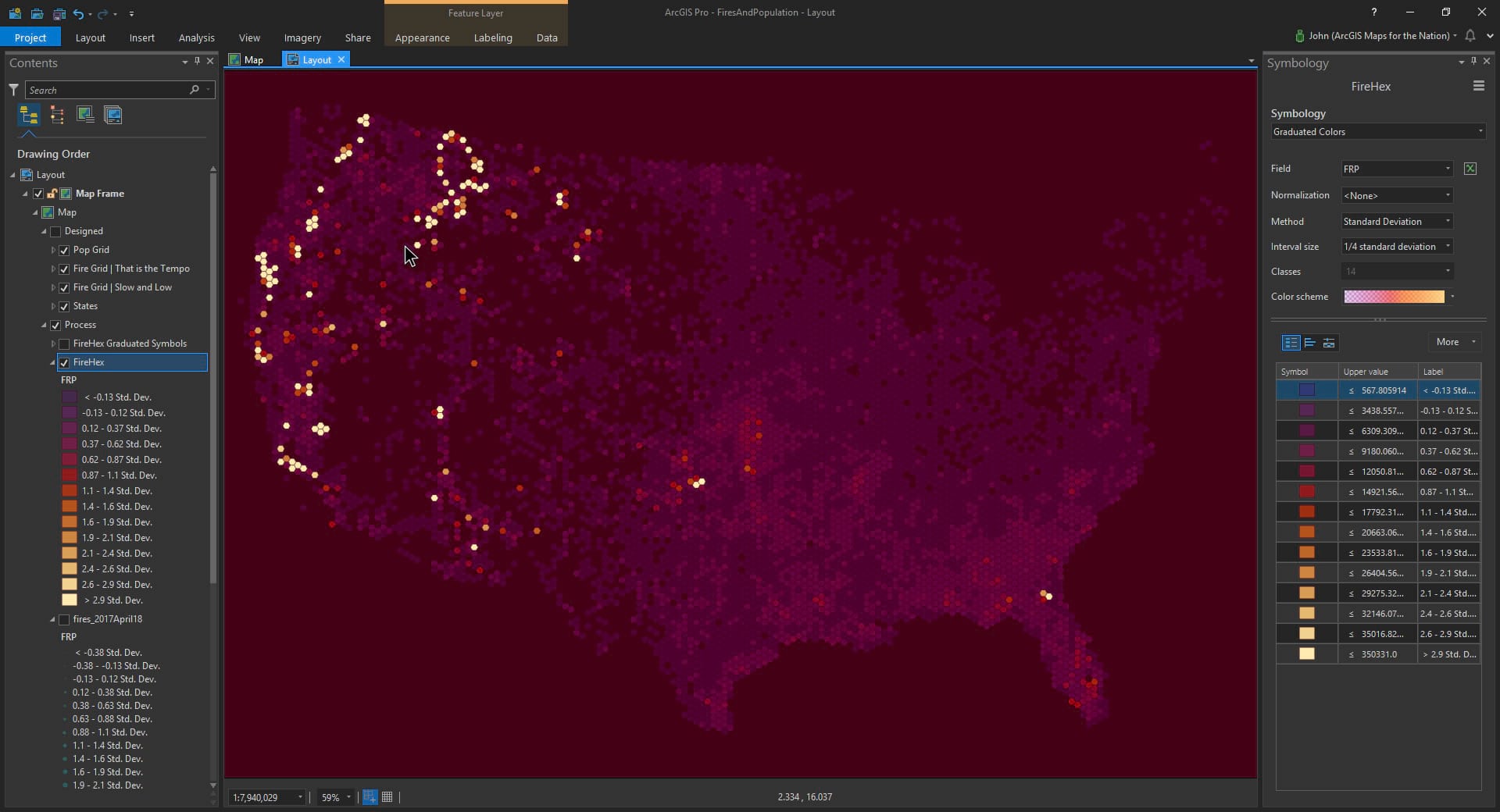
That’s better…
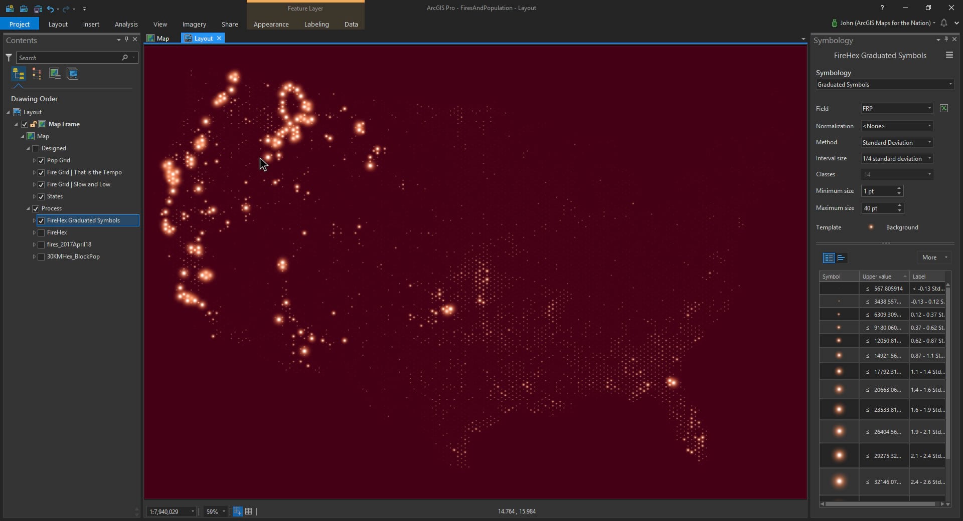
Graduated Fire Symbology
But just because our population and fire data are now in hexagonal polygons, there’s no reason we are stuck with simple fill colors for symbology. If you expand the symbology dropdown, you’ll see Graduated Symbols as an option. This renders a point symbol smack in the middle and represents lower values as smaller symbols and higher values as larger symbols. And since we are talking about fires there is no way that I’d let such a golden opportunity to use Firefly symbology slip by…
Graduated Population Symbology
And we can do the same thing with the population attribute. I made a copy of the hexagon layer and chose Graduated Symbols, pointing it at the population attribute. And, since we want to see fires and population at the same time, without one covering the other up, just use a ring symbol. Sneaky, huh? You can see through rings; no need to go filling them in willy-nilly, asking for trouble.
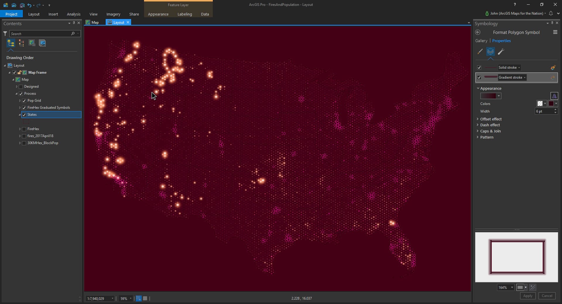
Supplemental Context
Now for a bit of context. I like to drop in a really faint political boundary layer to help folks orient themselves in the layout. In this case I’ve used this line dropshadow hack to give their edges a slight jump-off-iness.
Legend
Lastly, as much as I generally avoid legends, sometimes a helpful little explainer graphic is a fun and helpful addition. If I’m going to break down and add a legend, I at least am going to give it as much attention as the rest of the map. Here’s how you can do that sort of thing. If you must.
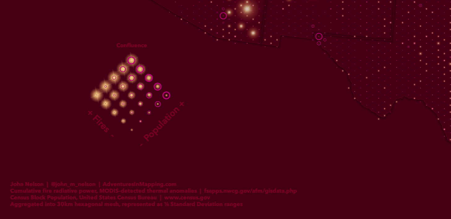
And that’s it! A bivariate-ish map showing fires and population.
Context
Why show them both at the same time? Because context drives meaning. Why not show other things, like roads and oceans and north arrows and neatlines? When shown in this distilled context there is a platform to invite comparisons. All thematic mapping is based on the question of…compared to what. And when you quite literally show two, and only two, phenomena then the mind becomes a comparison machine. In this spartan condition you can’t escape the fires-where-people-are context. Other maps, that show hillshade and elevation and climactic conditions can help you understand the nature of fires. But this map isn’t concerned with that any more than it is with the westward population expansion and urban sprawl inherent in the underlying population data. Those things are important drivers in follow-up conversations that this map may inspire. But a map has to first inspire to drive conversation.
Billy Wilder used to say regarding story writing, give the audience 2+2 and let them figure out 4; they’ll thank you for it. I think the same can apply to some maps, if that’s its purpose.
Happy Mapping! John Nelson


Commenting is not enabled for this article.