Wildfires continue to make headline news, most recently the fires surrounding the greater Los Angeles area. When I worked as a journalist mapping the news, we were tasked with locating fires, communicating the size of major fires, and mapping the environmental impacts. As climate change fuels more intense fires, it is important to visually communicate the severity of these events for people to better understand the scale and scope of these natural disasters.

The first map I ever made (using ArcMap back in 2011) was of lightning-induced fires in Oregon (forgive my cartographic decisions; I didn’t know any better yet!). To map the severity of the fires, I leaned heavily on bright and bold color choices.

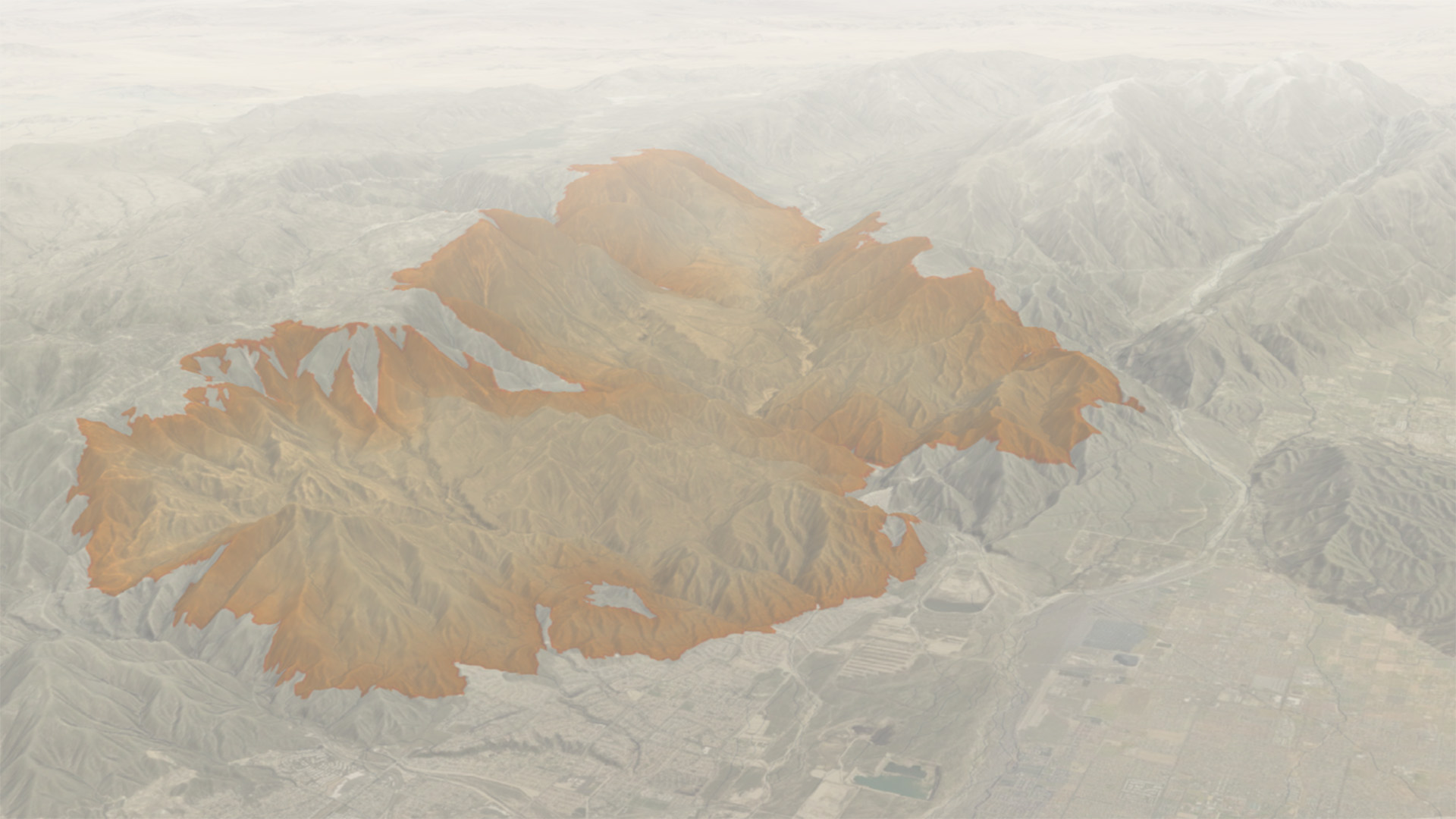
Mapping the Line Fire
Last September, the Line fire raged in the mountains north of San Bernardino, encroaching on the area, along with the nearby Bridge and Airport fires. To convey the ongoing situation, CalFire created a 3D interactive map using Scene Viewer, and news agencies mapped the fire extents to accompany their reporting.
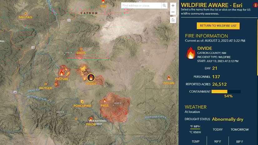
Now that the Line fire is contained (according to Esri’s Wildfire Aware app), I decided to map the extent of the fire to test out adding atmospheric effects to 3D maps in ArcGIS Pro.
When mapping fire, it is important to keep clarity and sensitivity at the forefront of the design process because fire can be incredibly destructive and dangerous for communities impacted. Select colors that help visualize severity (such as oranges and reds) and think critically about symbology choices to mirror the serious nature of a fire.

Adding ‘smoke’ to the map
I used an orange color to map the Line Fire extent using WFIGS Interagency Fire Perimeters. I also included hydrography and transportation data sourced from the Esri Living Atlas.
In ArcGIS Pro, the 3D environment uses the default appearance of a clear sky, which is not realistic for an ongoing wildfire event.
To communicate the atmospheric effects of this intense fire, I applied a fog effect to my map, using a tan/orange color to add ‘smoke’ to the sky around the fire. Adding color to the fog effect is available in the latest release of ArcGIS Pro 3.4.


Making some final adjustments
To further the hazy atmospheric effect, I added a rectangular layout element across the top of the map. I also added a transparent white gradient to mimic how smoke decreases visibility as distance increases.
Every map is an abstract representation of reality, so it is never going to look exactly like it would in the real world. And that is a good thing! If we made the ‘sky’ in this map as smoky as when the fire was ongoing, it would be impossible to see the data we are trying to map. But adding a slight smoke effect to the atmosphere helps represent poor air quality during the fire.


What are some ways you have mapped fire? What visual effects have you added to your fire maps to help communicate the critical nature of fires? Let me know in the comments or tag me on your maps on Bluesky.

Article Discussion: