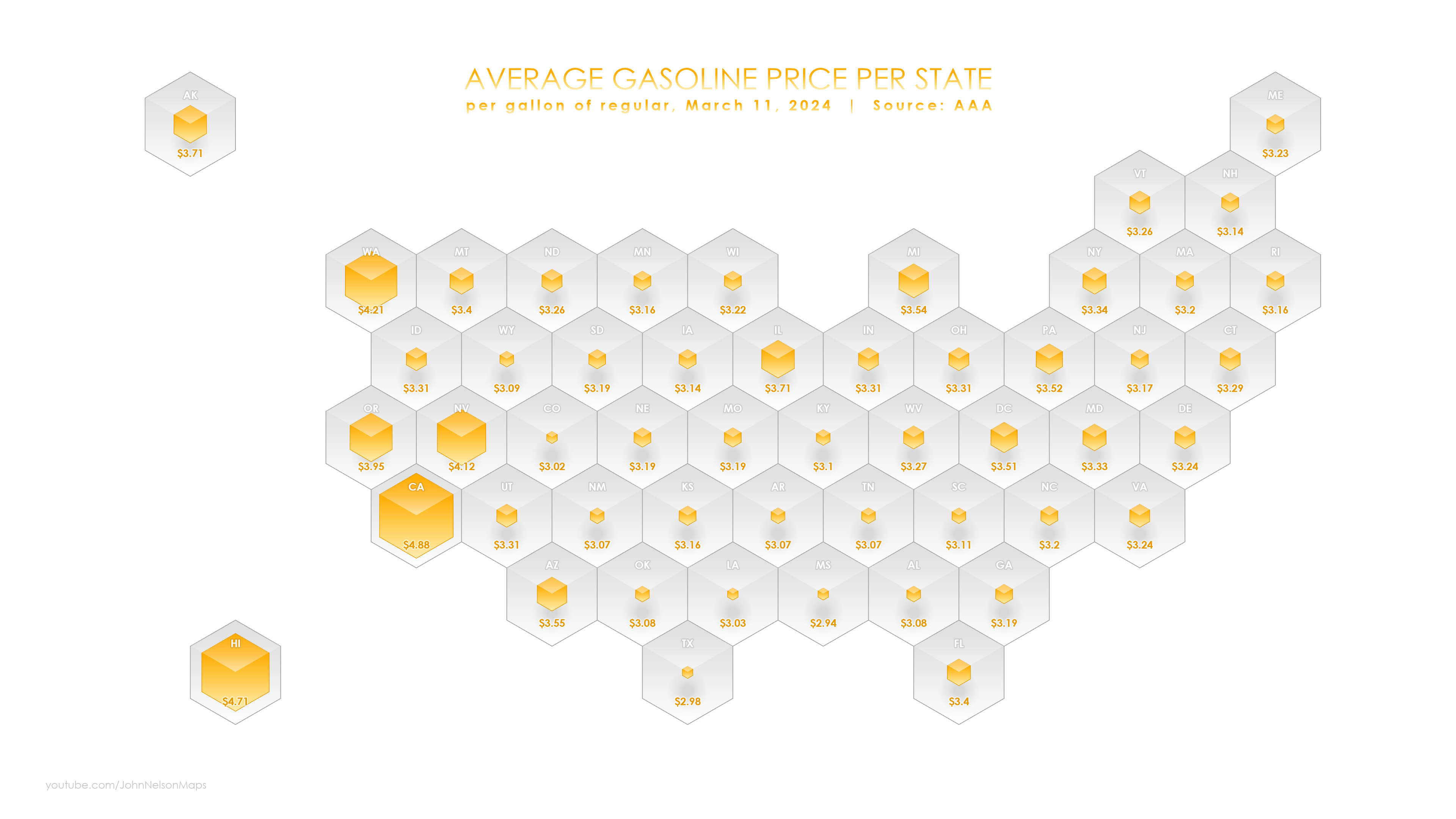
Of course maps are just the most fascinating and information dense graphical information products around…in my unbiased opinion. I can, and do, go on and on about the deep and pervasive benefits of spatial representations.
But…well…sometimes a map, strictly speaking, can have some issues. That’s ok though, because maps are here to fix the problem with maps! Say what? What’s the problem, you might be wondering? Well sometimes the phenomenon that we want to illustrate via a map suffers from the exactitude of the size and shape of the things on the map. For example, there are really big states in the US (looking at you, Alaska and Texas) and some really small ones (ah-hem, Rhode Island…and Delaware?). Some borders are simple (Wyoming) and others are exceedingly complex (Maryland). Showing all these states in their actual shapes and sizes can introduce unwanted variability. For instance, what if I just want to see a map-like thing showing average gas prices per state? I don’t want to be distracted or swayed by the actual state areas, but I do want to see, generally, if there are geographic patterns or regions where gas prices are higher and lower.

Cartograms let geographers have it both ways. A cartogram is a bit like a chart and a bit like a map. We put geographic entities in about their right locations, but size them based on data, rather than their actual political borders. Some cartograms go a bit further and even do away with entities’ shapes altogether and use a single shape…like nature’s favorite shape, the hexagon. It’s all about making things as simple as possible, but no simpler.
How can you make semi-spatial information products in an absolutely-spatial tool?
0:00 Rapturous intro
0:23 Creating a hexagonal tessellation
0:57 Selecting state hexagons
1:22 Adding state name attribute
1:54 Fifty-one personal anecdotes…you should skip this
9:00 Joining data to the hexagons
9:47 Graduated symbols
11:18 Adding cool-looking lighting
13:27 New chickens join the Nelsons
Here’s the hexagon layer that I made in the video, if you’d like to have a go at joining some data and making a crazy hexagonal cartogram. I’d love to see what you make, so if you give it a try, consider sharing it on LinkedIn and tag me.
Happy Cartogramming! John

Article Discussion: