Here’s how to make one of those fun little maps that takes the area of one known location and puts it atop another known location, to potentially surprise you with some cool scale context.
“Wow, the 48 contiguous US states are about the same size as Australia!” And stuff like that.
It can be fun and surprising because so many of the projections we’re most familiar with are pretty generous size-distorters. I like these sorts of maps because they can give a sense of context and scale for places that are physically (or conceptually) distant from each other. And while this sort of map might be a fun challenge to our specific perceptions of places, in a broader sense they invite an opportunity to question some more mental models of our world that could do with a fresh perspective.
For example, Ontario, Canada, is actually really big. I think bigger than you might guess. I mean, here’s how it compares to Alaska.
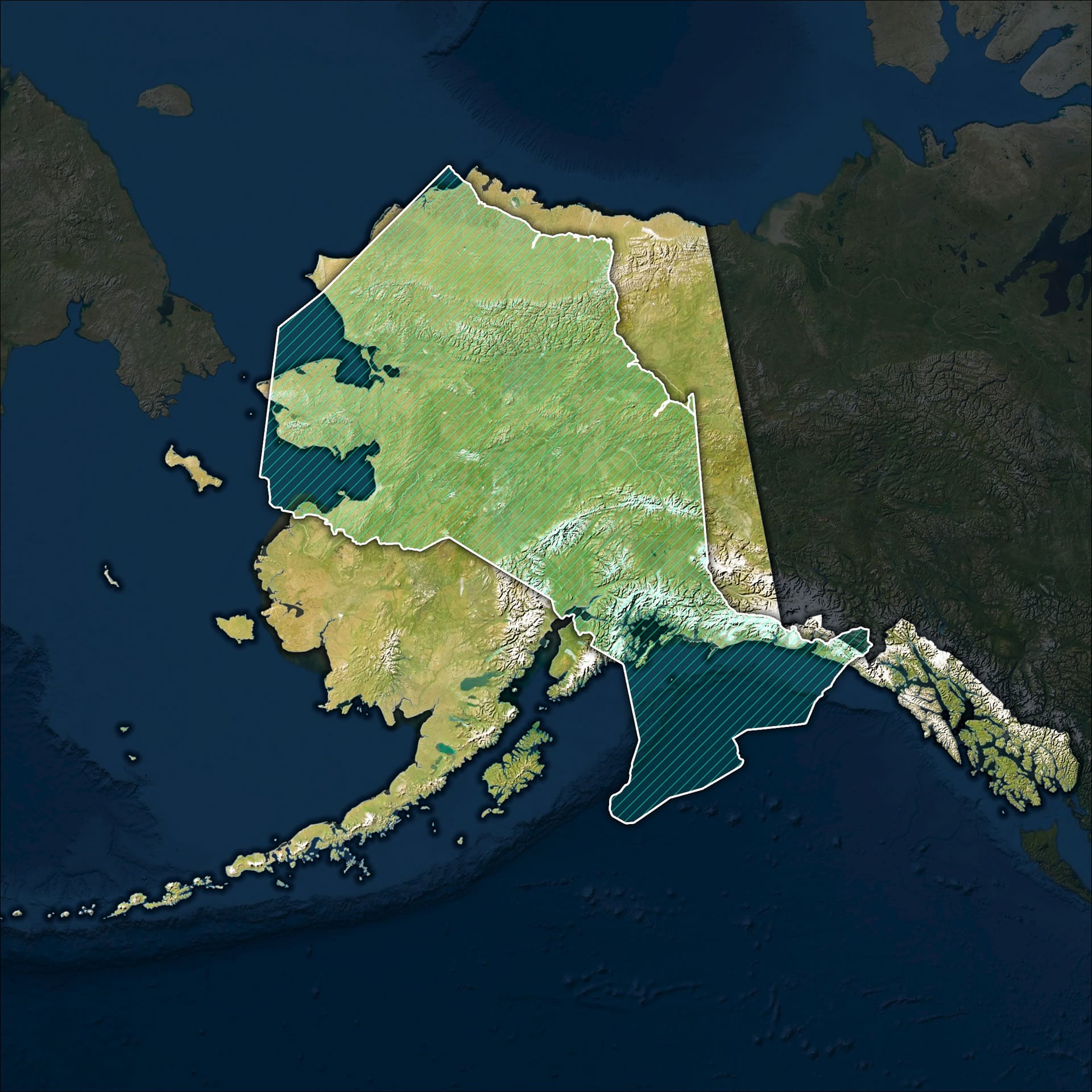
I know, right? See, comparative size maps. They’re fun.
Here’s how you can make one of these in an ArcGIS Pro project (two maps and a layout):
- Create two maps in an ArcGIS Pro project.
- Assign both maps the same projection, but the projection parameters are updated for each so the Latitude and Longitude of its center are the center of the area of interest.
- Insert both maps into a Layout.
- Copy the scale (bottom left) of one map and paste it into the scale of the other.
And that, friends, is pretty much it. If you’d like to watch a tedious and drawn out version of that process, with nasally rambling narration and awkward pauses, then feast your eyes on this…
0:00 Ah just skip this bit.
0:58 Style up a map for one location (in this case, Alaska).
1:44 Tweak each map’s projection (in this case, World from Space) so the “Latitude Center” and “Longitude Center” are roughly the same as the center of your area of interest.
2:49 No, I’m not using an equal area projection. WHAT! True. You don’t need to with this method as long as each map has the same projection and the projection is centered to the area of interest.
3:10 Give the second map the same projection, with a custom center.
3:40 For the overlay map, use only the area of interest (definition query) and apply a symbology that lets you see through it well.
3:58 New layout. Insert both maps right on top of each other.
4:47 Copy the scale of one map frame, and apply it to the other map frame (copy and paste the little scale value in the bottom left part of the layout).
6:02 Dress up the bottom map a bit with a terrain-enhancing blend mode.
6:11 Recap. For posterity.
7:18 Shameless invitation to subscribe to this map-how-to YouTube channel.
Ready to just crank out size comparison maps one after the other? That’s great because we could all use a bit of a challenge to our save and cozy geographic assumptions. Get shaken up once in a while!
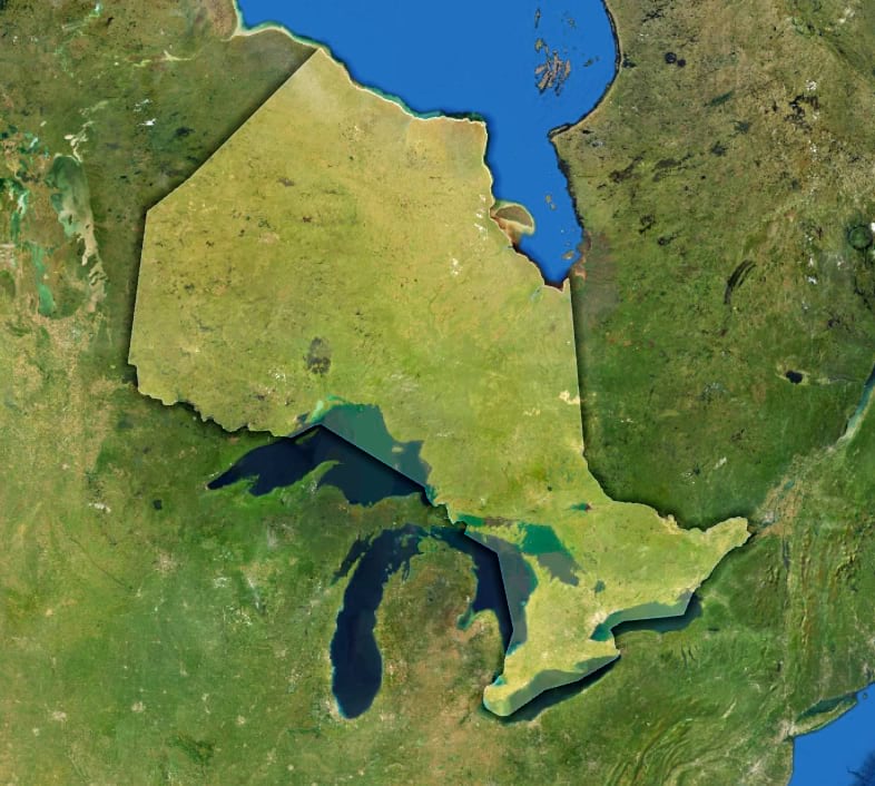
P.S. Thank you to my friends in Ontario for generously volunteering your beautiful (and surprisingly vast) province. In hindsight, I really wish I’d used a version of the Ontario border that omitted Great Lakes so nobody would think I was pulling a fast one on them. It’s really not all that much area, though. See?

Article Discussion: