In my previous post, I described how to sort through a mountain of data and pull out the diamonds. Now it’s time to cut those shiny little rocks into faceted gemstones. You’ve got data, and people keep telling you that the data speaks for itself. But, you know, sometimes it needs a little polish.
This blog is only going to cover one aspect of the design of the Ice Road to Diamonds project: the fade-out effect in the background.
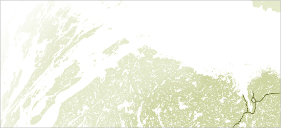
When making a thematic map, one must never lose sight of the theme. If you do, all design decisions become impossible. The theme of this map is a 600 km ice road that services diamond mines in northern Canada. The most important feature on the map is the road. Next are the mines. Finally the lakes near to the road and mines. But did you see how many lakes there are in this map? The attribute table says 63,140. That means that while a few lakes (the ones crossed by the ice road) are important features, the rest of them serve more as a background pattern.
And it is a beautiful background pattern. I wanted to maintain the mottled texture of this lake-riddled land. I just didn’t want it to be too distracting from the map theme. My solution was to fade it out. The contrast between white lakes and green land decreases gradually with distance from the road. This allows the important lakes to still be read as features, while the unimportant ones do not compete with other map elements.
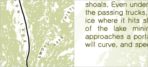
In addition, it helps pull your eye in towards the road, giving it greater emphasis without having to make the road line itself any thicker.
For a map with some really masterful fading, using a different technique, check out John Nelson’s Osprey story map.
But here’s how I did it. If you want to follow along, download this project.
First, you’ll need a buffer around the ice road.
1. On the Fade Map, use the Measure tool to decide how far you want the fade to extend from the road.
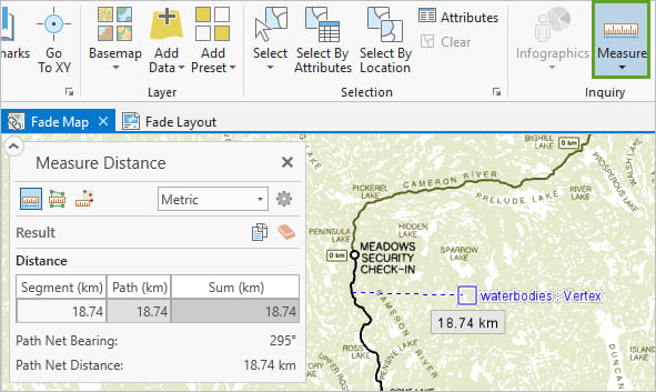
2. Select only the appropriate road features. Select by hand, or select by attribute.

Tip: To remove features from your selection, hold down the Ctrl key and use the select tool. To add features, hold down the Shift key and use the select tool.
3. Now you can run the Buffer tool on the road layer. It will only buffer your selected feature. I ran it twice, once at 120 kilometers, and once at 40.
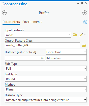
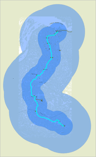
Next, you’ll use those buffers as your background color.
4. In the Contents pane, remove the worldLand layer, which is currently serving as your background, and drag the 120 km buffer layer to the bottom. Turn off the 40 km buffer layer for now.
5. Open the Symbology pane for the 120 km buffer layer, and give it a nice pale green fill color, such as HEX# E6EACE.
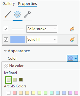
6. For the symbol outline, change the stroke type to Gradient Stroke.
7. Set the two colors for the gradient to white and the same pale green background color as the fill. Then make the width enormous – like 200 points – to get a true fade effect.


8. Follow the same steps for the 40 km buffer layer, except it should fade from pale green to the slightly darker HEX# CFD6A4, and use a 100 pt width.
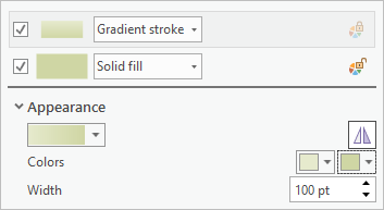
Now your buffers have soft fuzzy fading edges.
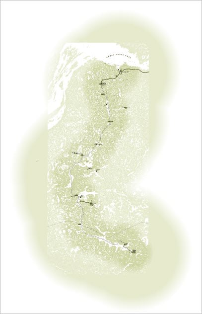
But there’s still a little tweaking that can be done.
9. On the Symbology pane for the 40km buffer layer, change the Offset effect of the gradient stroke to -50 pt.
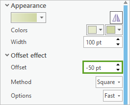
10. Change the offset for the 120km buffer layer to -98 pt.
Combining Width and Offset properties can get kind of confusing. It can be difficult to predict what the result will be. I find that temporarily changing the stroke colors can help you to figure out what’s going on.
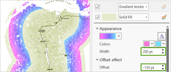
The image above also demonstrates that if you make the offset a negative number more than half of the width, it moves too far inside the fill.
Anyways, the final effect is quite subtle. Switch over to the Layout to see it.
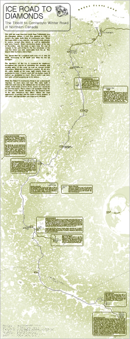
But that’s the point. Backgrounds should be subtle.
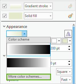
Play around with buffer size, outline width and offset effect until you find the right balance for your map. You can also create your own custom color schemes and save them to a style if you want to get really fancy with that gradient stroke. Just click the color scheme menu under Appearance and click More color schemes to apply it.
You can see the full and final map here.

Commenting is not enabled for this article.