Hello there! My name is Greg and I am a Product Engineer for ArcGIS Pro. We are happy to introduce a new feature in ArcGIS Pro 2.4 to help simplify, summarize, and speed up data analysis. Say hello to dynamic feature binning, a method of feature aggregation and a great way to visually represent point data.
Added emphasis on ‘dynamic’: we’ll come back to this in a bit.
For now, take a moment to consider any data you use that is densely packed or contains millions of locations or points (for example, every recorded lightning strike in the world in the last 30 days.) When you first add data like that, it’s usually in the form of a feature layer and symbolized with a default point symbol.
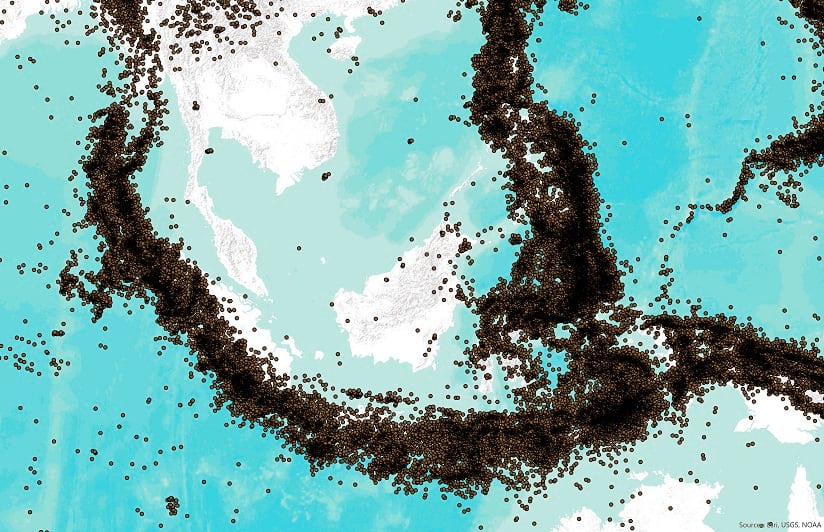
The image below shows XY locations of recorded earthquakes for the entire world since 1900 and is zoomed in to Southeast Asia. Even at this scale, there are too many points. So many, in fact, that we can’t even see the Philippines under the morass of symbols. Beyond that, we can’t be sure how many points there are in certain spots. The high density could mean there are 5 – or 500 – earthquakes covered by one symbol.
How can we better explore this data? We could create a heat map, but the way heat maps interpolate and extrapolate data would show that Thailand is also heavily impacted by earthquakes. It’s not the best mapping option for this situation, and in some cases, you may need to preserve the symbology of the points.

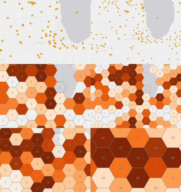
Dynamic feature binning takes the hundreds or millions of point features in this feature class and groups them into bins at multiple scales. Bins are arbitrarily generated polygon frameworks that are used to summarize dense information. You can aggregate points into bins for any type of data, but it is best suited for data that is not bound by political boundaries or preexisting geography.
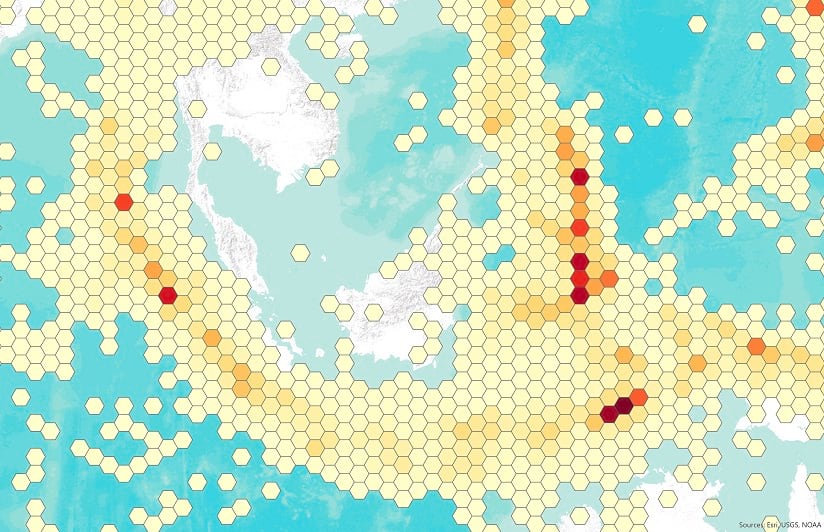
To apply dynamic feature binning in ArcGIS Pro, I first enable feature binning on the feature class. You can view whether a point feature class has feature binning enabled by viewing the layer’s properties. Once this is done, my ‘bin-enabled’ feature layer has two components: the underlying point features (like the image above), and the bin polygons (see below). In the example below, the bins are symbolized with the total number of points in each bin. Using an unclassed color scheme, I can visualize the data for areas with high earthquake frequency. The highest number of earthquakes occur over the Philippine Sea, near Timor, and the northwest coast of Sumatra.

Binning techniques are not new to mapping or GIS. However, the process has been improved greatly for ArcGIS Pro starting with the 2.4 release. Previously you had to manually create bin layers (tessellations or fishnets) using various geoprocessing tools. Then you would perform additional data processing to assign values to each polygon. This had to be done for every desired map scale, and there was no dynamism. New map scales could not be visualized without rerunning the tools.
With dynamic feature binning, there is no need to rerun tools—it’s dynamic. This means the scale at which bins draw instead of points, the size, and symbology of the bins update on-the-fly without impacting drawing performance. The calculations and summations of the data are done when binning is first enabled.
With these new capabilities, there are requirements regarding the type of data storage required, setting up the data, and managing updates to the data. For example, your data must be a point feature class stored in an enterprise geodatabase such as SQL Server, PostgreSQL, or Oracle. An equal area projection for your data is strongly recommended. To fully understand feature binning, I recommend reading the web help topics linked below for reference before jumping into it.
In a future blog post, I will walk through the feature binning process using sample tornado data from the United States. I’ll highlight the binning techniques that give you additional control over bin drawing, symbology, and calculating additional statistics. I’ll also discuss managing the data behind the scenes, all with the goal of making better sense of complex data.

But if you can’t wait and want to start binning now, give it a go! You can share bin-enabled feature layers as map image layers to your portal, so anyone in the organization or beyond can view them.
We hope you gain value from this new feature, and we look forward to seeing some nifty creations. Happy Mapping and see you on the next blog!


Commenting is not enabled for this article.