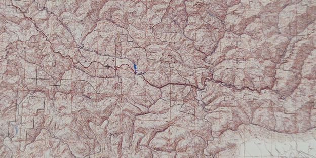
In the 1990s I went a little crazy with shaded-relief. Once I learned how to manipulate it a bit, every map I made had to use it. It looked great of course, but it also helped the map reader.
Some background. Before I studied GIS I was an art student. When I started working as a GIS consultant, I sometimes produced maps for clients. Early on, I took home the book on using the raster tools and map algebra and studied it. I realized there was a lot more that could be done artistically in Arc/Info than had been tried, including in the realm of shaded-relief.

Making something beautiful wasn’t my only motivation. These maps were working maps for foresters. As it turned out, using relief and building on an illusion of three dimensions seemed to solve a problem by decluttering the maps.
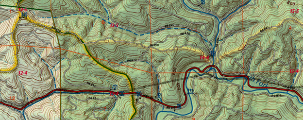
Foresters were having trouble reading the maps without relief because the maps had so much line. Lines for roads. Lines giving directions to each sample plot. Lines for township and range. Lines for rivers and streams. Lines for the ownership boundaries. Lines for railroads and power lines. Lines for watershed edges. And now lines for contours? The maps were so full of line they looked like a pile of sticks. It took too much work for a human brain to make sense of things.
Contours were important, but wherever the slope was steepest, the relief became covered by contour lines. This meant the 3d effect of the relief was nullified right where it should be its strongest.
The artist in me wasn’t satisfied. My desire to integrate the contour lines into a beautiful relief map got me thinking there must be a solution.
Somehow I got the idea of applying shading to the contour lines. It’s not something that is obvious the map needed. But when you apply this simple effect, together with the relief, the shaded contours improve depth in the map immensely.

The shading on the contours seemed to take the contours out of the competition of line. Shading them seemed to place the contours into the background as a reference so that it would not fight with operational layers the foresters needed to read. The lines are still there, but they are no longer getting the way of your perception. It started to blend in and become a part of the relief. Could this technique help you with your work?
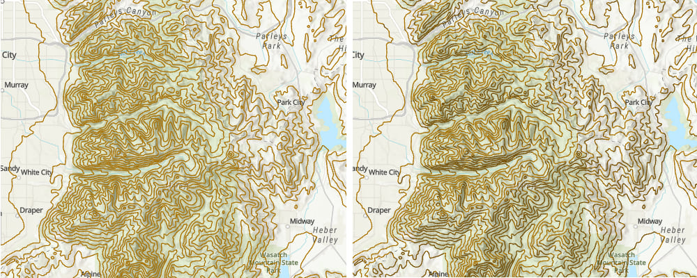
Consider this example. The contour lines on the left are drawn with one color. The contour lines on the right have a darker color when they’re in the relief shadow. Both maps use relief. Can you tell the difference?

If you would like to create your own shaded contour lines, I created a how-to video you can follow to learn the technique and make your own shaded contours just like the image on the above right. I will show you how to shade contours start to finish using layers from the Living Atlas. You will create shaded contour maps for the US State of Utah, the video is just under 21 minutes in length.

Great tutorial! thank you