Often polygons don’t play nice and just spill all over neighboring polygons and it can be hard to visually discern the actual extents of the hodgepodge. Sometimes its a problem of just two polygons that overlap, and sometimes you are dealing with loads of overlapping polygons. Here are a handful strategies for representing overlapping polygons in ArcGIS Pro so you know what is where.
…
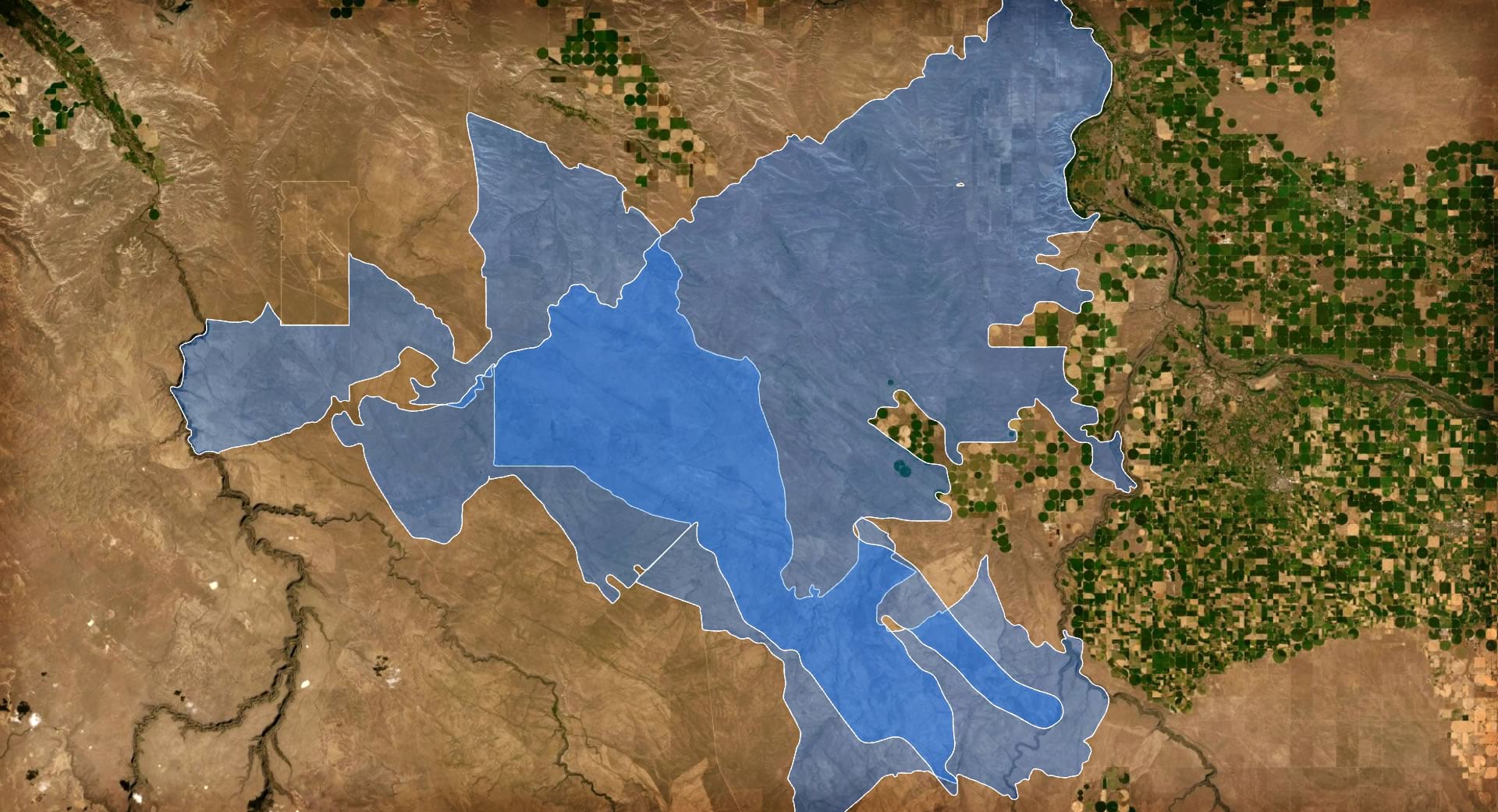
If you just have two overlapping polygons, and they are of the same type or category, you can use the tried and true feature transparency trick. By giving the polygons’ fill some amount of transparency, you can see the extents of both polygons and the additive opacity effect makes the areas of overlap clear.
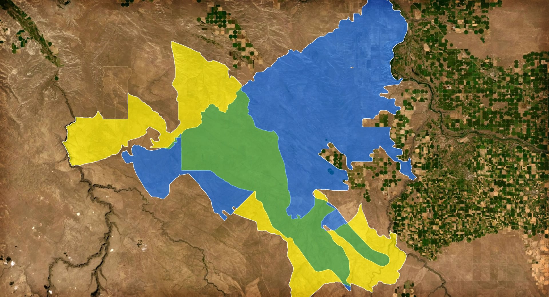
But what if your polygons are of two different categories and have their own colors? In this case it helps to have two colors that combine into a commonly familiar third, blended color. Yellow and blue makes green when they are given a feature-level multiply blend mode.
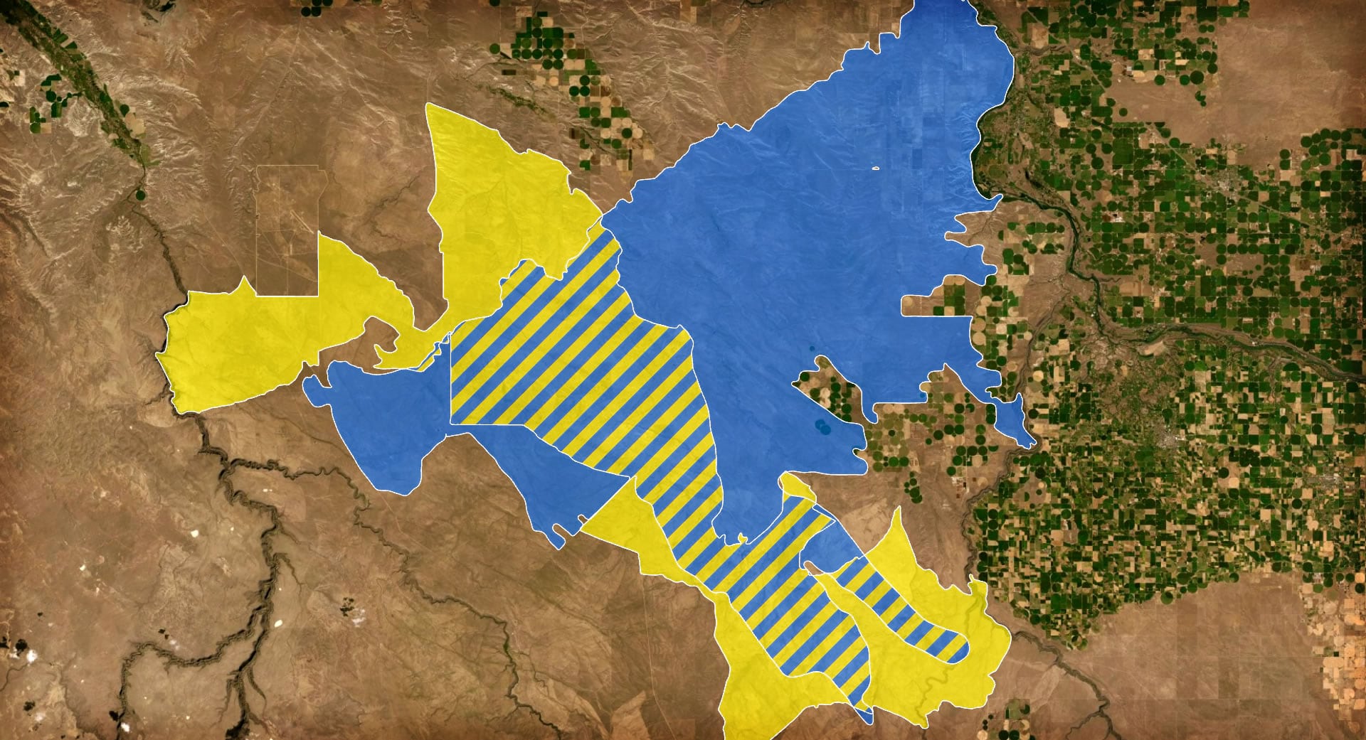
But colors aren’t always this tidy. Maybe your colors don’t combine to something familiar or you just don’t want to introduce a third color into your map, what then? You can hack the hatched fill symbol and give the overlapping area a hatched fill of both constituent colors. You’ll need to first use the Union geoprocessing tool to isolate the intersecting area, though.
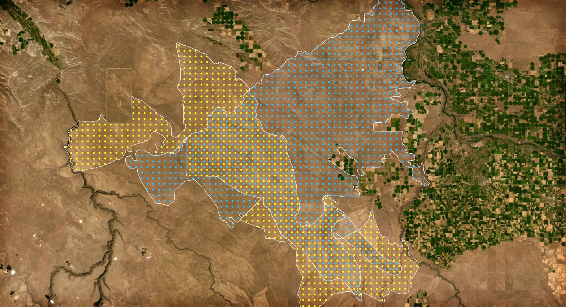
But what if you don’t want to use geoprocessing and end up with a new and complex layer to manage? A similar take on this strategy, but one that does not require any geoprocessing, is to use a repeating marker pattern for the fill. Just offset the pattern of one category so that both patterns are visible when overlapping.
So far we’ve just been dealing with the relatively simple case of two overlapping polygons. But what if your map has tons and tons of polygons that overlap? In this case, the good old feature transparency trick is very useful. When the polygons are given a semitransparency, the amount of overlap becomes apparent via the increased opacity of all the stacked up fills. The more overlapping polygons you have, however, the more transparent you’ll have to make the fill; it’s important to play around and find the right balance.
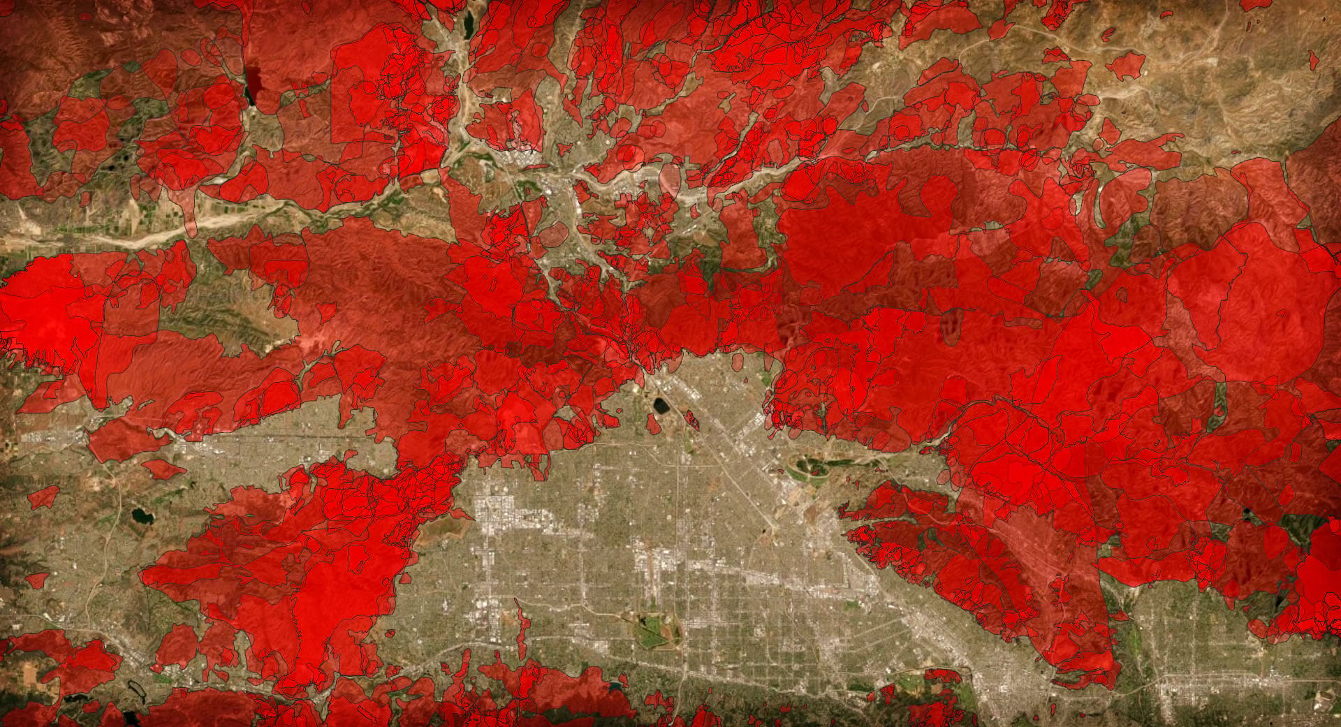
Say you don’t want to use semitransparency for whatever reason, will a feature blend mode work in a similar manner? Sure! In this case, the polygons are given a feature blend of multiply. The deeper the resulting color, the more overlapping polygons can be assumed.
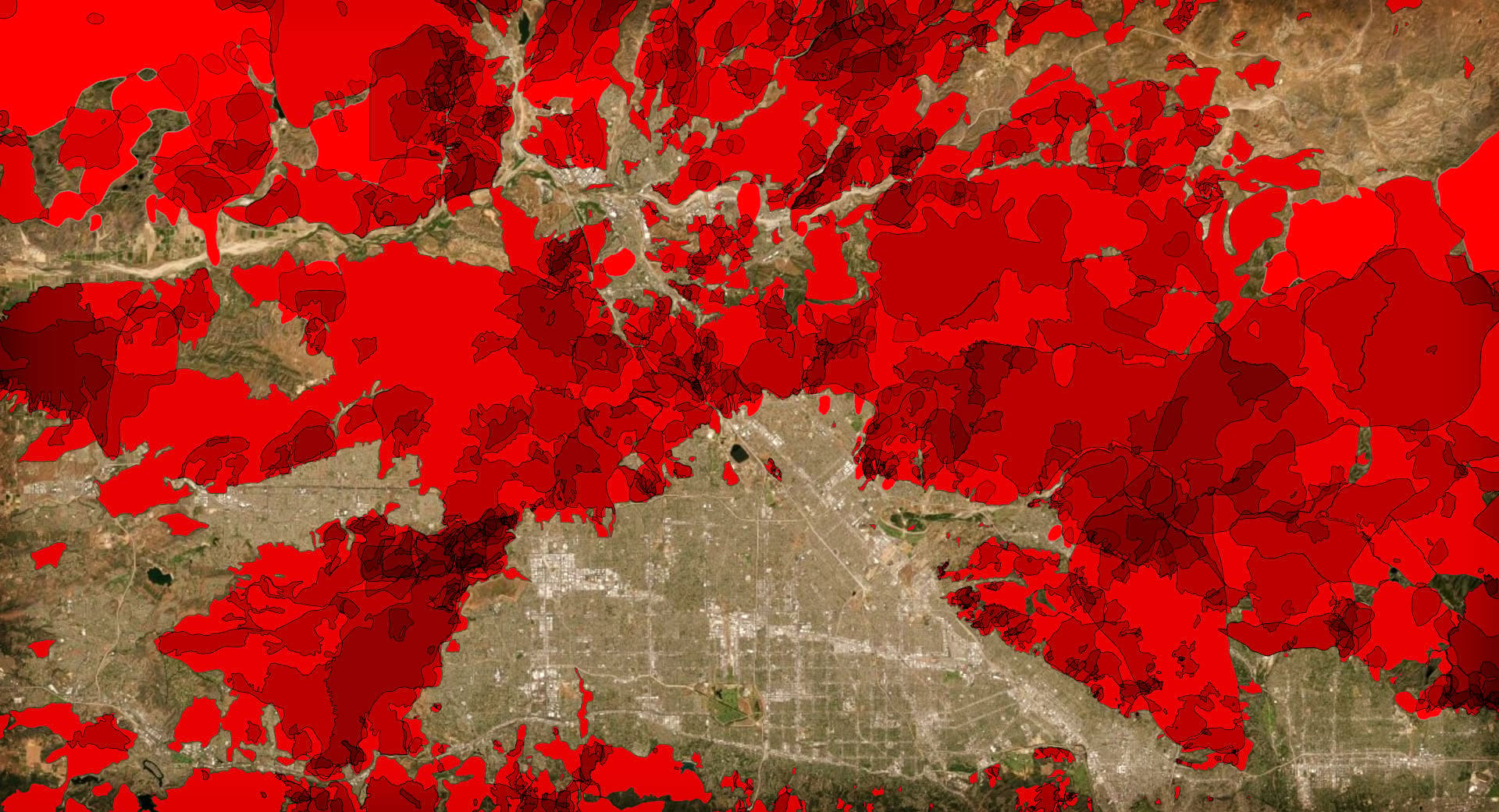
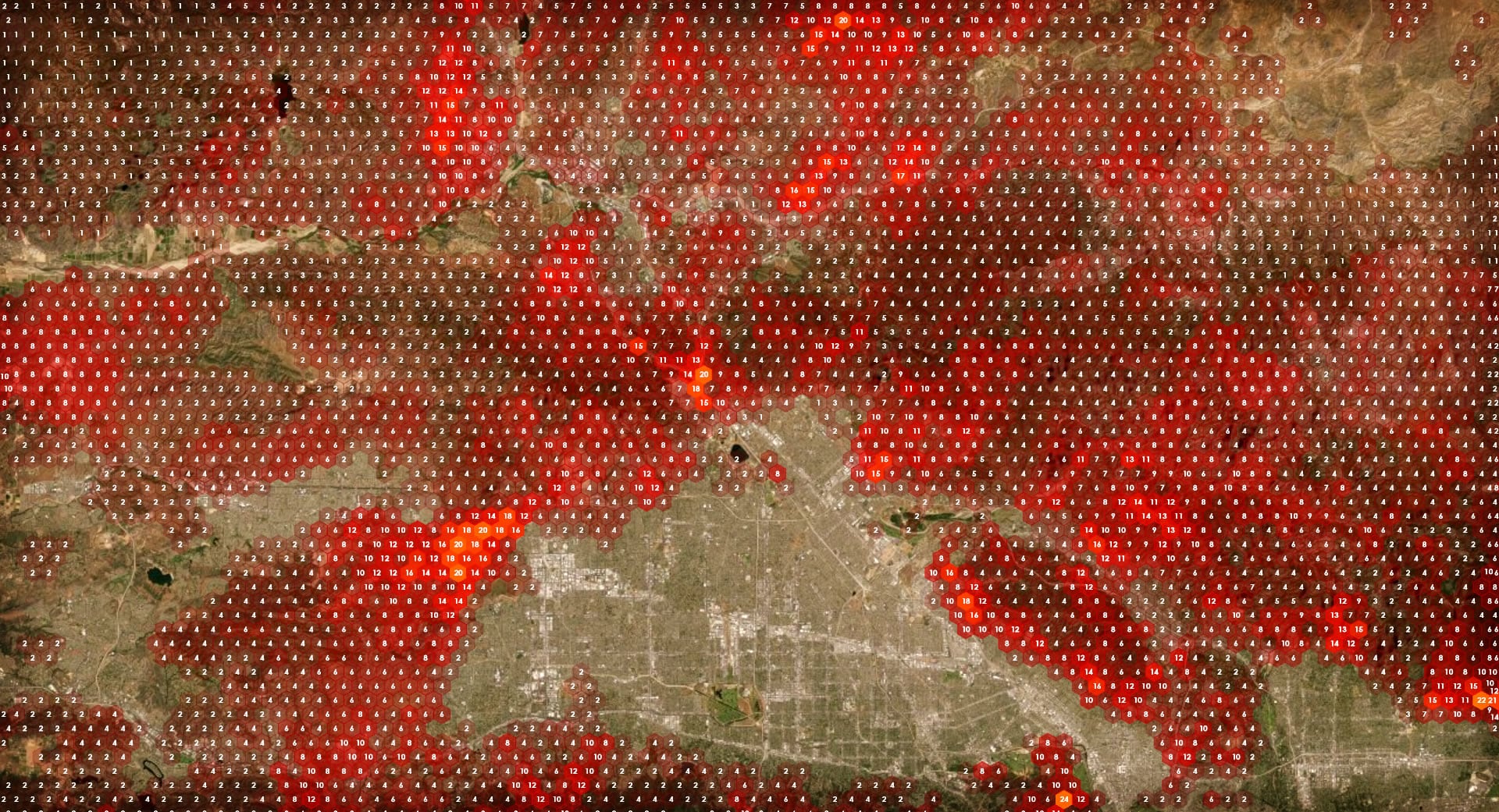
But these methods (semitransparency and blending) are purely visual and there isn’t a concrete way to represent just how many polygons are overlapping at any location. They only provide a general sense of more and less. To get right down to the nitty gritty and count up how many polygons overlap in any one location, you can create a tessellation layer into which you can count up all the overlapping polygons. While the original polygon boundaries are no longer visible, the hexagons themselves can be given a symbology method to show more or less density. Additionally, you can use labels to show exactly how many polygons overlap in each cell.
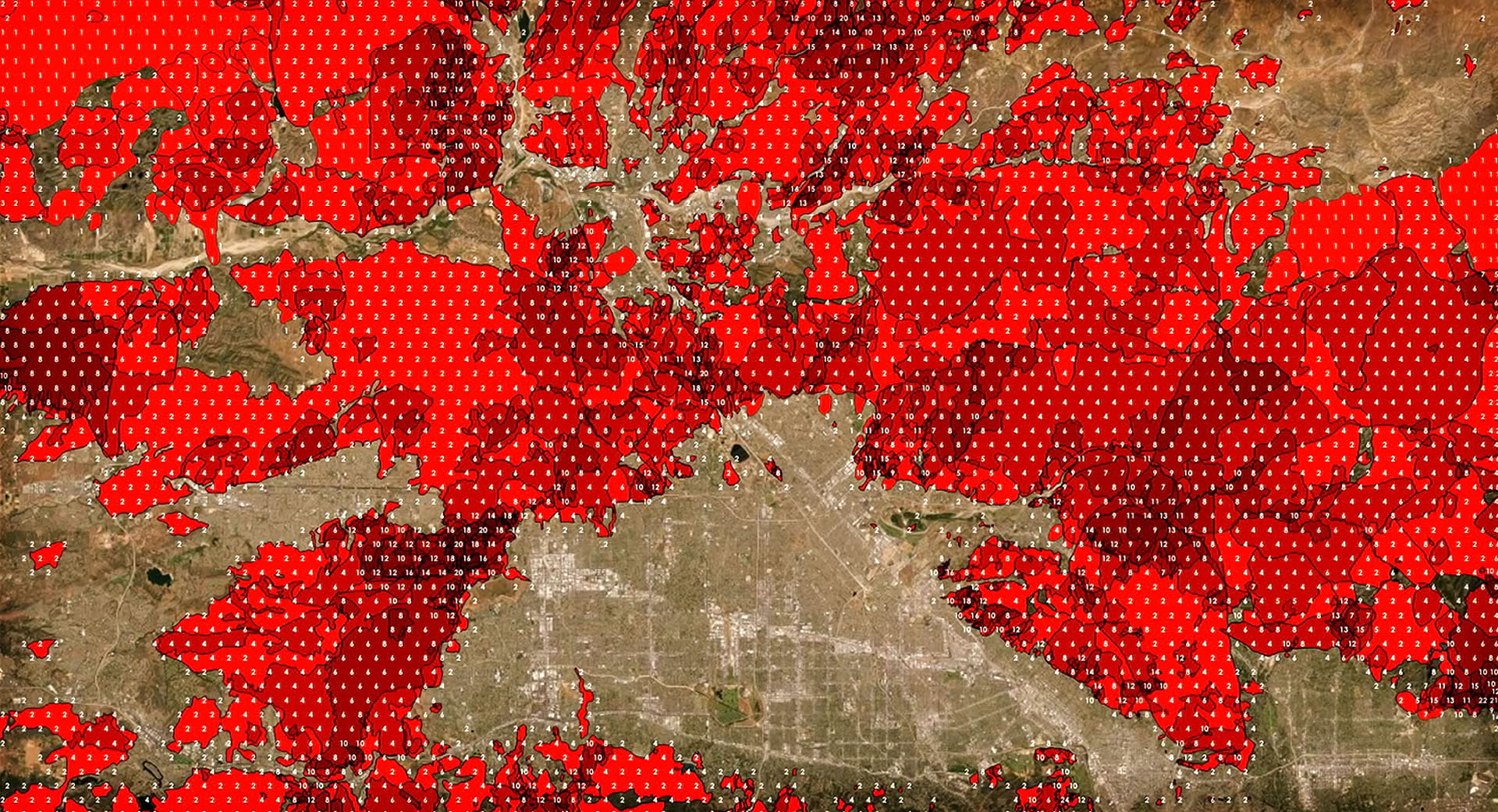
If you are feeling rambunctious, you can even retain the labels from the aggregation (and give the cells fully transparent symbology) and use them to label the input layer of any of the previous methods. A hybrid approach.
There you go! A handful of things to try out in your project, if you are running up against the challenge-opportunity of overlapping polygons and how to represent them. If you are wondering about how to implement any of these methods, have a look in the video above where all of them are demonstrated. Have fun, mappy friends!

Article Discussion: