An age pyramid, also known as age-sex population pyramid, graphically shows the distribution of different age groups in a population, classified by gender. When the area depicted has a growing population, it takes the shape of a pyramid.
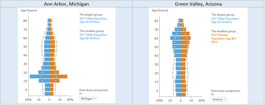
Age pyramid style visualization has been available in ArcGIS Business Analyst and can be used to quickly understand the population distribution in an area. For example, below are two Age Pyramids showing population distribution for Ann Arbor, Michigan and Green Valley, Arizona – depicting two completely different population distributions.
This article helps you understand how to customize an existing age pyramid to use other variables, as well as how to create a pyramid style chart from scratch in the Business Analyst Web App.
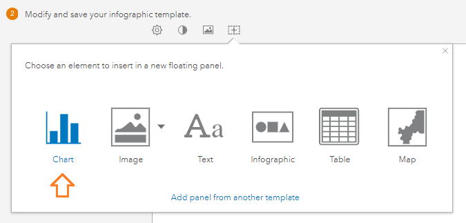
Customize an Age Pyramid panel
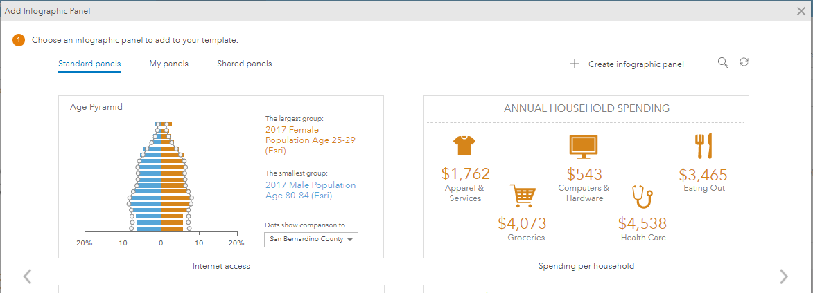
The Age Pyramid is one of the standard infographic panels available for the United States, that you can add to a custom infographic template you create for the US.
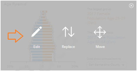
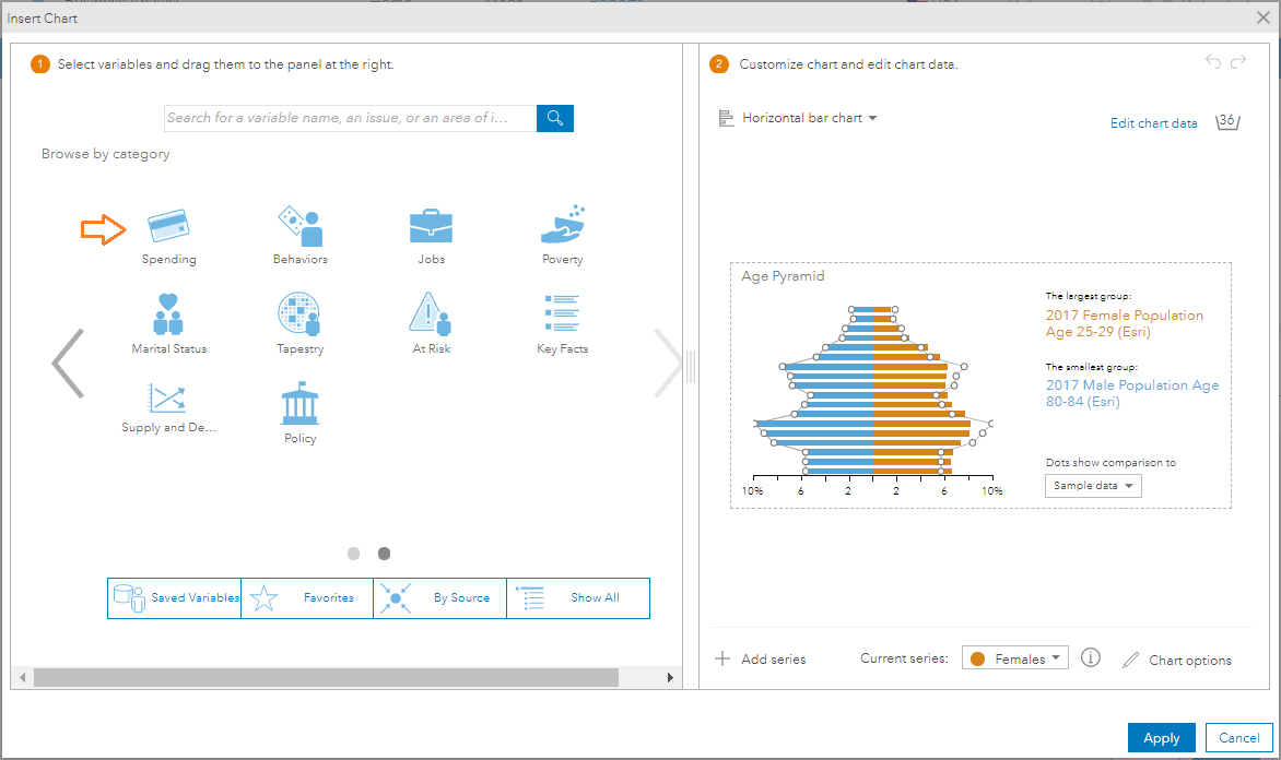
After adding the Age Pyramid panel, move your mouse cursor over it and click Edit.
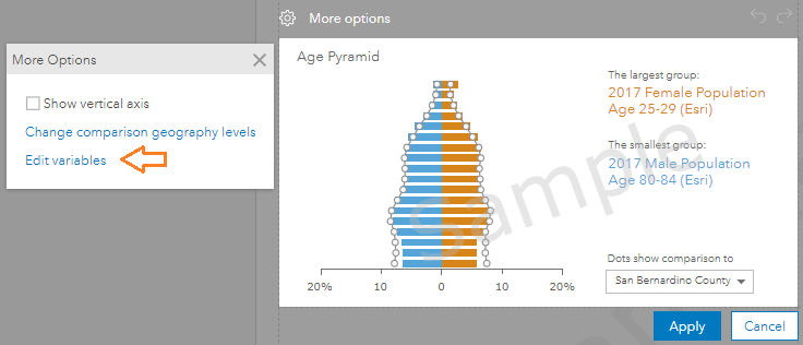
This panel uses male and female age counts in 5-year increments as the default, but you can modify that to use different age variables, or even variables from another category. Click Edit variables.
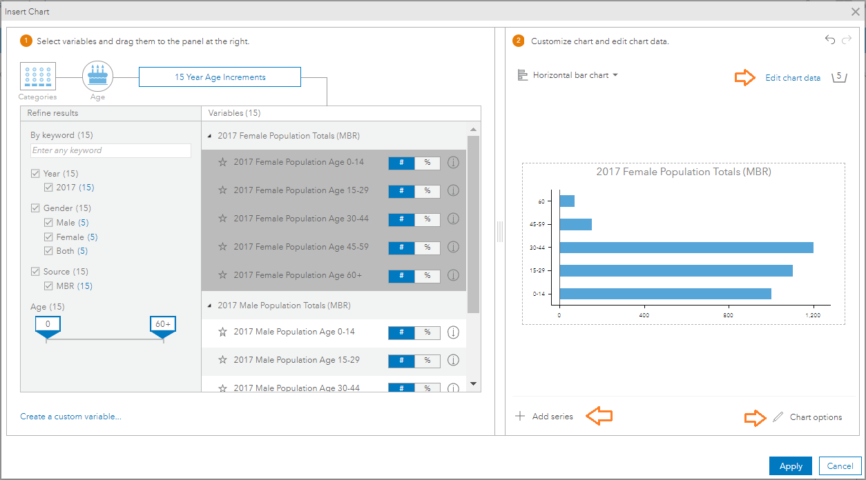
The Insert Chart dialog opens. Say, you want to compare the average spending on different types of Men’s and Women’s clothing. Under Browse by Category on the left, drill into Spending > Clothing.
Select the spending variables pertaining to Women’s apparel. Drag and drop them into the chart data section on the right. Click Replace the current series, as you want to replace the variables in that series with these ones.
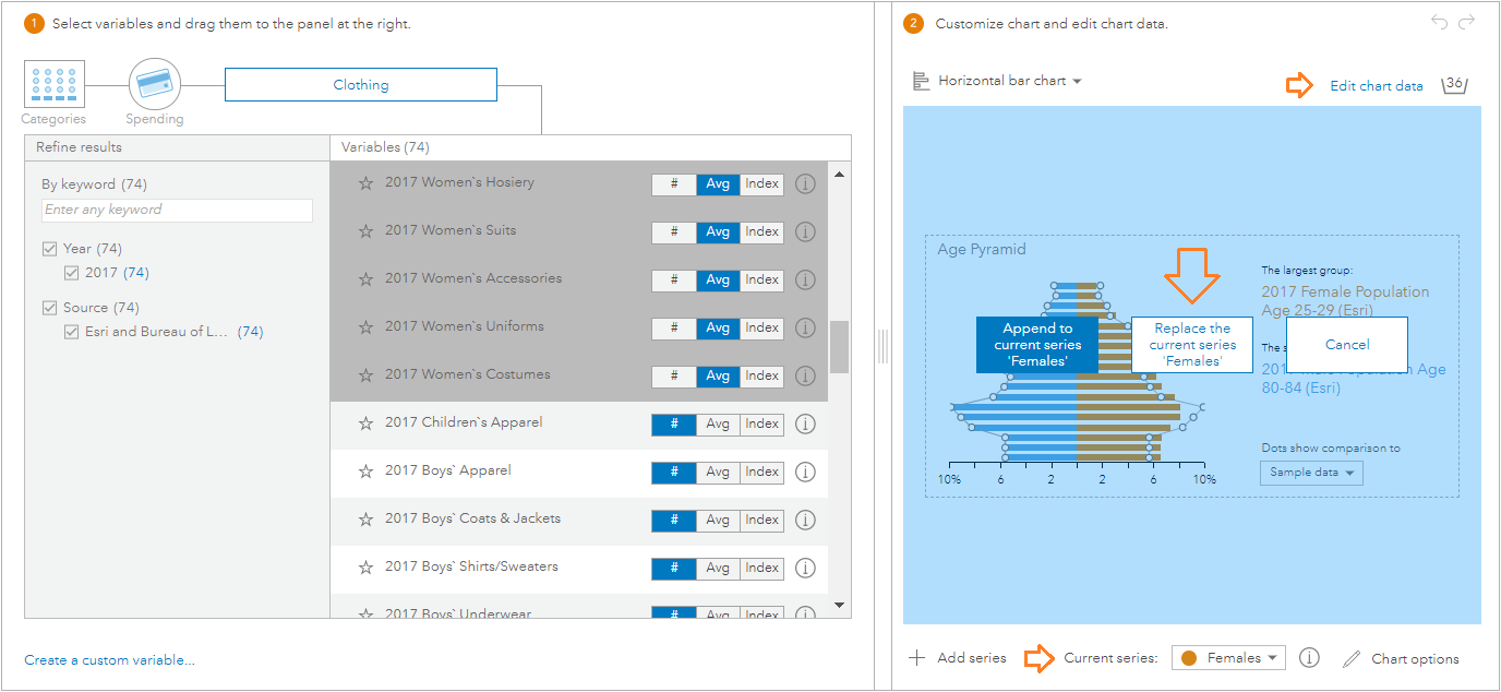
Next, select ‘Male’ in the Current series dropdown. Select the spending variables to Men’s apparel and drag and drop them into the chart data section. Properties of the chart can optionally be modified in Chart options. When done, click Edit chart data.
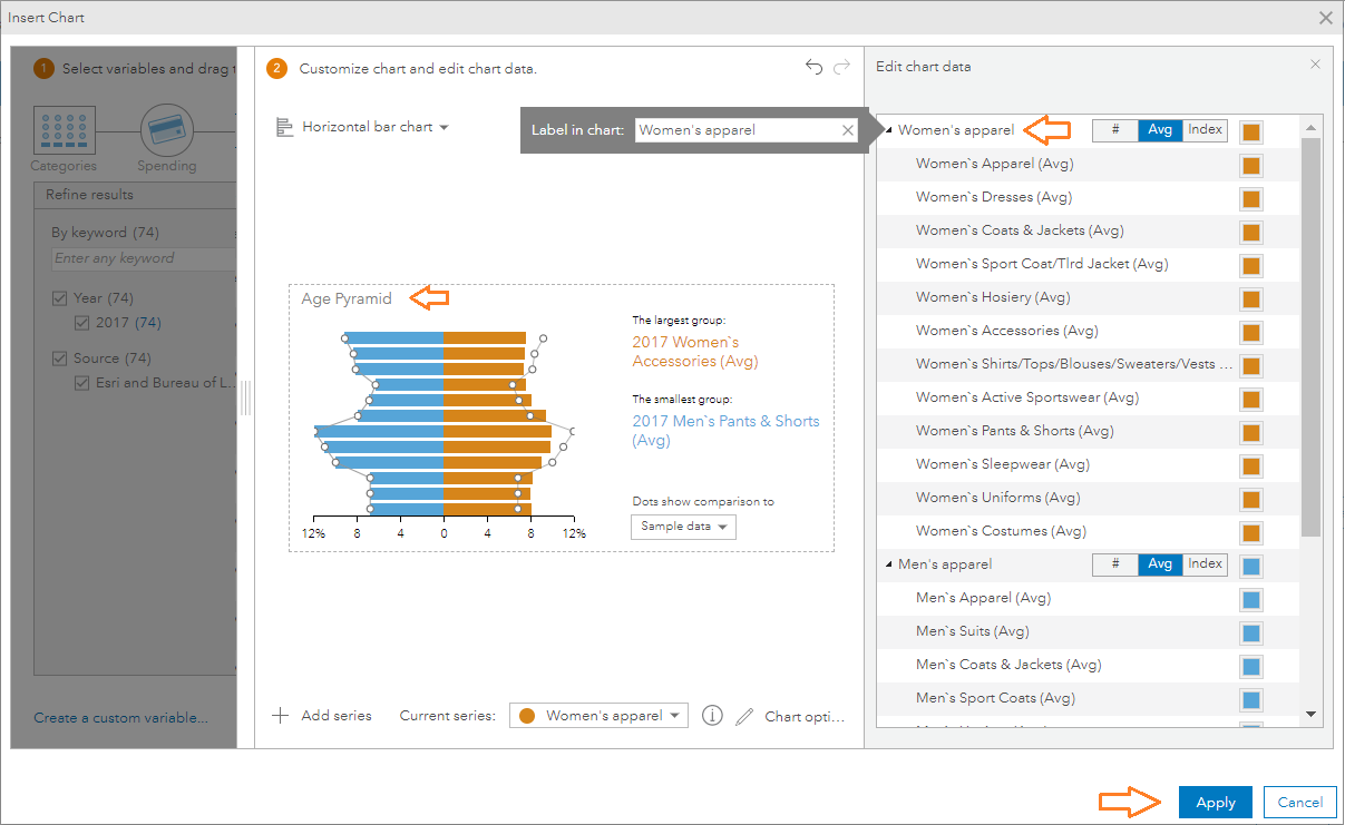
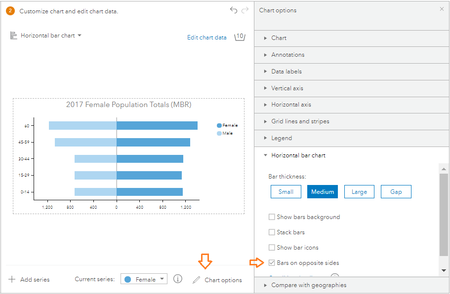
Click on both series titles, and change them from ‘Females’ and ‘Males’ to ‘Women’s apparel’ and ‘Men’s apparel’. Click on the chart title and change it from Age Pyramid to ‘Average spending on Men’s and Women’s Apparel’.
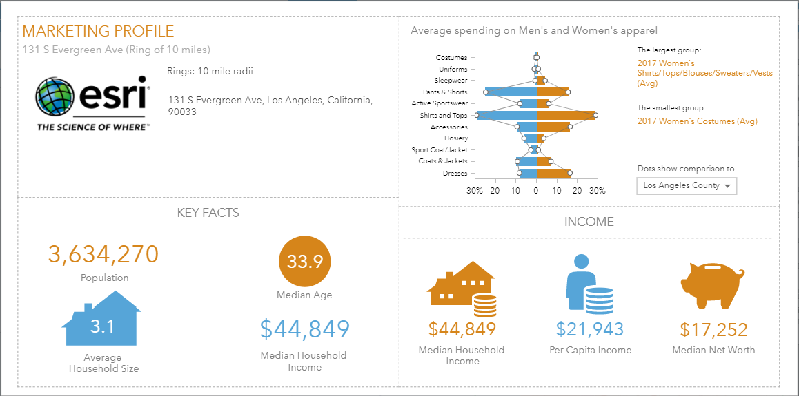
When done making the changes, click Apply to save the panel to the infographic template. You can then run the infographic template for a site to view the customized pyramid chart for a site – for example, the panel in the top right below shows spending on various men and women clothing categories for a site in Los Angeles. Each horizontal bar in the chart shows the average spending on a category of men’s and women’s apparel (in blue and brown respectively).
Create your own pyramid chart
You can also create your own custom pyramid style chart, populated by variables of your choice. The BA web app has data for 137 countries, and here we create our own age pyramid chart for France.
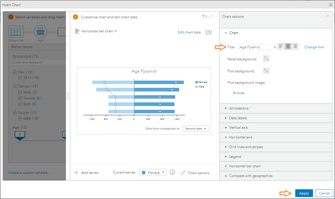
The Insert Chart dialog opens. On the left, drill into Age > 15 Year Age Increments, select all the variables under 2017 Female Population Totals (MBR) and drag and drop them into the chart data section on the right. Then click Add series.
Now select all the variables under 2017 Male Population Totals (MBR) and drag and drop them into the chart data section – they will be added to the second series you just added. Under Edit chart data, name the series Female and Male. Click Chart options to expand that section, and under Horizontal bar chart, select the Bars on opposite sides checkbox.
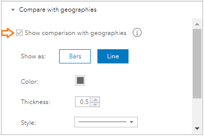
Select the Show comparison with geographies checkbox, to visualize comparisons with one or more geographic boundaries in which the site is contained, which helps place the site in context.
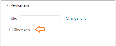
Under Vertical Axis, uncheck the Show axis checkbox.
Under Chart, change the Title to Age Pyramid. Click Apply to add this panel to your infographic template.
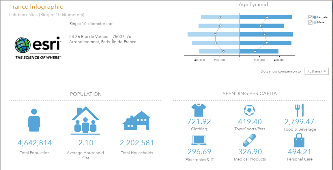
You can add additional infographic panels to the template, and save it. Run the infographic for a site to view your custom age pyramid chart for the site, with comparisons to geographies – for example, the panel in the top right below shows spending on population distribution by age for a site in Paris.

Commenting is not enabled for this article.