ArcGIS Open Data was renamed to ArcGIS Hub on June 28, 2017.
The past month has seen a few releases of ArcGIS Open Data, which most notably include the ability to create dynamic charts and dynamic statistics on your site pages. Charts and stats are two great ways to showcase the data that lies within sites, and being dynamic, they will update automatically when your services update. You can set them and forget them (until your users write you with compliments).
Without further ado – some details:
Dynamic statistic cards
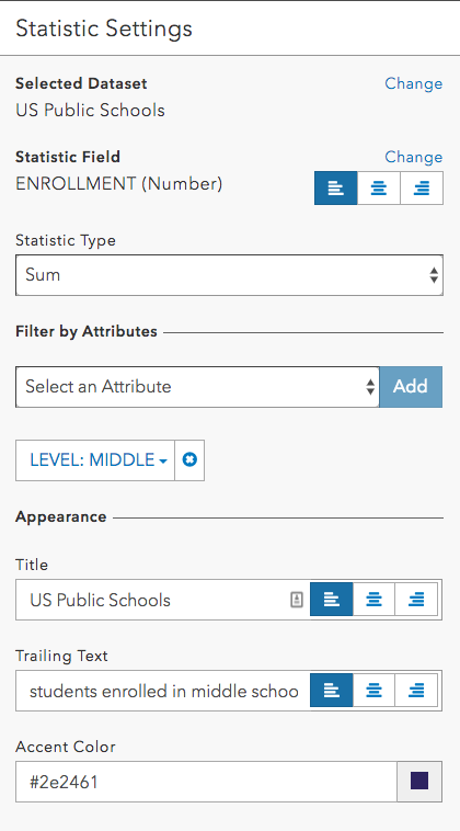
Configuring a statistic card on your site will create a statistic based on the feature layer. You can select a specific field to calculate, determine the statistic type (sum, count, average, etc), add any filters, and finally configure the appearance. In the example below, we’ve added a dataset, US Public Schools. We’re then configuring the card to give us the total enrollment (sum) of students in public middle schools only, opposed to all public schools. We could filter by any of the fields present in the dataset to give us a wide option of statistics based on one single dataset. Behind the scenes, we’re querying the feature service and displaying the query response on the page.

The impact of this card can be far reaching depending on your dataset – crime data, for example, is always changing and is of high importance to people living in your communities. You can create a page which shows the number of crimes by type in a particular time period, and these statistics are always up to date with the latest data. This keeps your community members informed without needing to edit the page every time the data changes, which can be more than once a day!
Dynamic chart cards
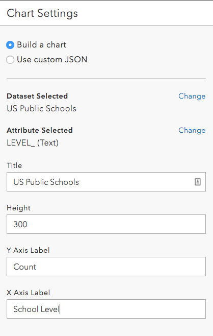
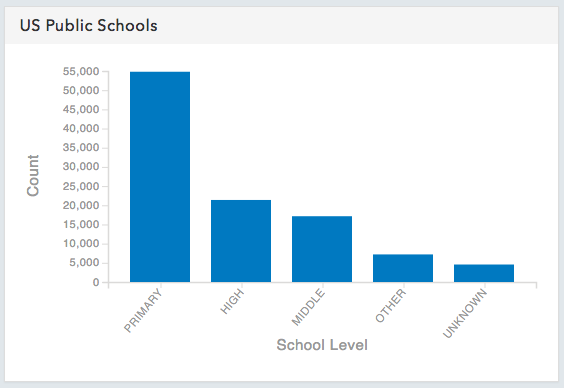
There are two options when configuring charts for your site: basic and custom. The basic charts are based off of services on your site, and automatically create a bar chart based on the count of a field you select. This is a very quick way to display your data at a glance.
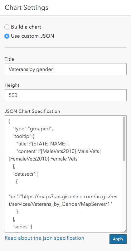
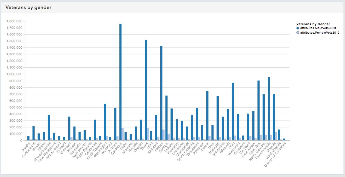
Alternatively, you can get more advanced by inputting your own custom JSON. The chart cards are based on Cedar, an open source charting library built at the DC R&D Center. Using Cedar you can include grouped bar charts, like below, as well as timelines, horizontal bar charts, scatterplots, and bubble scatterplots. Details are available in the Open Data documentation.
Again, both these chart types are linked back to services, so they will update whenever the service itself is updated.
Examples in the wild
We’re already seeing some users include statistic and chart cards on their pages – check out Iowa DOT’s Winter Operations page for statistic usage, and the City of Raleigh’s Transportation page to see some charts. Then, let us know what you build! We’re waiting to hear from you on GeoNet.
Article Discussion: