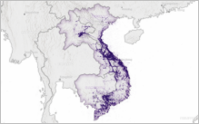
 In December 2016, the US Department of Defense released digital records involving bombing missions carried out during the Vietnam War.
You can now turn all that data into a visually appealing map with a new Learn ArcGIS lesson, Cartographic Creations in ArcGIS Pro.
“You learn a lot about presenting big data to an audience,” lesson editor Kyle Bauer said. “The user sees over one million points on a map — it’s probably the most data of any of our 50 lessons.”
Learn ArcGIS is a story-driven website launched in 2014 to guide users through real-world problems with GIS solutions.
The goal of the new lesson is to convert big data into an attractive and meaningful map. As part of the two-hour lesson, users will symbolize dense point features, create a time series chart, and configure a detailed map for printing.
The lesson is also a chapter in The ArcGIS Book, second edition, which will be distributed for free in July at the Esri User Conference in San Diego.
Cartographic Creations in ArcGIS Pro is the second military-themed lesson in ArcGIS Learn. The other, Actionable Intelligence, is also an ArcGIS Pro lesson in which users analyze intelligence reports to prevent enemy rocket attacks on their base.

Article Discussion: